R1 L01-whitewhite
Primary: Summit lockup
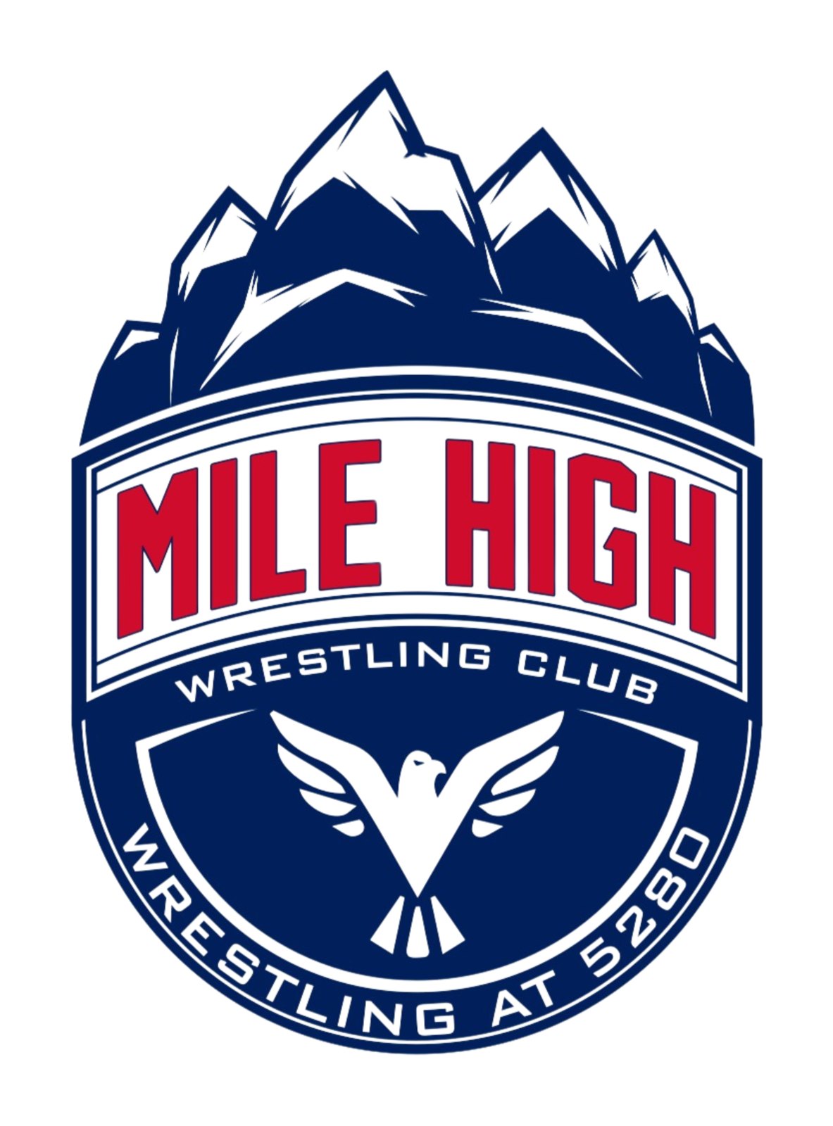
The shield's mountain crown sits straight on MILE HIGH; WRESTLING CLUB tracked to the same width. No shield, no banner, no arch. Fronts, singlet chest, store header.Mile High has three looks in circulation: the navy and red shield, BSN’s MHWC stack, and a vendor’s redrawn badge. R1 pulls them into one lockup system built from the club’s own shield and puts it to work on flat designs; R2 adds modern lockups of the same assets; R4 updates the crest; R5 updates the mountains and the eagle; R6 builds on the R4 picks. Every item is numbered R1 <id>: Approve it, flag it for Revision and type what to change, or Archive it. Clicks save to one shared review that shows who did what. Click any image for the full-size file.
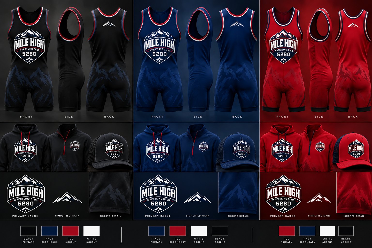
R1 Lockups — one system built from the club’s own shield (the version on milehighwrestlingclub.com), not a new logo. The mountain crown and the eagle are traced straight from their file. The type keeps the shield’s two faces, refreshed: a heavier condensed block for MILE HIGH, set straight instead of arched, and the wide extended face for WRESTLING CLUB. Colours are sampled from their file: navy #011F5B, red #CF0C2C and white, with black as the alternate ground. On navy and black the crown carries a white keyline so the rock reads, the same as on the shield. Vector masters (SVG and PDF, type outlined) and transparent PNGs are on Drive.
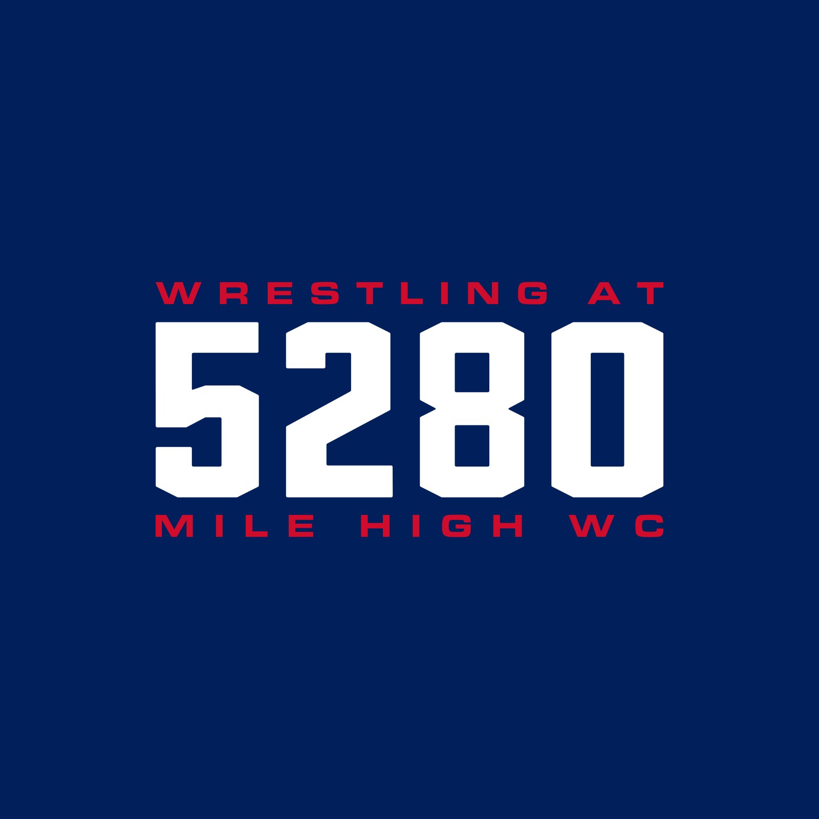
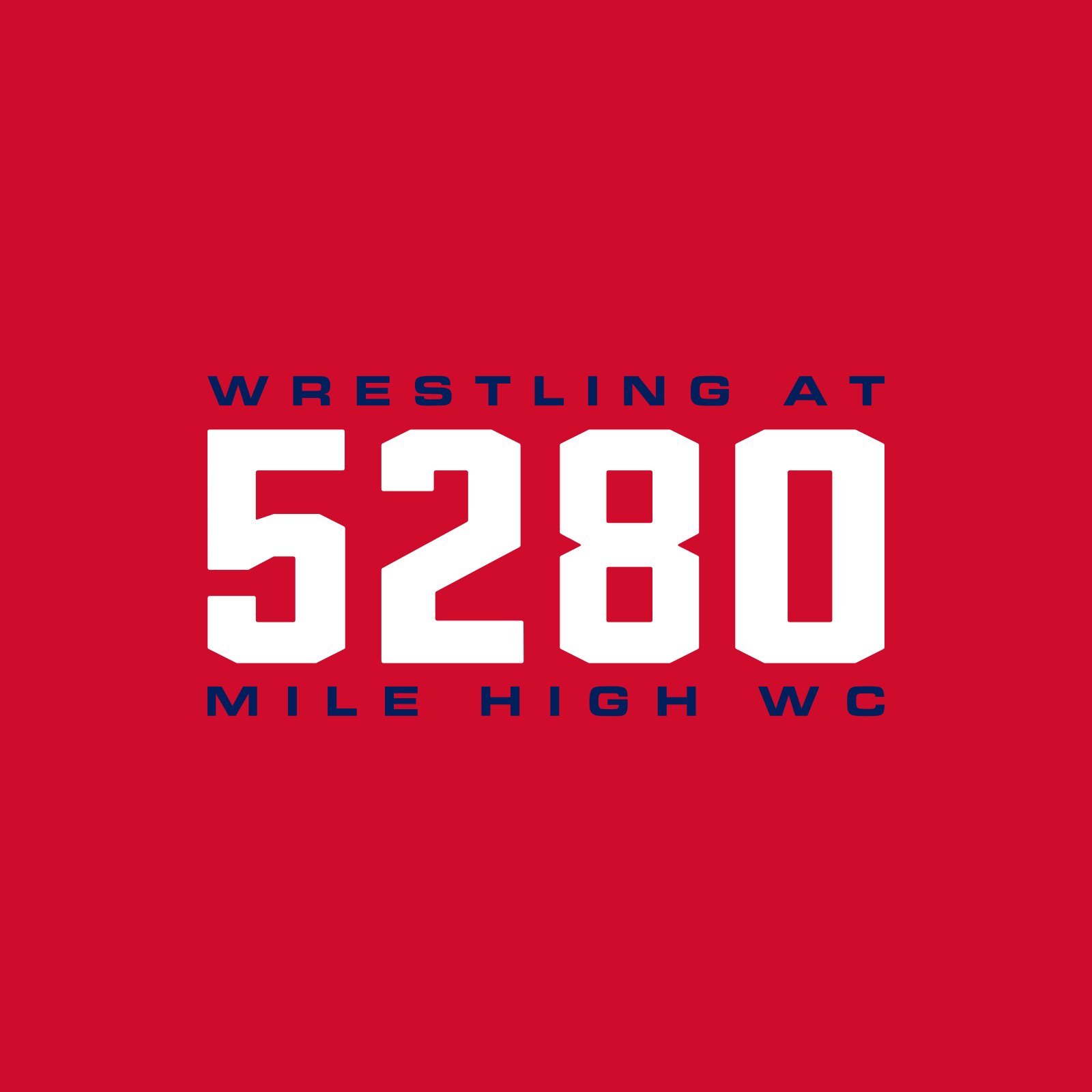








R1 Designs — the lockup system put to work on flat garment-colour grounds. Each piece has one idea and is built on a construction that sells now (Homefield’s Colorado line, Rocky Mountain Underground); each card names its source. Two type families only, the club’s real marks only. Weak and duplicate takes were cut. These are Magnific concept renders; approved pieces get rebuilt as vector separations from the lockup masters before production.
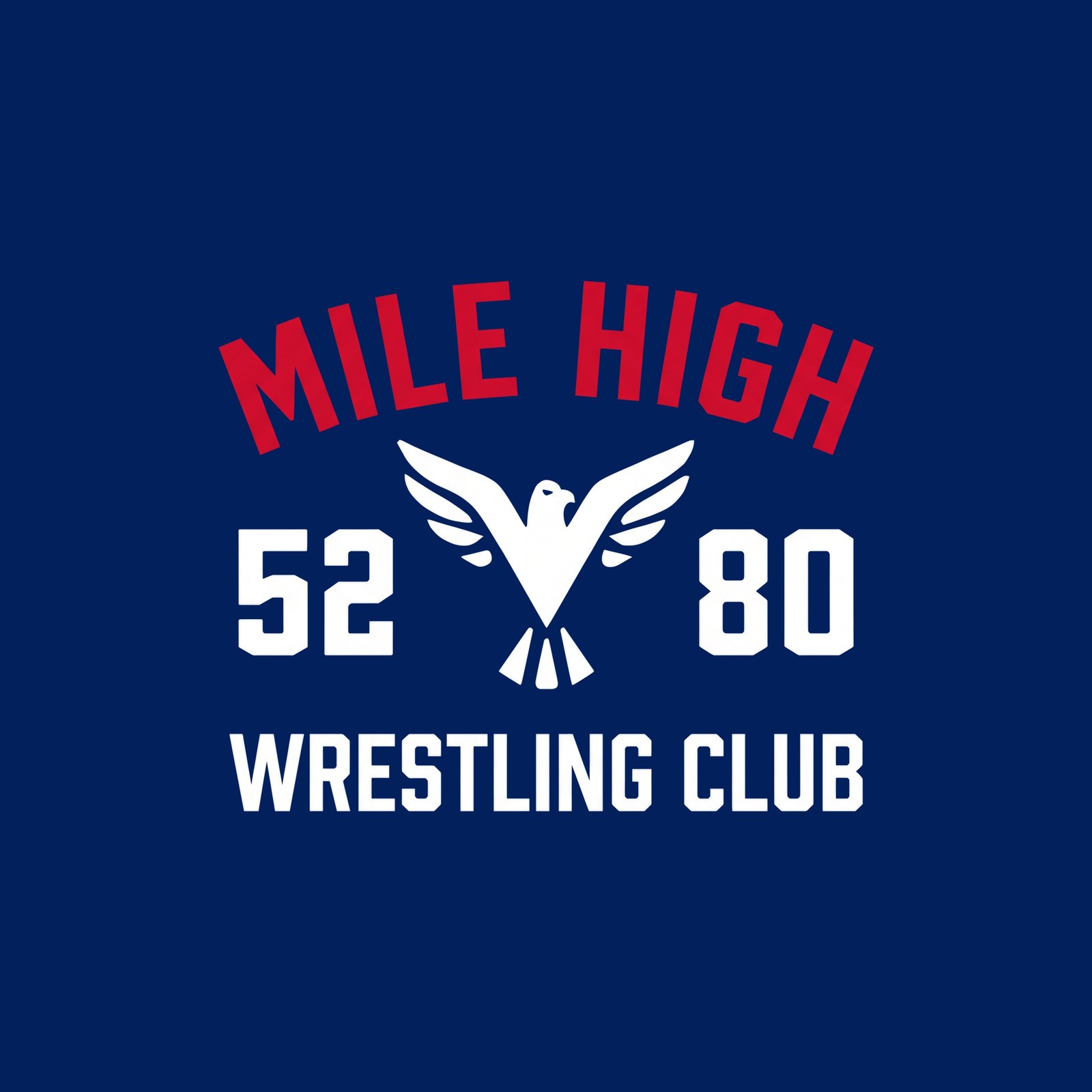
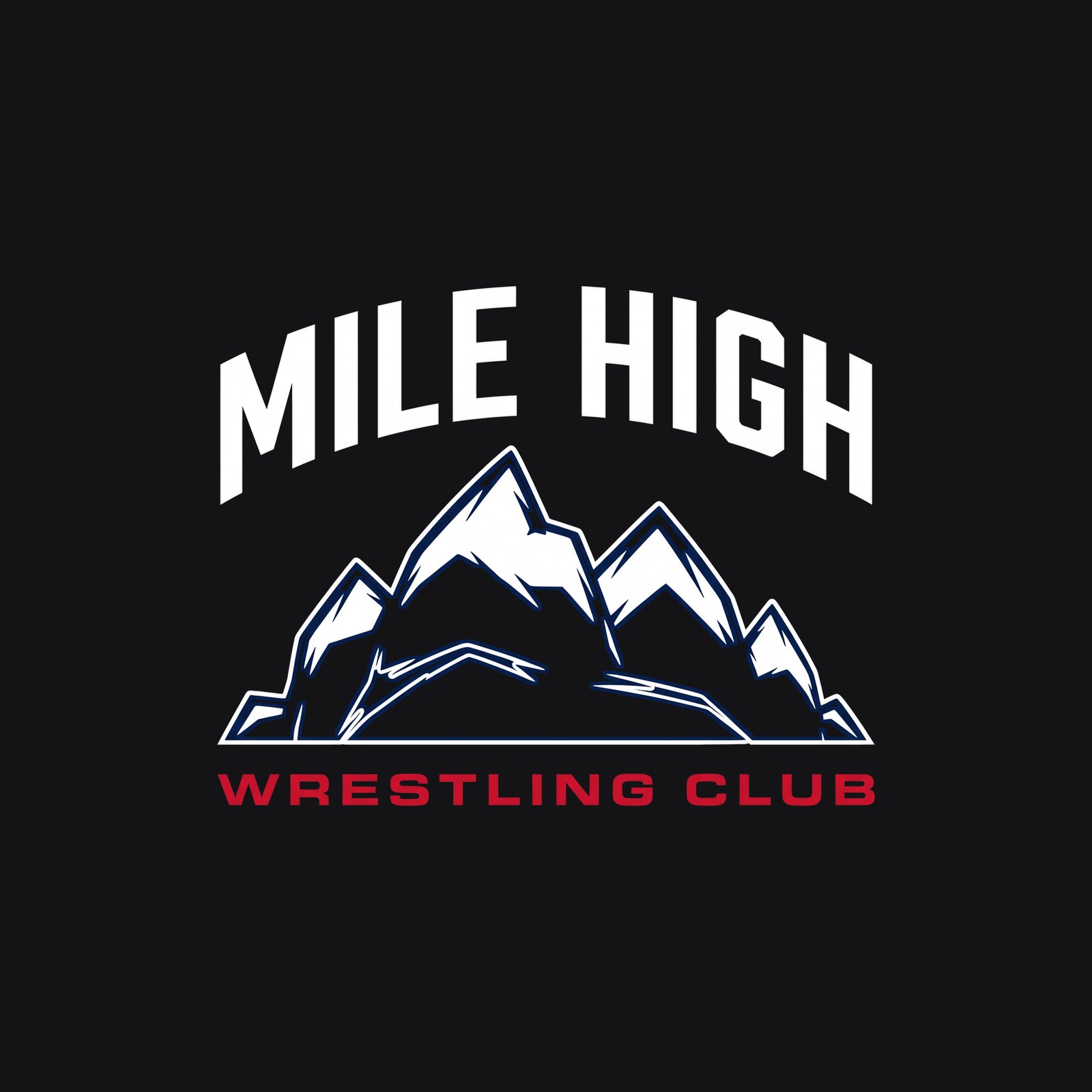
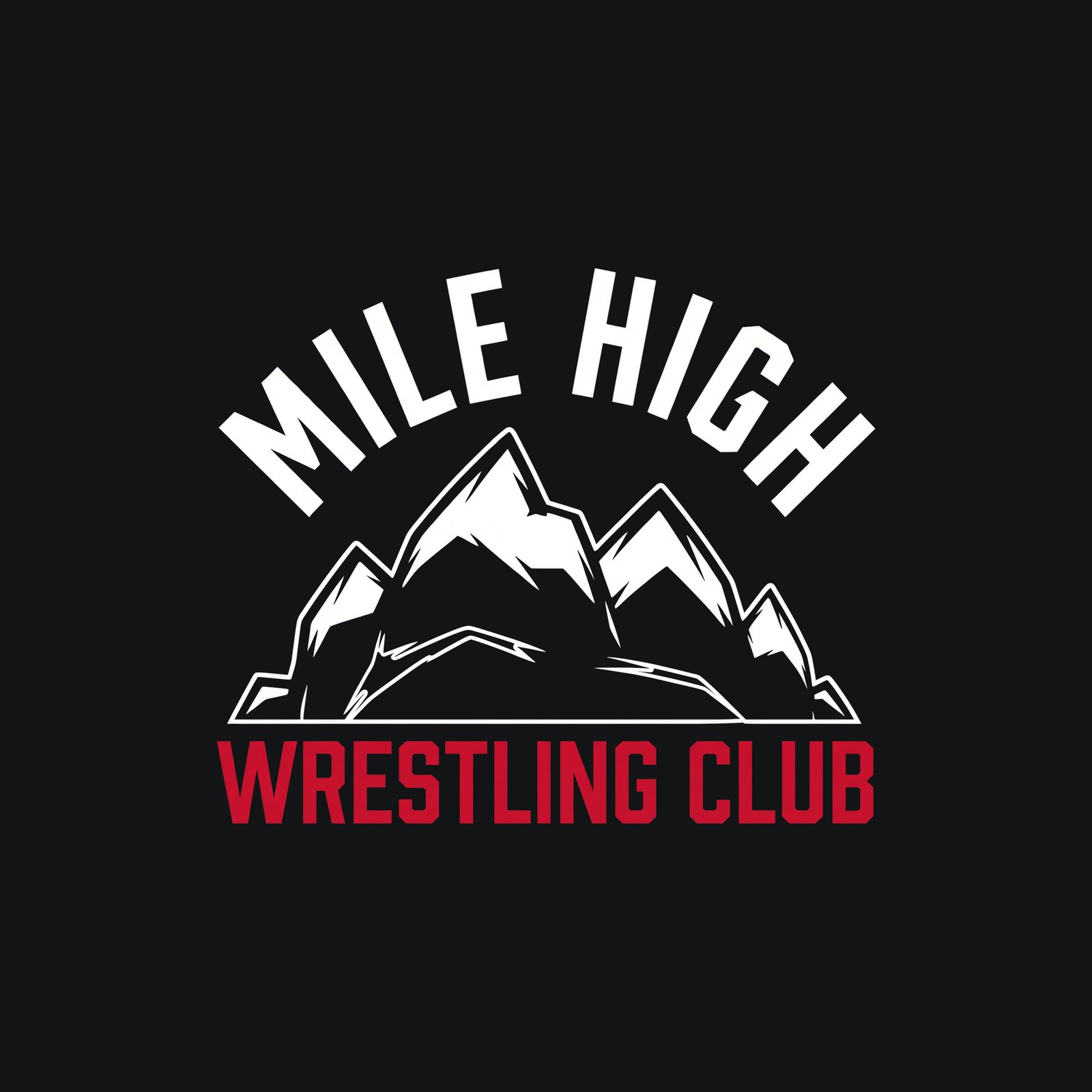
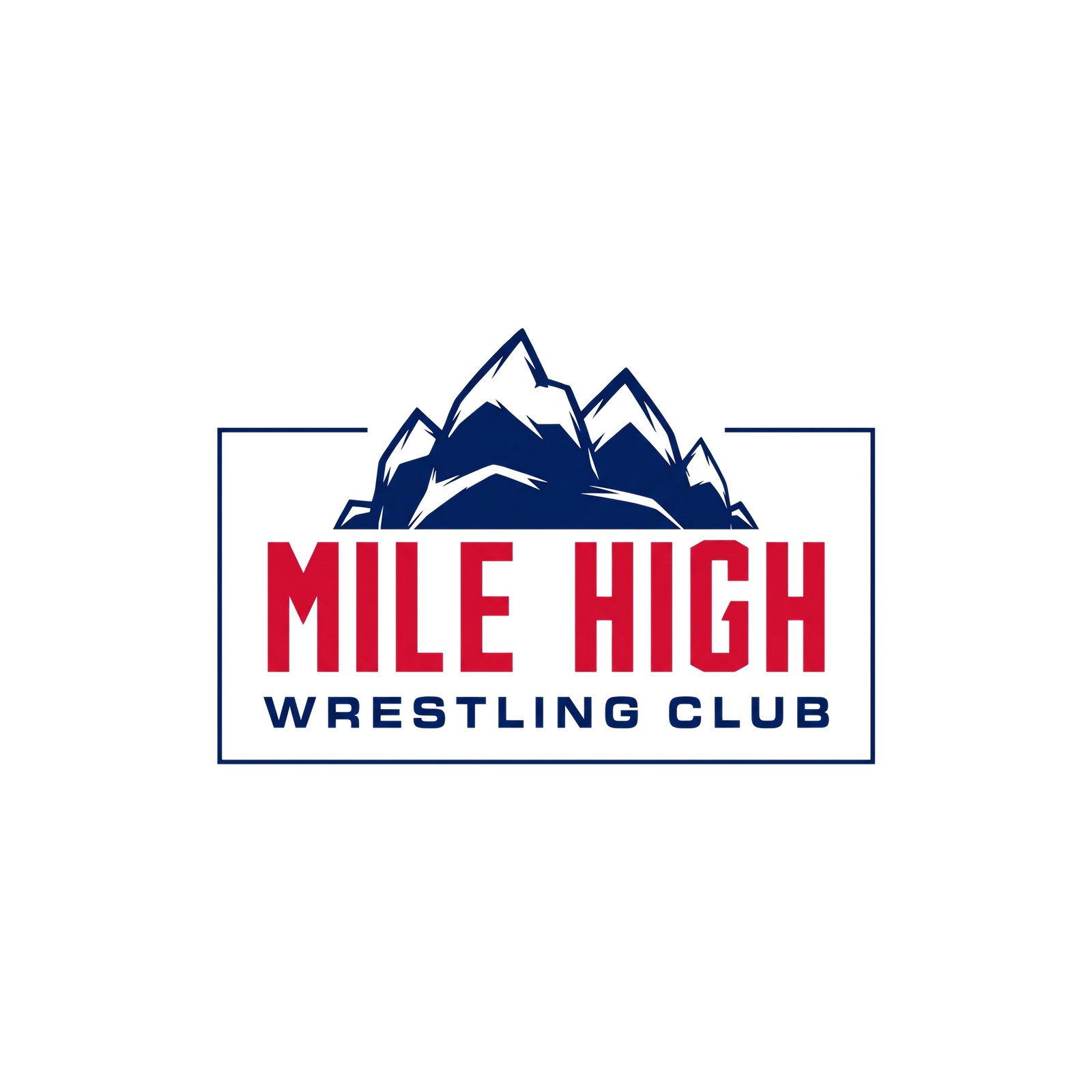
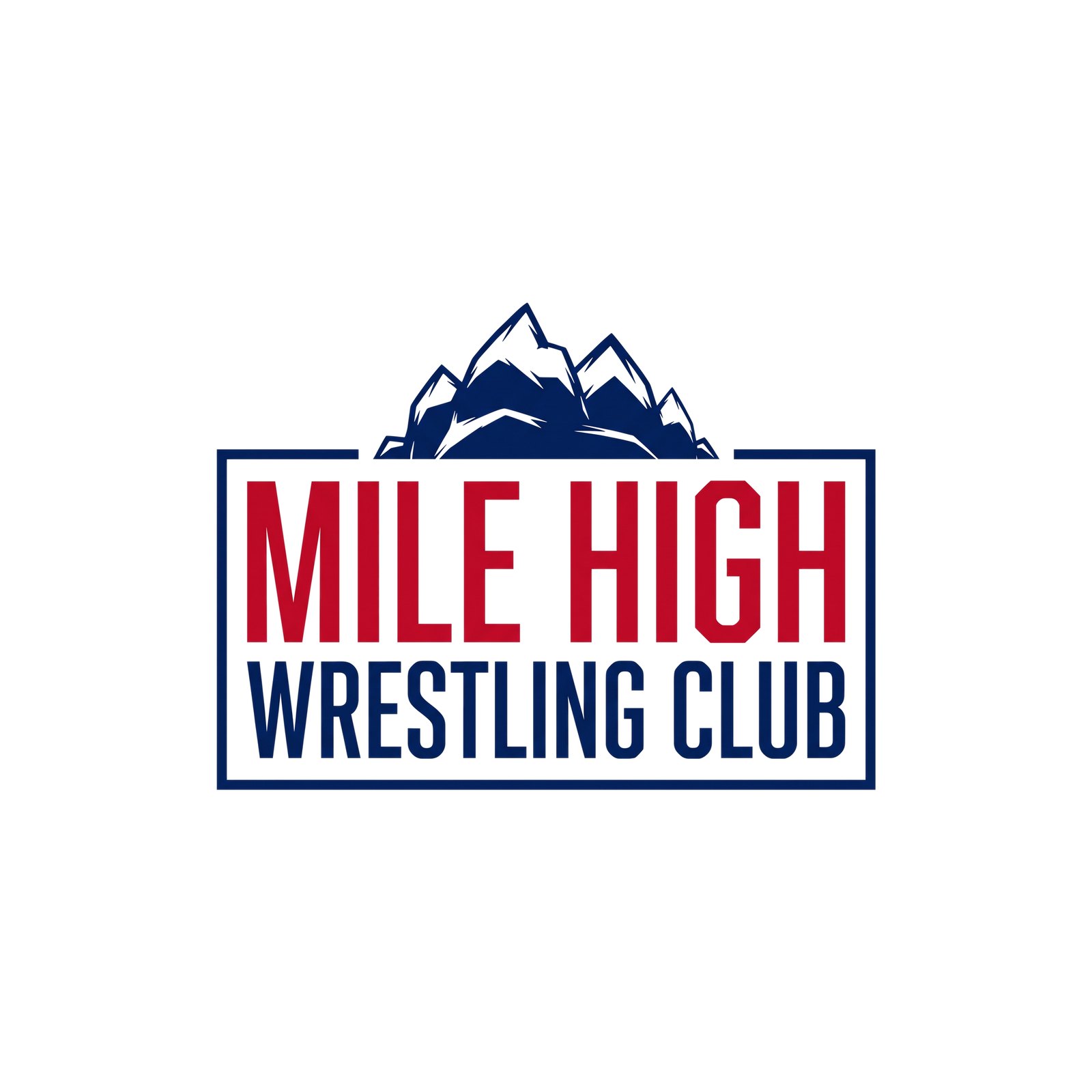

R2 Modern Lockups — more lockups of the same real assets, built the way current identities are: altitude as the idea (Denver Summit FC’s 5280 logo, the Broncos’ summit-marker neck tag and 5280 bumpers), wide extended type, vertical and stacked type, a repeat stack. Same marks traced from the shield, same two typefaces, same navy and red, spot colours only (no tints). True vectors; SVG, PDF and transparent PNG on Drive in LOCKUPS_R2_MODERN_2026-10-06.
R4 Crests — the club crest updated with a modern sports-identity feel: bolder shapes, one line weight, flat colour, upright peaks. Built from their current crest (the other vendor’s newer badge was not used as a reference). Concept renders; the picked crest gets rebuilt as true vector with the picked mountains and eagle.
R5 Mountains — modern updates of the club’s own mountains: the same range redrawn with every summit standing straight up, in ten style directions. One colour so only the drawing is judged; treatments come after a pick.
















R5 Eagles — the hard-edge eagle round. Only B09_alt is kept (the client’s pick); the rest drifted heraldic and were taken down. The R7 Eagles tab goes back to the rounded eagle.

R6 Crests — more crests built on the three R4 picks (K04_alt summit cut, K09 crest + wordmark, K01 the crest rebuilt), several carrying the new R5 hard-edge eagles and mountains. Each card says which pick it grew from. Concept renders; the picked crest gets rebuilt as true vector.
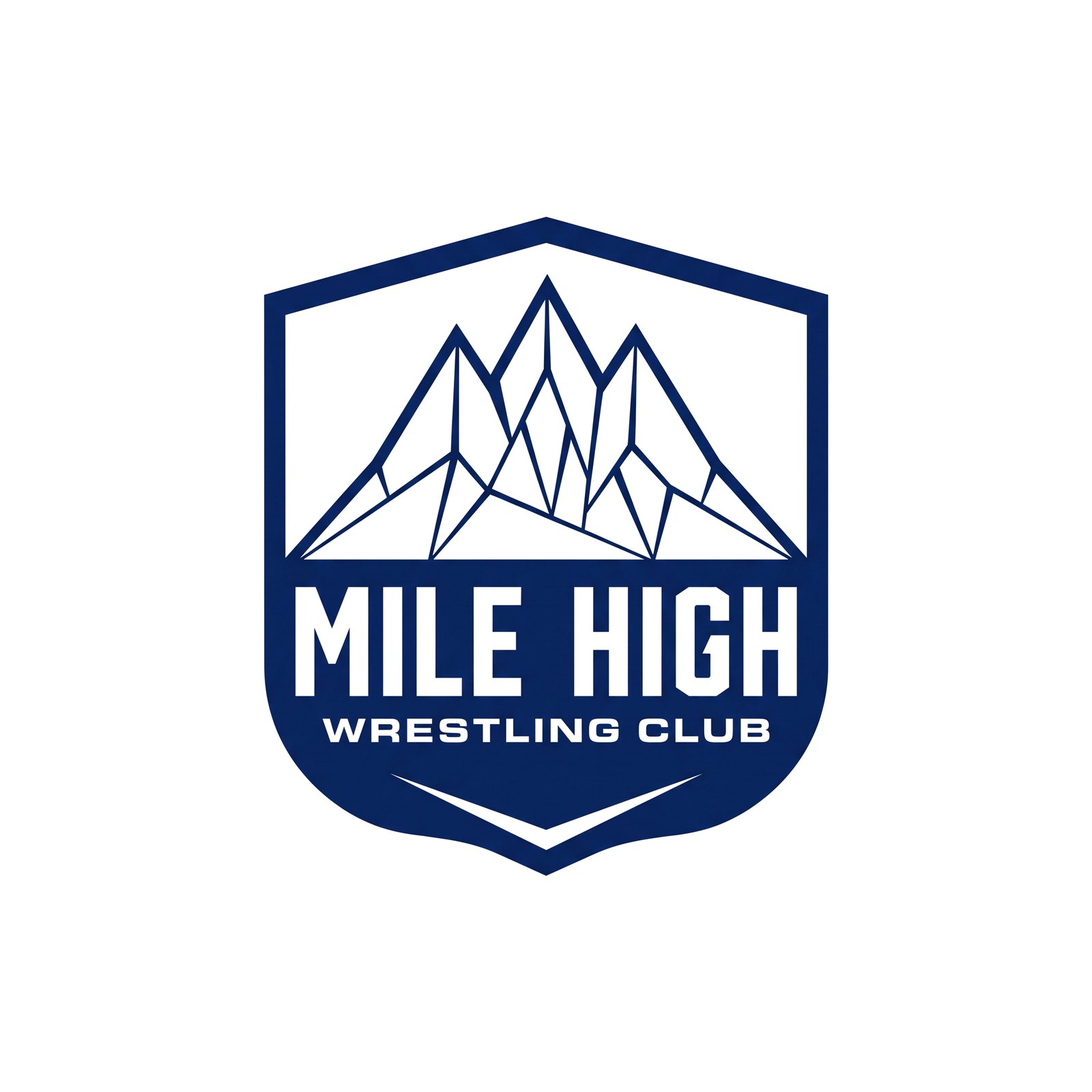
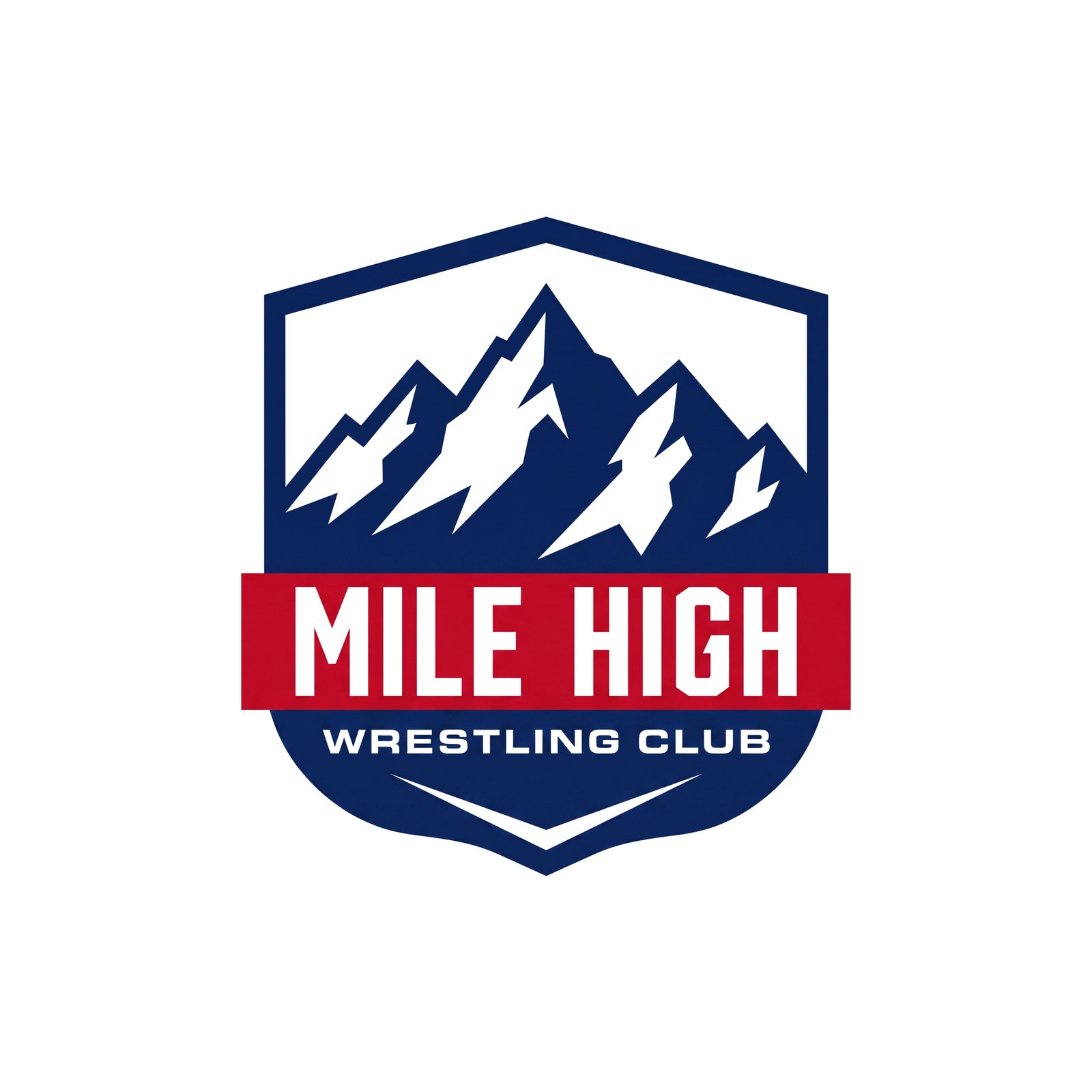
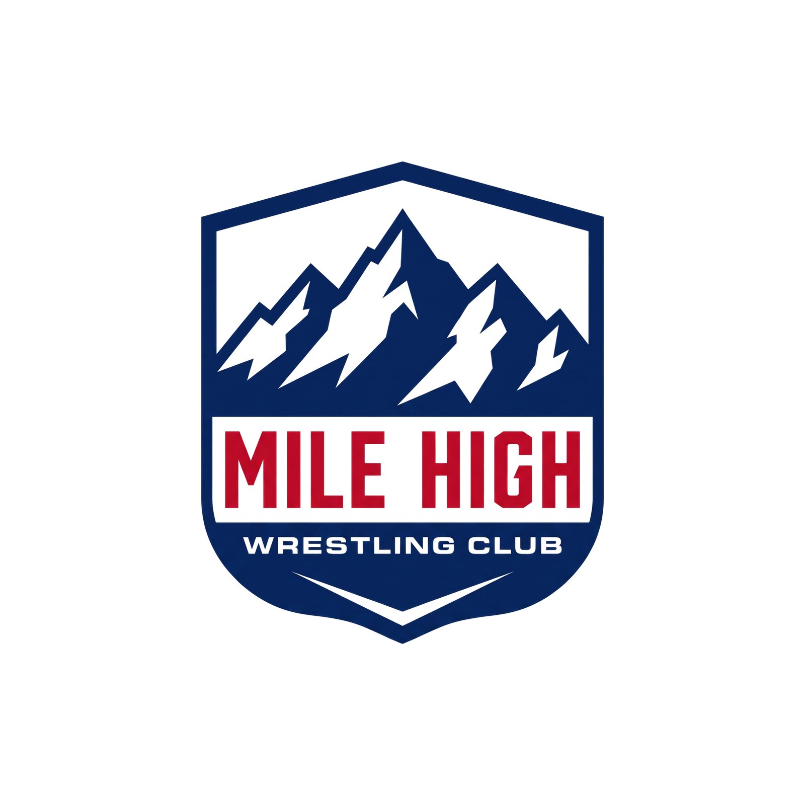
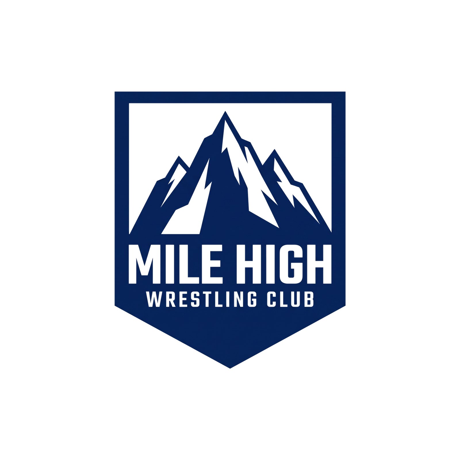
R7 Mountains — built from the picks: T08_alt (split light), T10 (heavyweight, the lower-left reflection now clipped above a solid base), U09_alt (the spire, redrawn as a true pyramid with uneven shoulders) and U01 (made less uniform). Every white plane now stops inside a solid navy base.
















R7 Eagles — back to the club’s rounded eagle: refined, bolder, compact, soaring, a rounded take on the B09_alt pick and an icon version. Kept away from heraldic spread-eagle and phoenix shapes.












R8 Eagle — the eagle picked from R7 (E01) with the tail from E03, as asked: a precise edit, not a new drawing, and already a true vector (SVG, PDF and PNG in navy, white and red on Drive in EAGLE_E01v2_2026-10-06).




R8 Mountains — the final mountain run, as exact edits of the picked drawings (not new generations), already true vectors: SVG, PDF and PNG in navy and white on Drive in MOUNTAINS_R8_FINALS_2026-10-06. Each card shows white ground; the alt shows navy.














R9 Mountains — follow-ups on the R8 picks: W08v2 with the reflection's bottom made level with the base, and W09v2 with the middle peak brought down three amounts. Exact edits, true vectors on Drive in MOUNTAINS_R8_FINALS_2026-10-06. White ground on each card, navy on the alt. Eagle winner: R8 E01v2. Basic alternate: R7 W04_alt.








R11 Crests — a bigger crest round built from the R6 crests that had promise (V01, V03, V04, V07_alt, V08, V12) and the R4 picks, plus new directions (clipped-corner badge, red keyline shield, monoline). Every one carries the LOCKED marks exactly: mountain R9 W09v3 and eagle R8 E01v2 (Magnific drew each crest with flat placeholders, which were then replaced with the approved marks). Takes where the eagle overlapped the type, mountain or border were cut. The R10 vector round was taken down.
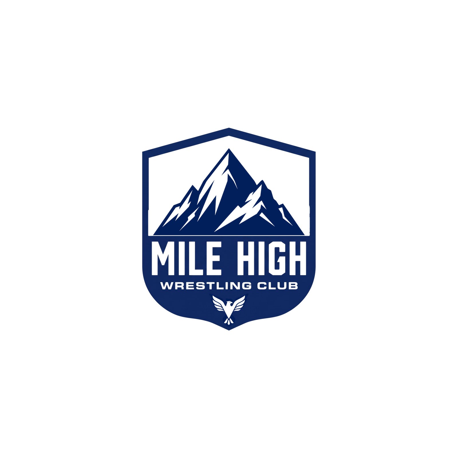
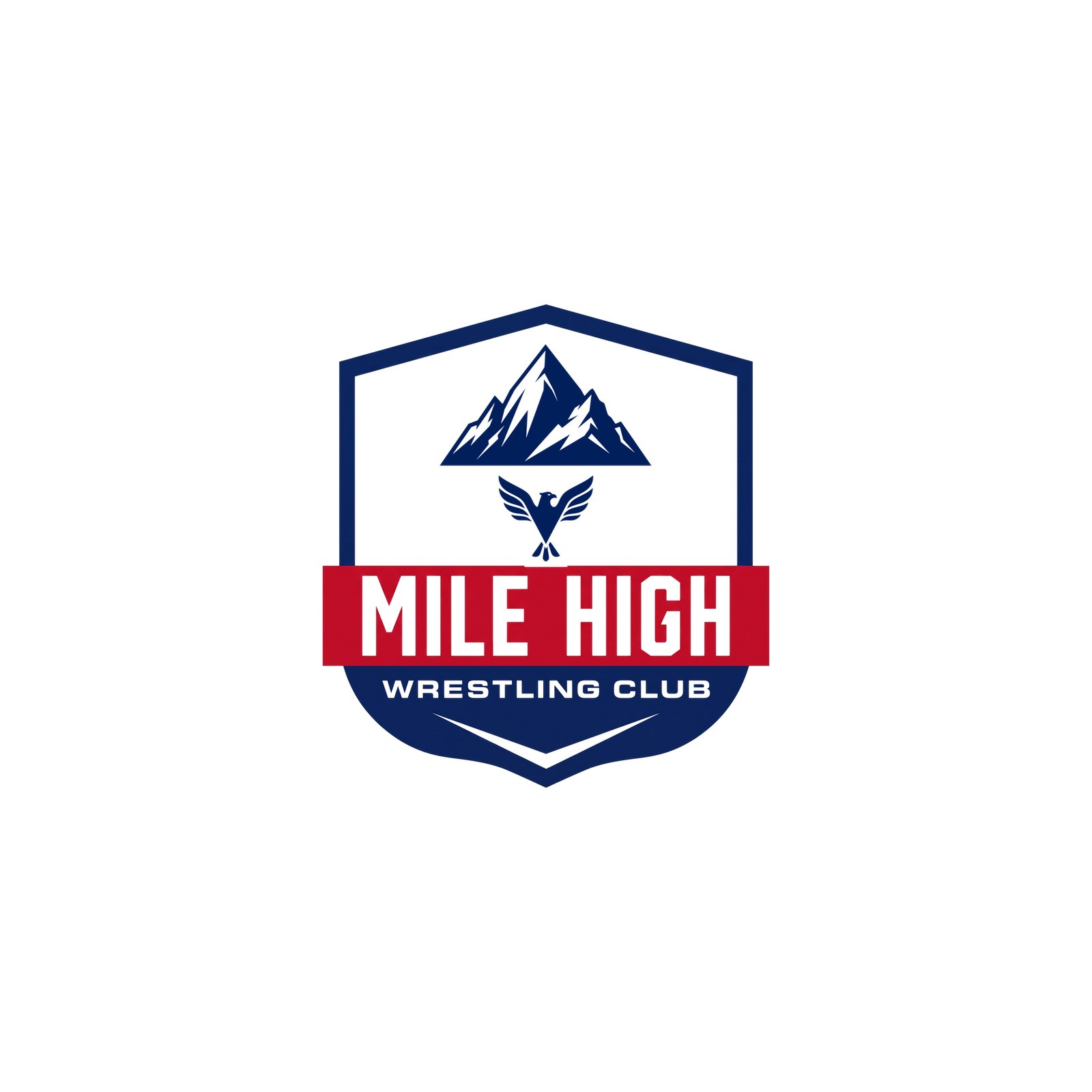
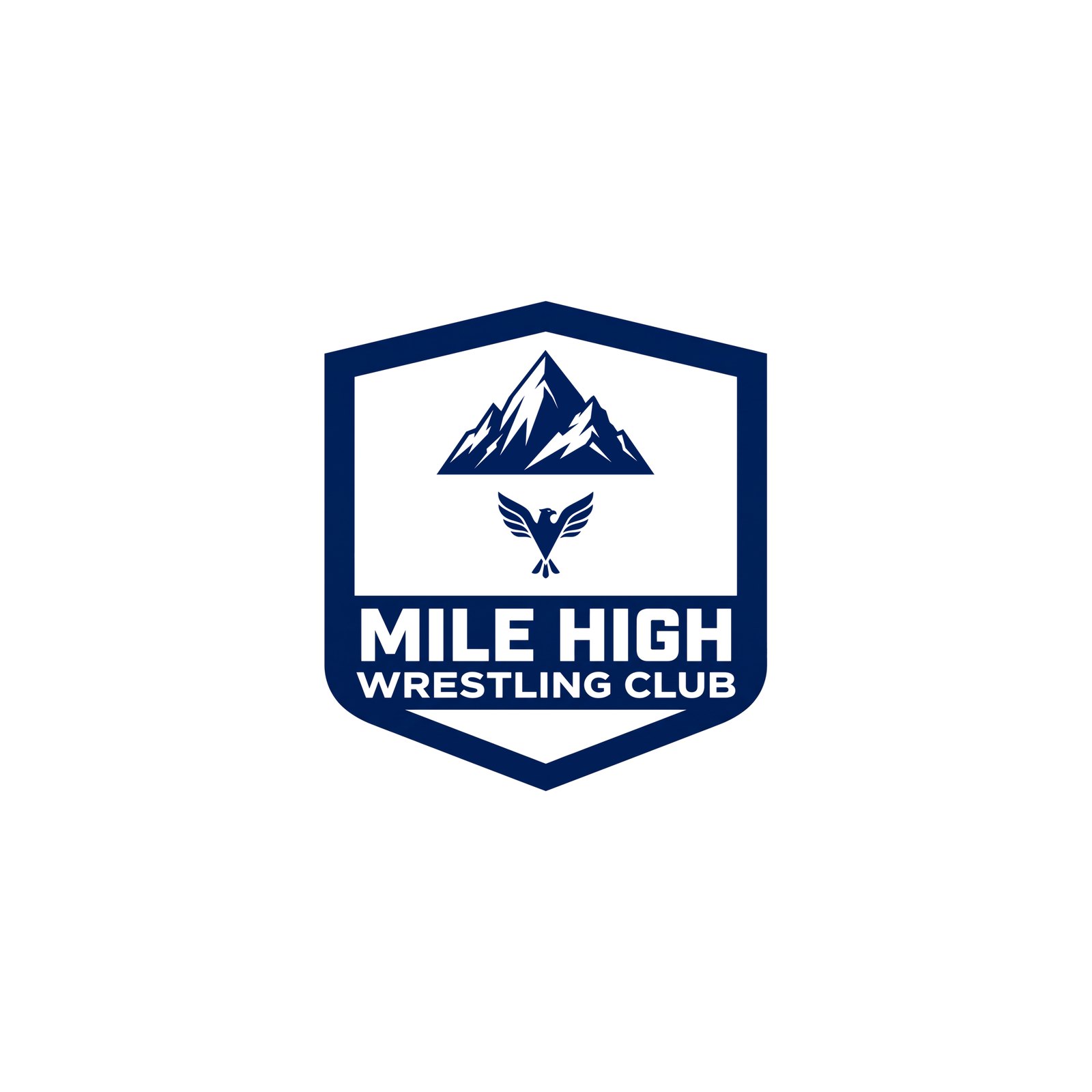
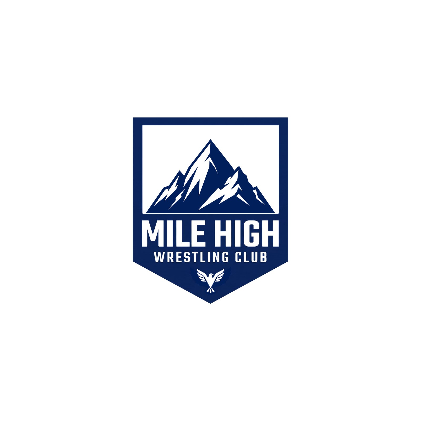
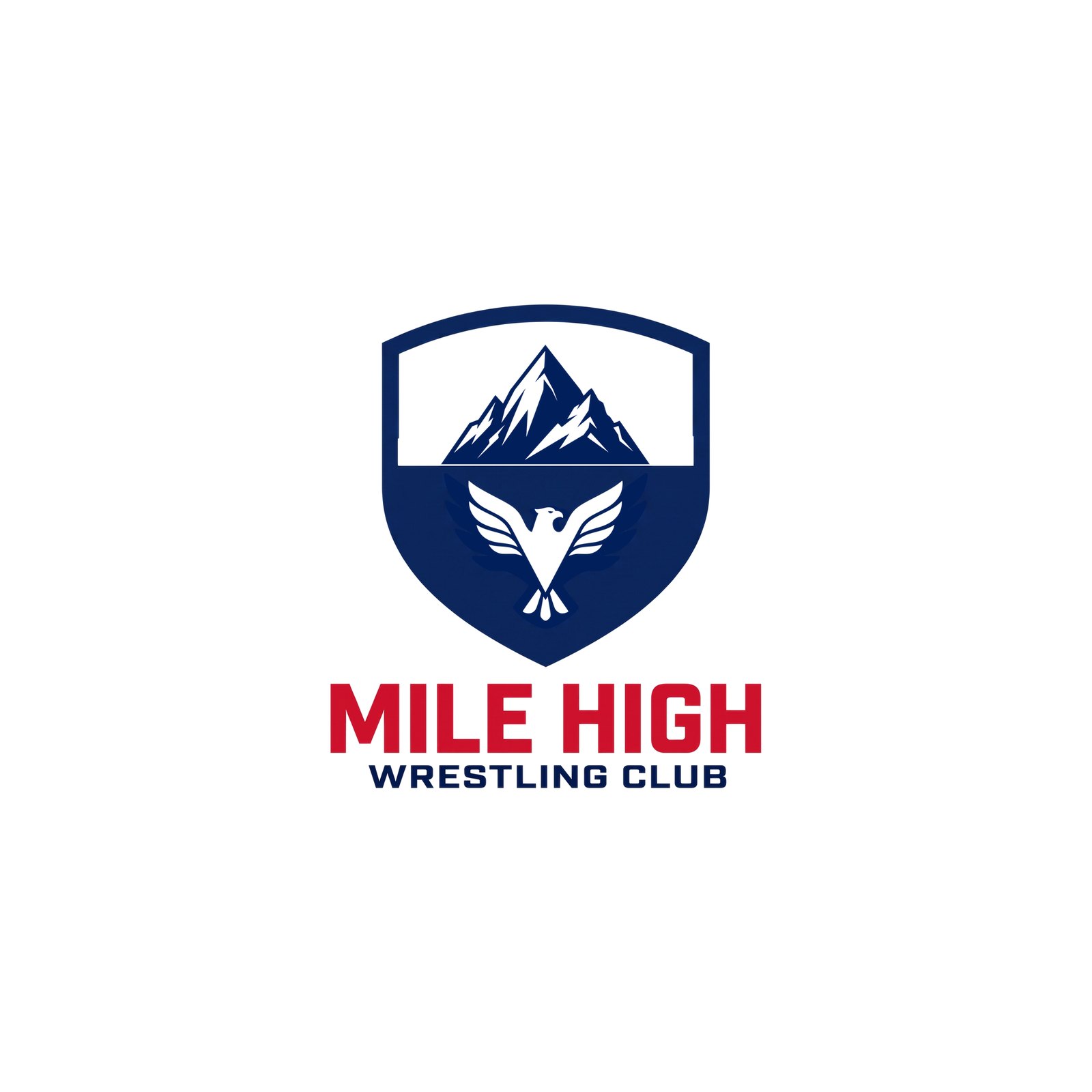
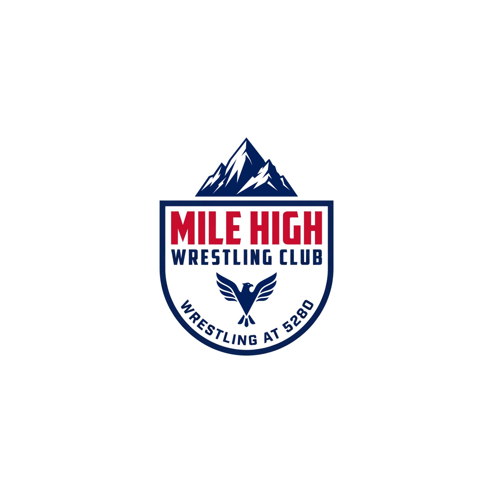
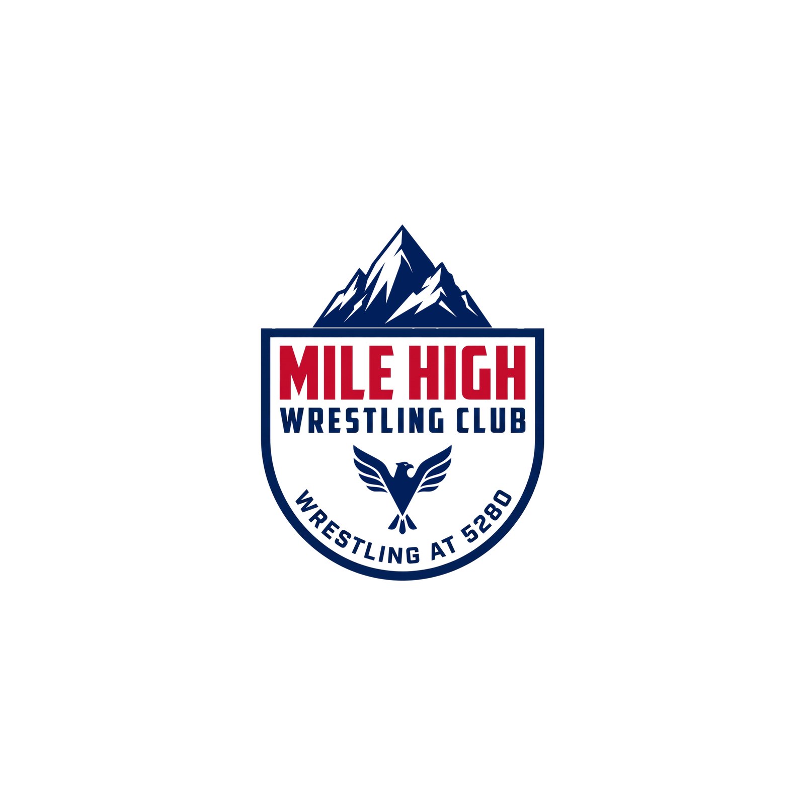
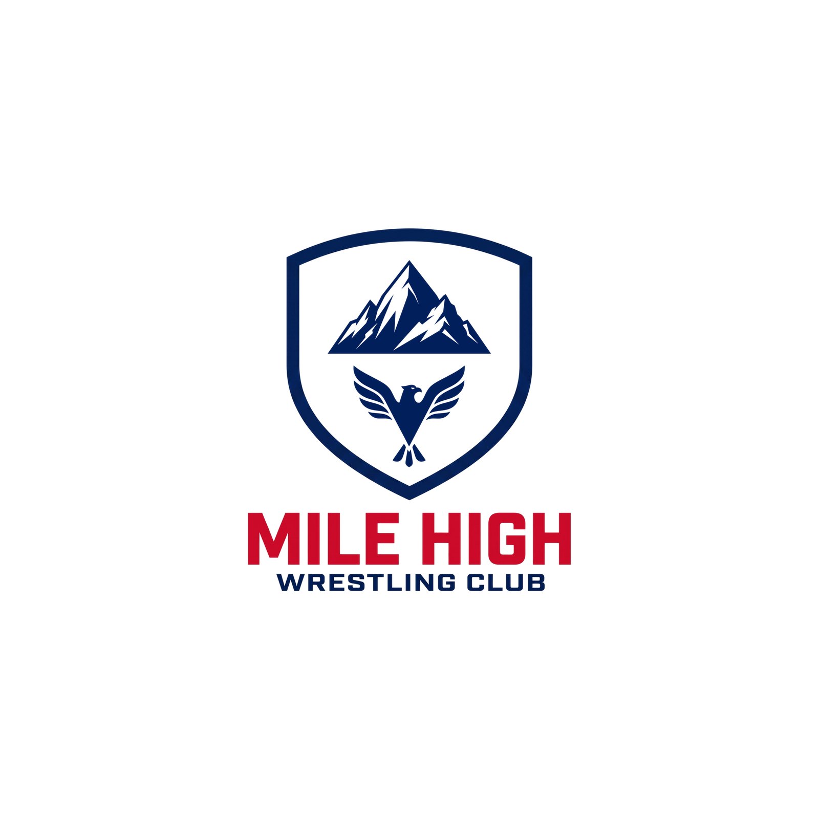
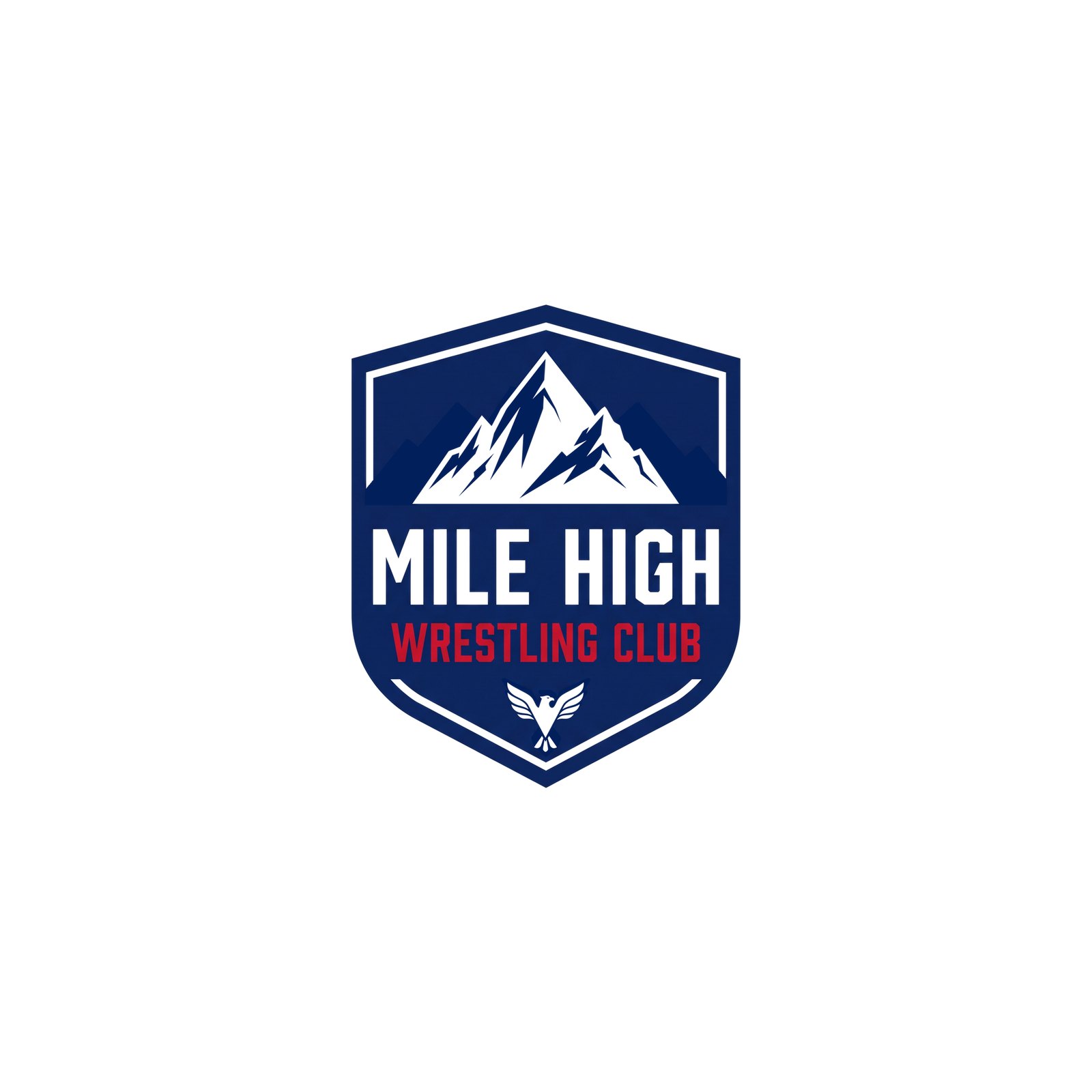
R14 Crests — the R4 K09 treatment done properly: the top of the eagle’s wings is the cut between top and bottom — the eagle silhouette offset by one white buffer cuts the navy mountain mass, with the same buffer over the eagle as at the sides. Locked eagle R8 E01v2 with its wings spread wider so it sits like K09, locked mountain R9 W09v3 squatted. K09’s shield and type kept. Built exactly (not generated), so these are production-ready. R13 was taken down.
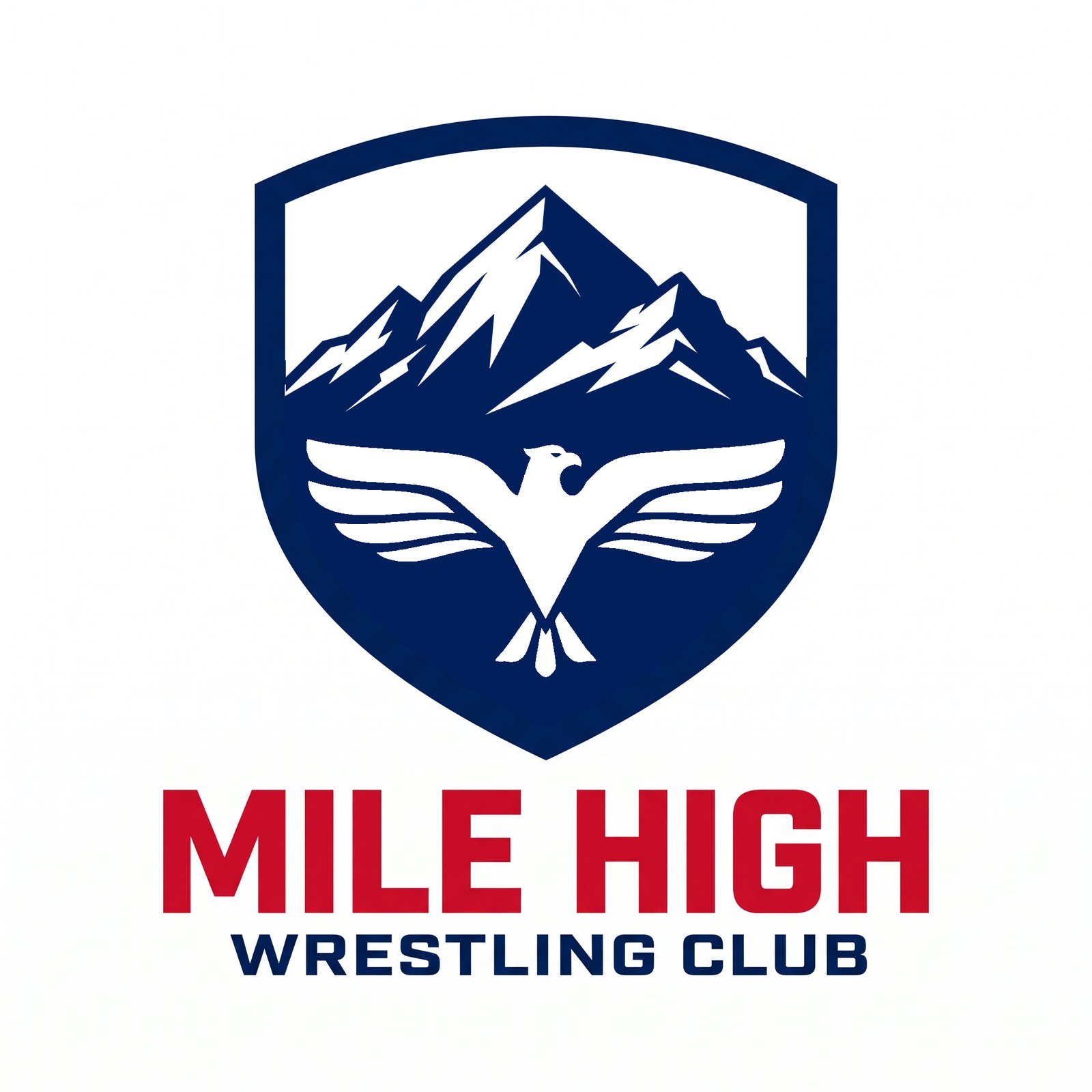
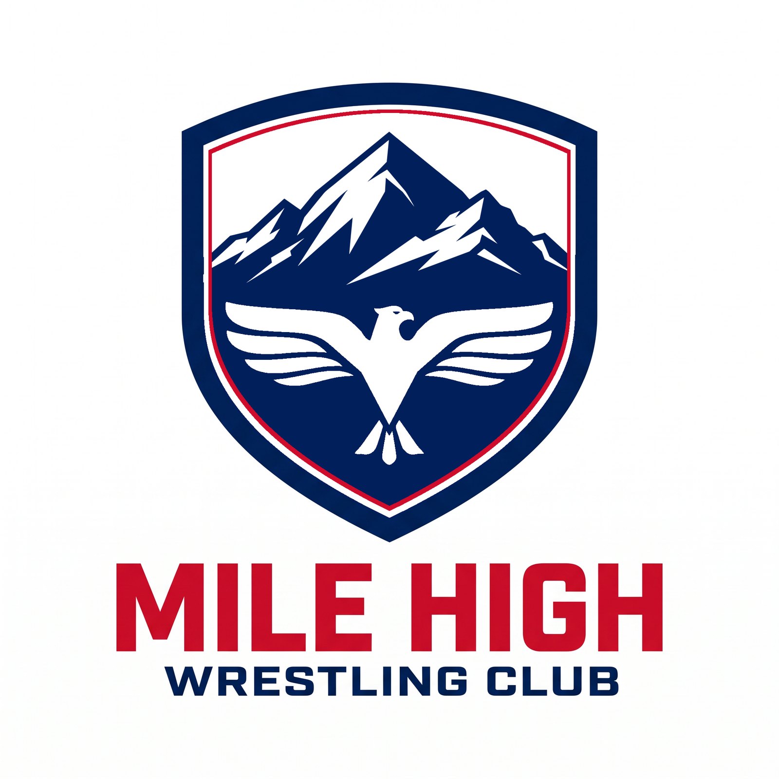
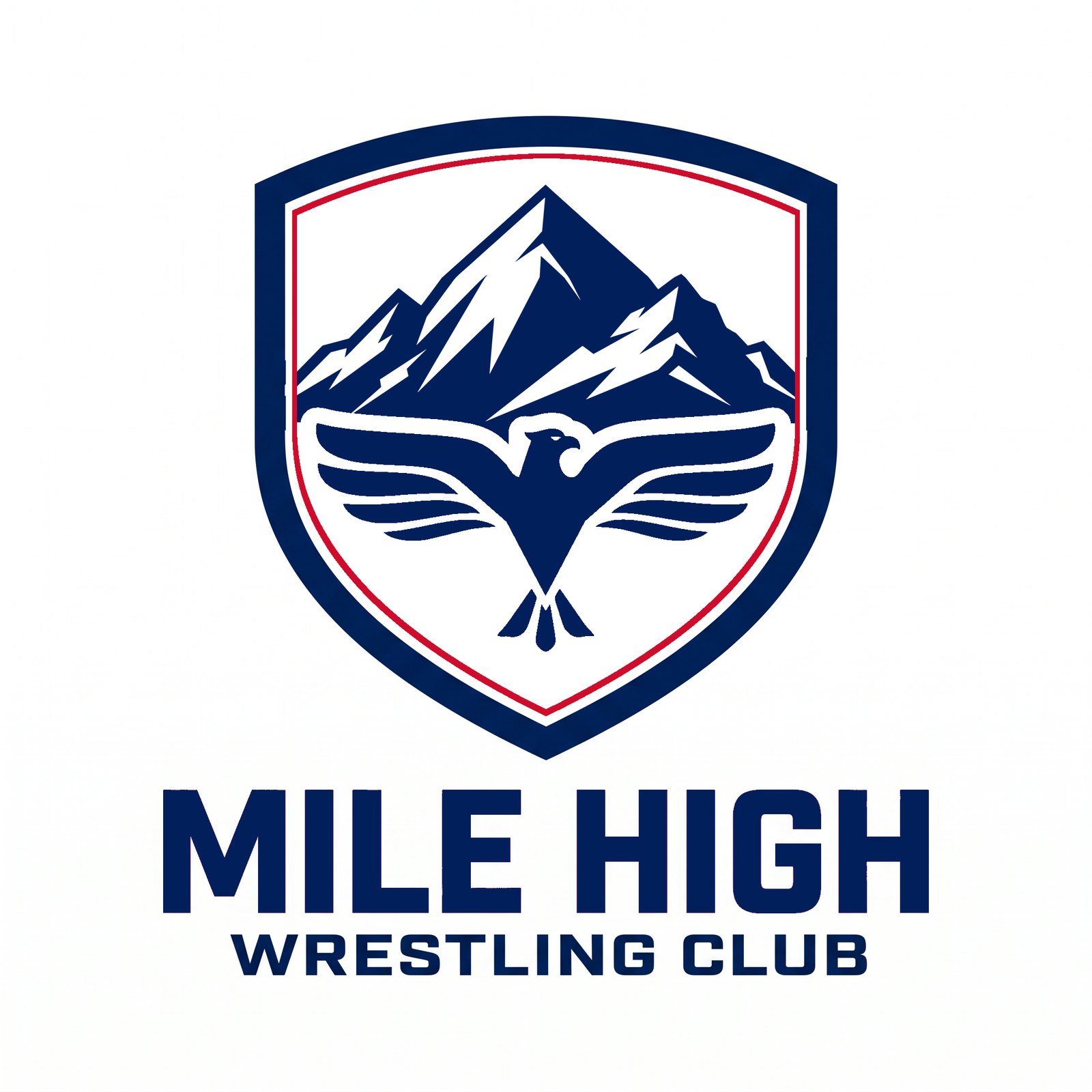


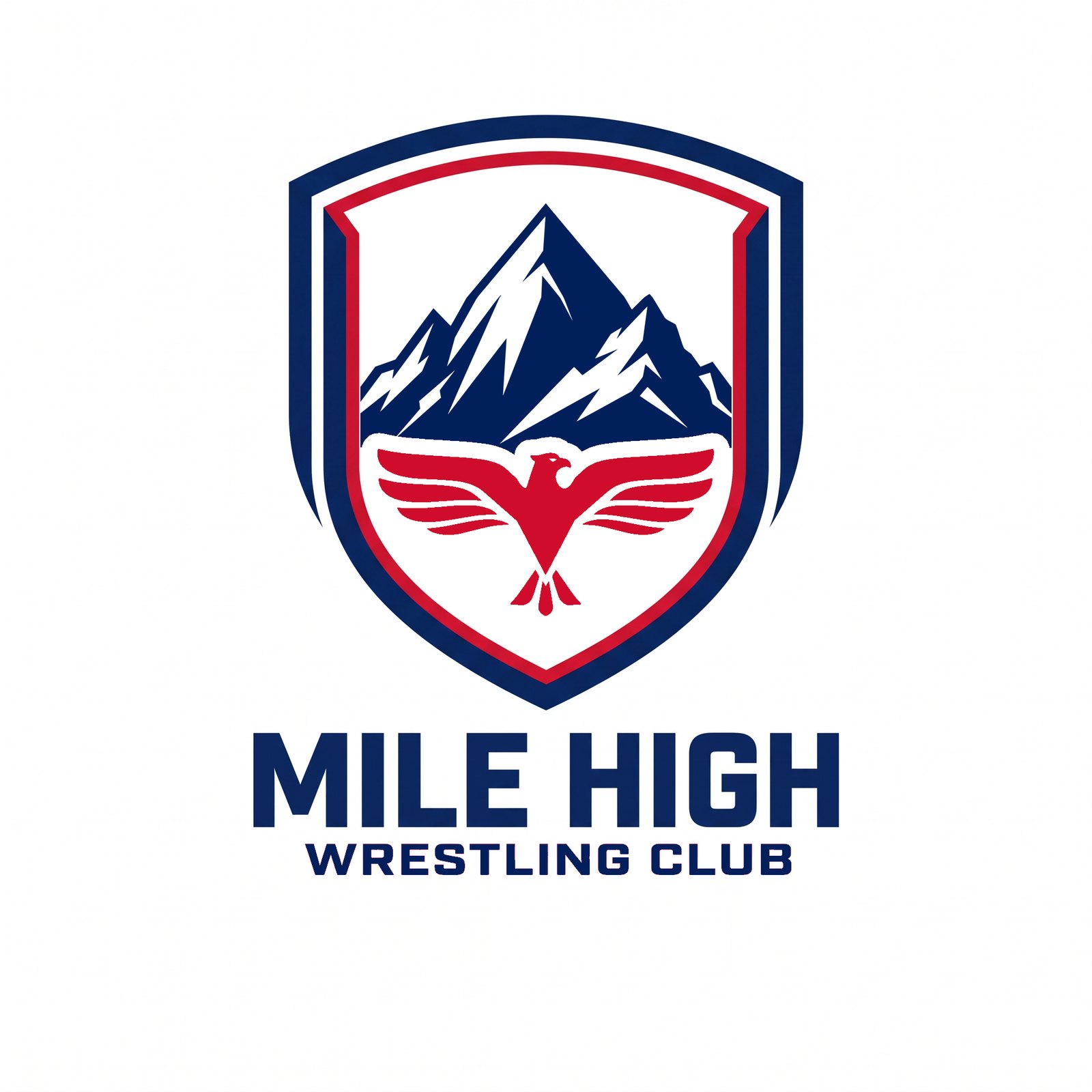
R15 Crests — the R14 eagle-cut treatment inside the R11 P15_alt shield the client liked (stepped navy border, white gap, red inner keyline, taken from that file). The white buffer around the eagle is the same over the wings and against the keyline. Flooded-navy versions (Z04, Z05, Z09, Z11) carry a white eagle with no outline, just the even buffer. Built exactly with the locked marks.
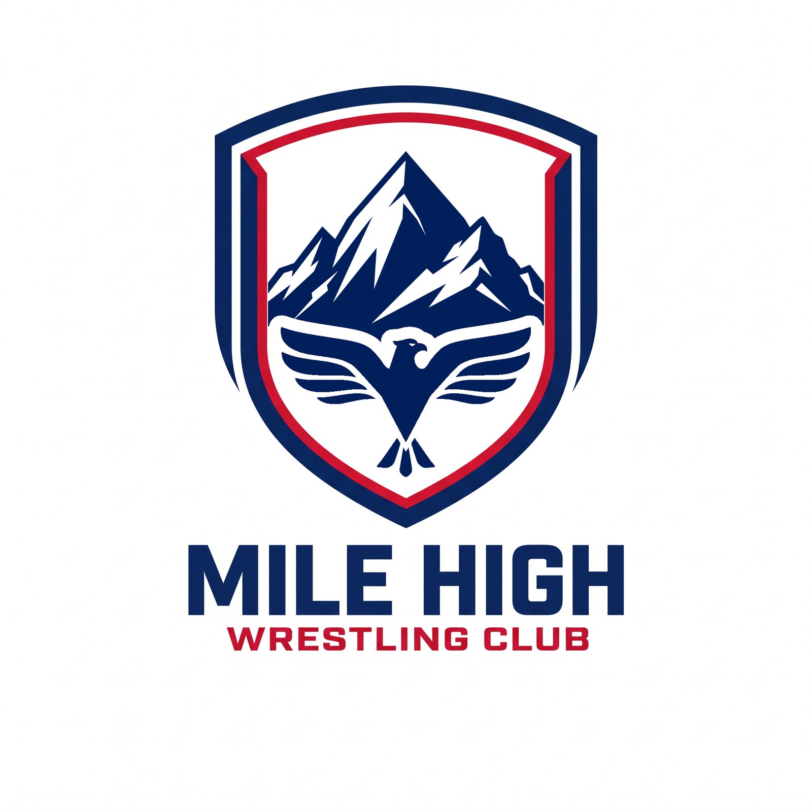
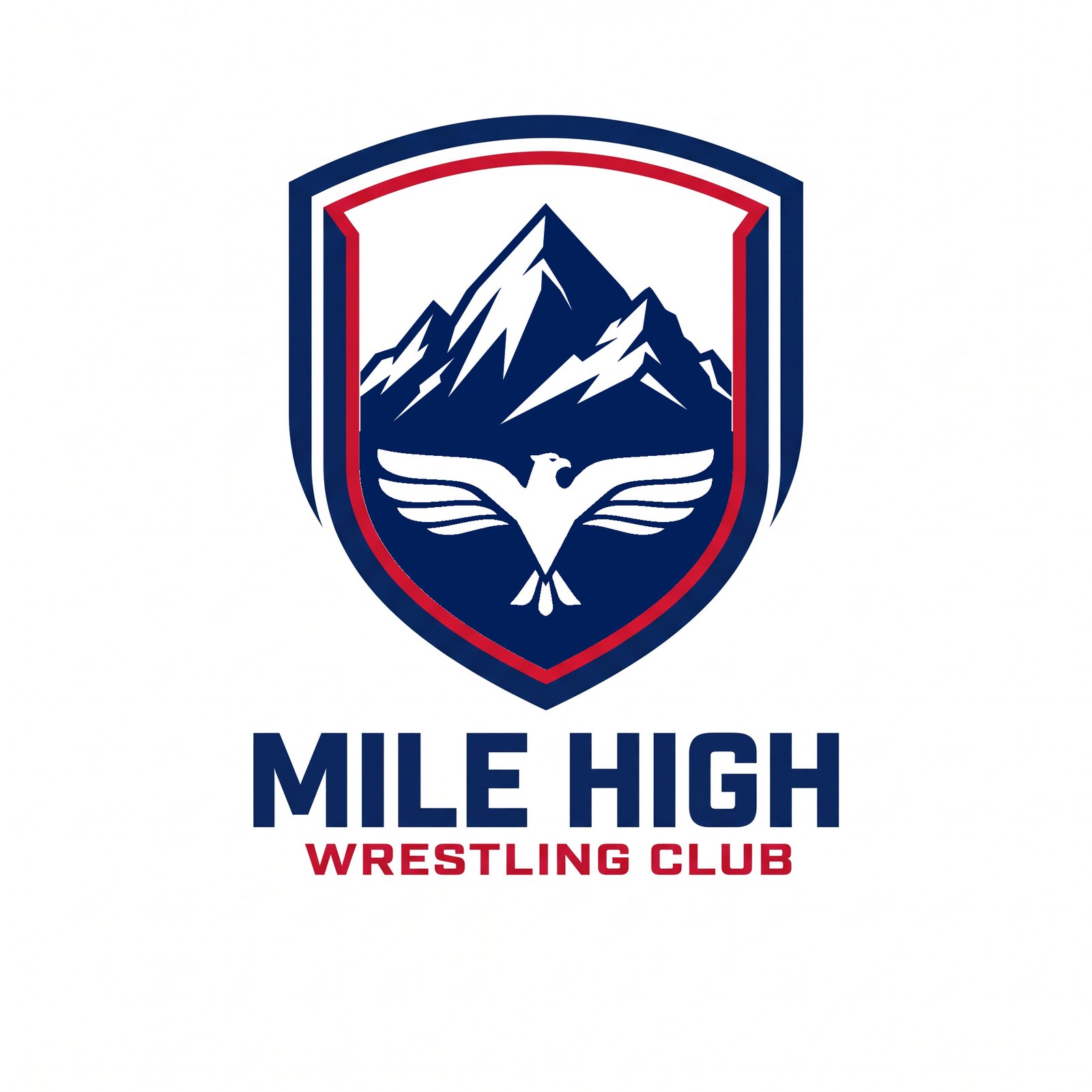
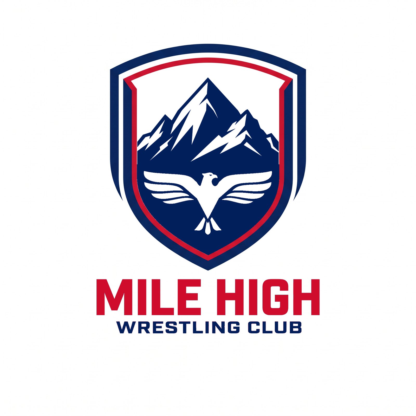
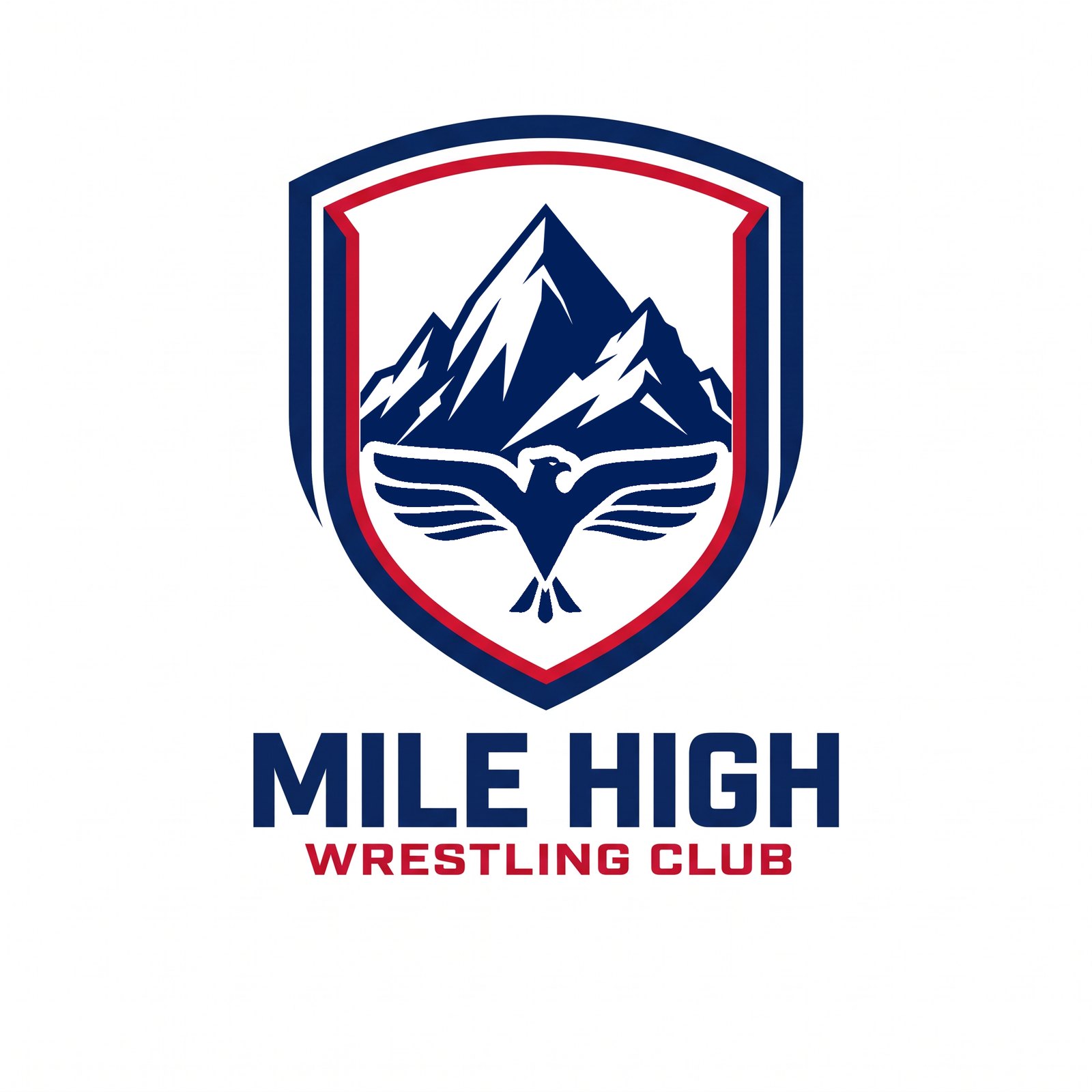


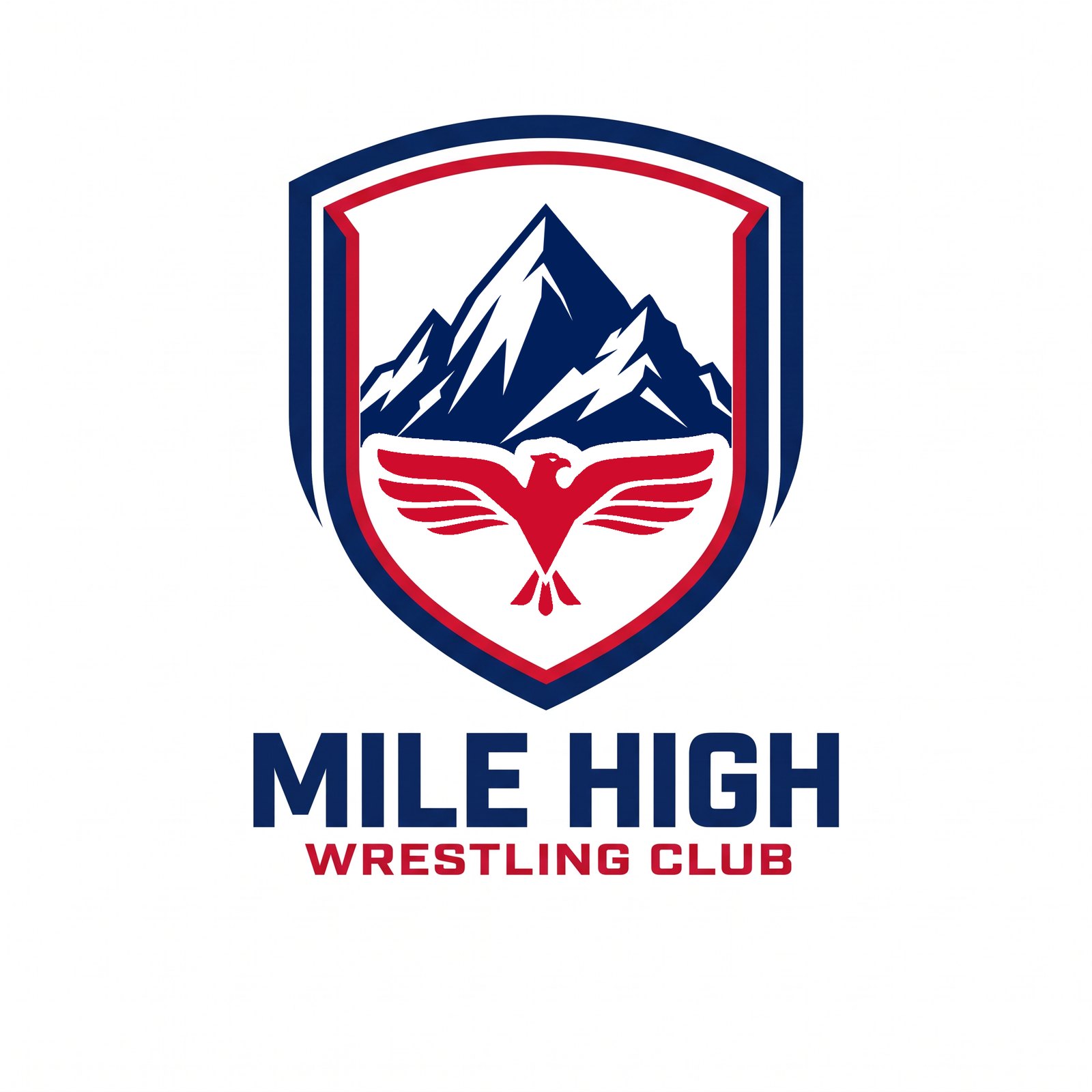
R16 Crests — three new treatments on the R15 P15_alt crest: the M’s first stem and the H’s last stem extended to WRESTLING CLUB’s baseline; 5280 in the open top-left corner in navy or red (in the wordmark’s extended face, the range narrowed a touch to open the corner); and the eagle in red on the white field. Mixed together in V11–V13.
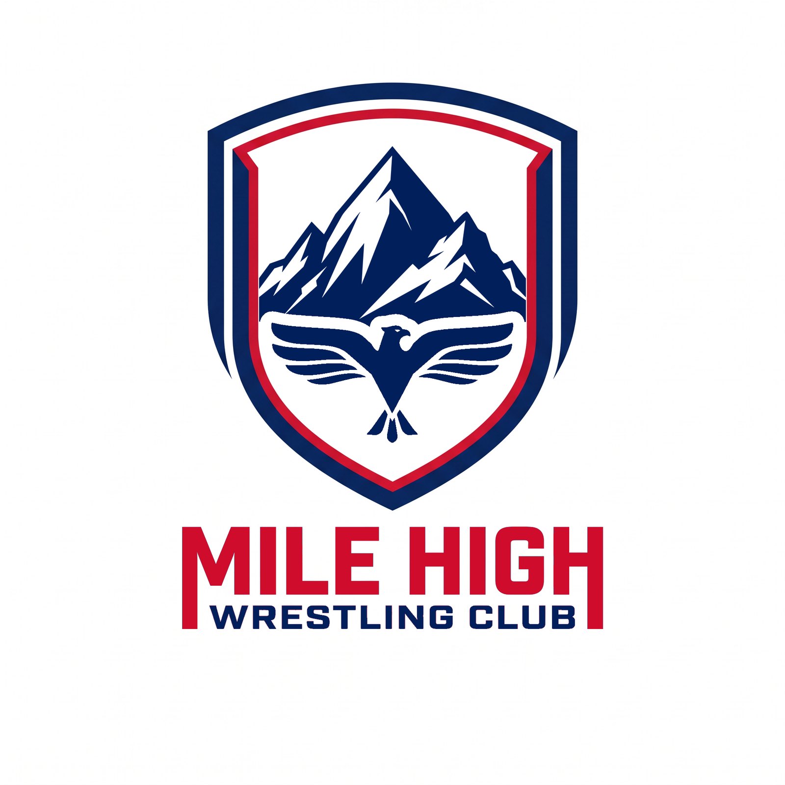
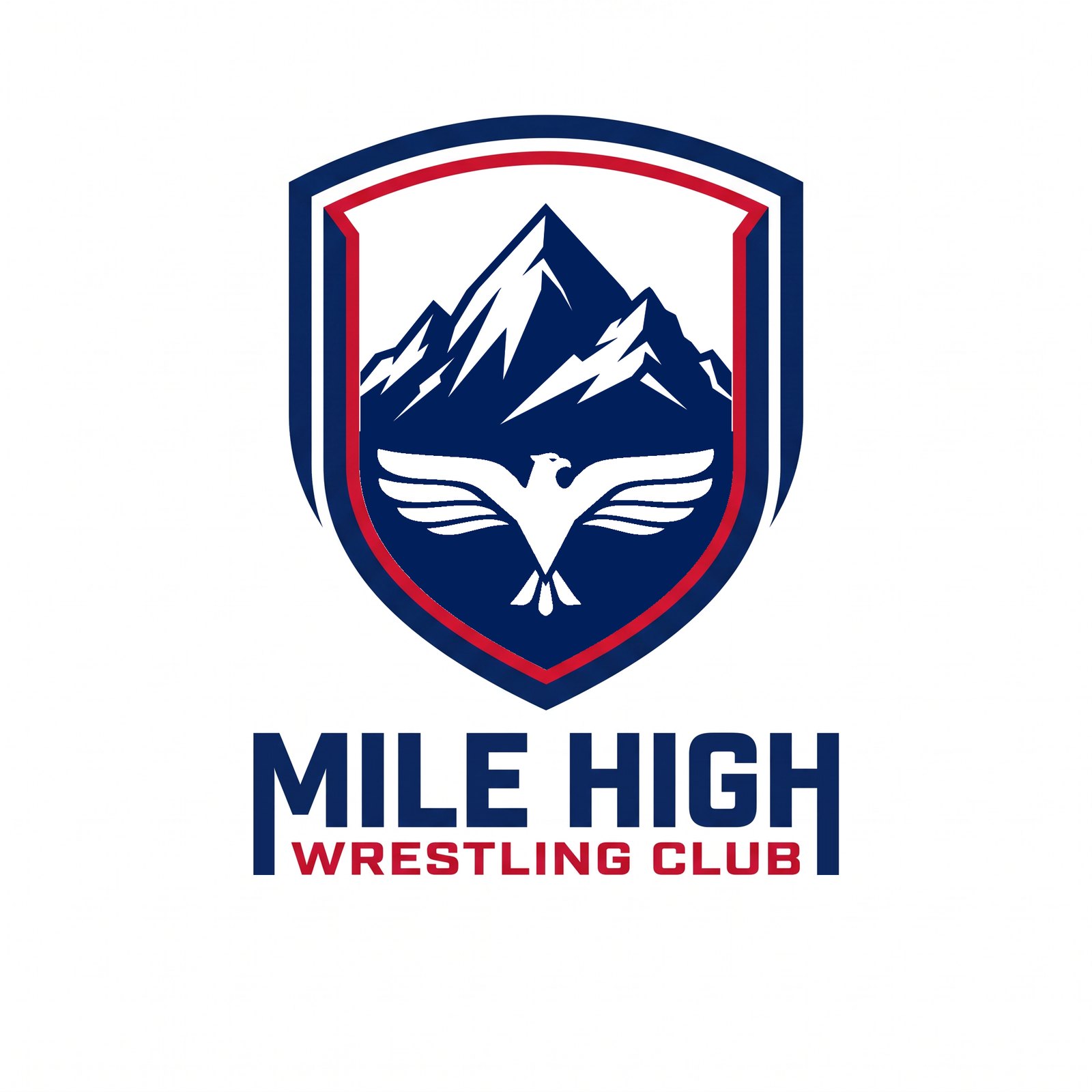
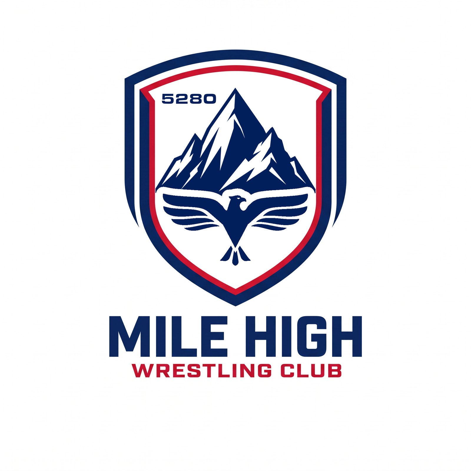
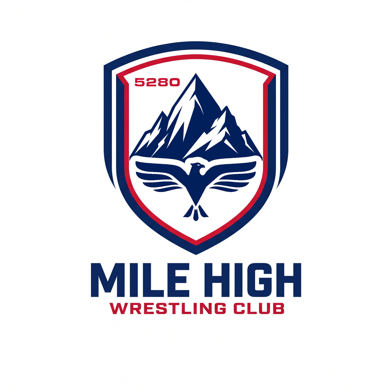
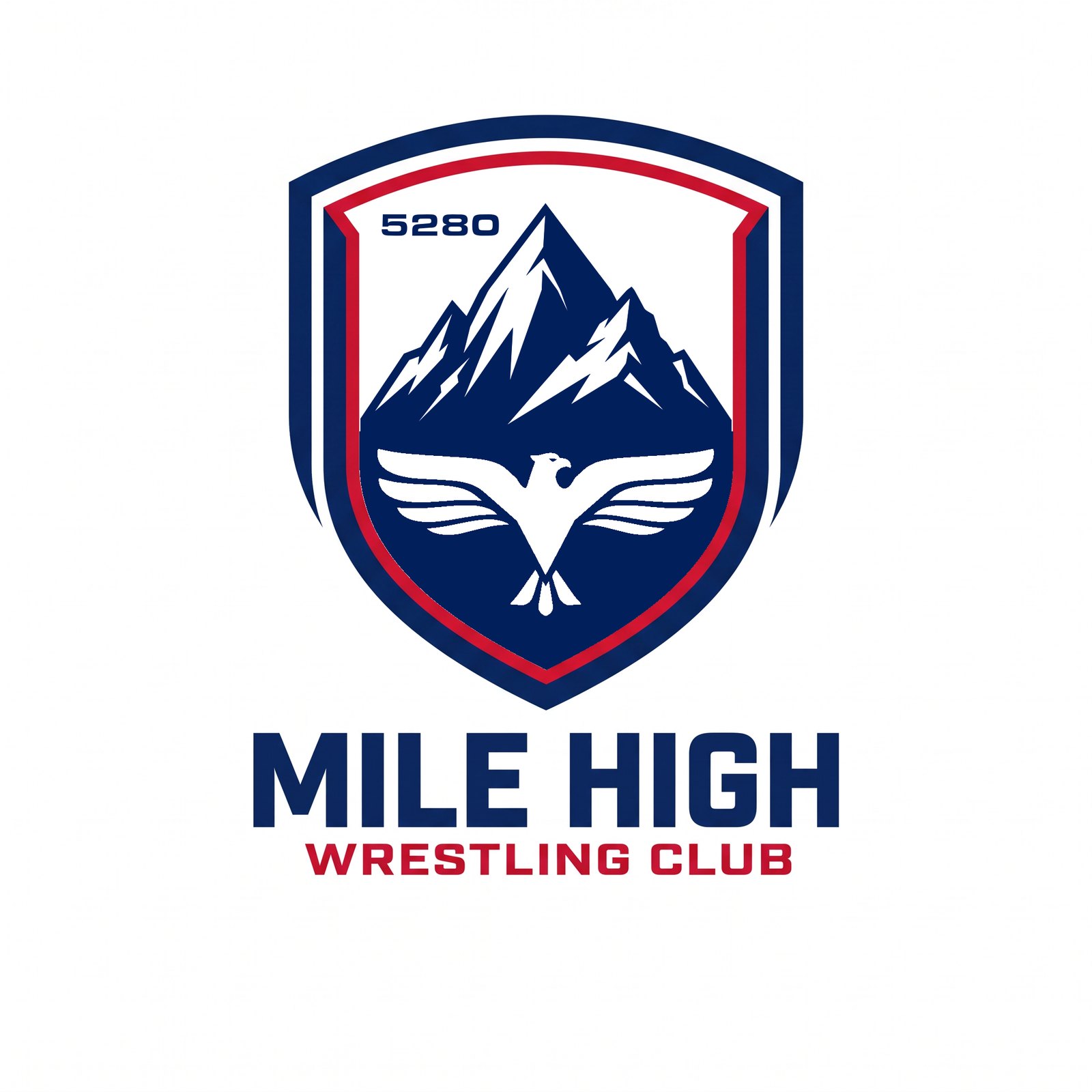
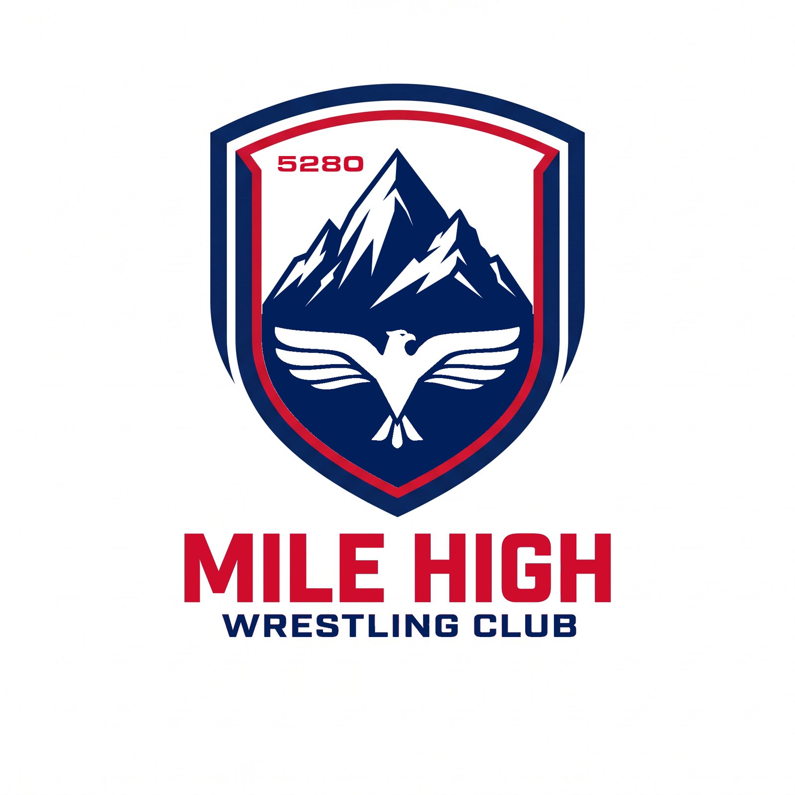
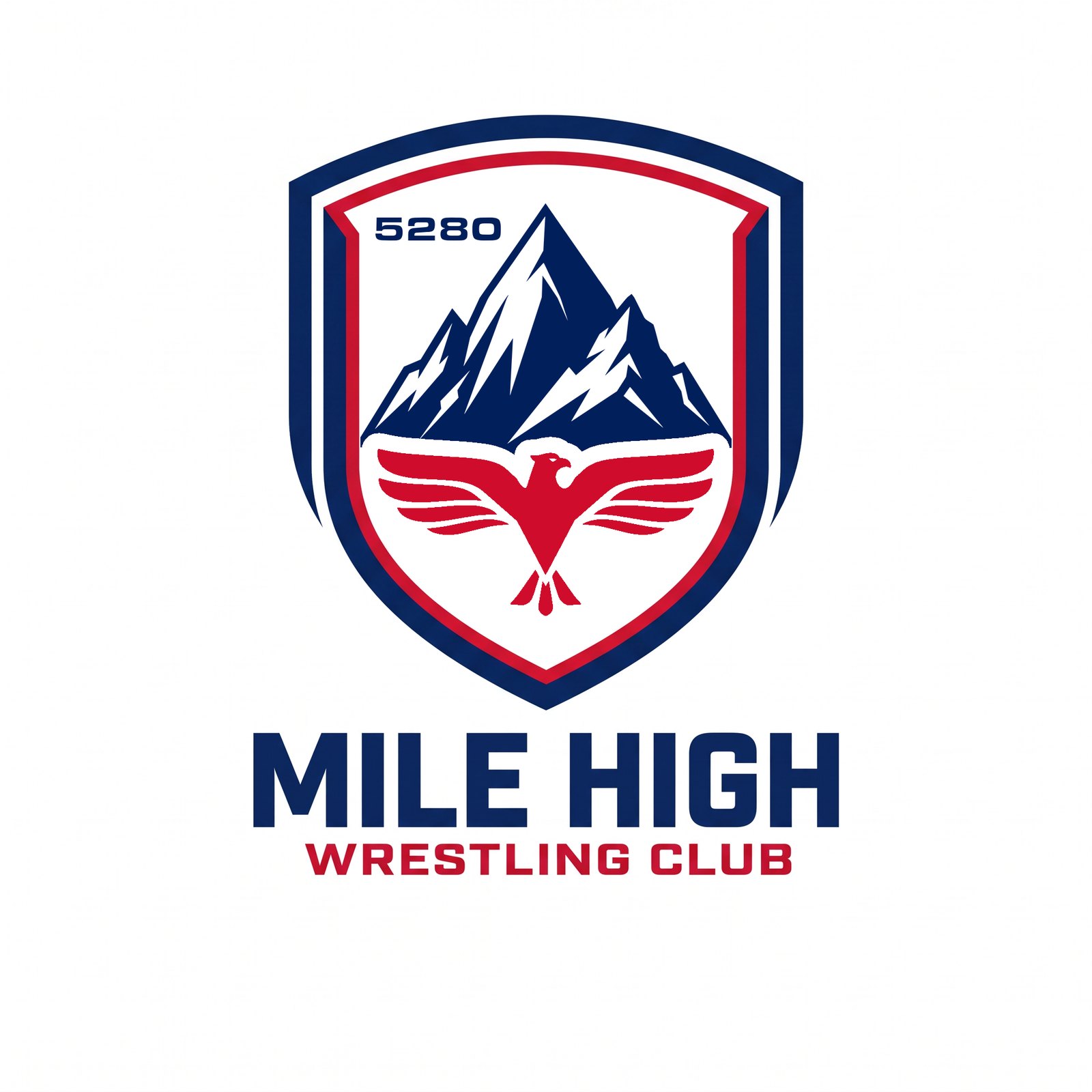
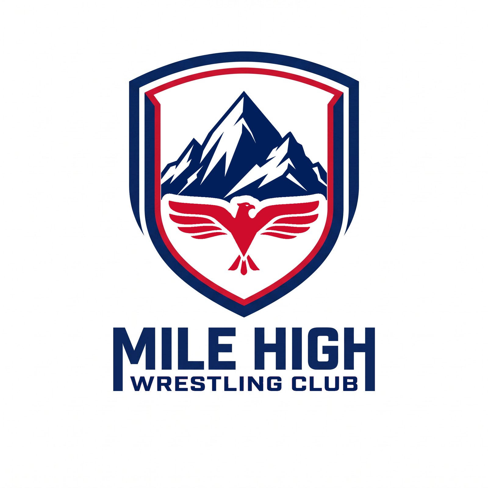
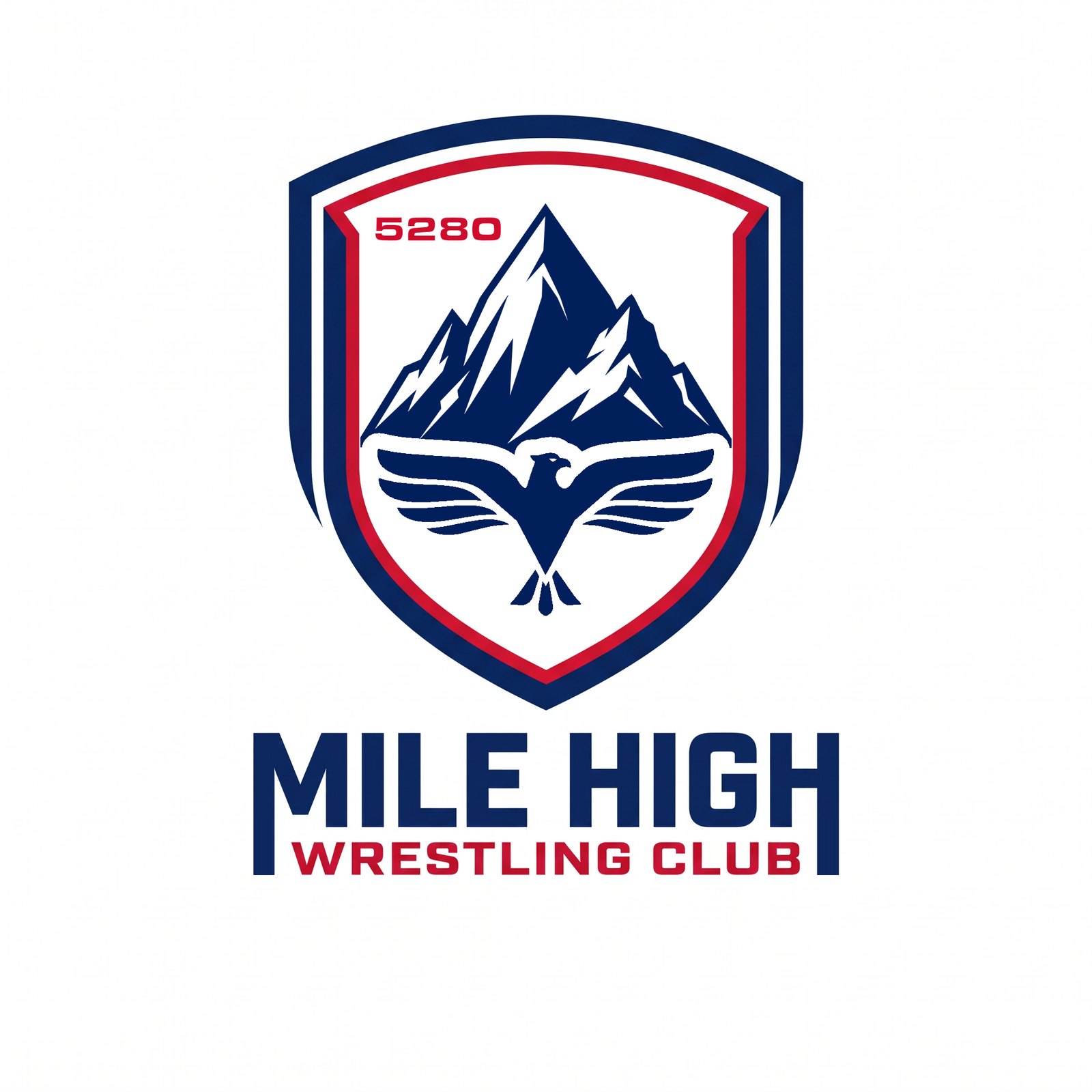
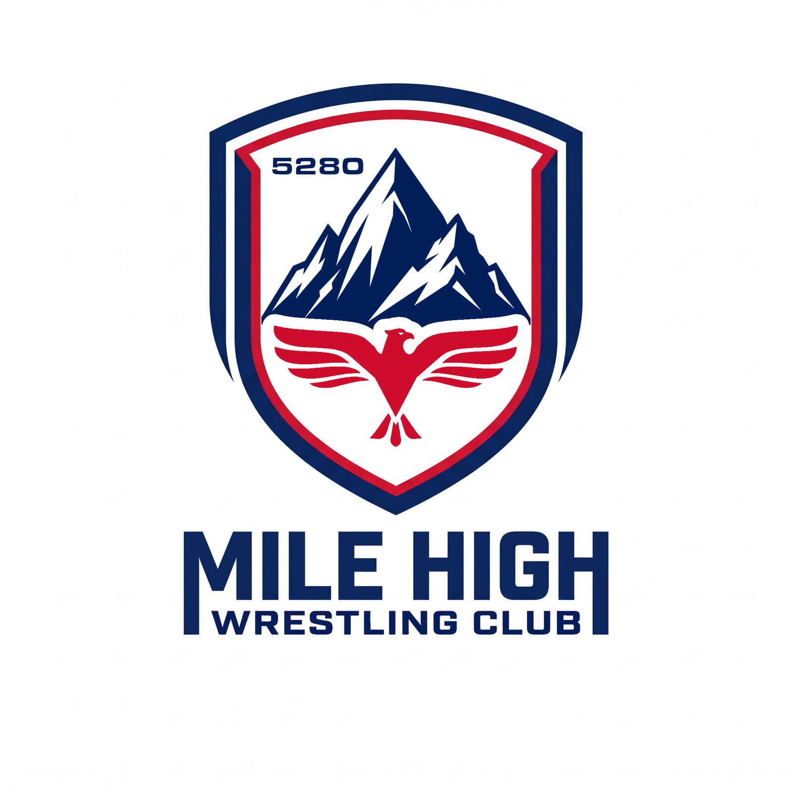
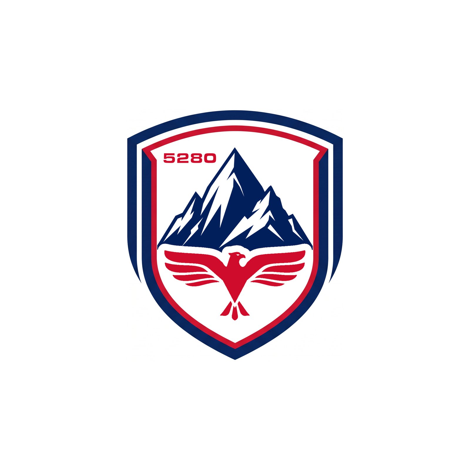
R17 Crests — 5280 moved to the top-right corner and made smaller (T00–T06), and 52 over 80 stacked flush right in the same corner (T07–T13), each in navy and red and combined with the red eagle, the extended M/H stems and the flooded navy field. Same buffer from the keyline and the peak as the eagle has.
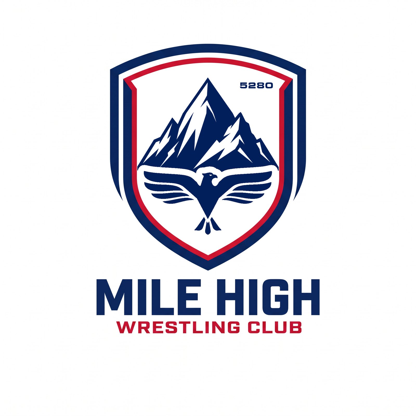
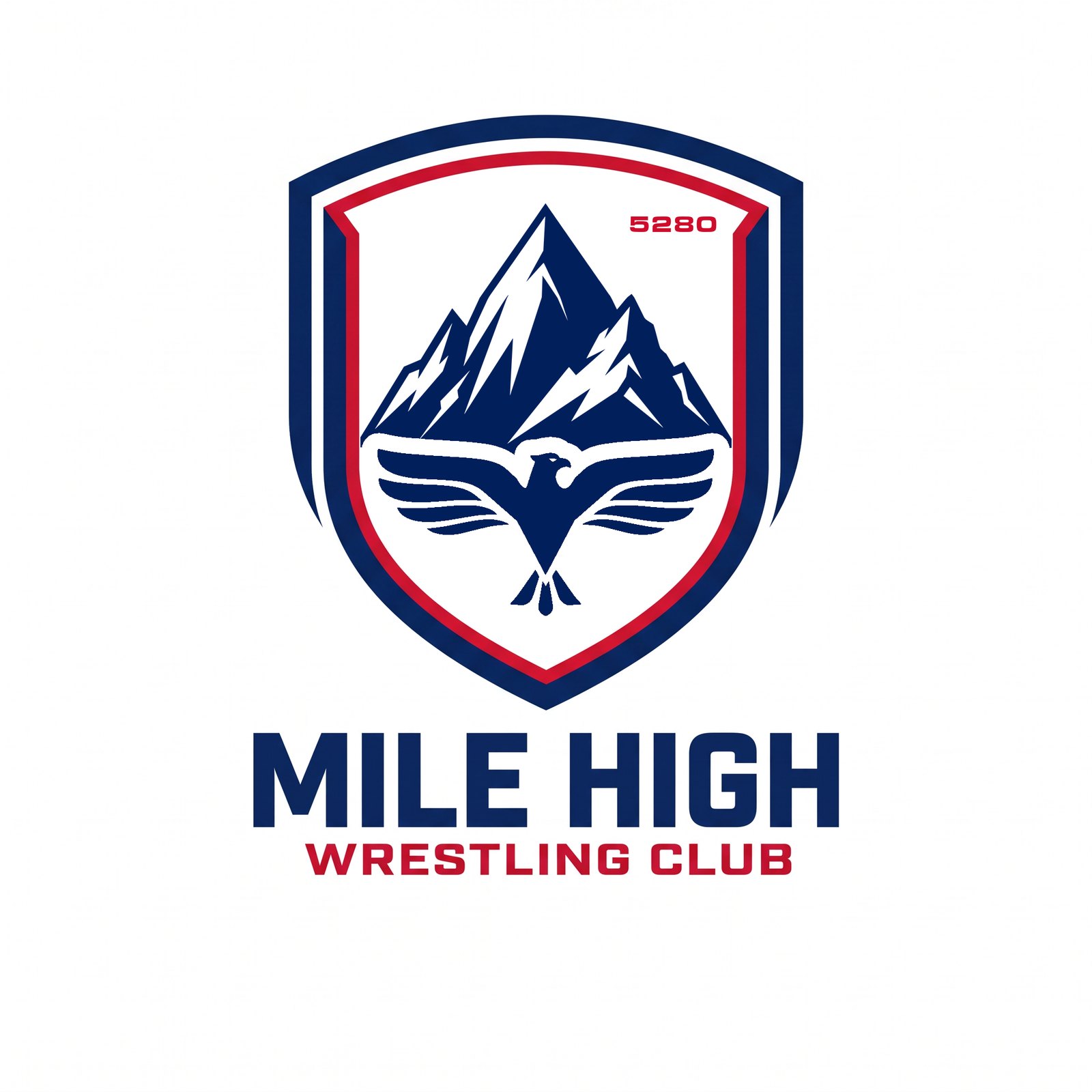
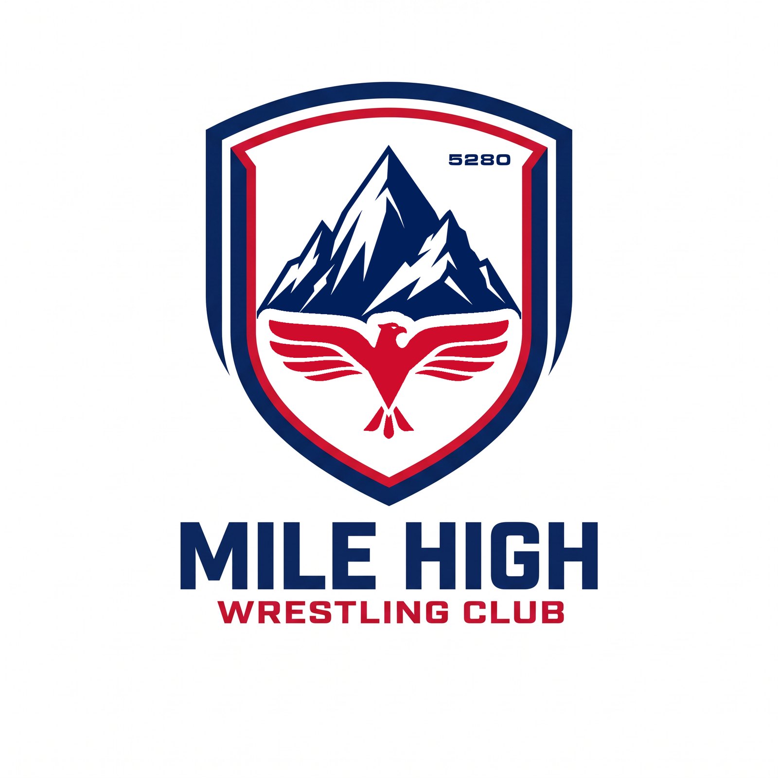
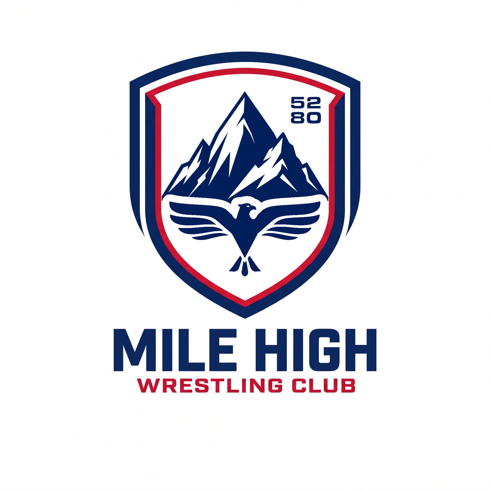
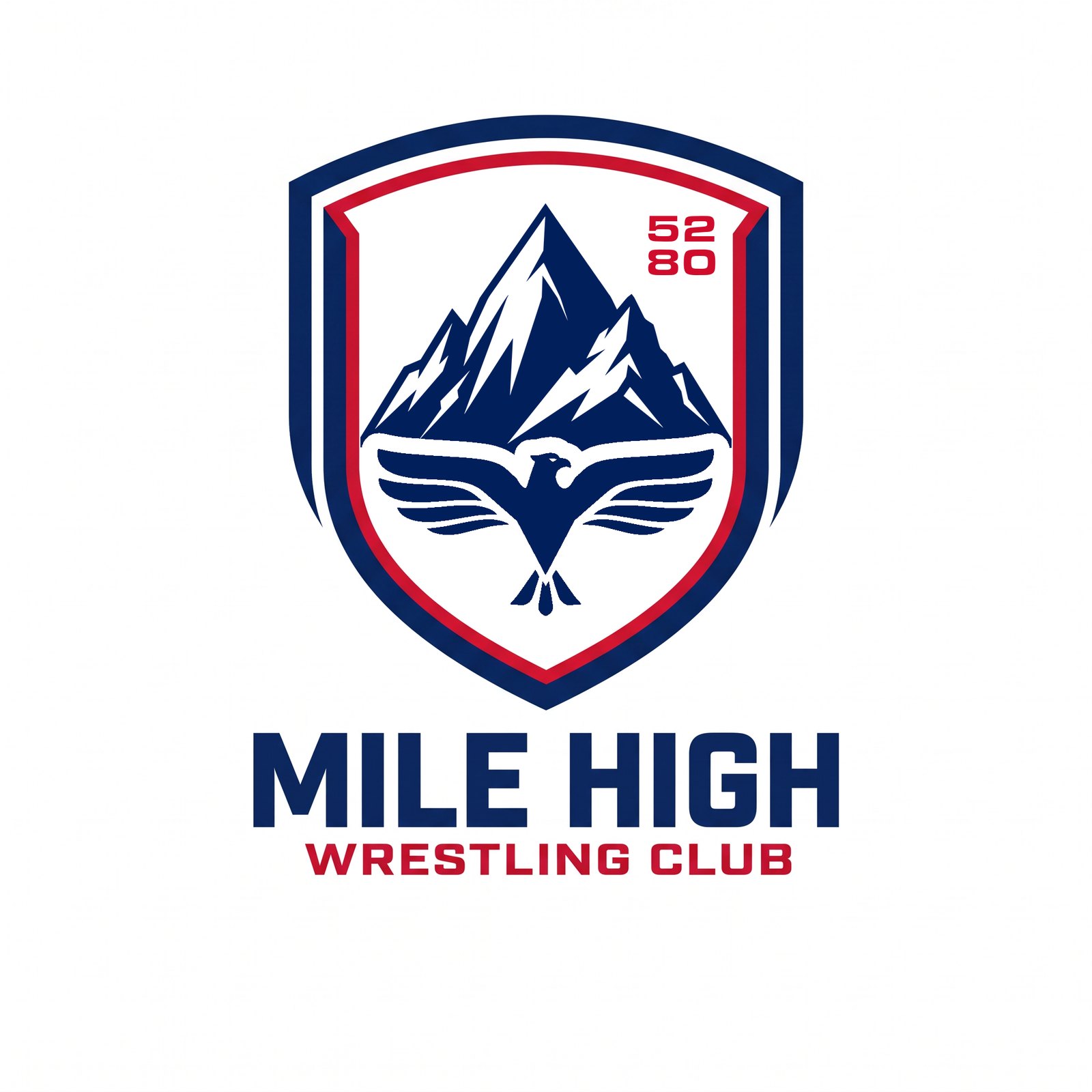
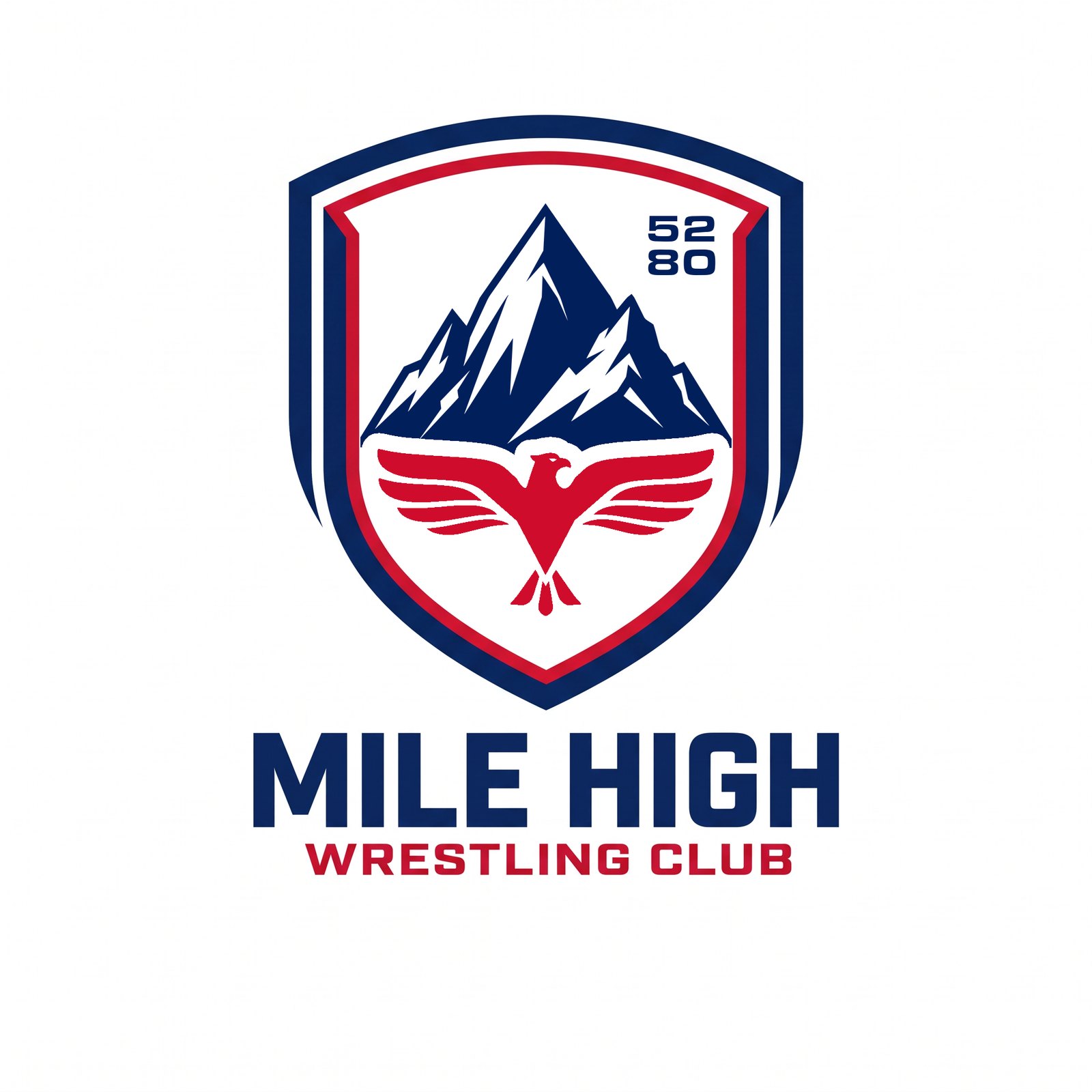
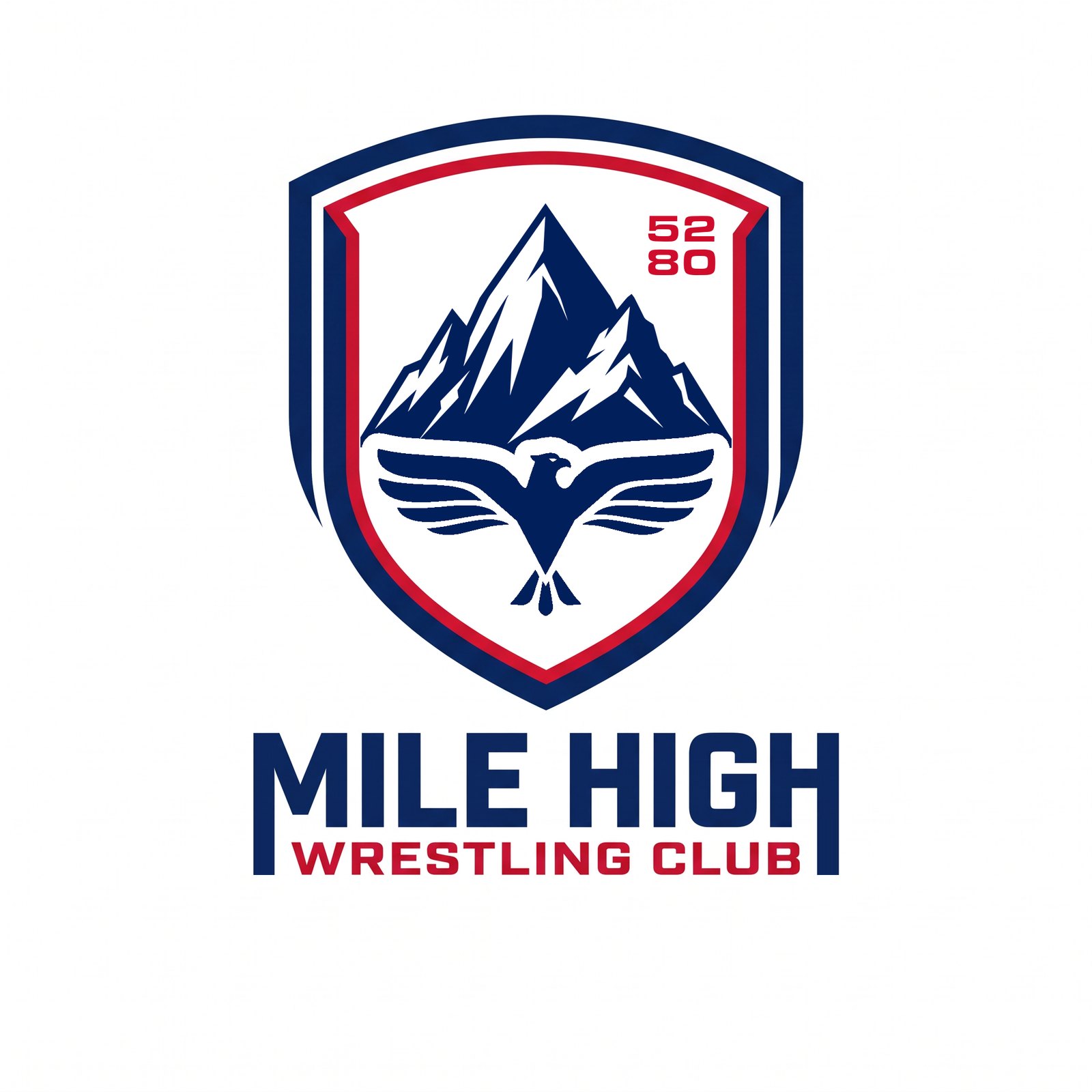
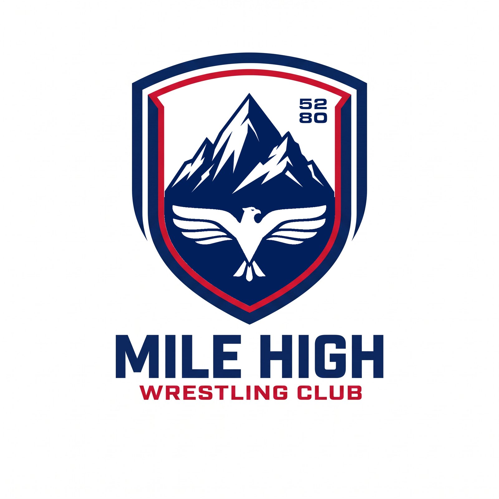
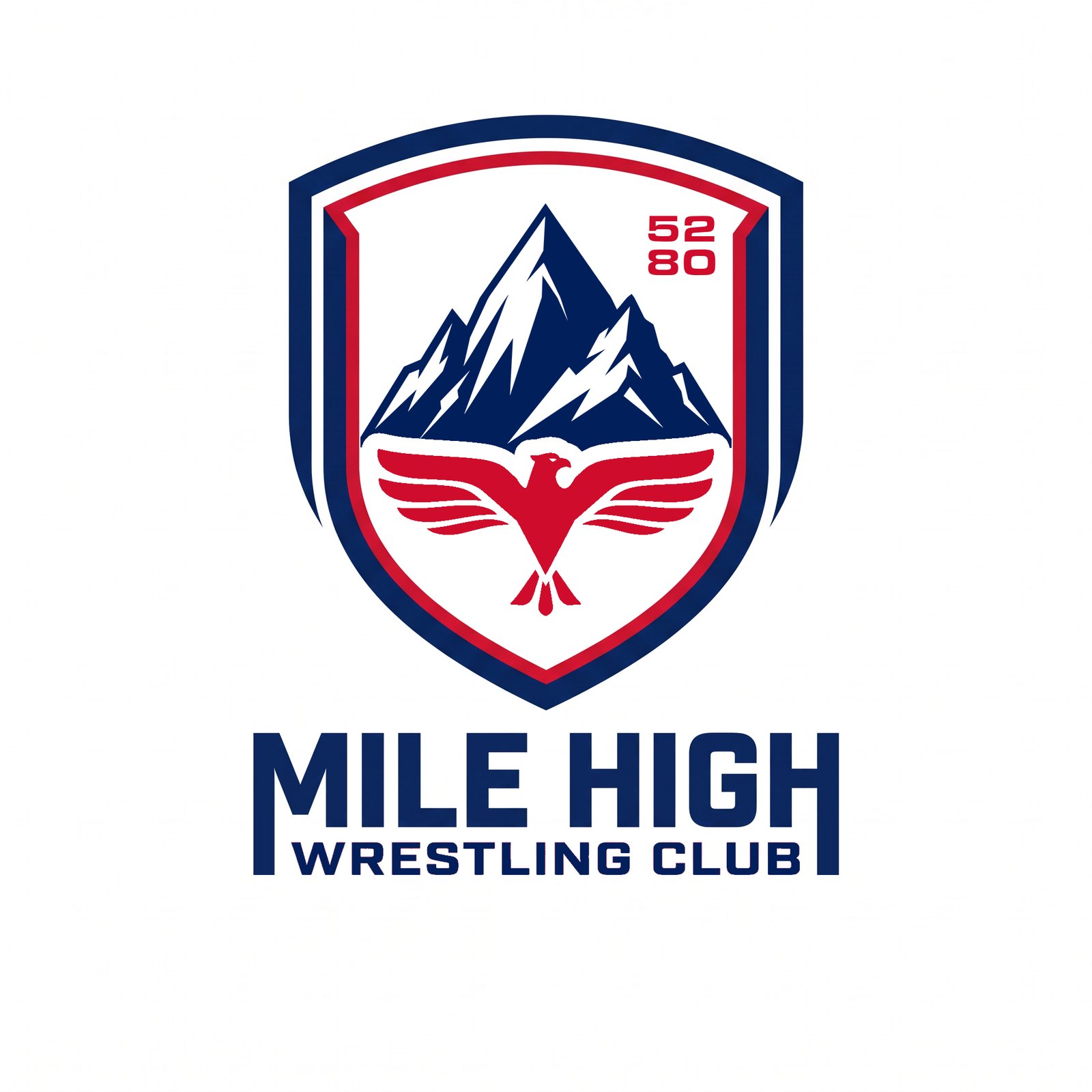
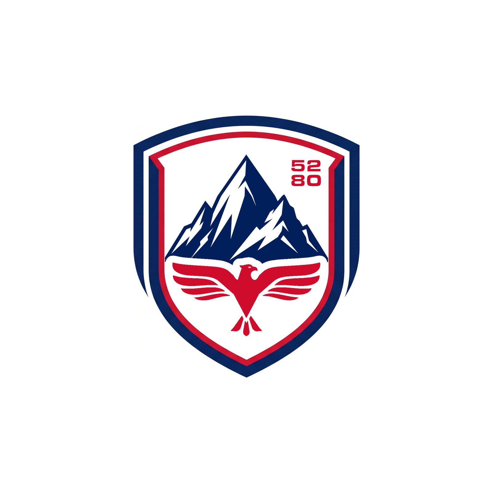
R18 Crests — the R15–R17 internal treatment (eagle silhouette cutting the mountain mass, even buffer, locked marks) dropped into ten other shields from earlier rounds: flat-top heater, roundel, clipped badge, arched open shield, triple border, red outer border, shield-in-shield, square heater, U shield, red outer + navy keyline. Each in three versions: navy eagle (a), flooded navy (b), red eagle + 52/80 (c). Frames drawn empty by Magnific, filled exactly with the locked marks.
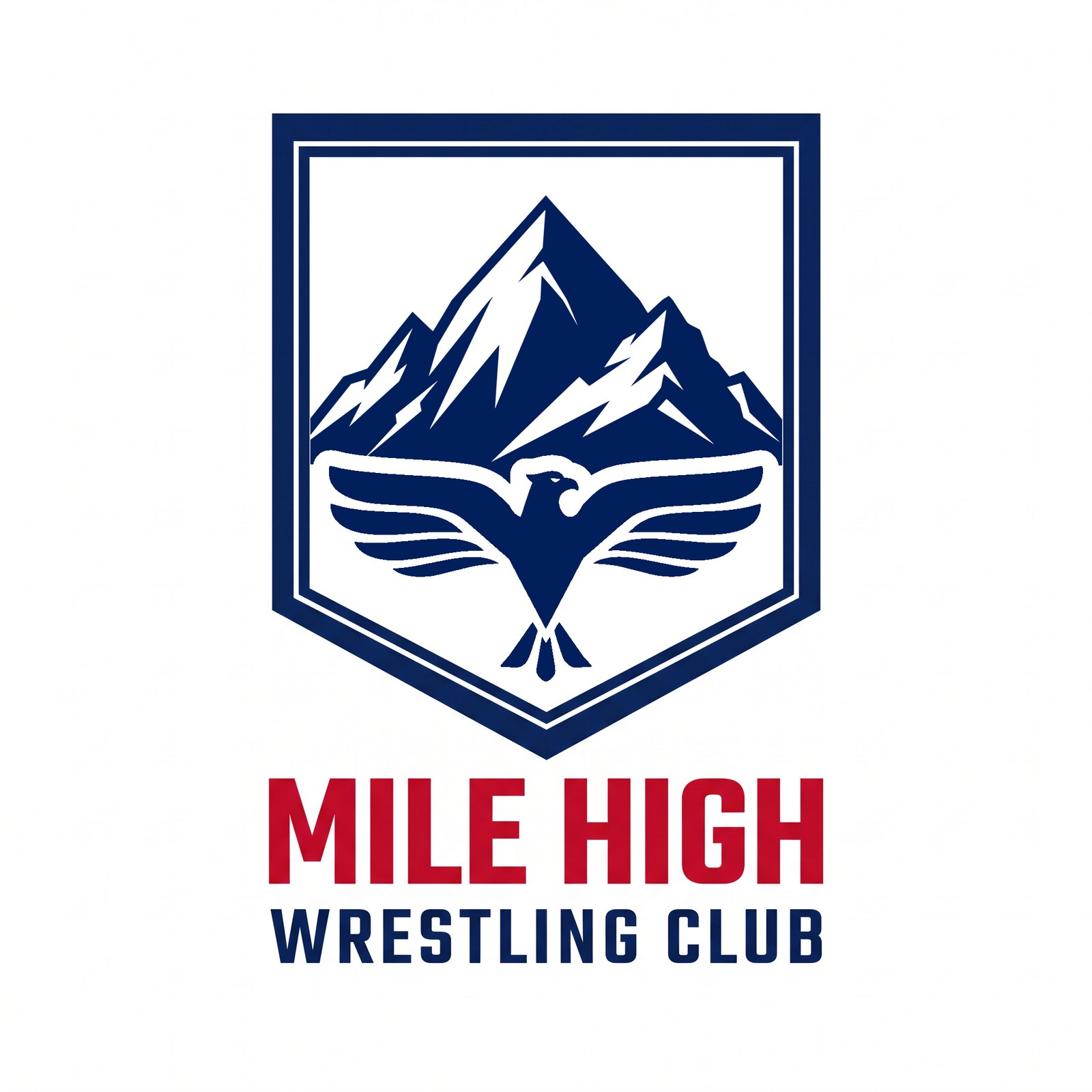
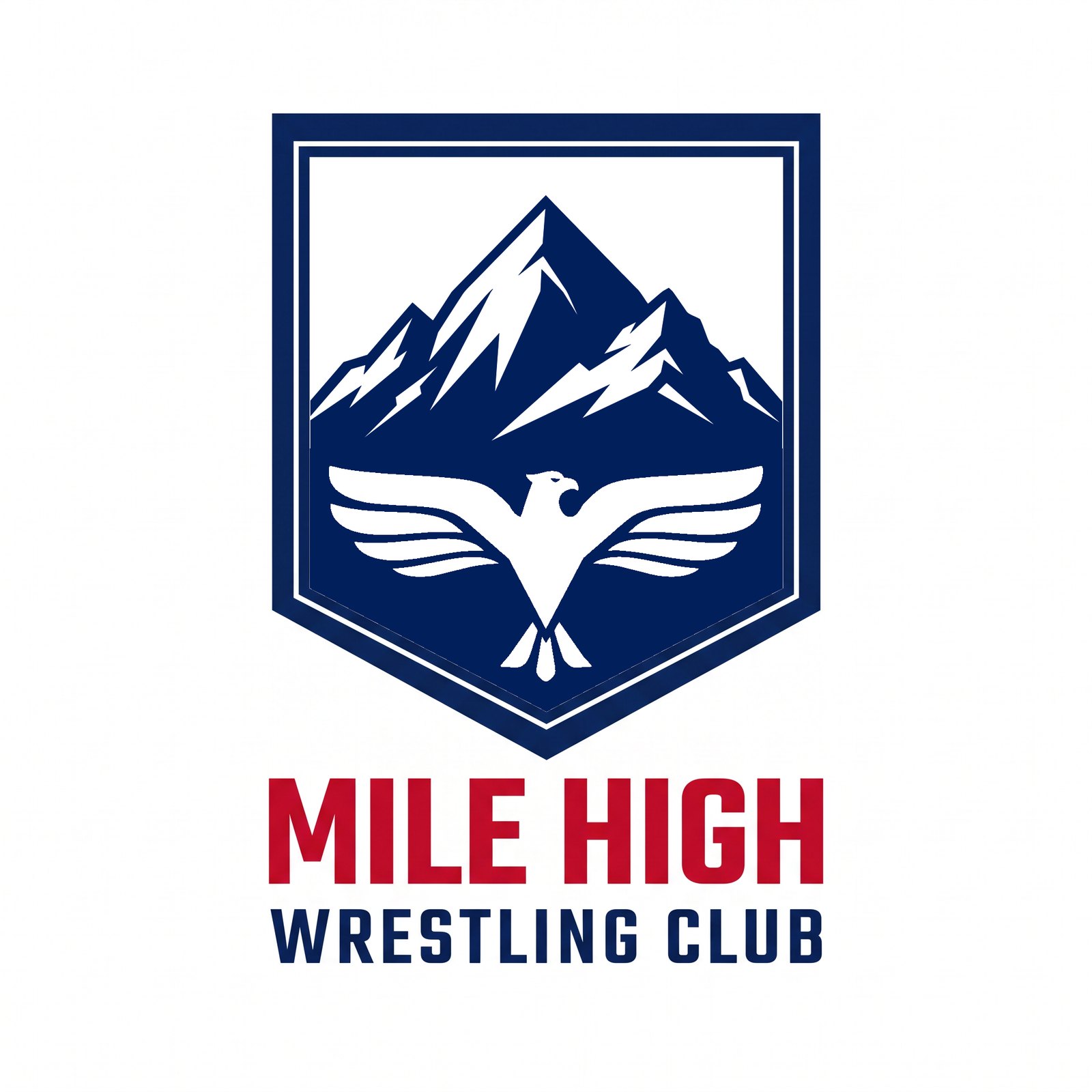
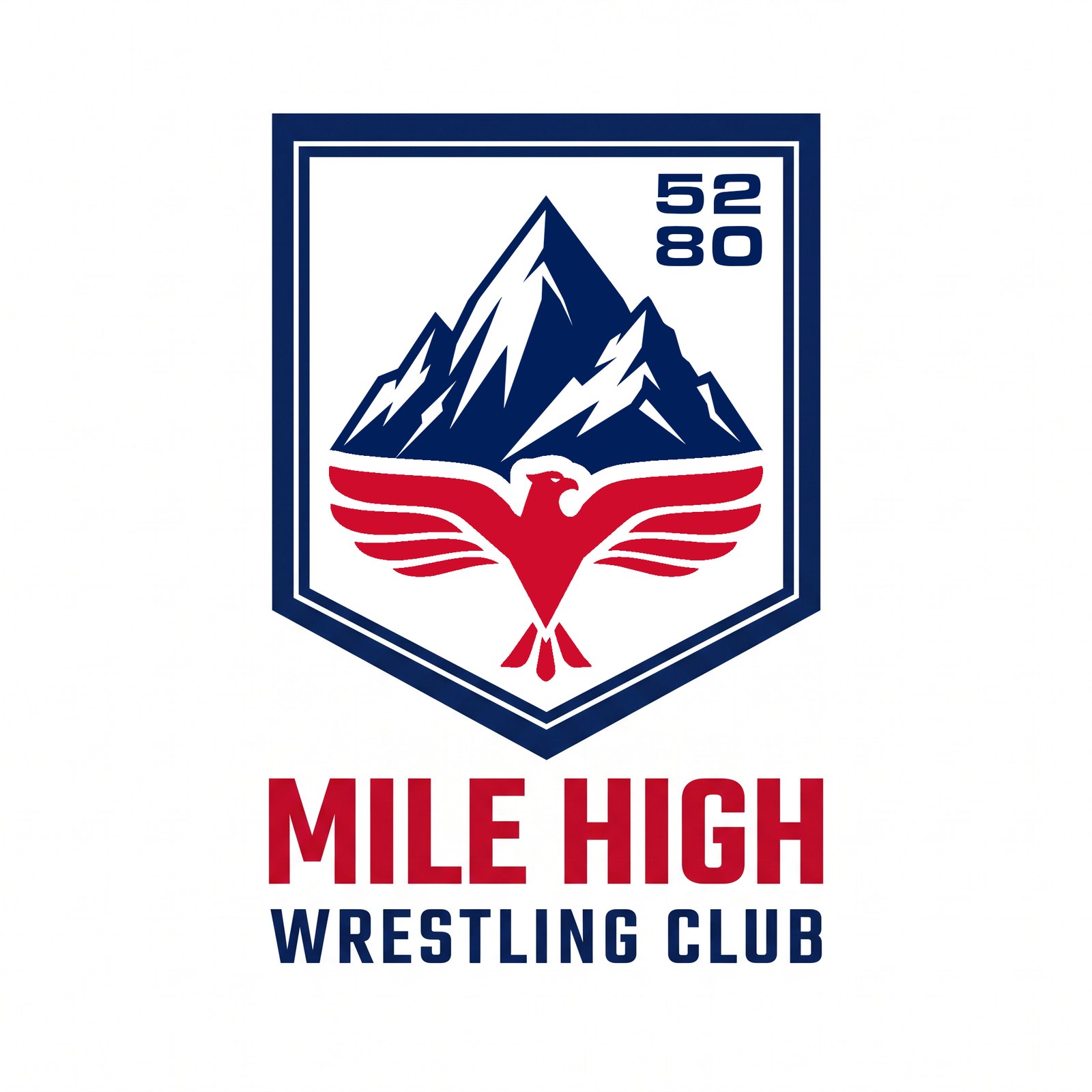
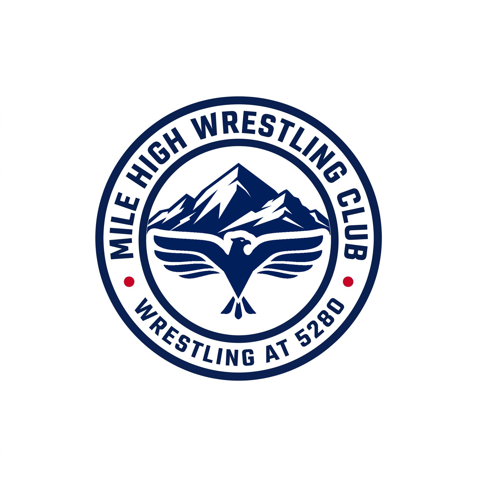
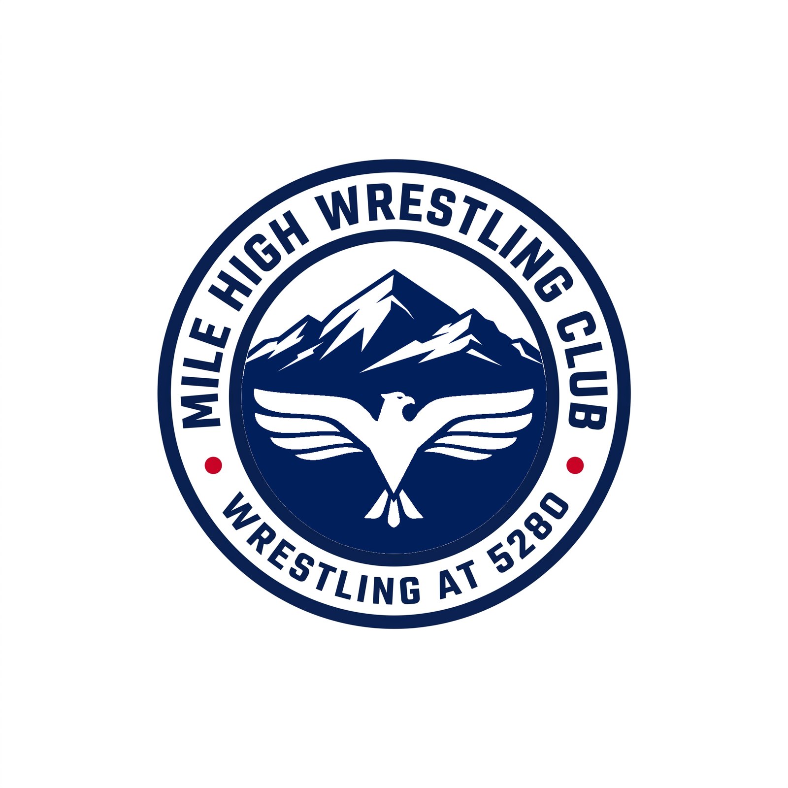
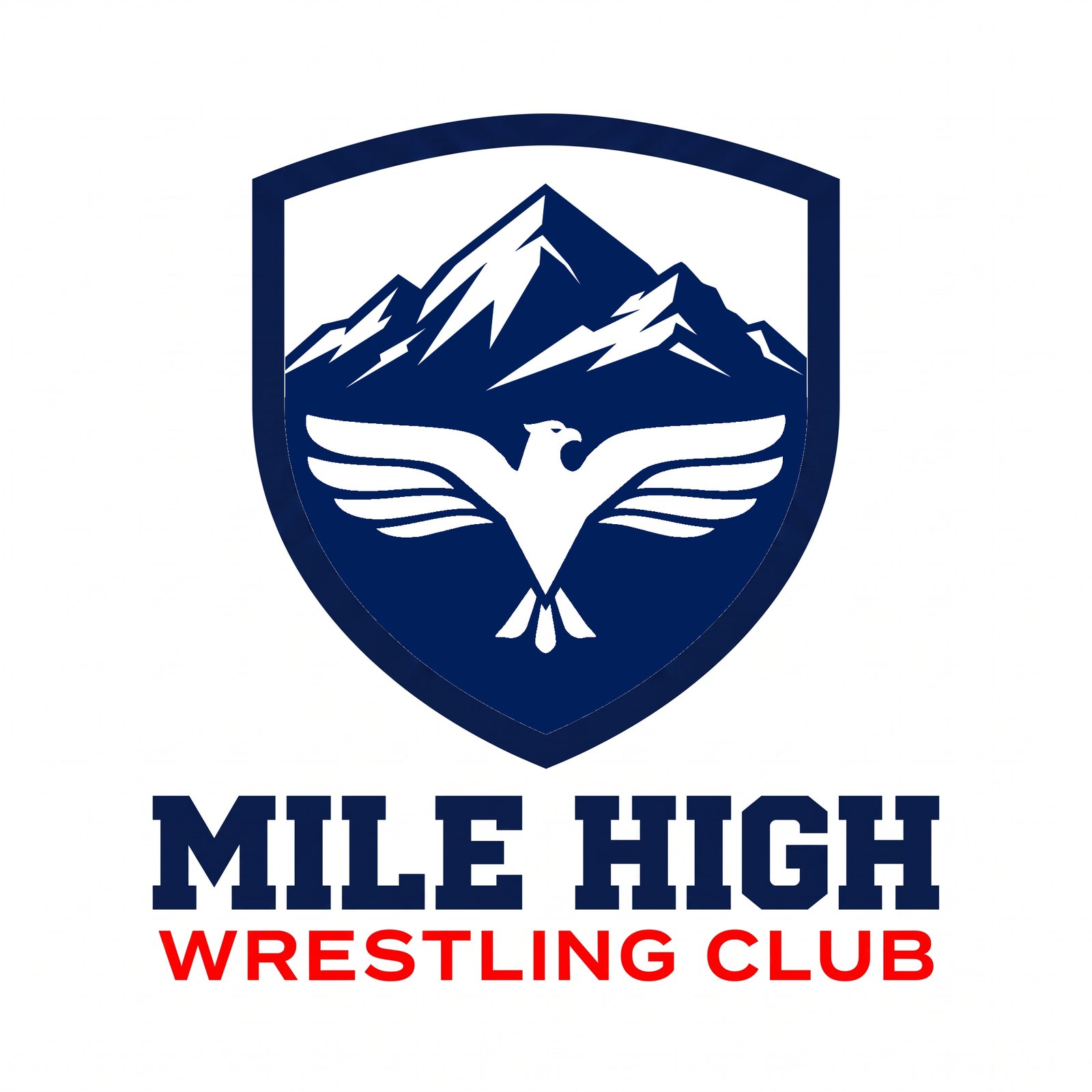
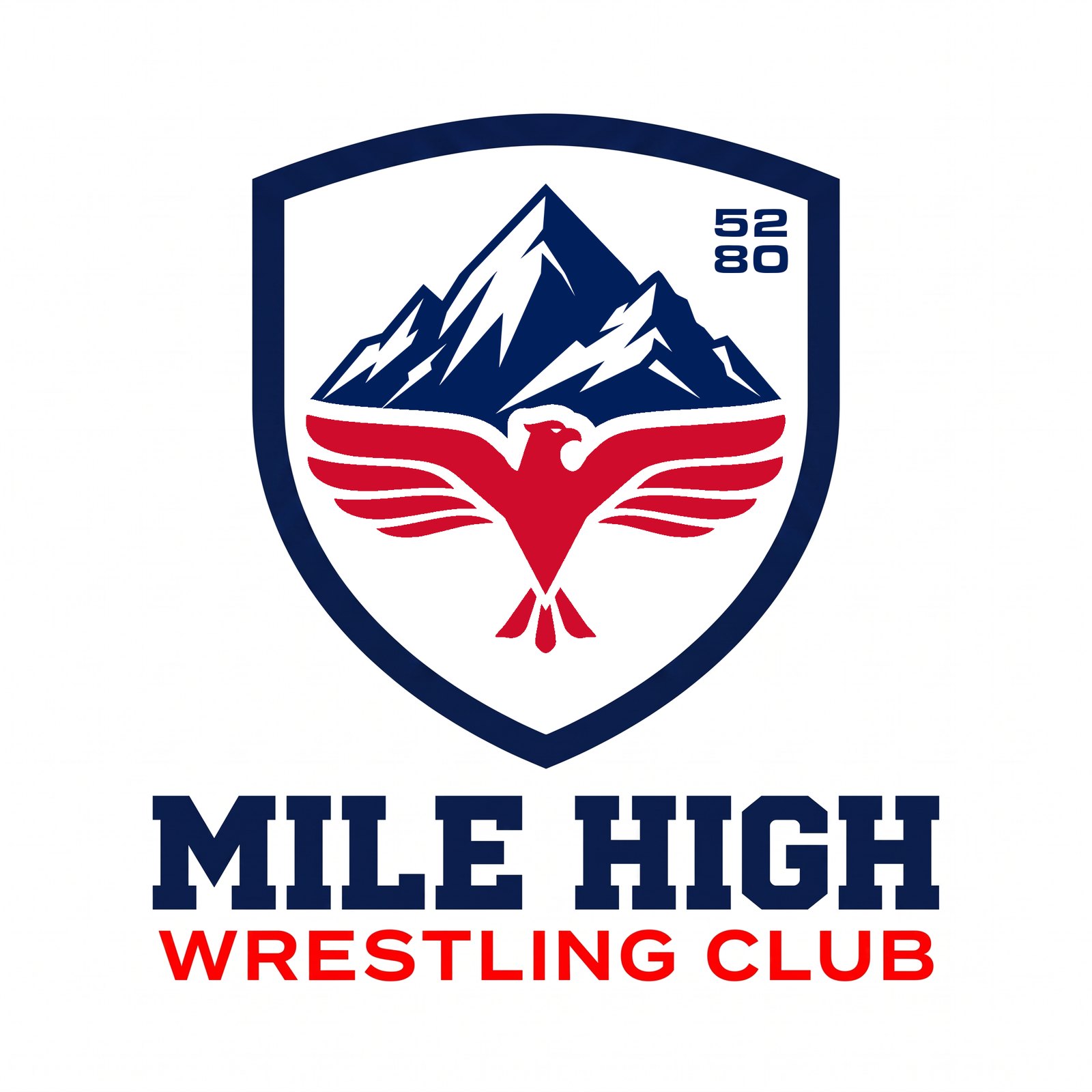
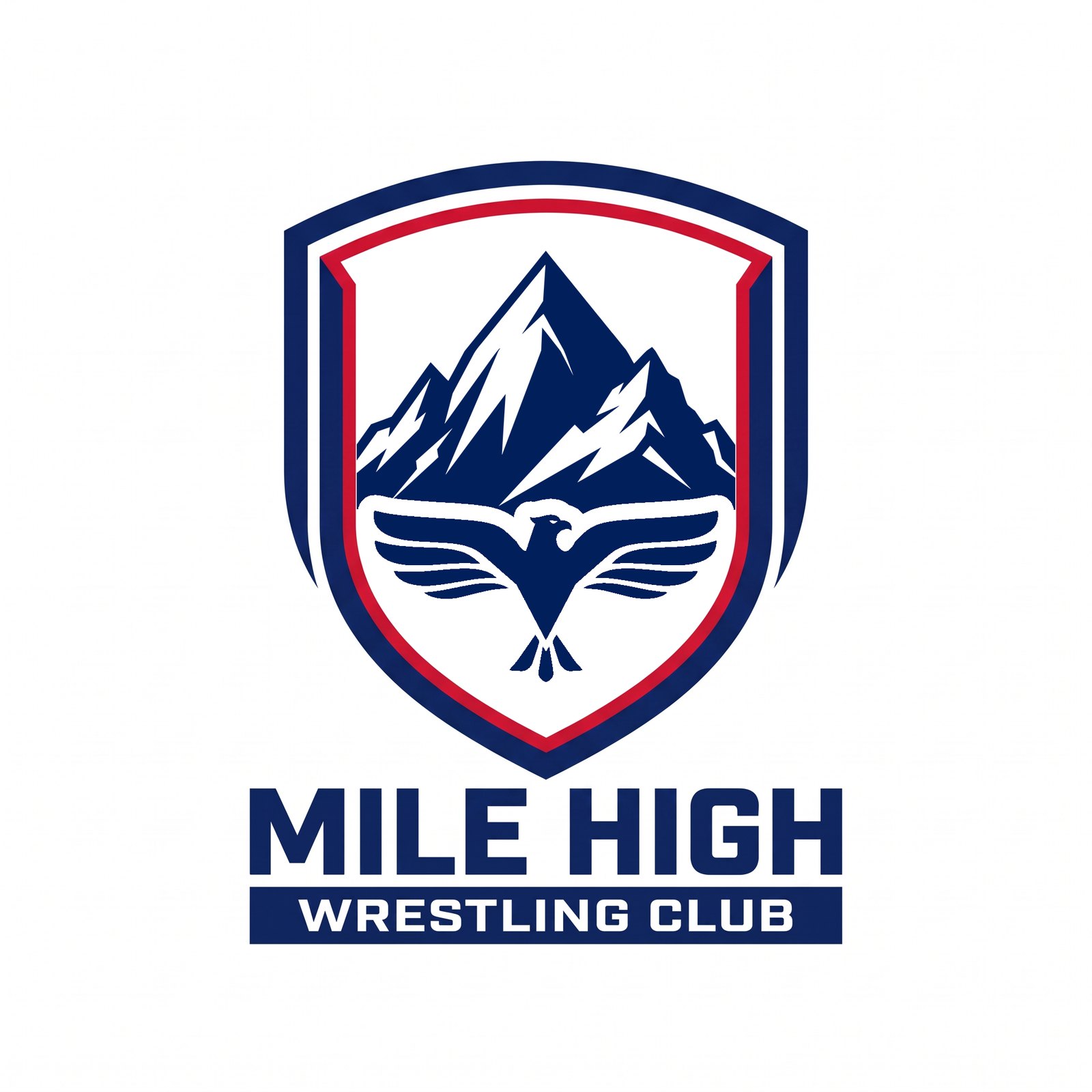
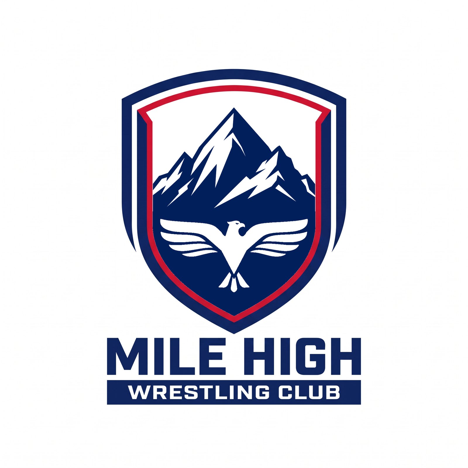
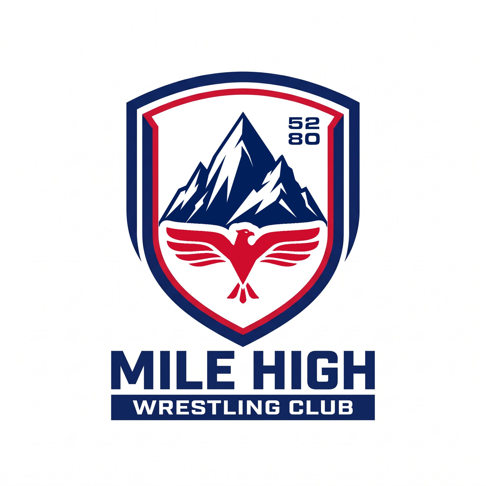
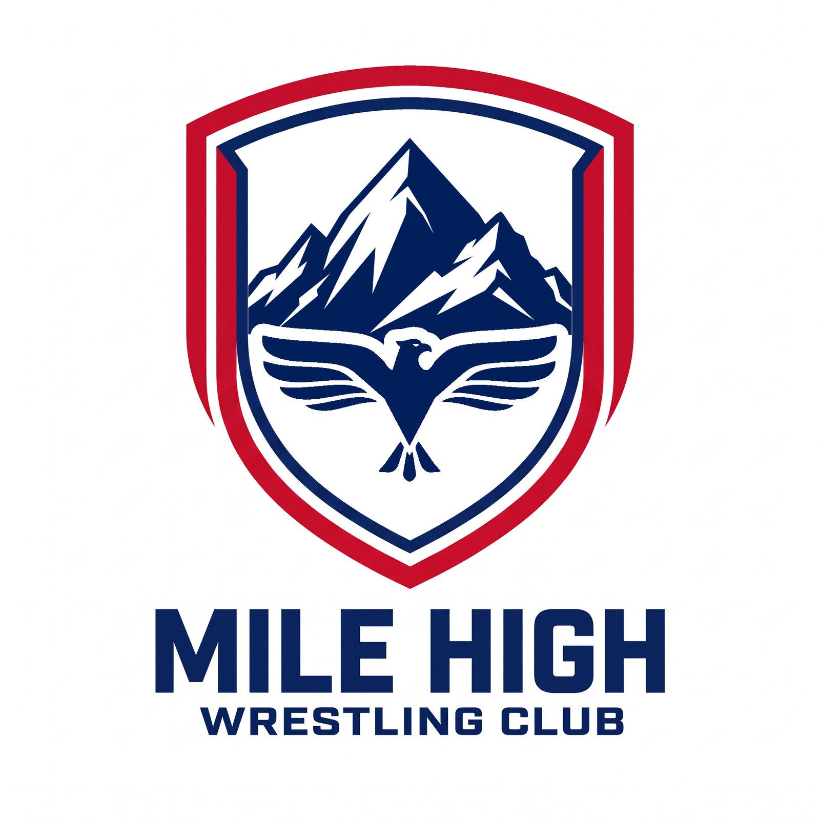
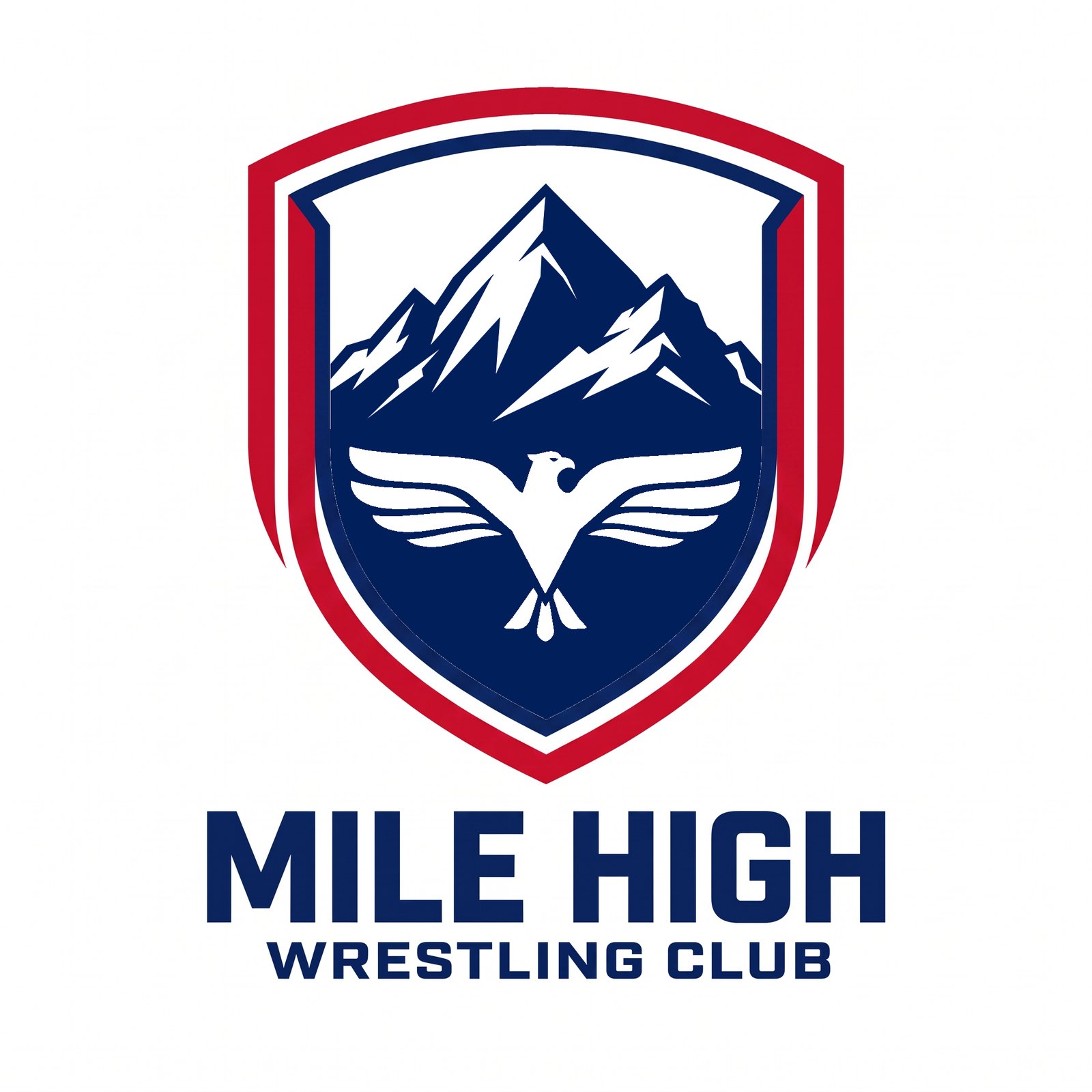
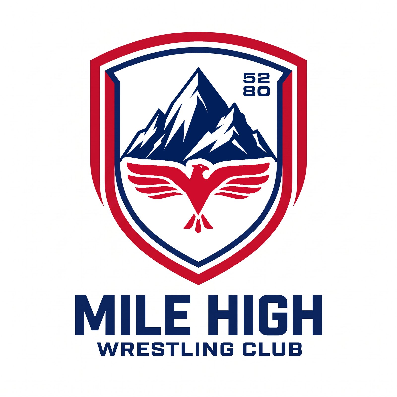
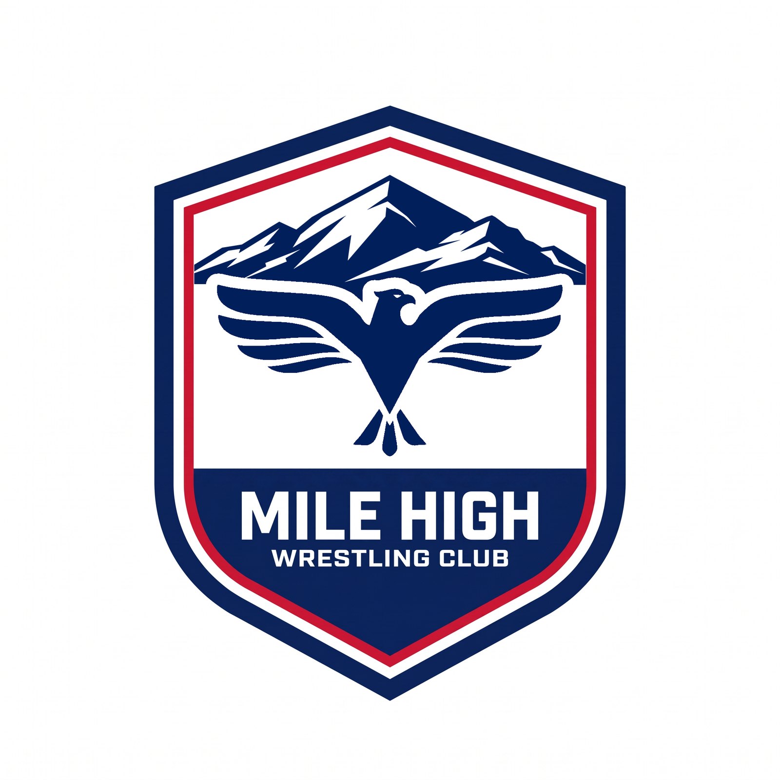
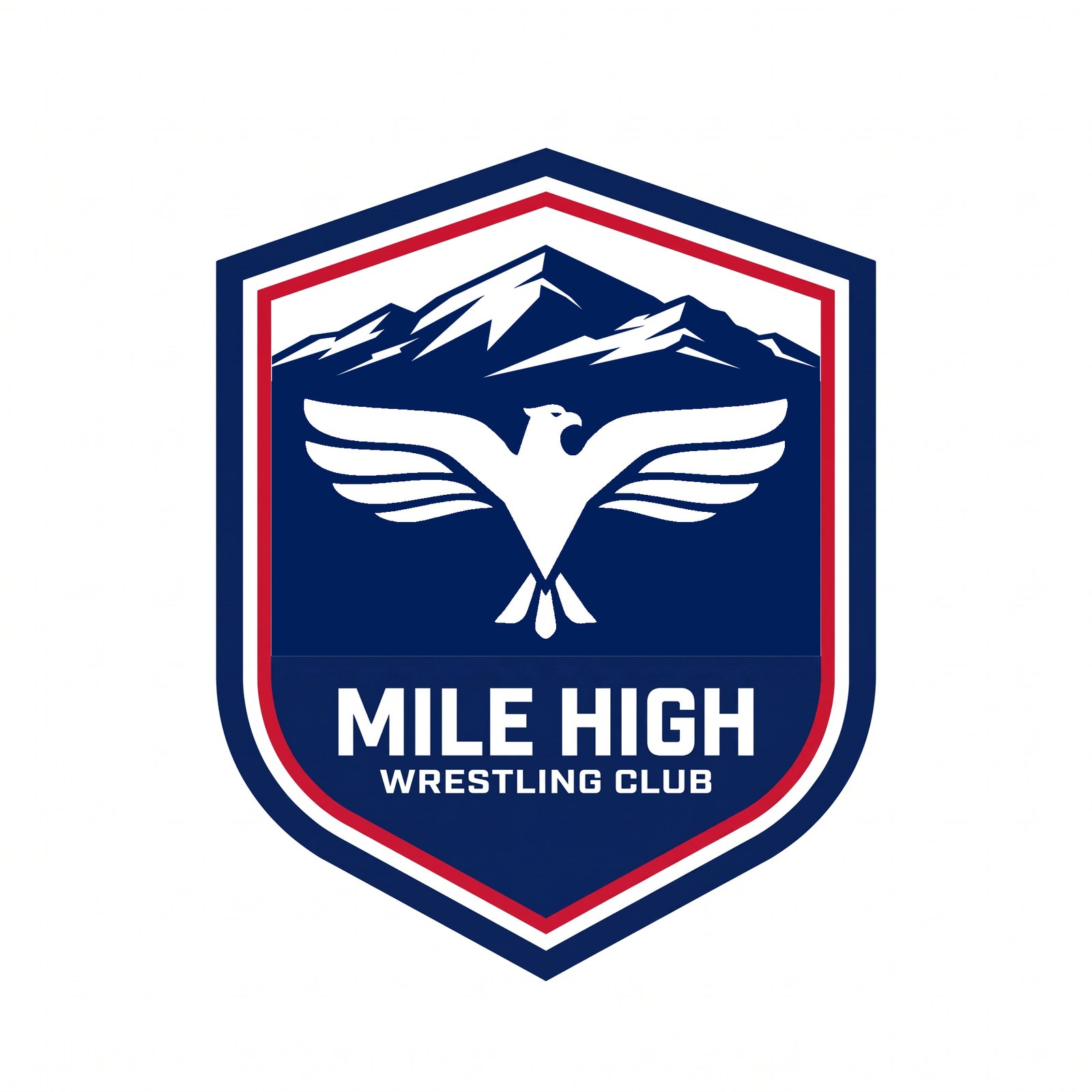
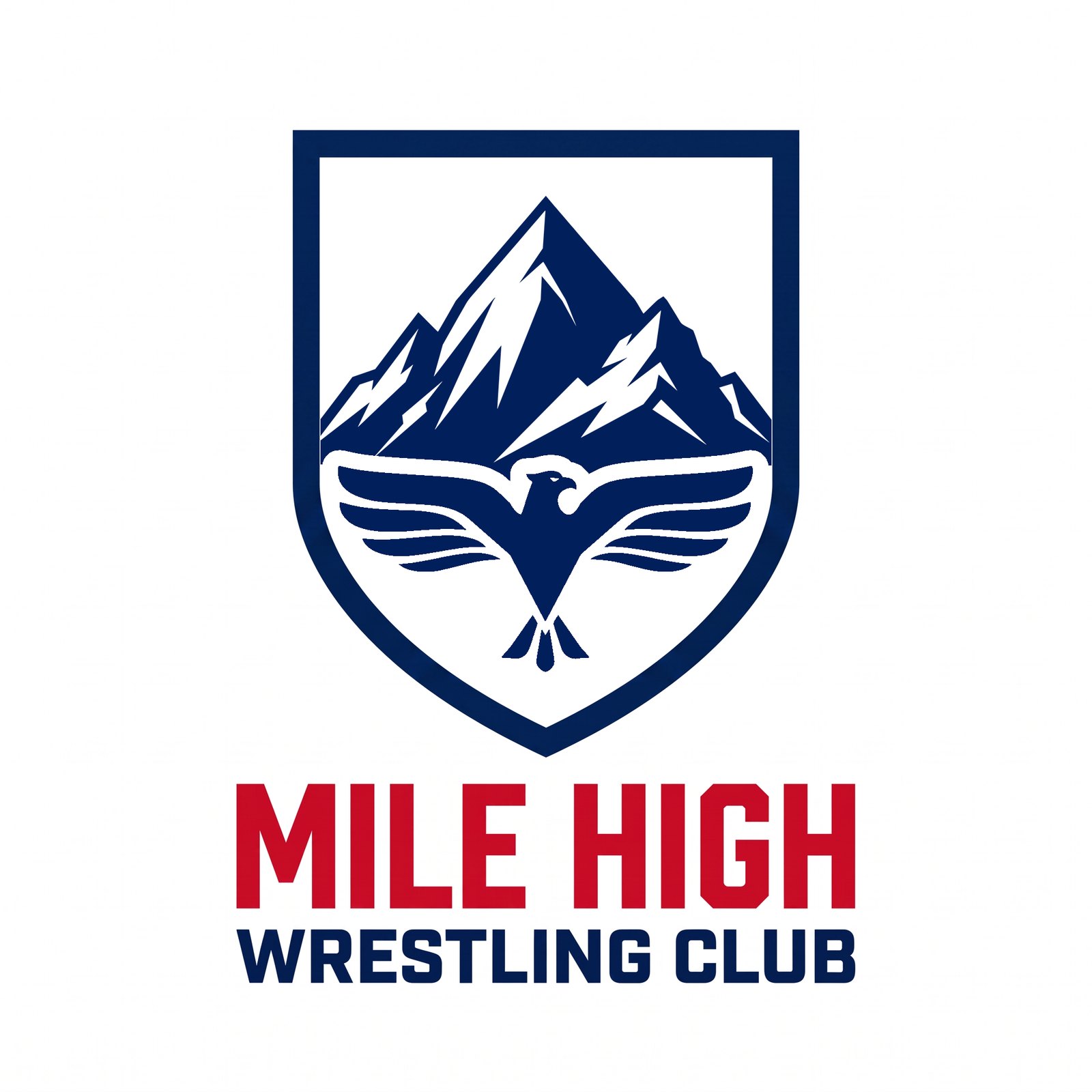
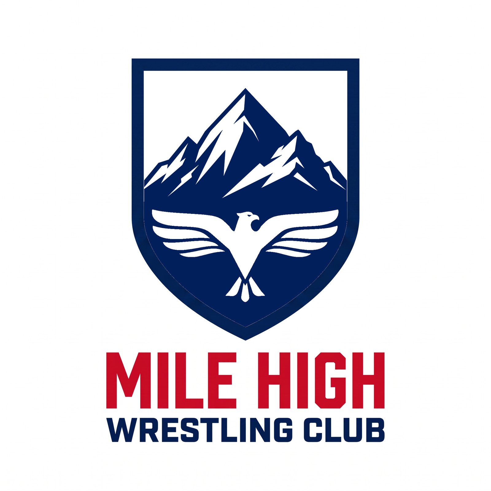
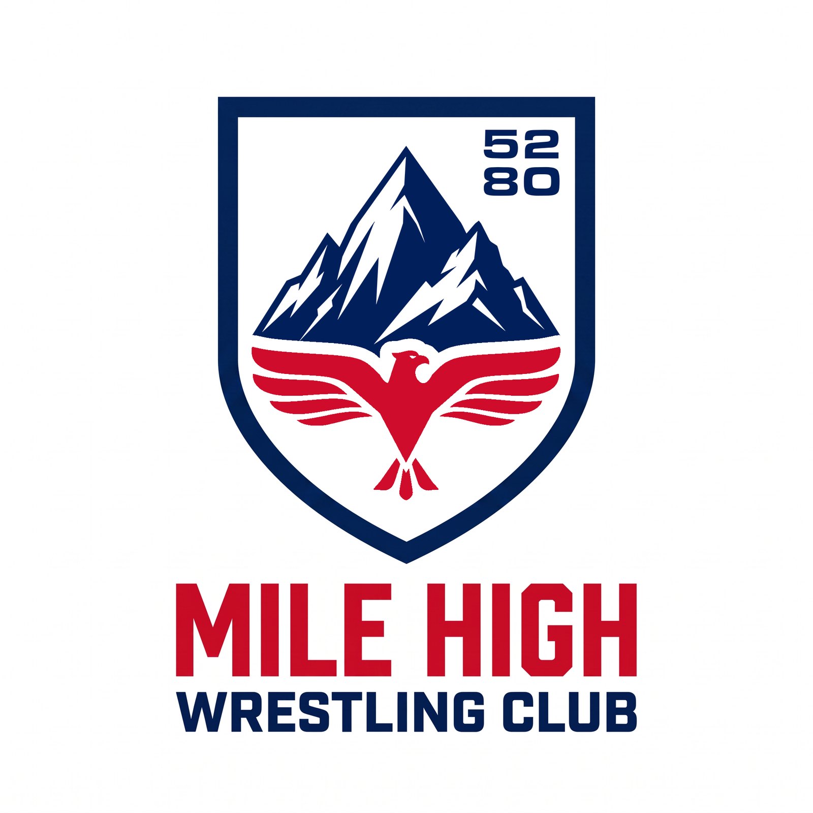
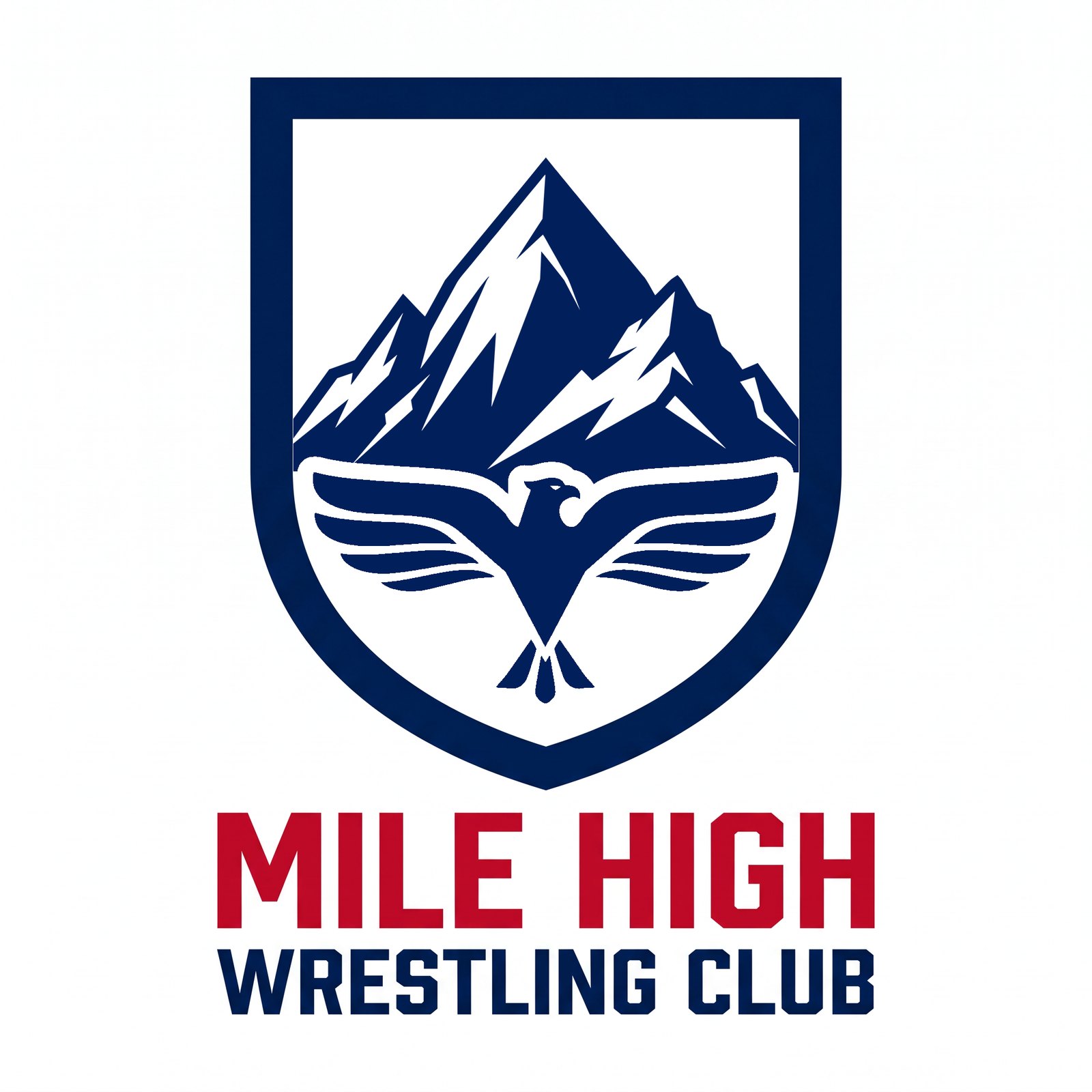
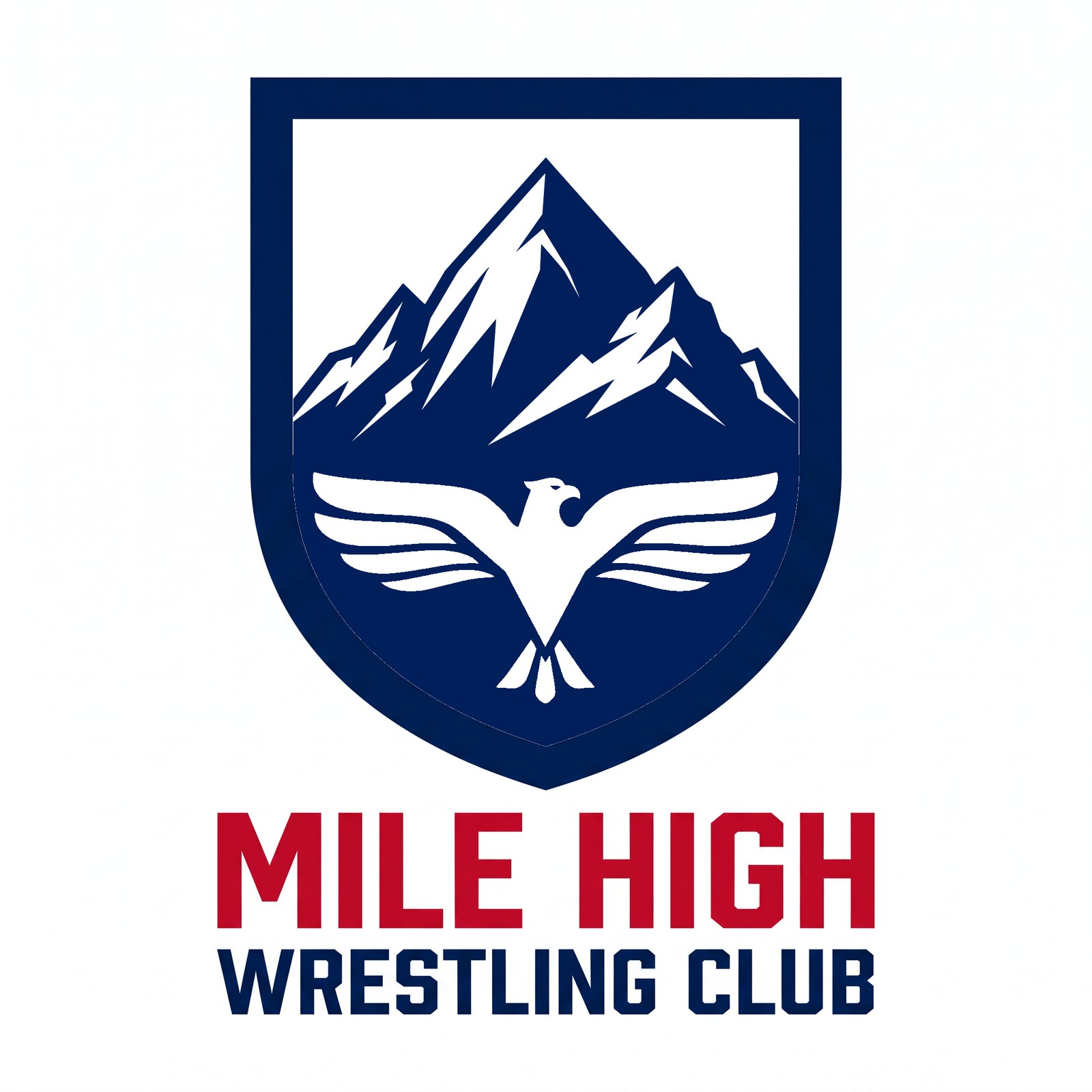
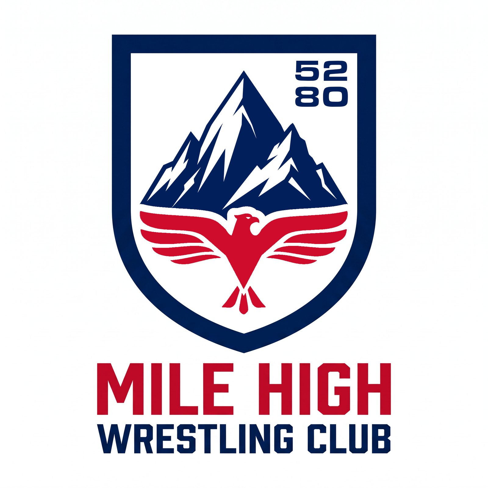
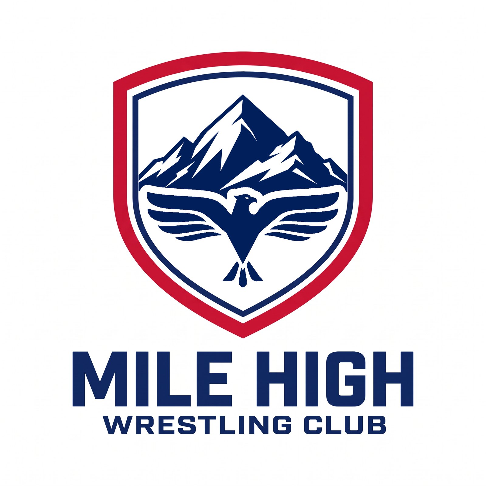
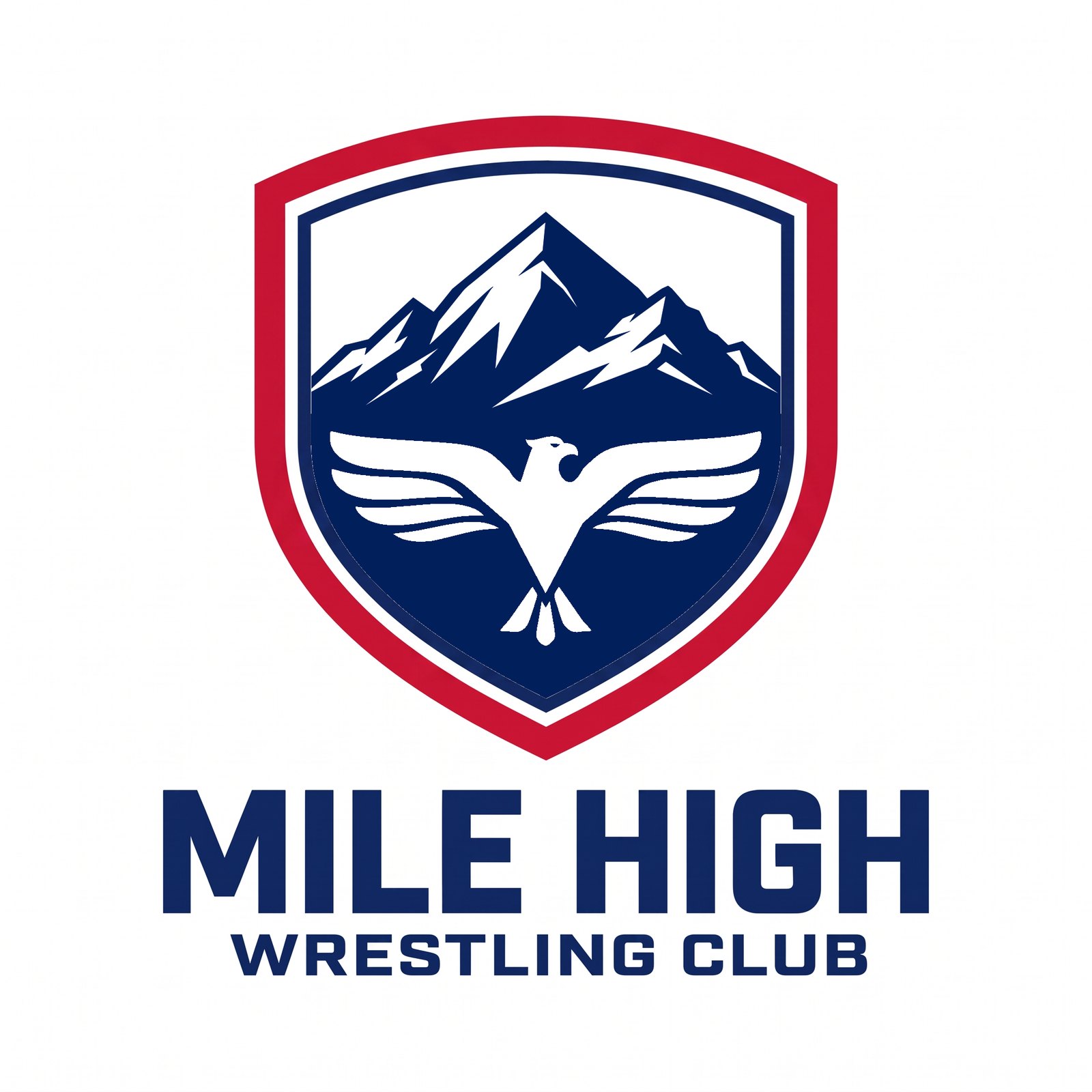
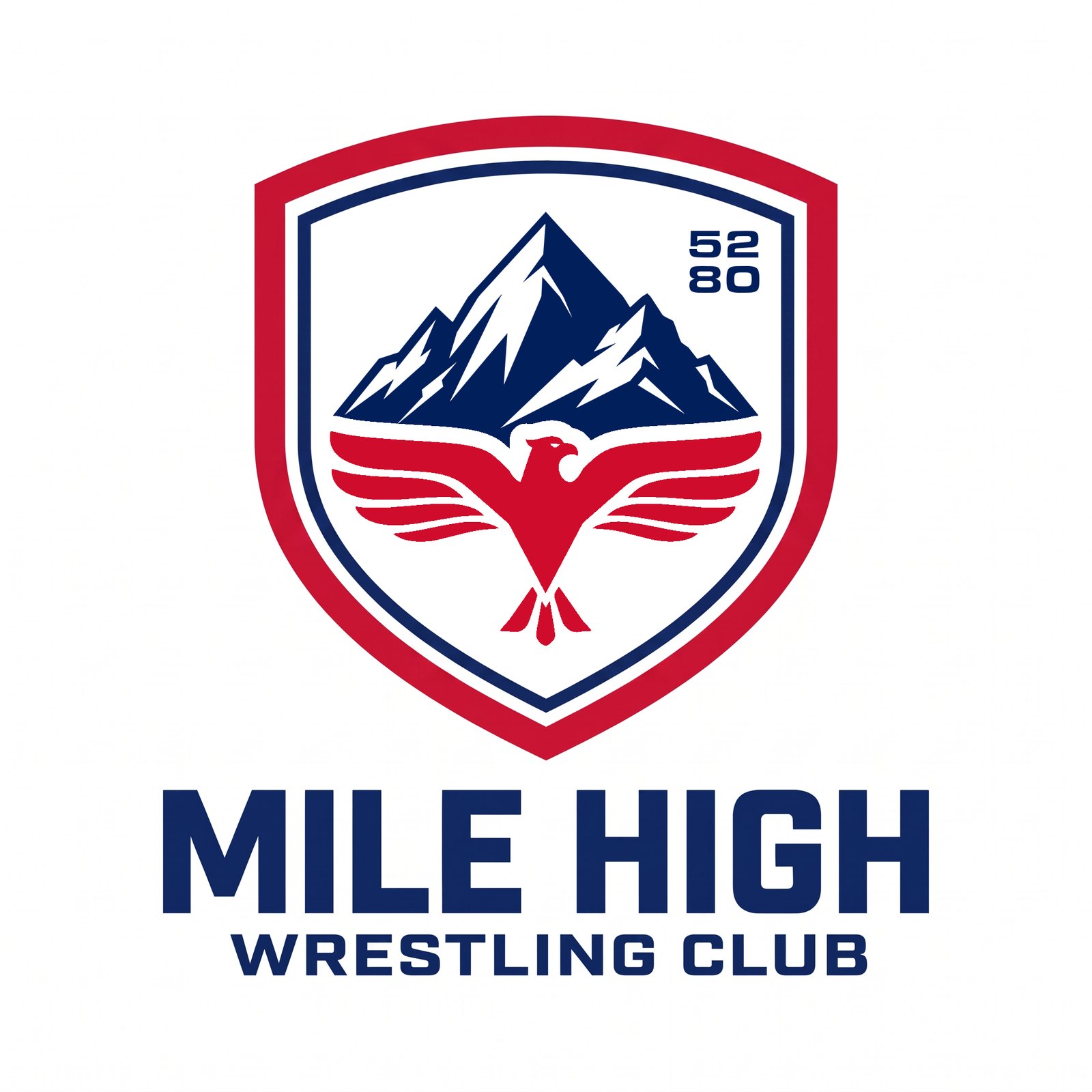
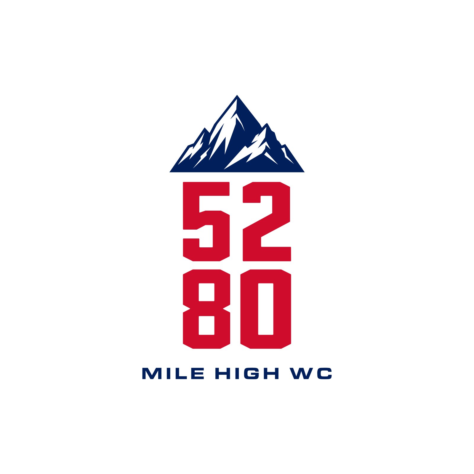
R19 5280 — R2 N03 (Summit on 5280) rebuilt with the locked mountain R9 W09v3: stacked 52/80 and one-line 5280, navy/red/white, one with the eagle. The numerals are Hyper Elite Condensed (kept on tap for other pieces), the club line Eurostile Extended. True vectors: SVG, PDF and PNG on Drive in LOCKUPS_R19_5280_2026-10-07.
R20 Crests — the R16/R17 crest with the border flipped at the top: the outer navy arc and side rails removed, and a navy bar run under the red line across the top and shoulders — red over navy at the top, navy outside red down the two sides to the point. Same eagle-cut inside; stems, 5280 and red-eagle options carried over.

R22 MHWC — MHWC added to the approved designs, matched to each one’s own type: MHWC replaces the wordmark in the crest’s condensed block (alone, or exactly as wide as the crest’s own WRESTLING CLUB line), horizontal versions, the Summit-on-5280 lockup with MHWC, and MH/WC stacked in the corner where 52/80 sat. R21 was taken down.
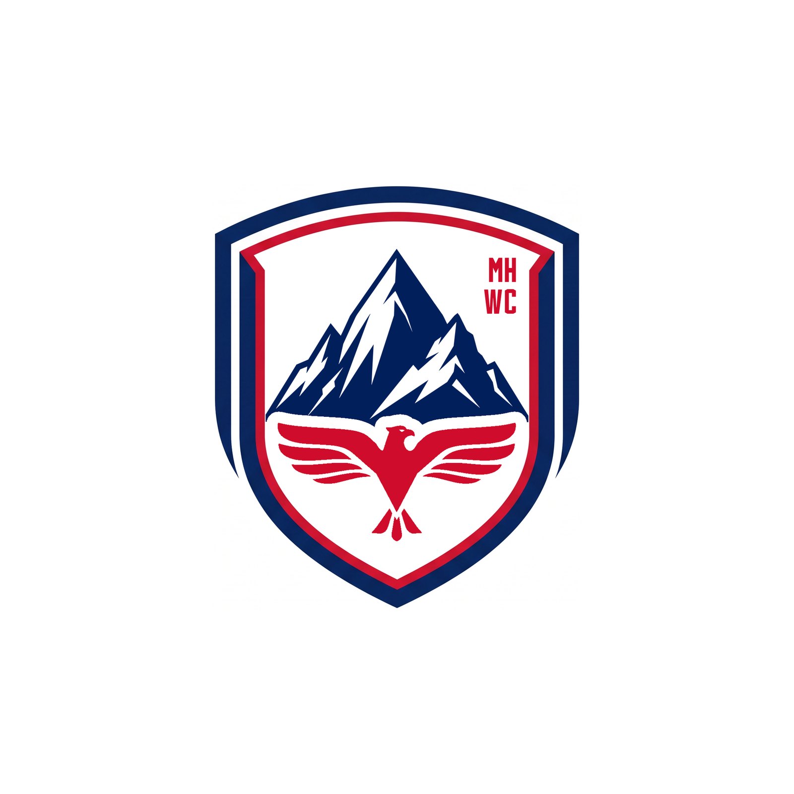
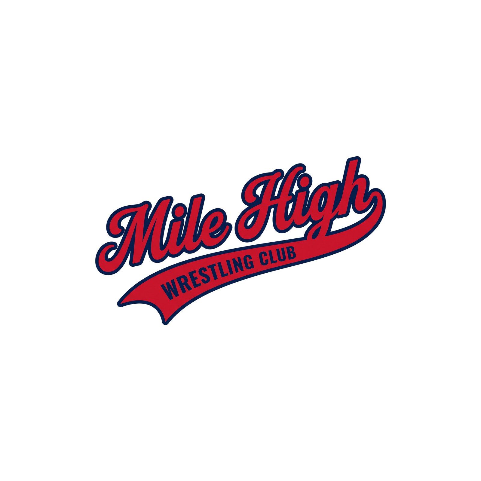
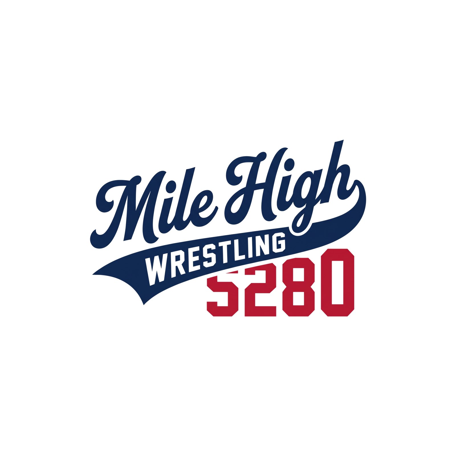
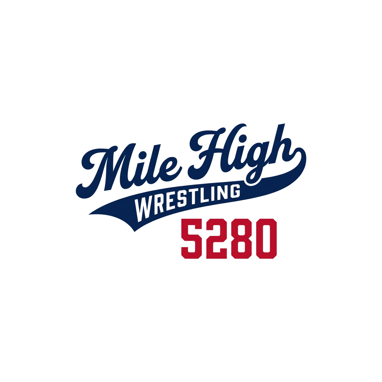
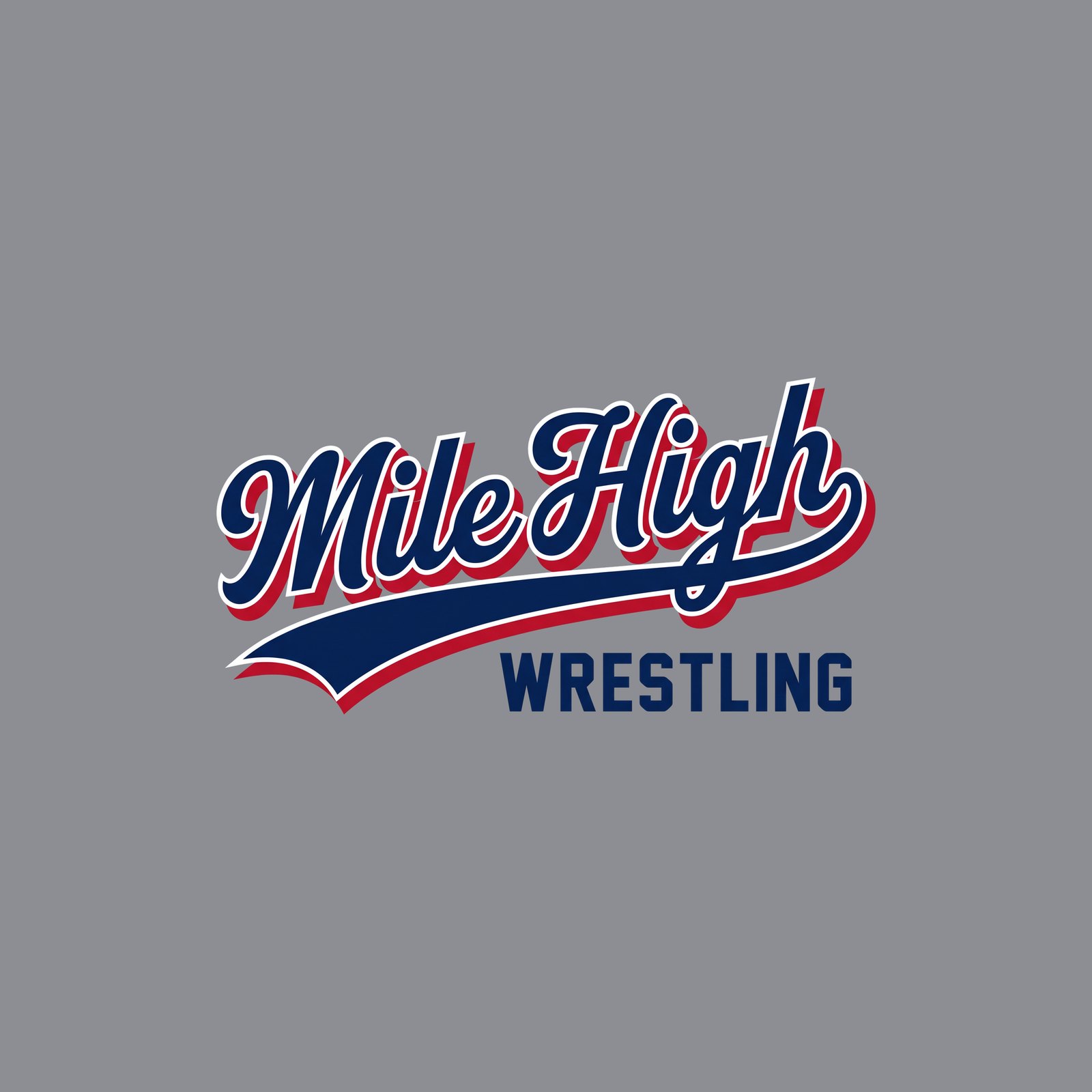
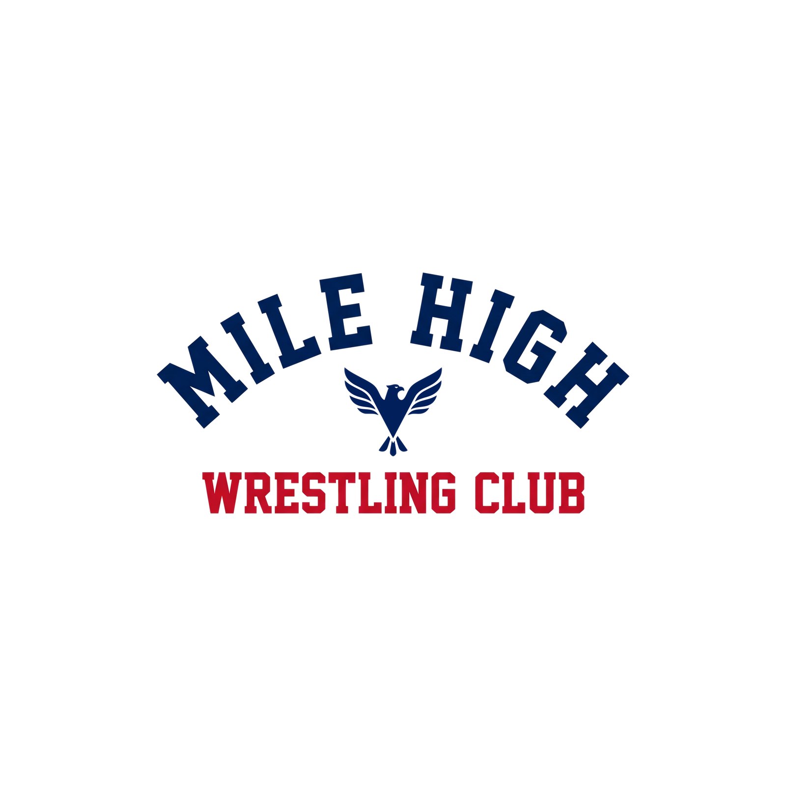
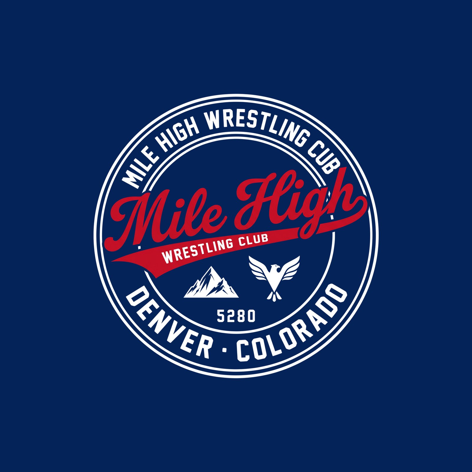
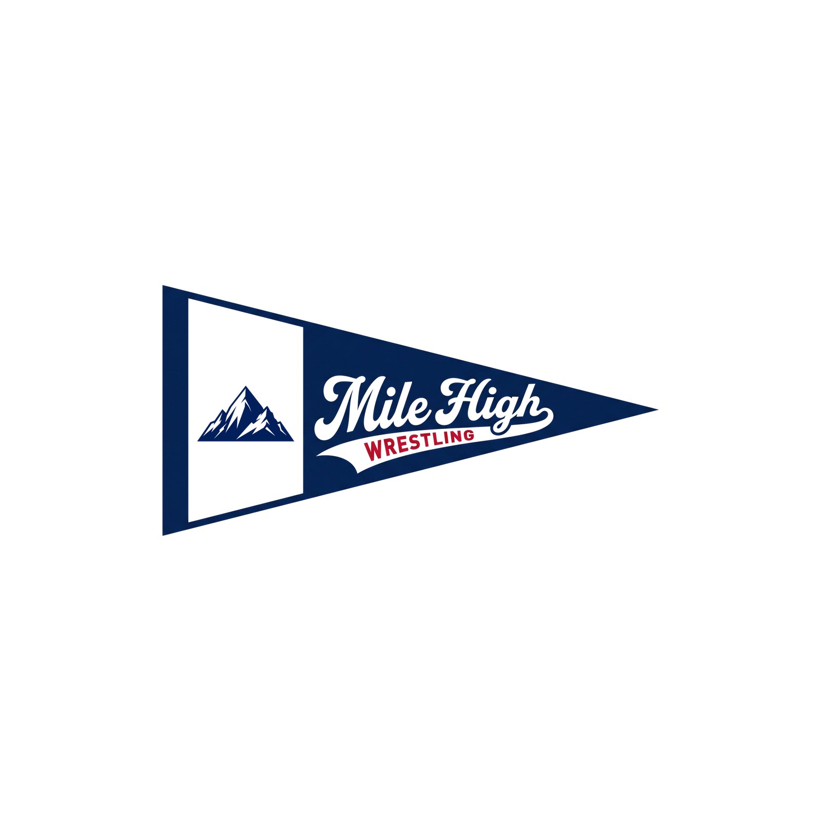
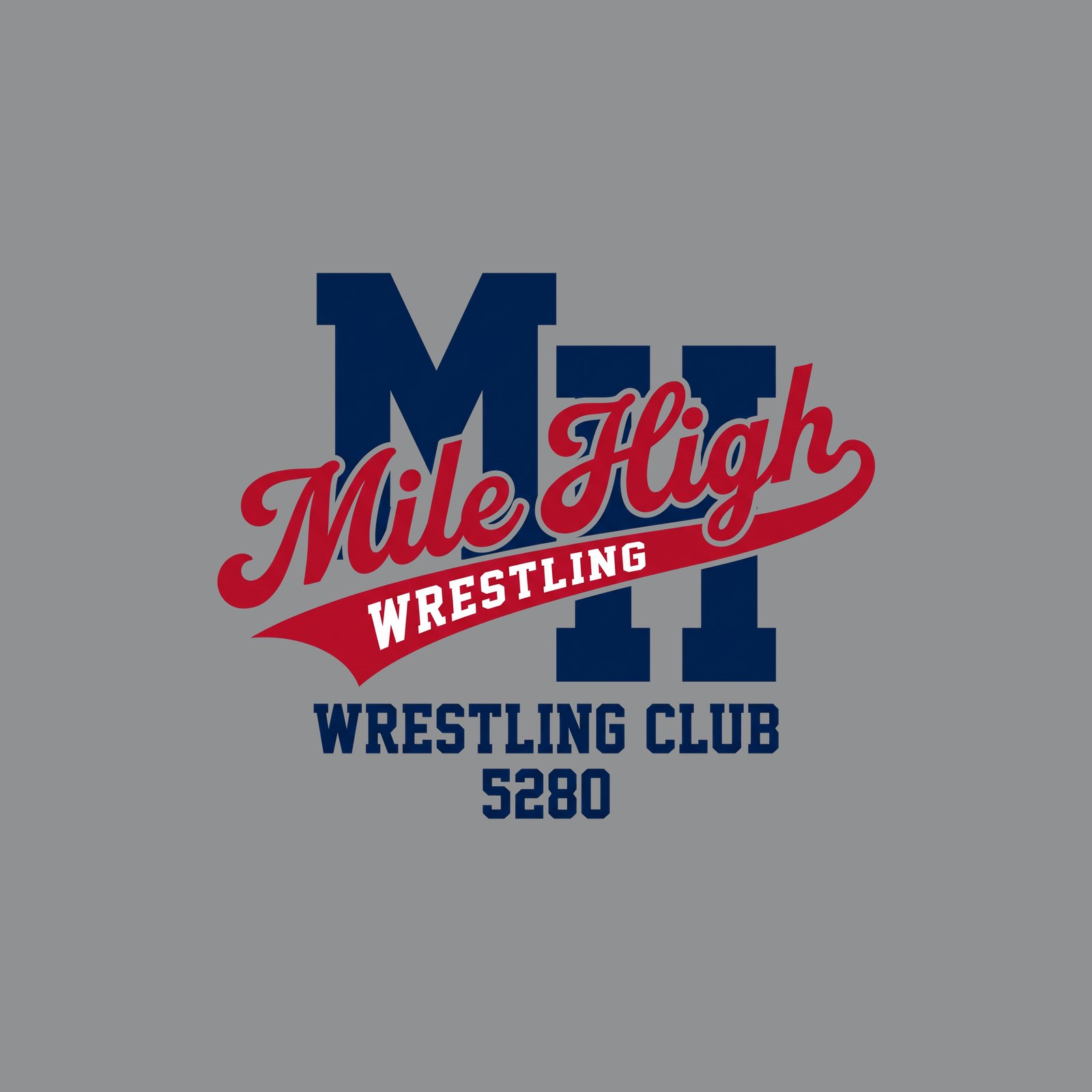
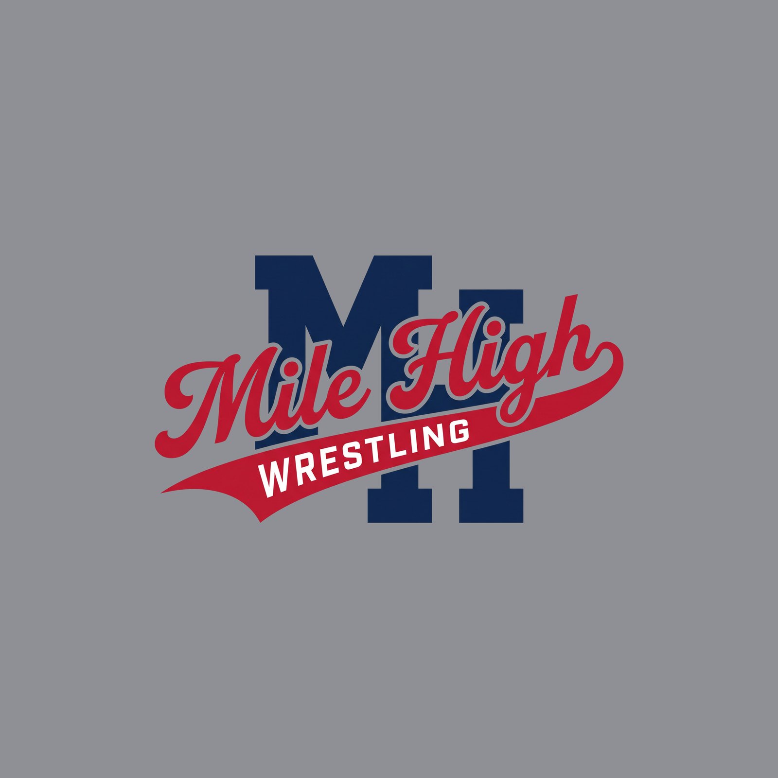
R23 Retail — the retail round: Mile High in an angled baseball script (capital M and H) with WRESTLING in the tail, in navy / red / white and on white, navy and grey; plus the Waver (script over a big block WRESTLING), the 1980s stripe, the collegiate arch, a seal, a pennant and an MH monogram with the script across it. Built on what sells (Homefield’s Toledo, Oklahoma State and Nebraska scripts; ’47 Waver). Locked mountain and eagle where they appear. Concept renders; the picks get vectorised.
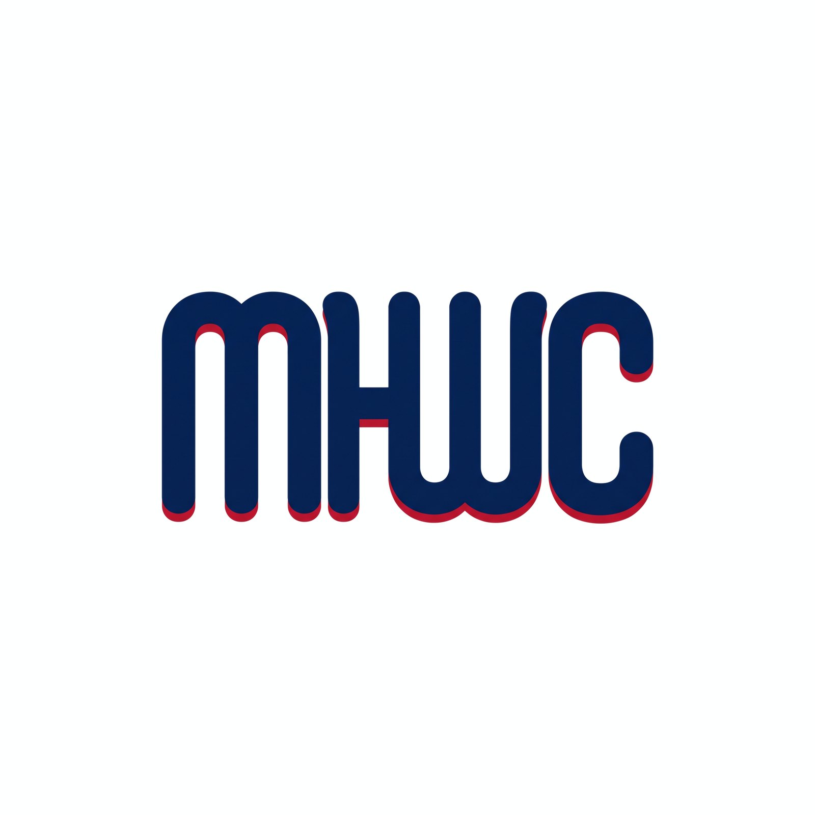
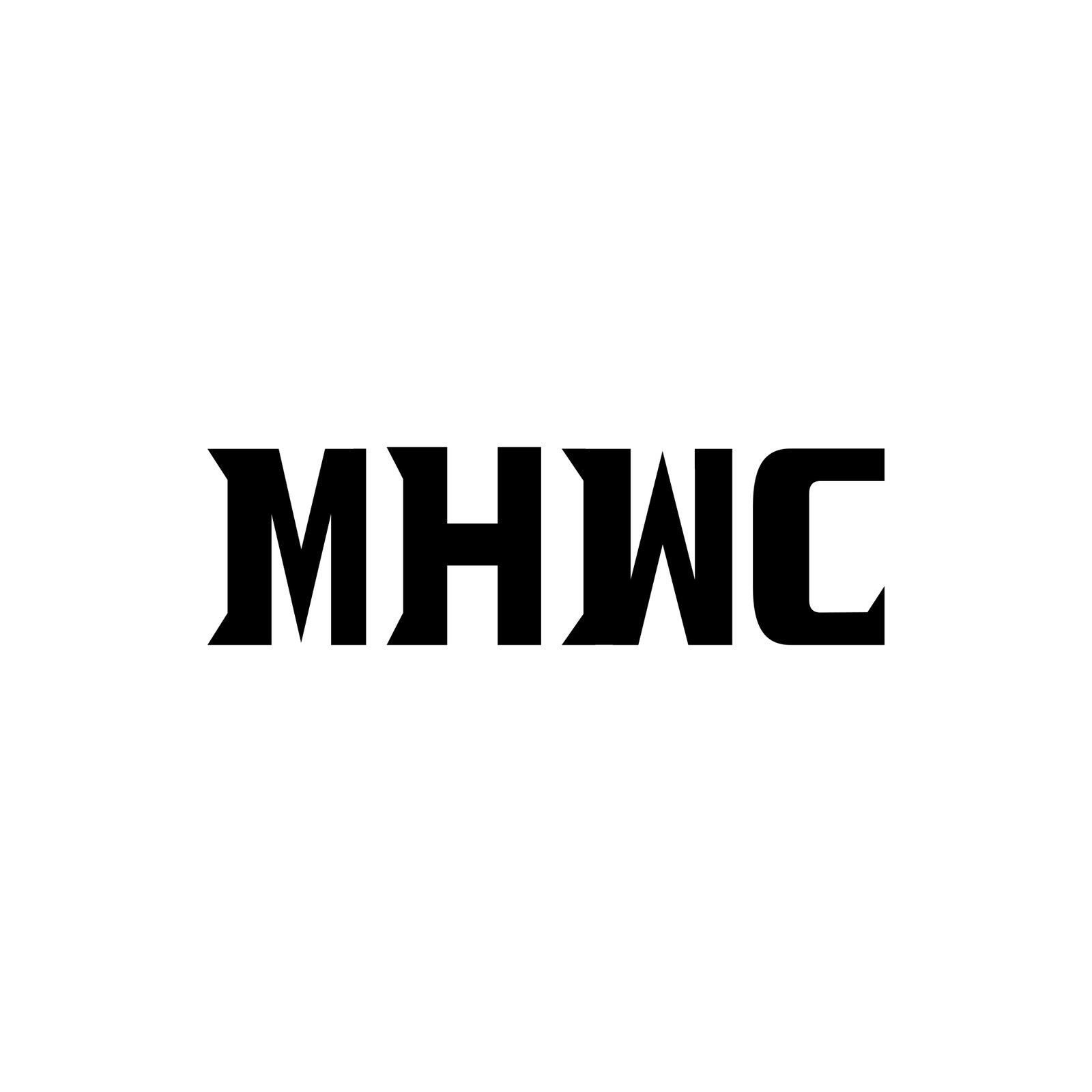
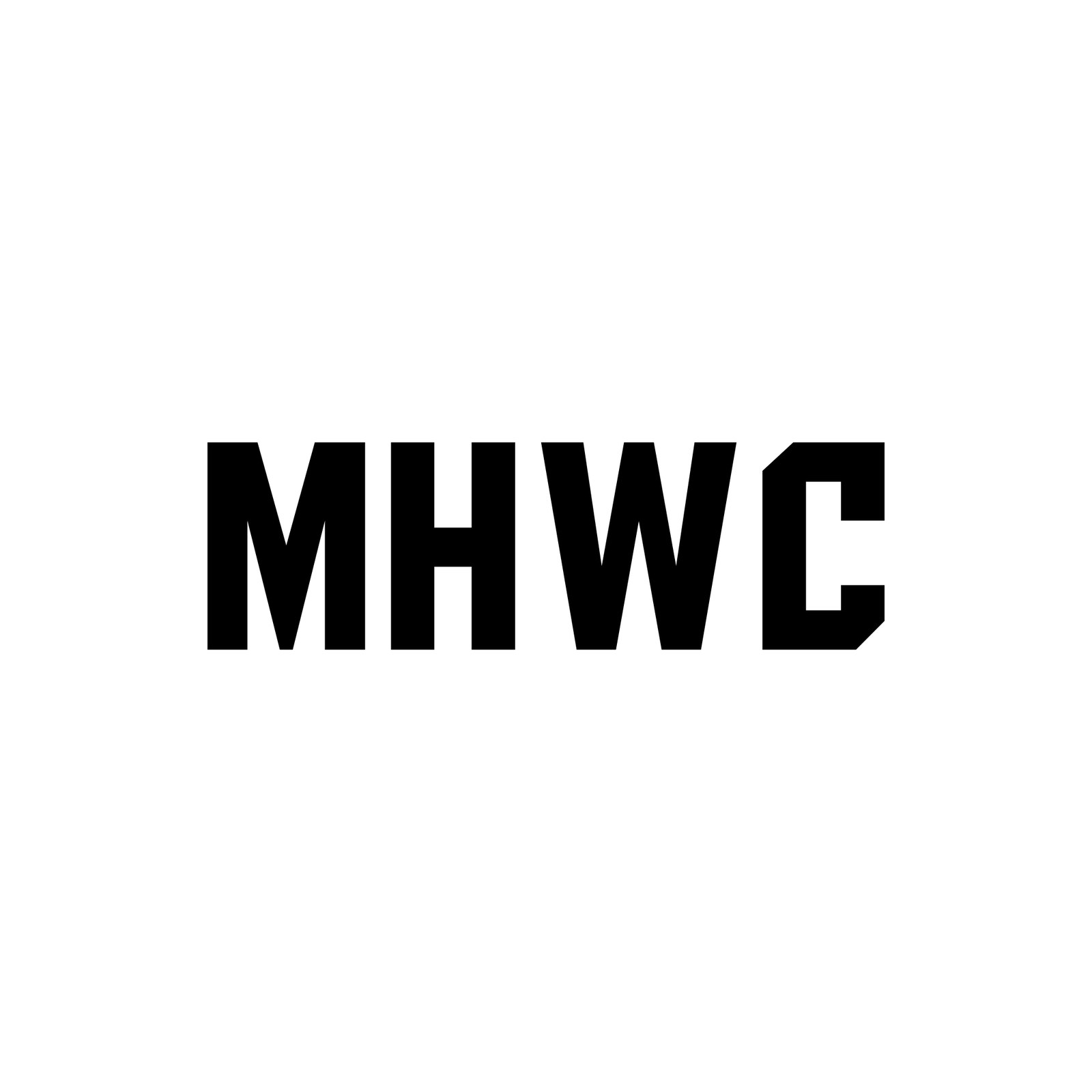
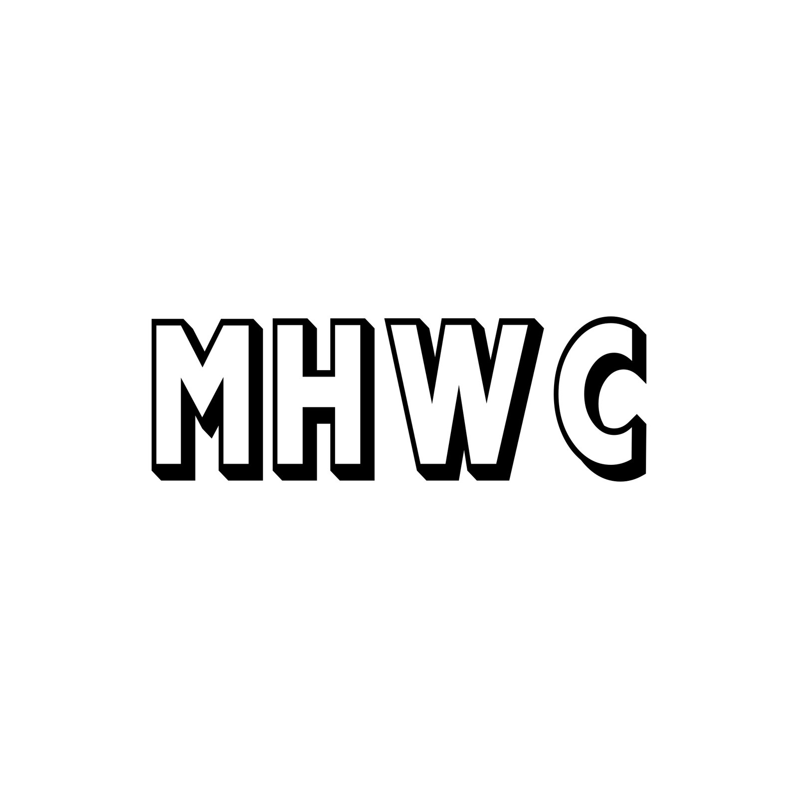
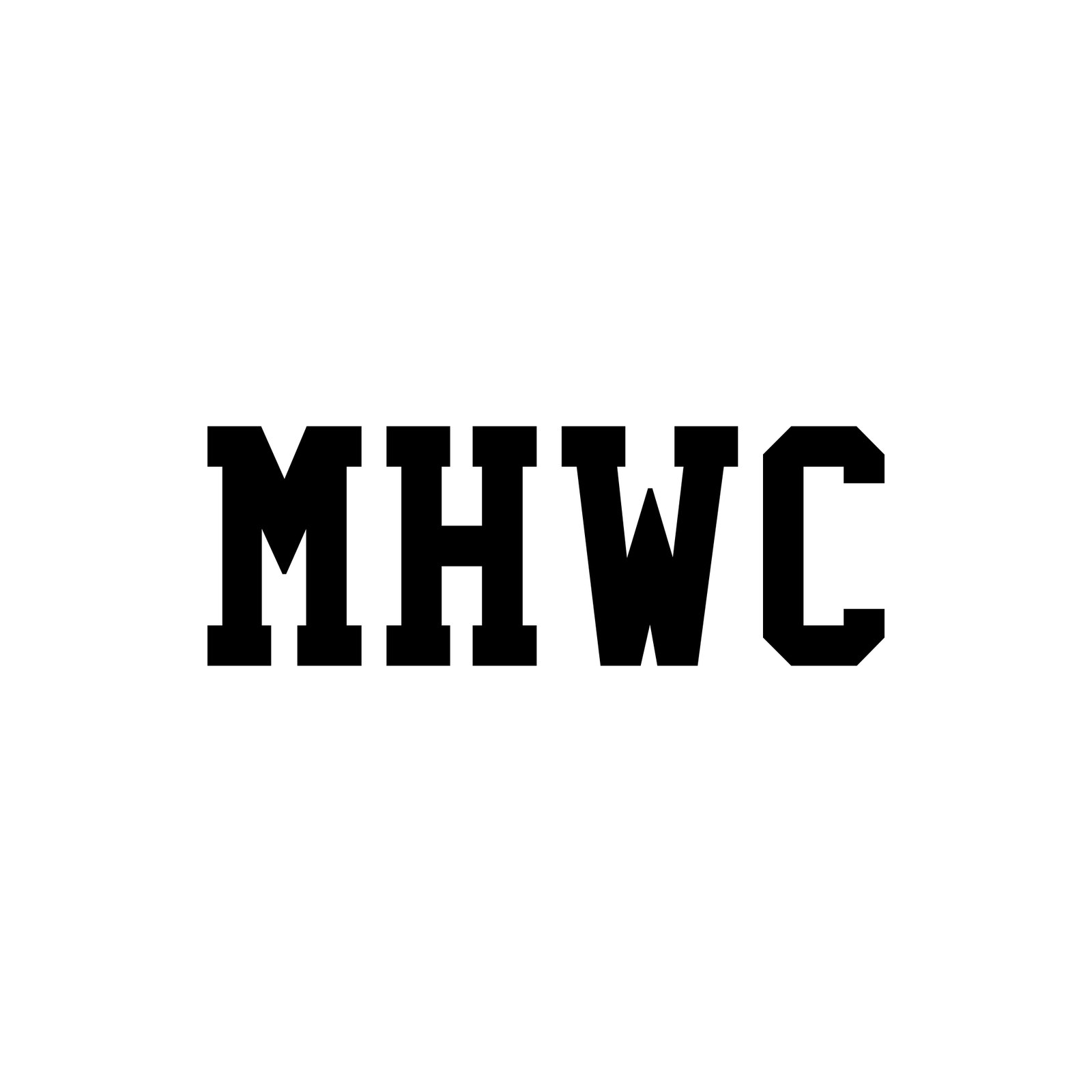
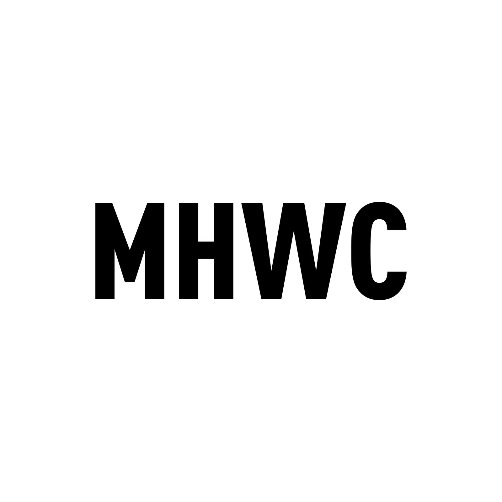
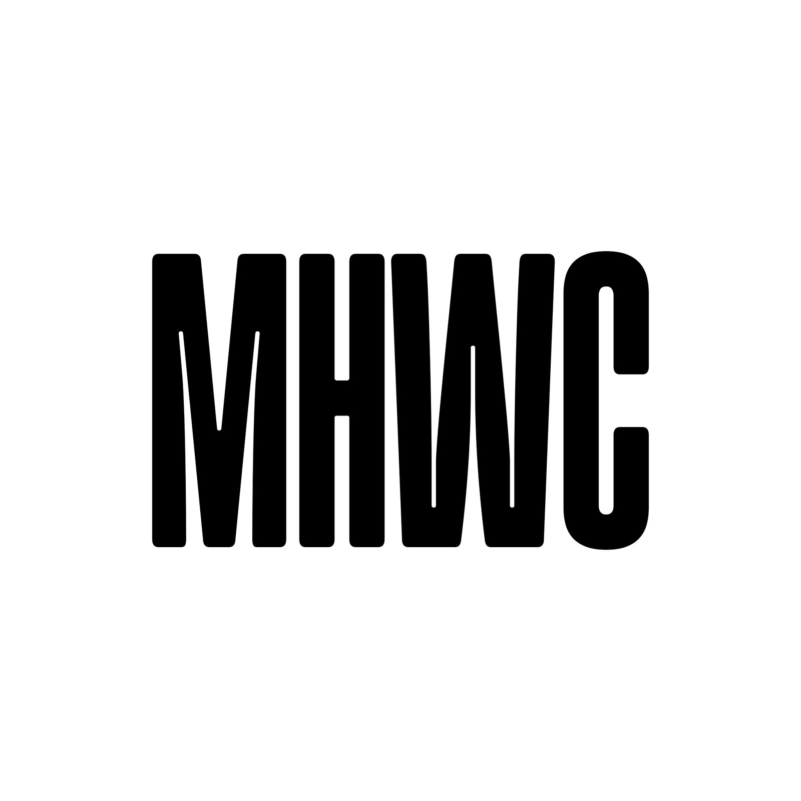
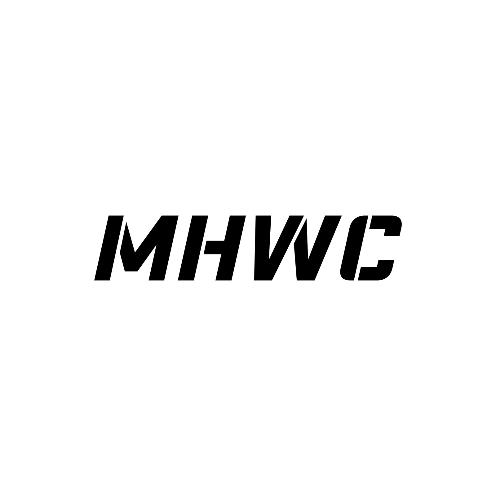
R24 MHWC Type — 23 designed MHWC letterform treatments, one idea each: eight clean (extended geometric, tall inline, rounded tech, monoline, ligature, stencil, keylined reverse, split fill), eight aggressive (forward italic speed cut, blade, flat extrude, chiseled, compressed stack, knockout slab, interlock, wide crush) and seven sci-fi (slit cuts, hex tech, segmented, negative-space panel, inline circuit, stepped, dual tone). No grunge, no texture. The pick gets built as a true vector.
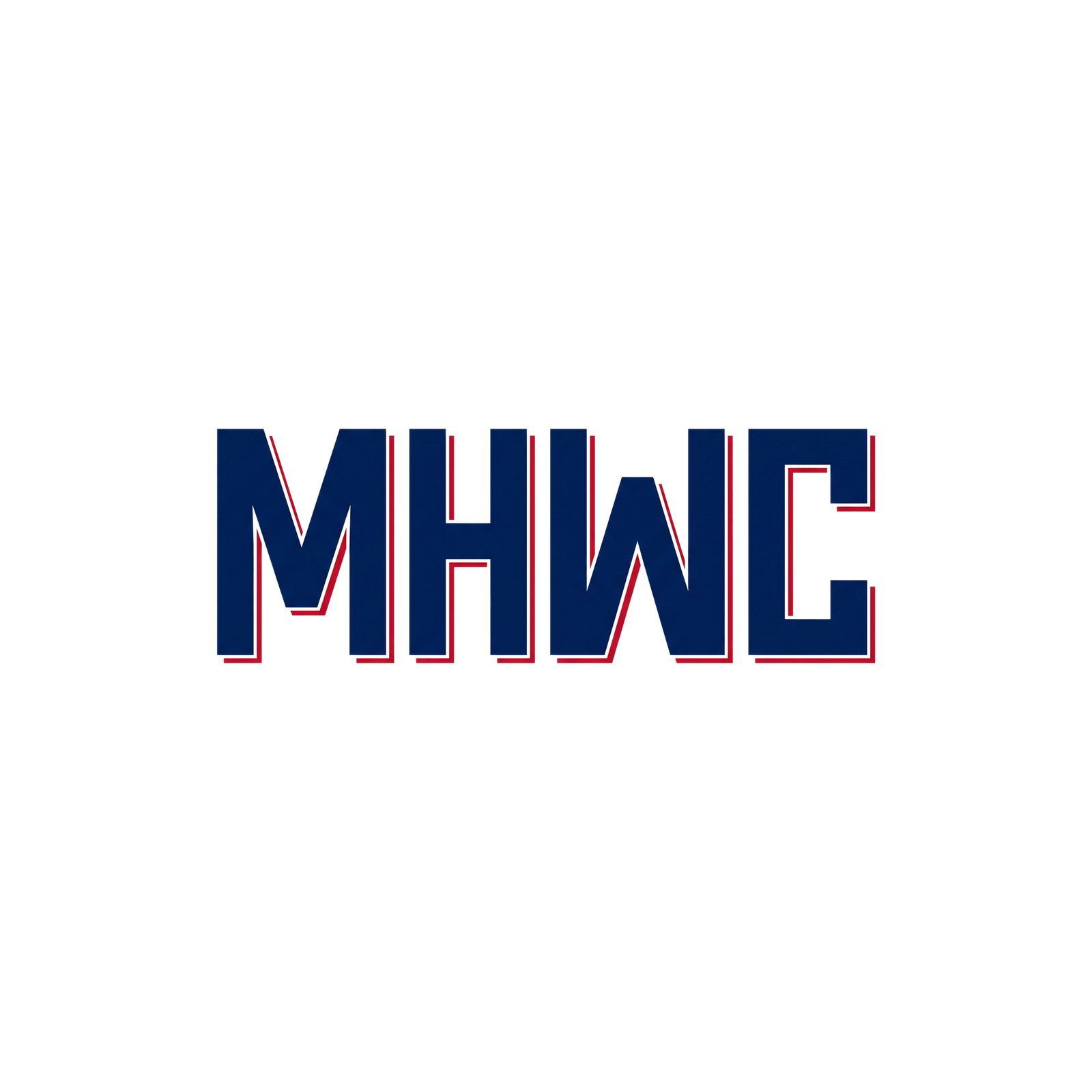
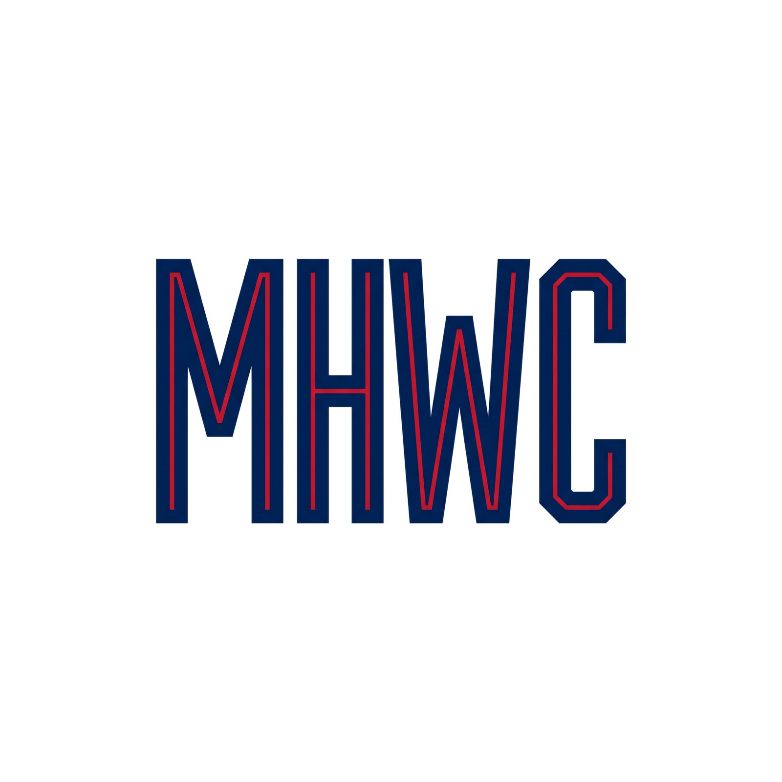

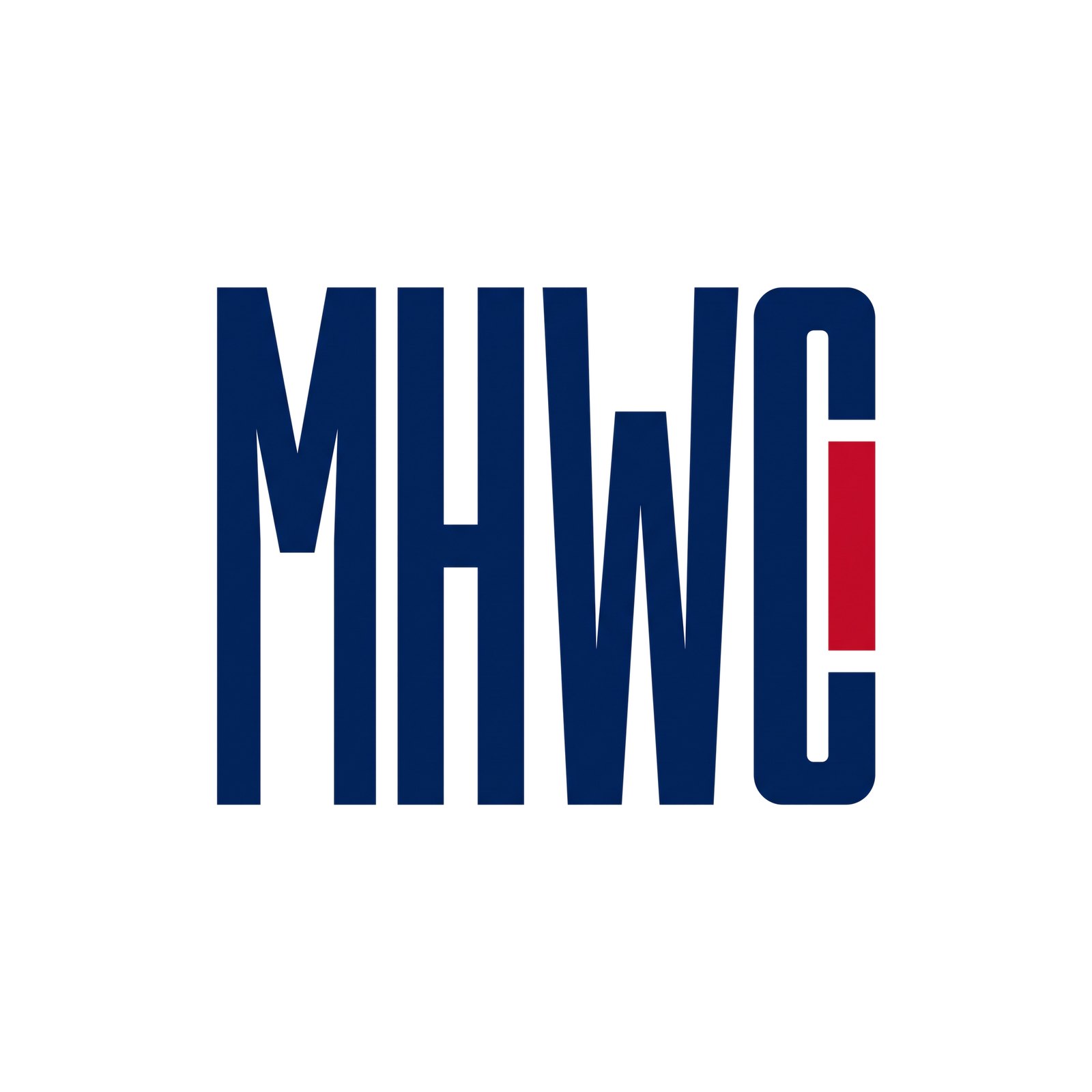

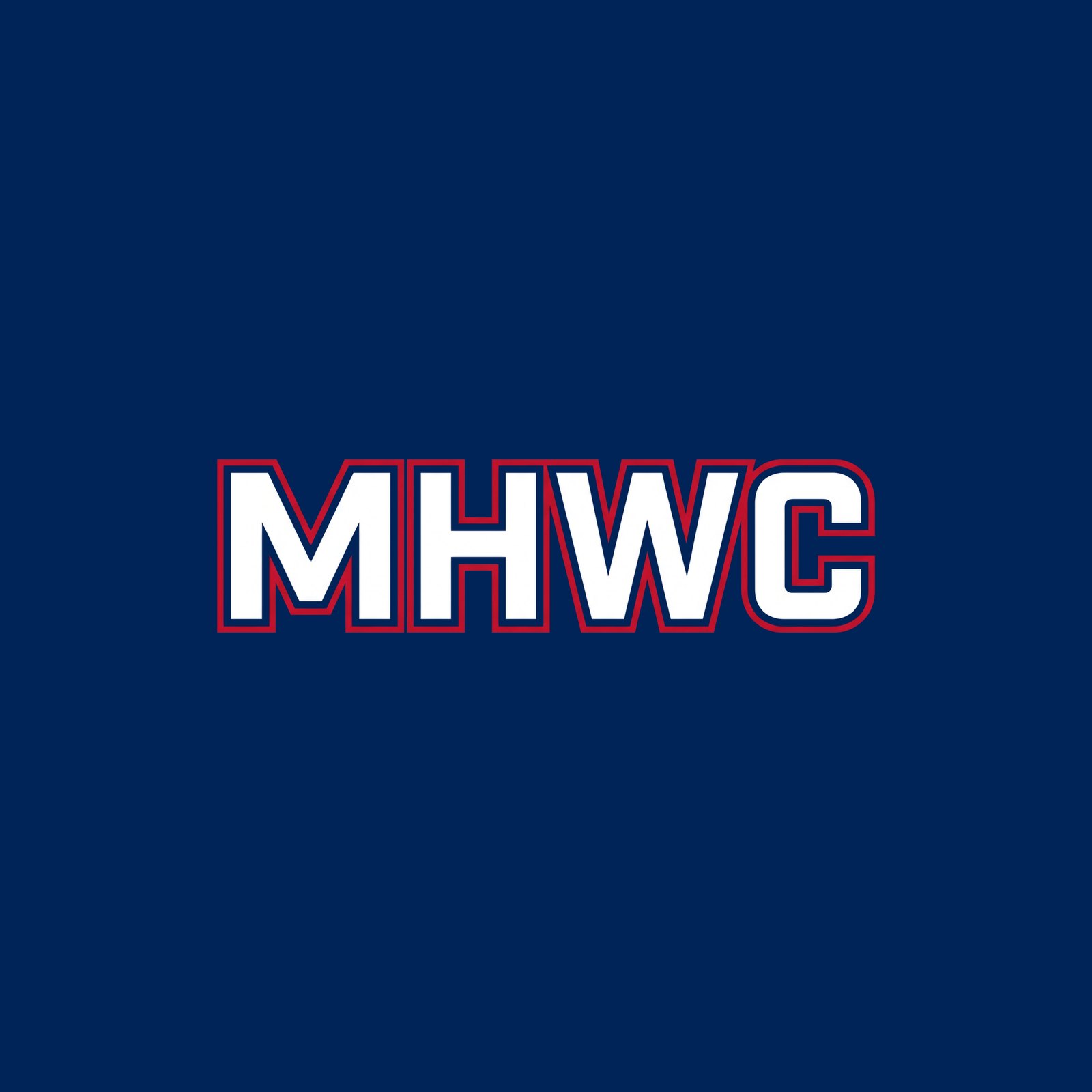
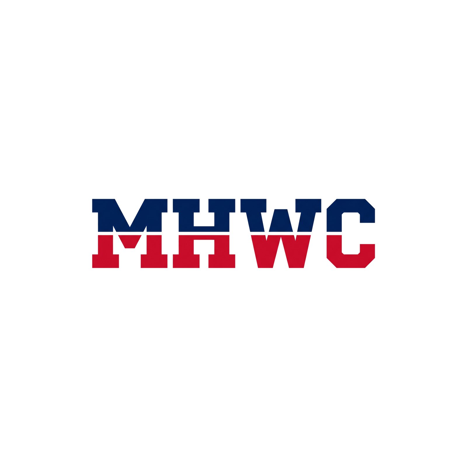
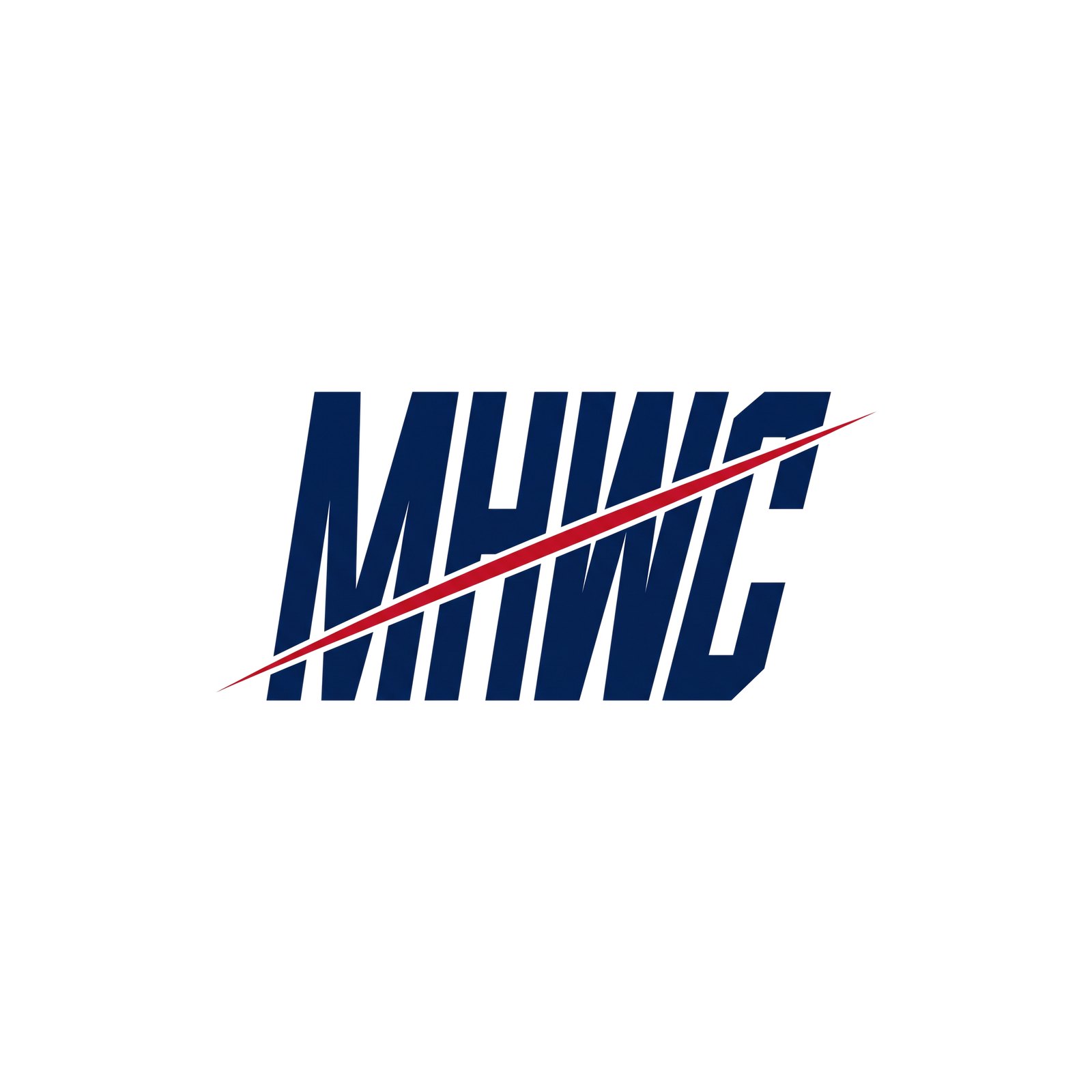
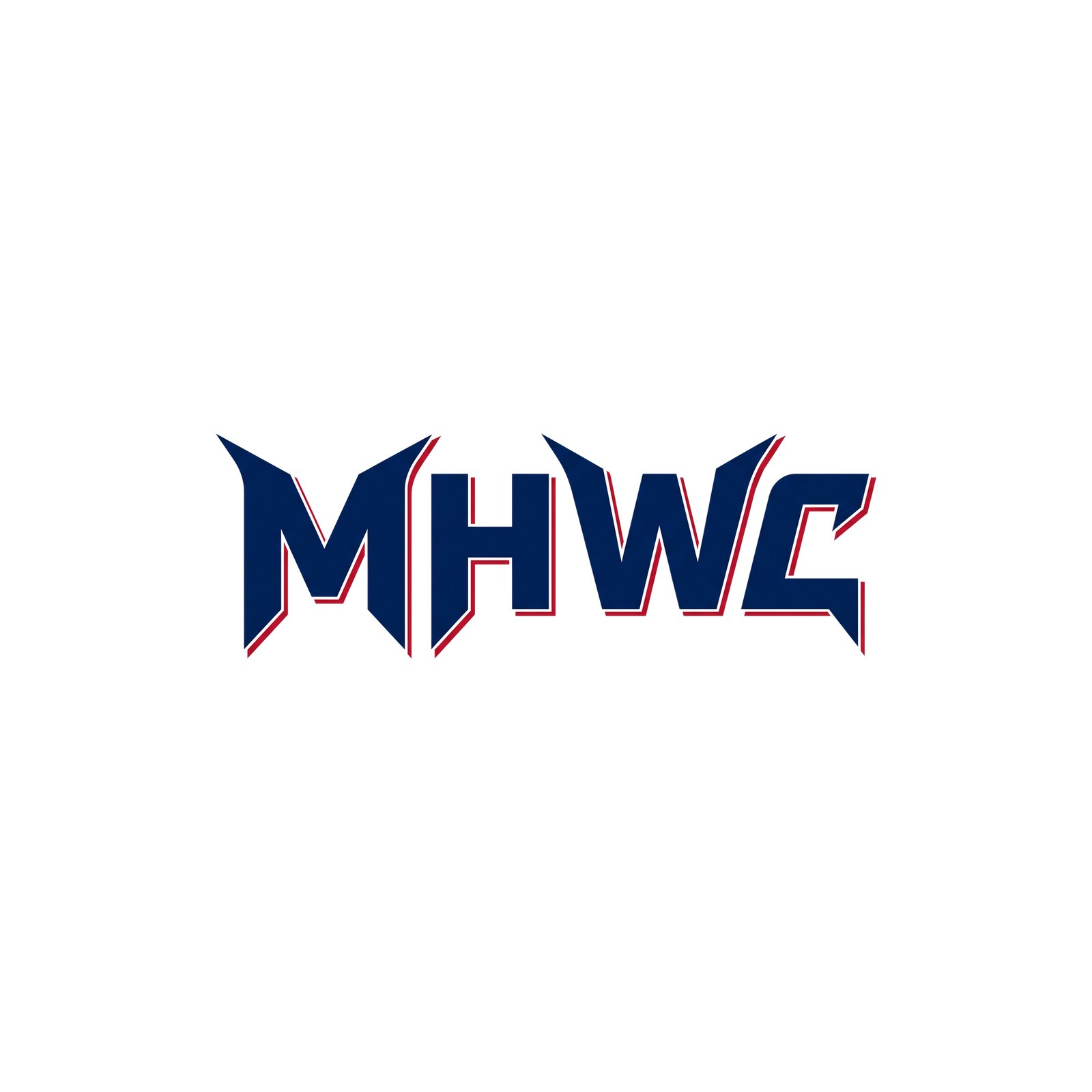
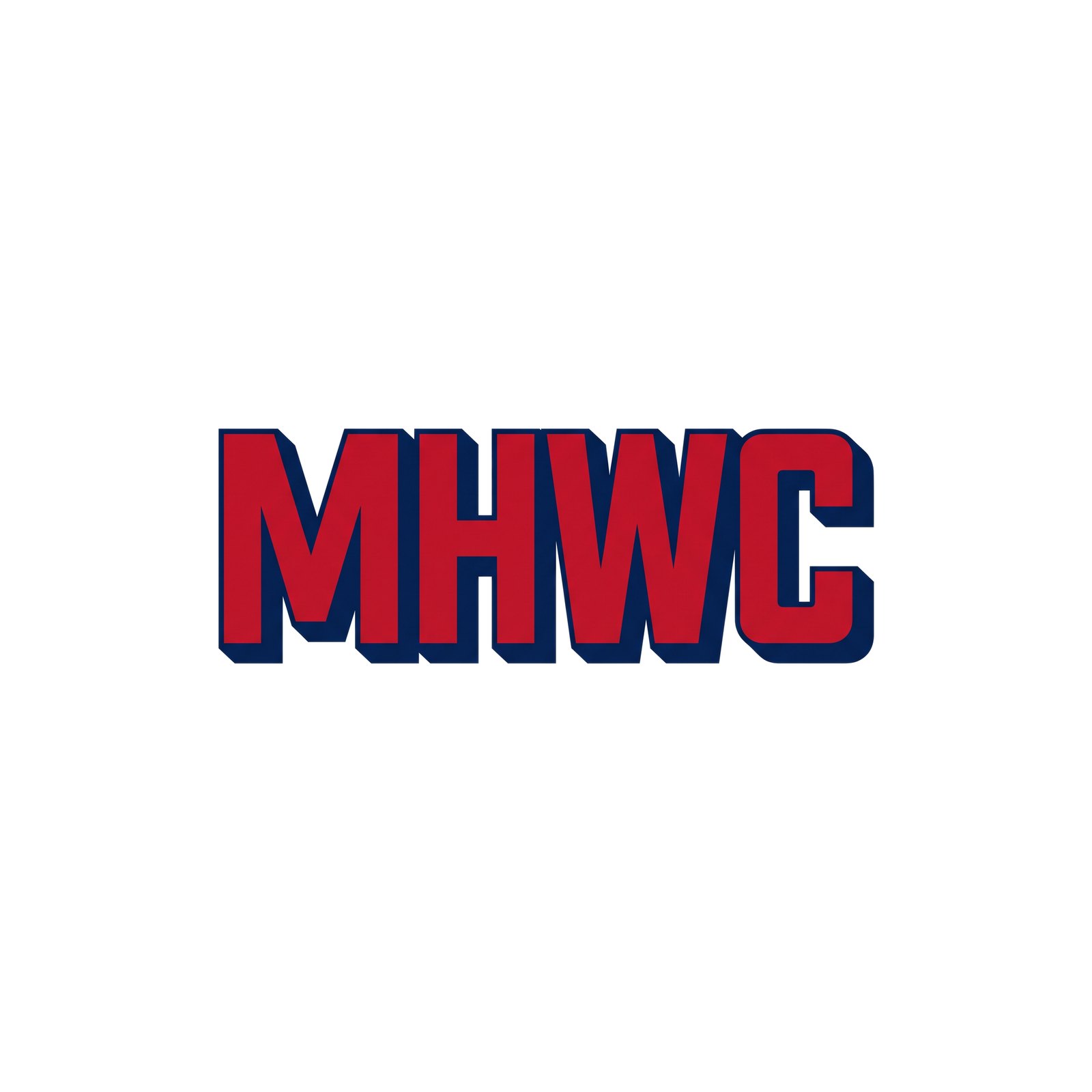
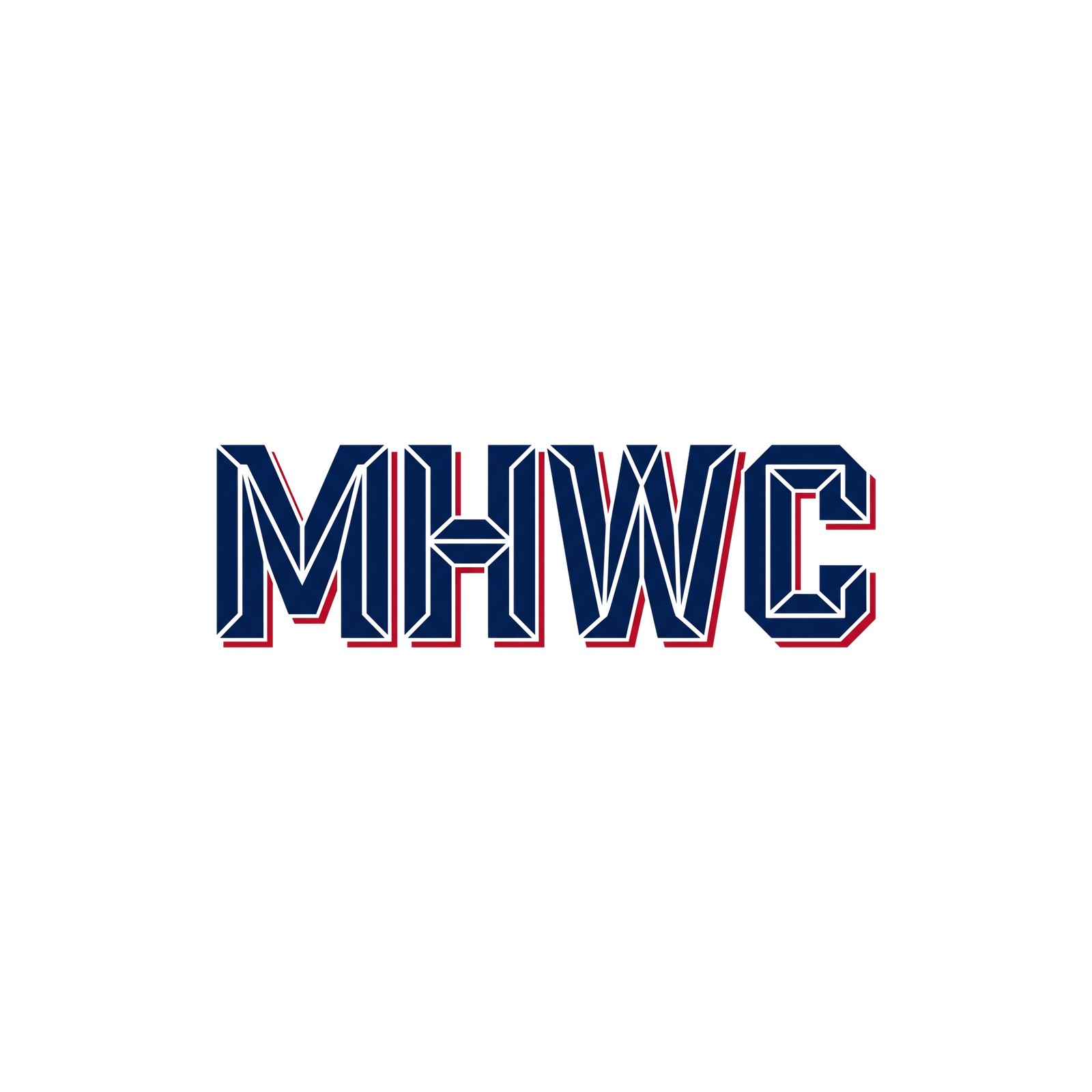
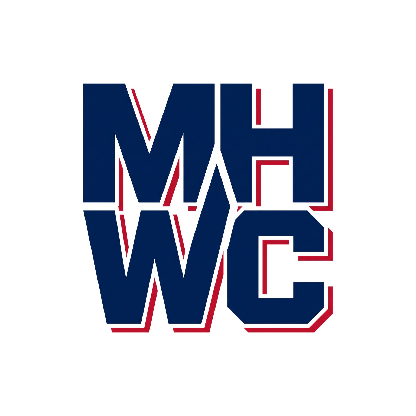




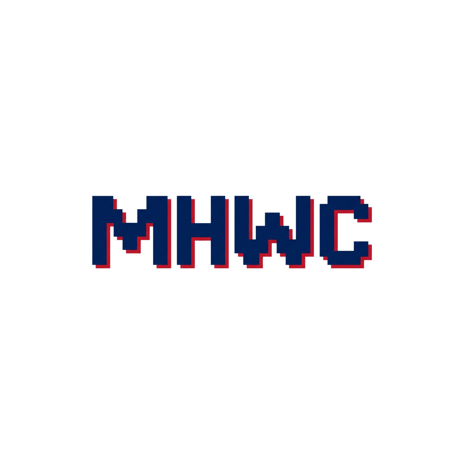
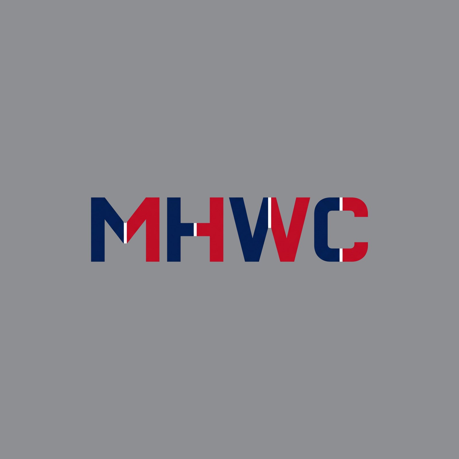
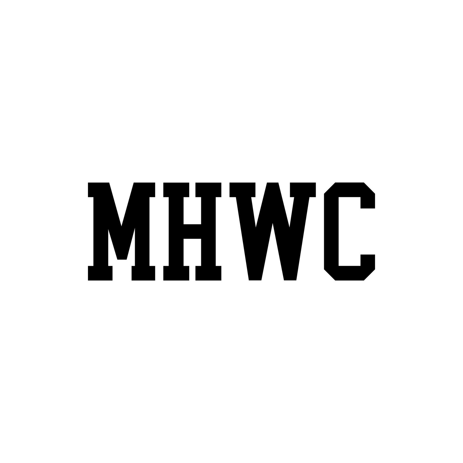
R25 MHWC Traditional — 23 traditional MHWC letterform treatments: varsity block (double outline, athletic serif, reversed jersey, arched, rounded, spurred, stacked, flat shadow, flat bevel, outline-only, on grey), collegiate slab serif (plain, inline, split), tail scripts (navy, red outlined, reversed, soft mid-century), Tuscan, western slab, condensed gothic, felt-letter flat and an interlocking monogram. No grunge.
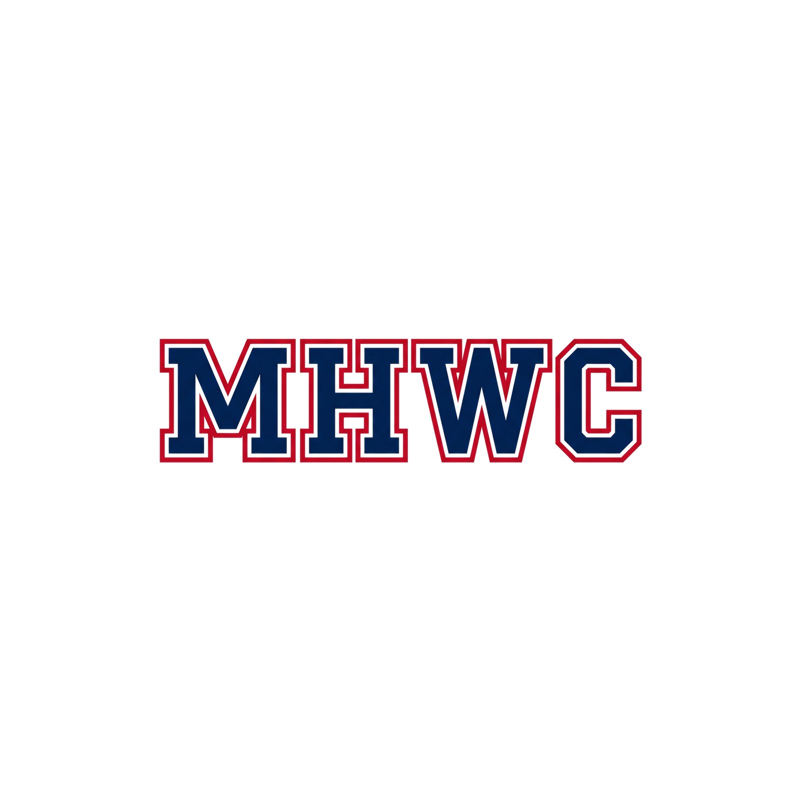
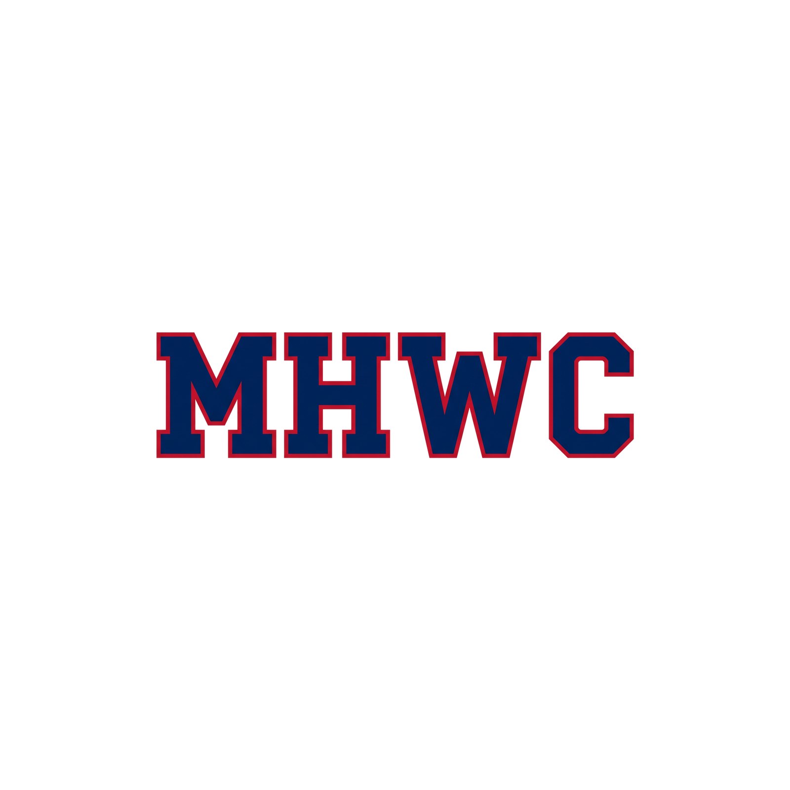
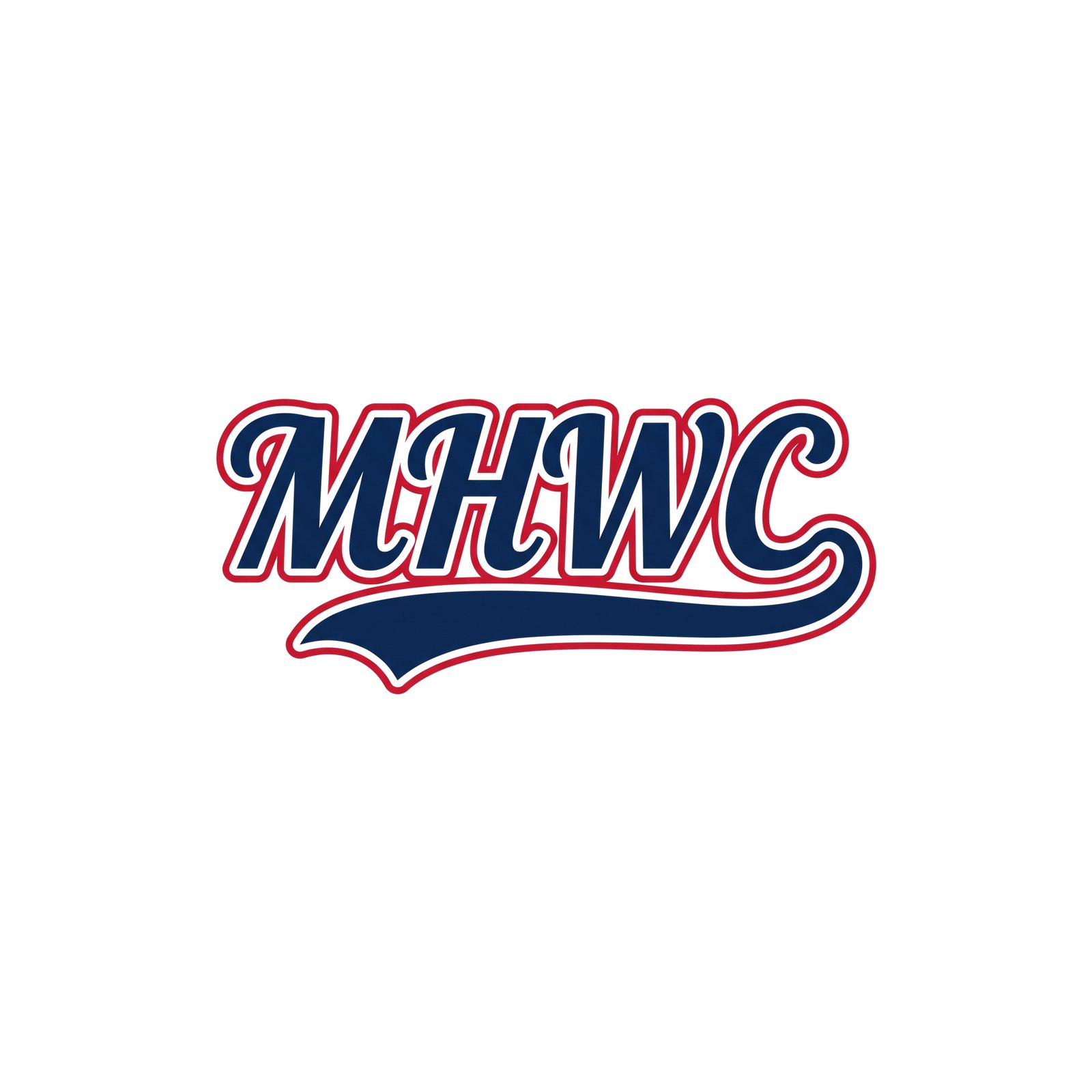
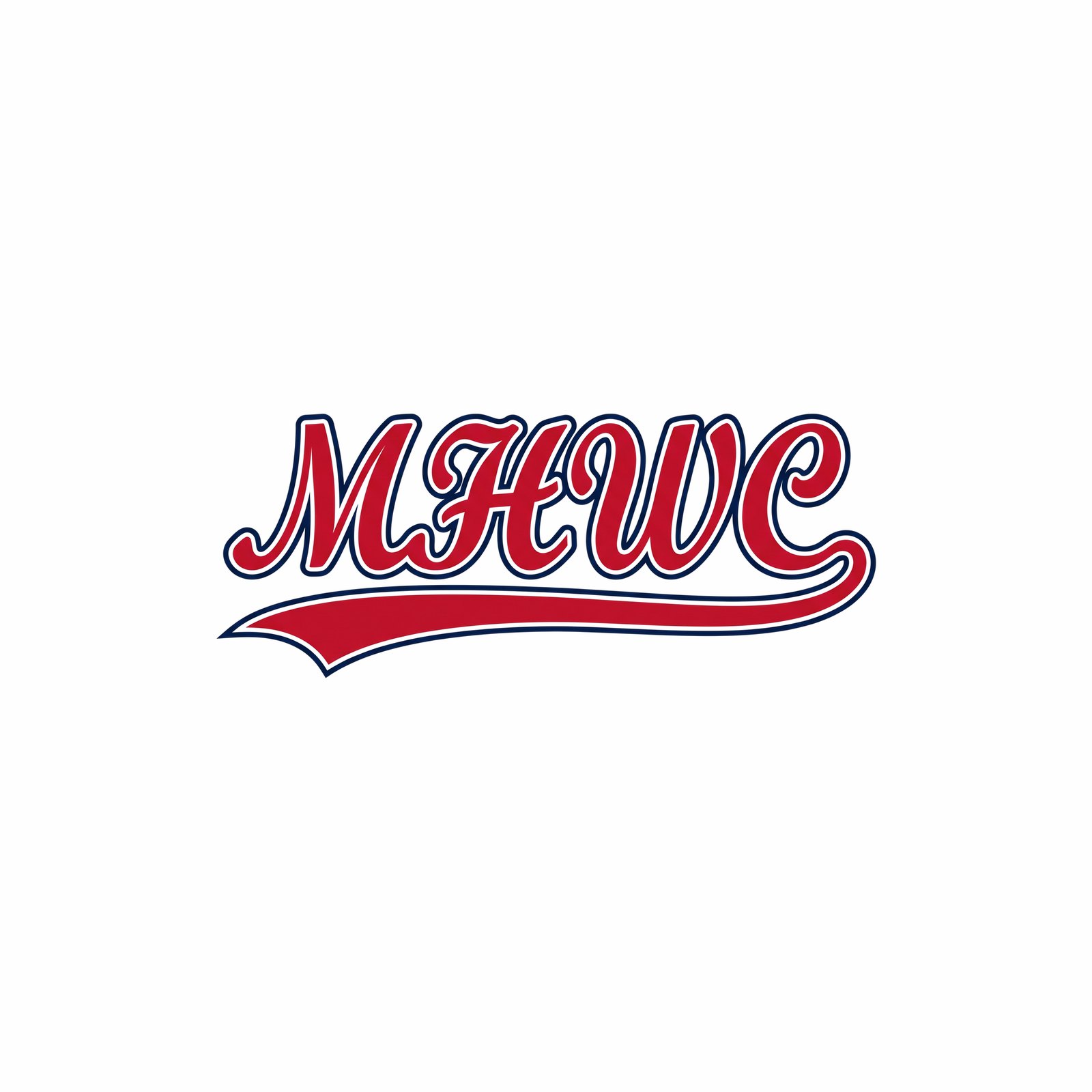
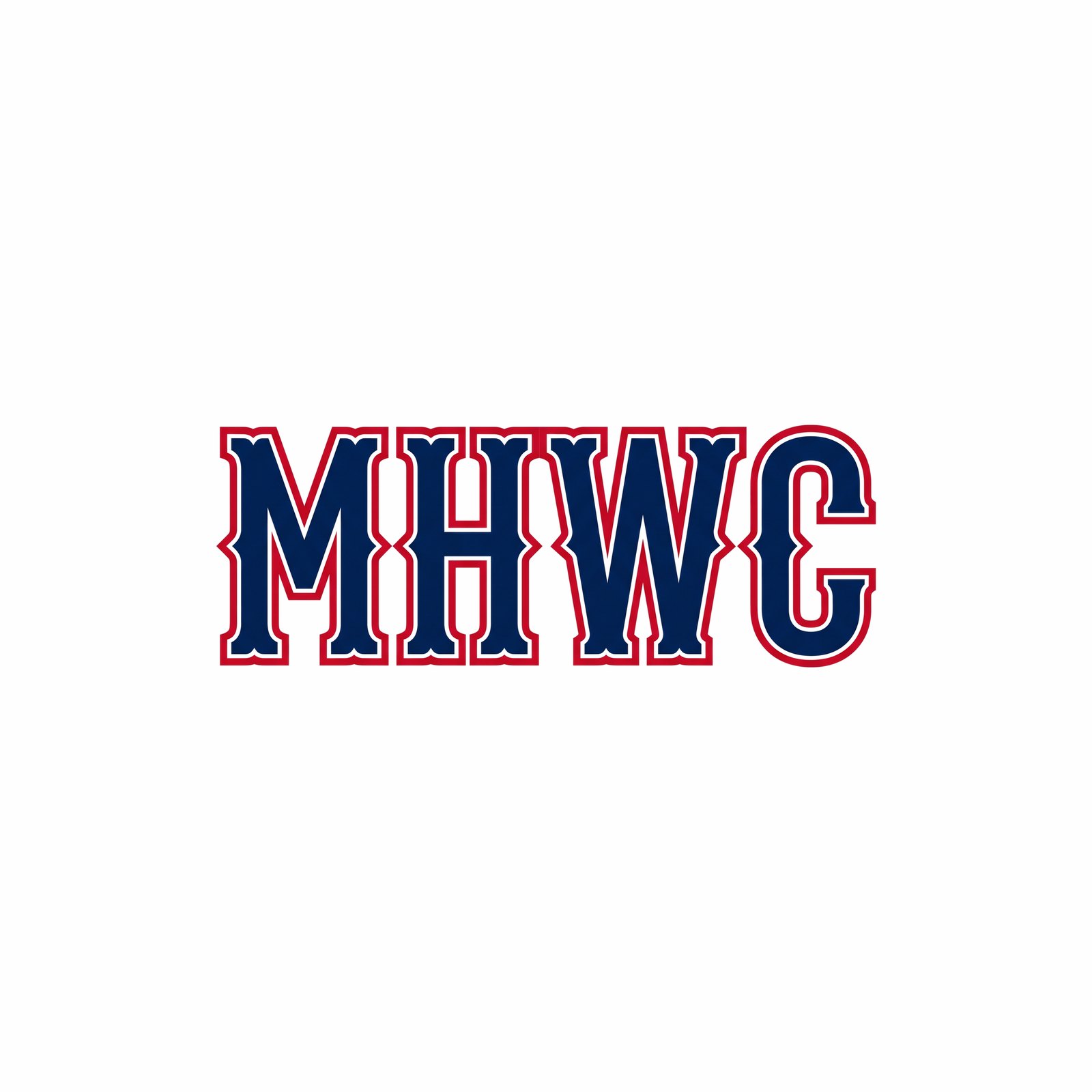
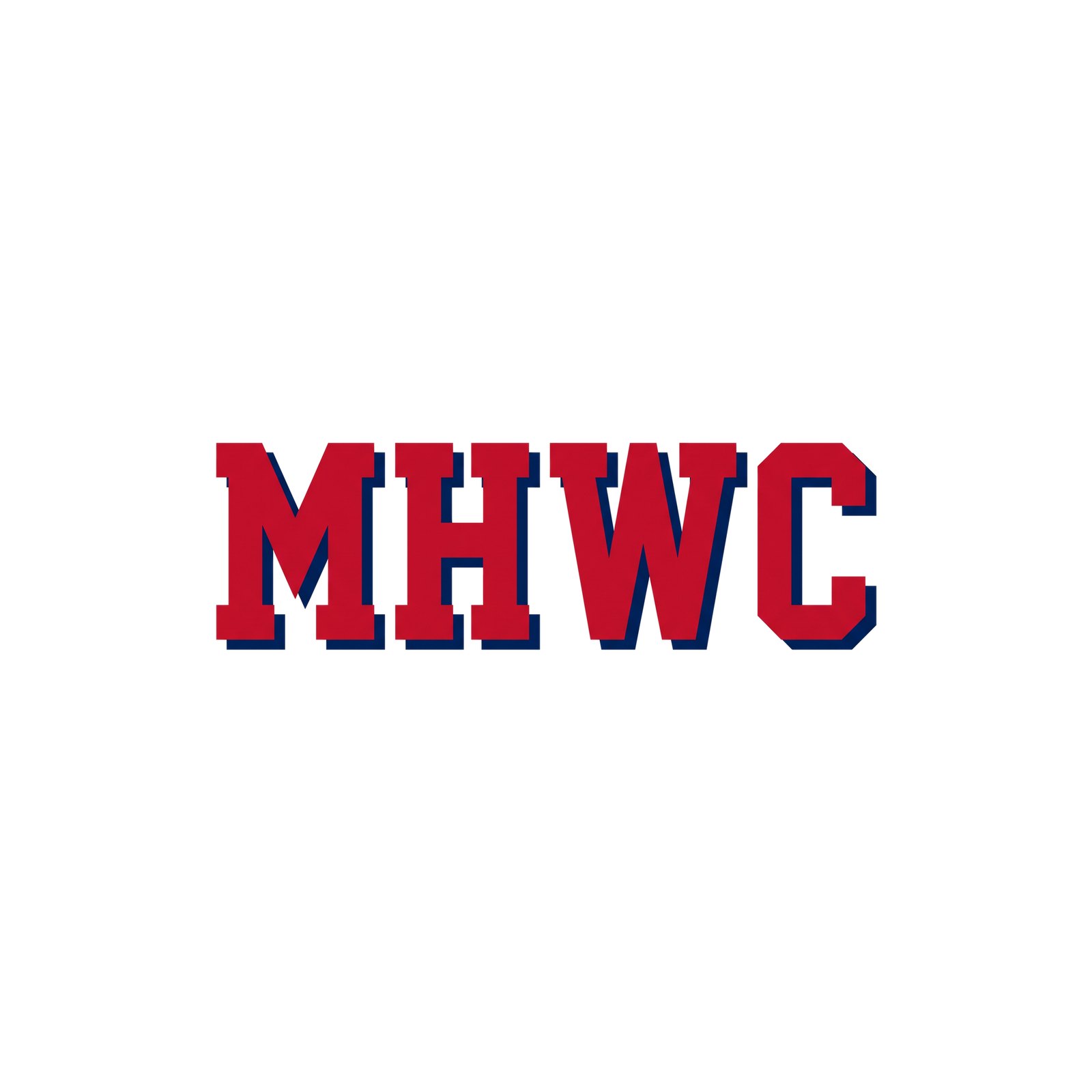
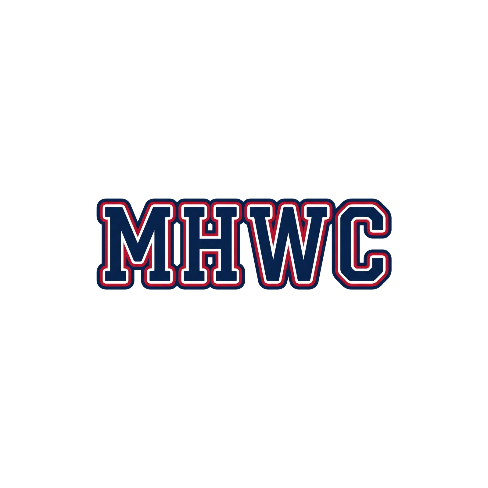
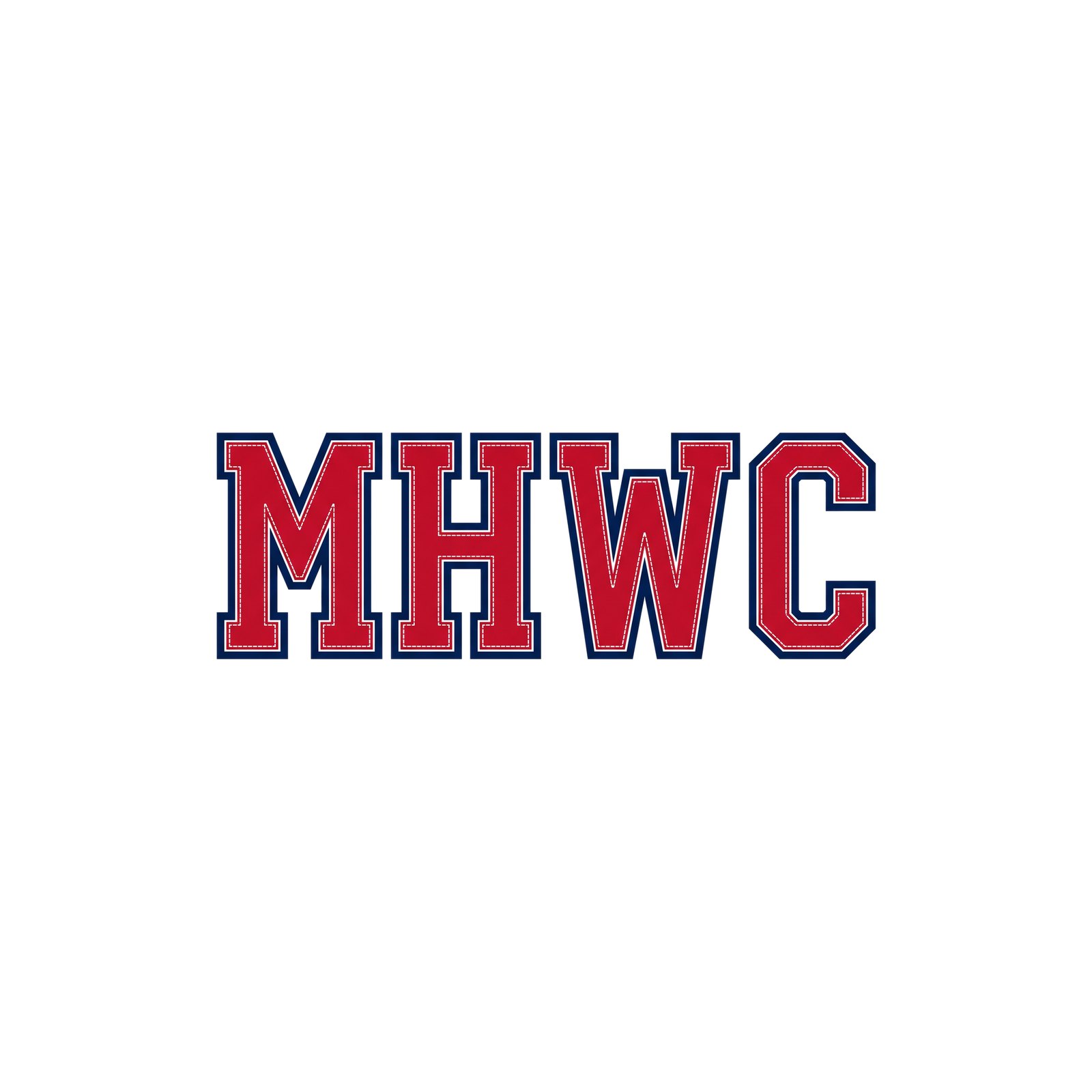
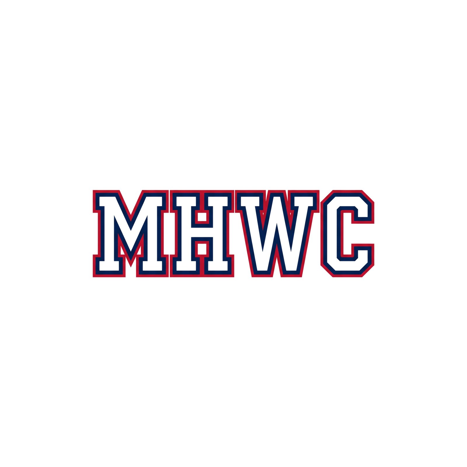
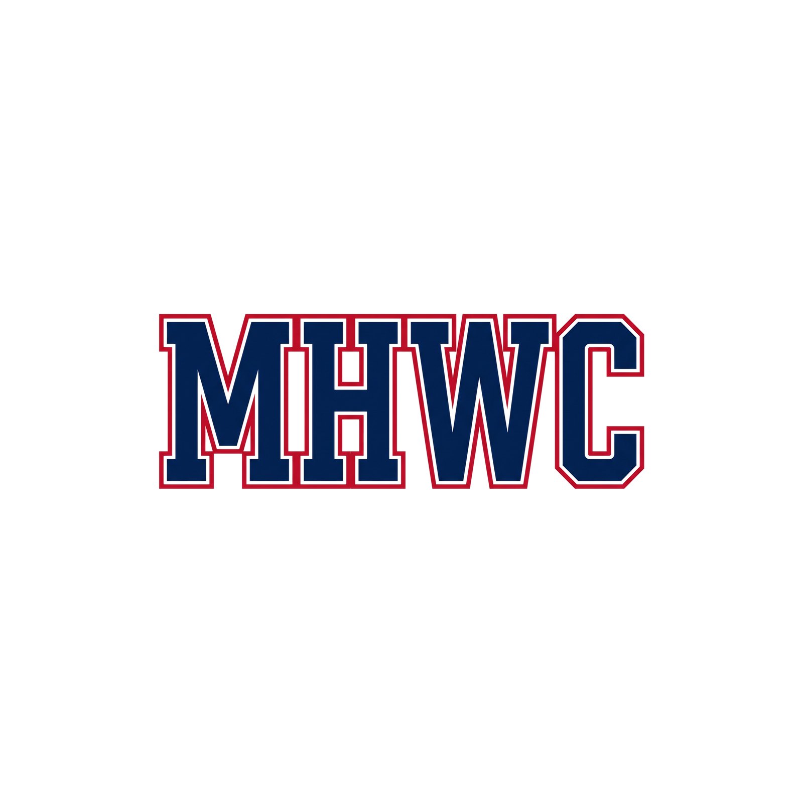
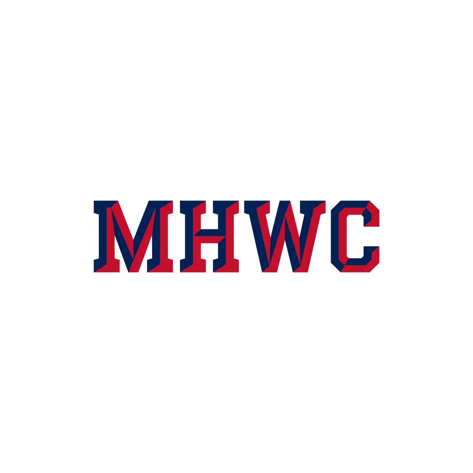
R26 MHWC Round 3 — 24 more MHWC treatments covering ground the first two rounds did not: wrestling heritage (singlet numeral block, duals-poster block, 1970s team issue, warm-up stripe, Fargo block, headgear stencil), pro-sports wordmark styles (hockey block, MLB jersey script, statement band, football block italic, racing stripe, 1990s throwback split), letters carrying the locked marks (mountain in the M, summit crown, eagle in the W, eagle over the word) and a few classics with a twist (peak cut, altitude lines, flat chrome, serif italic, outline shadow, red-bridge stencil, framed stack, swash underline). No grunge.
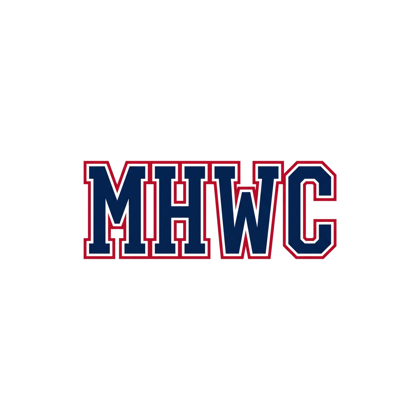
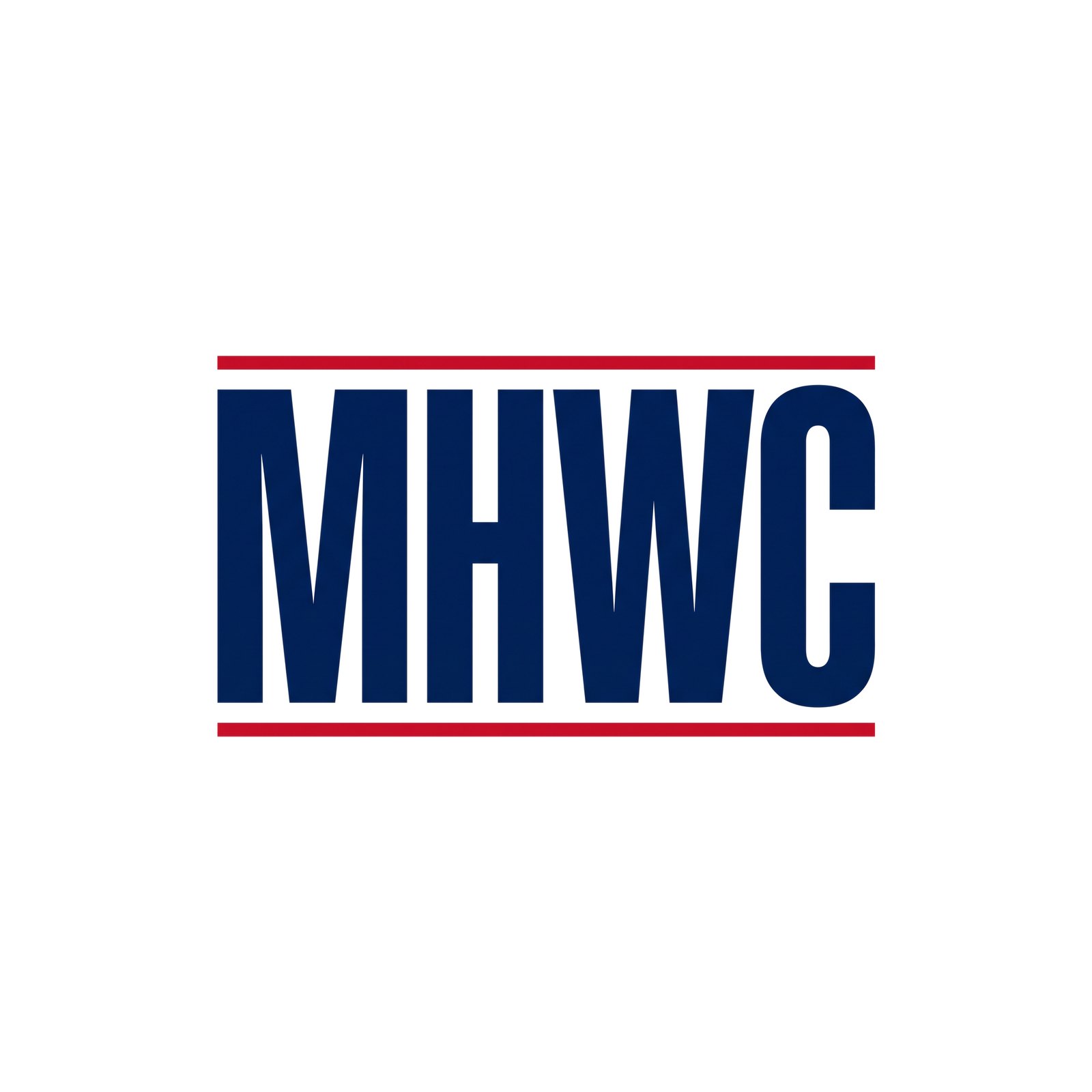
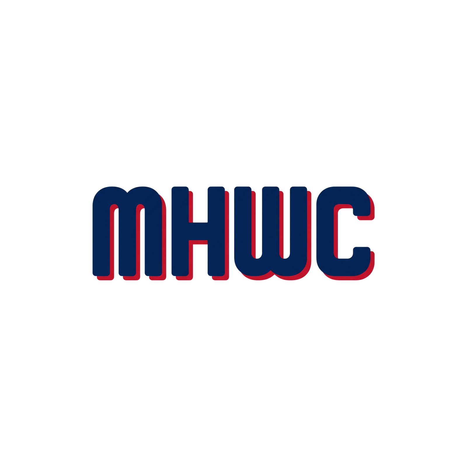
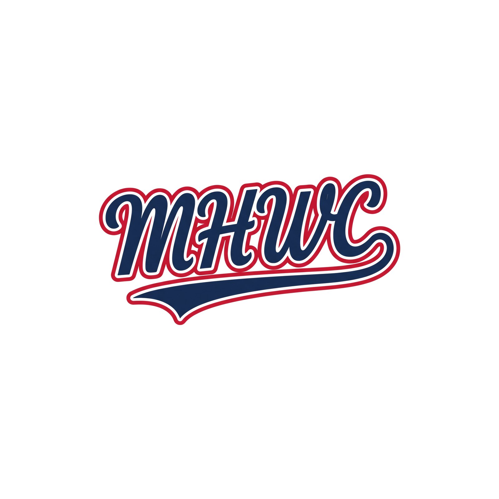

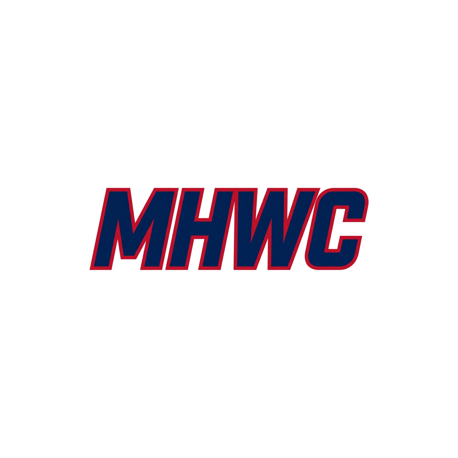
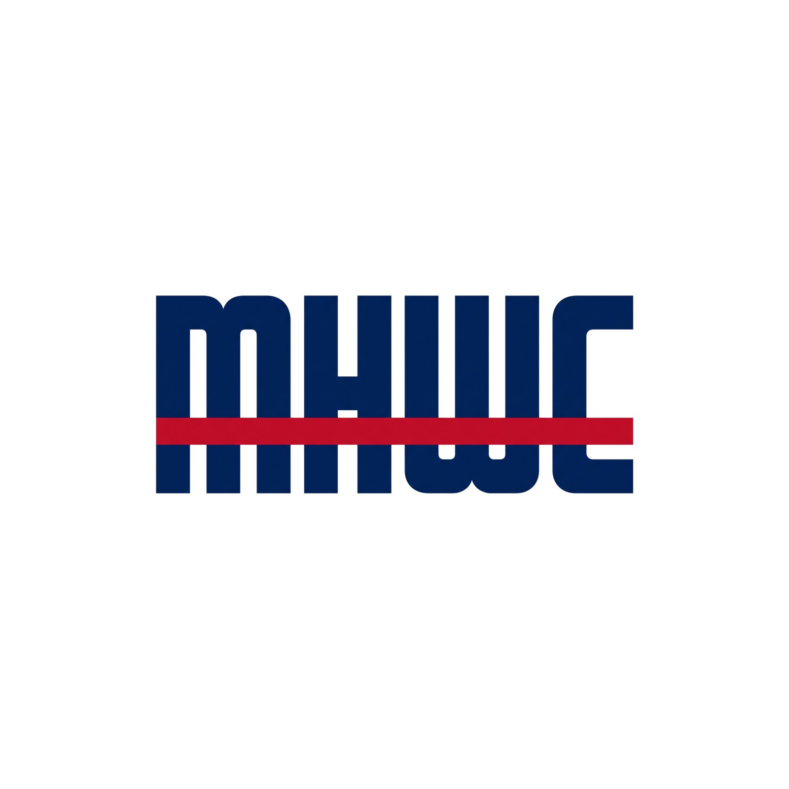
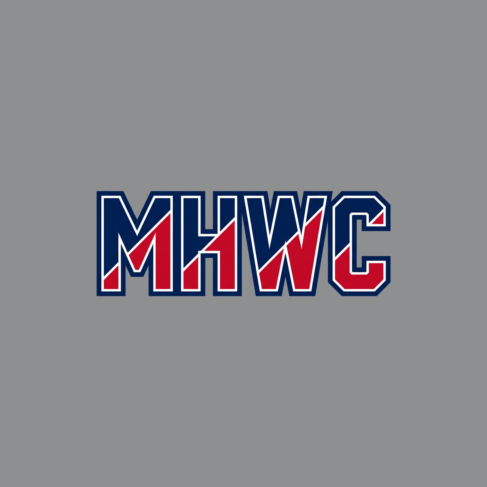
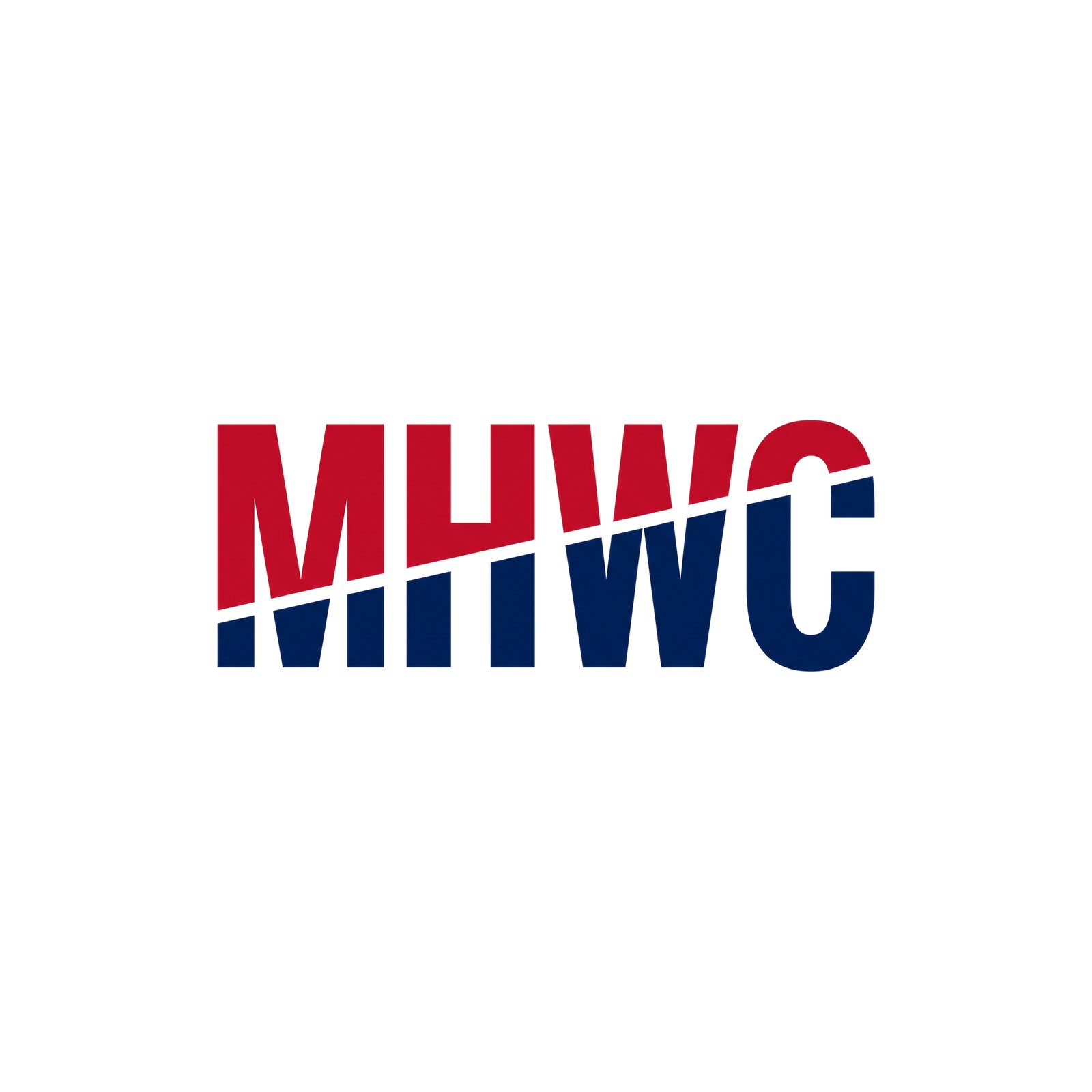
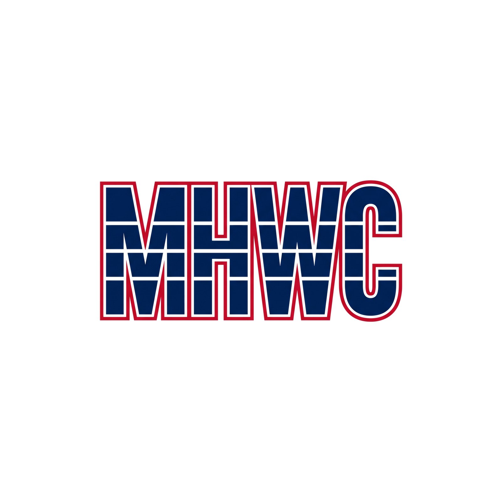
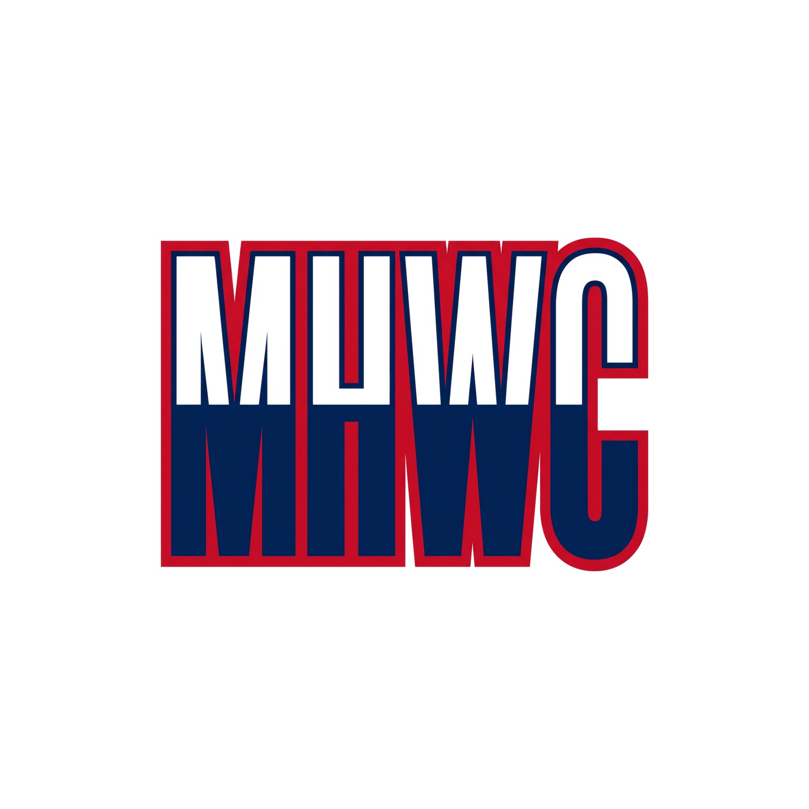
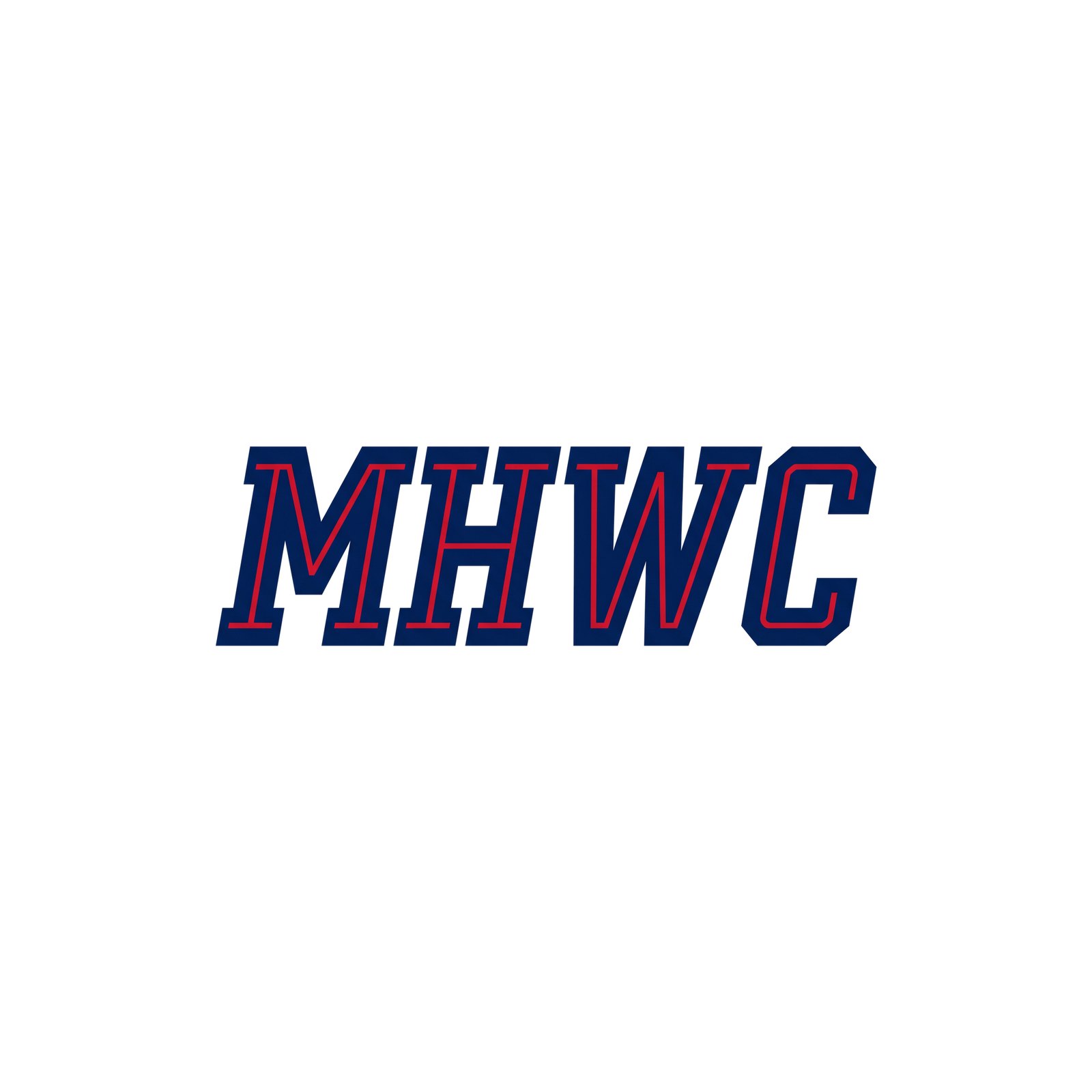

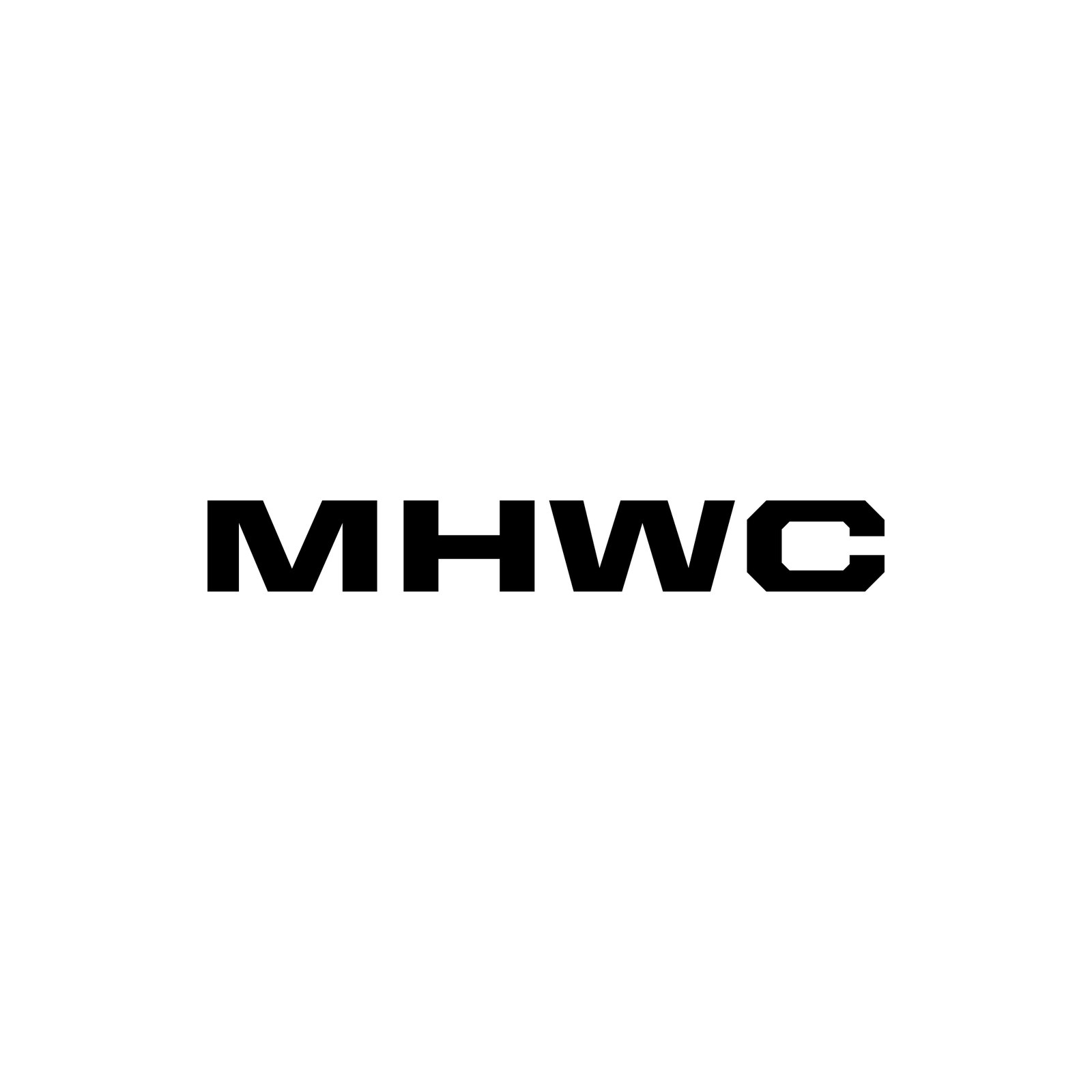
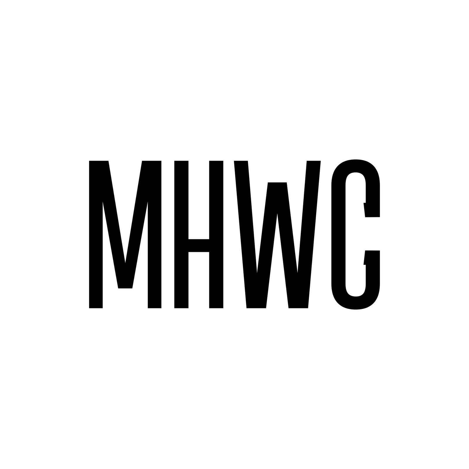
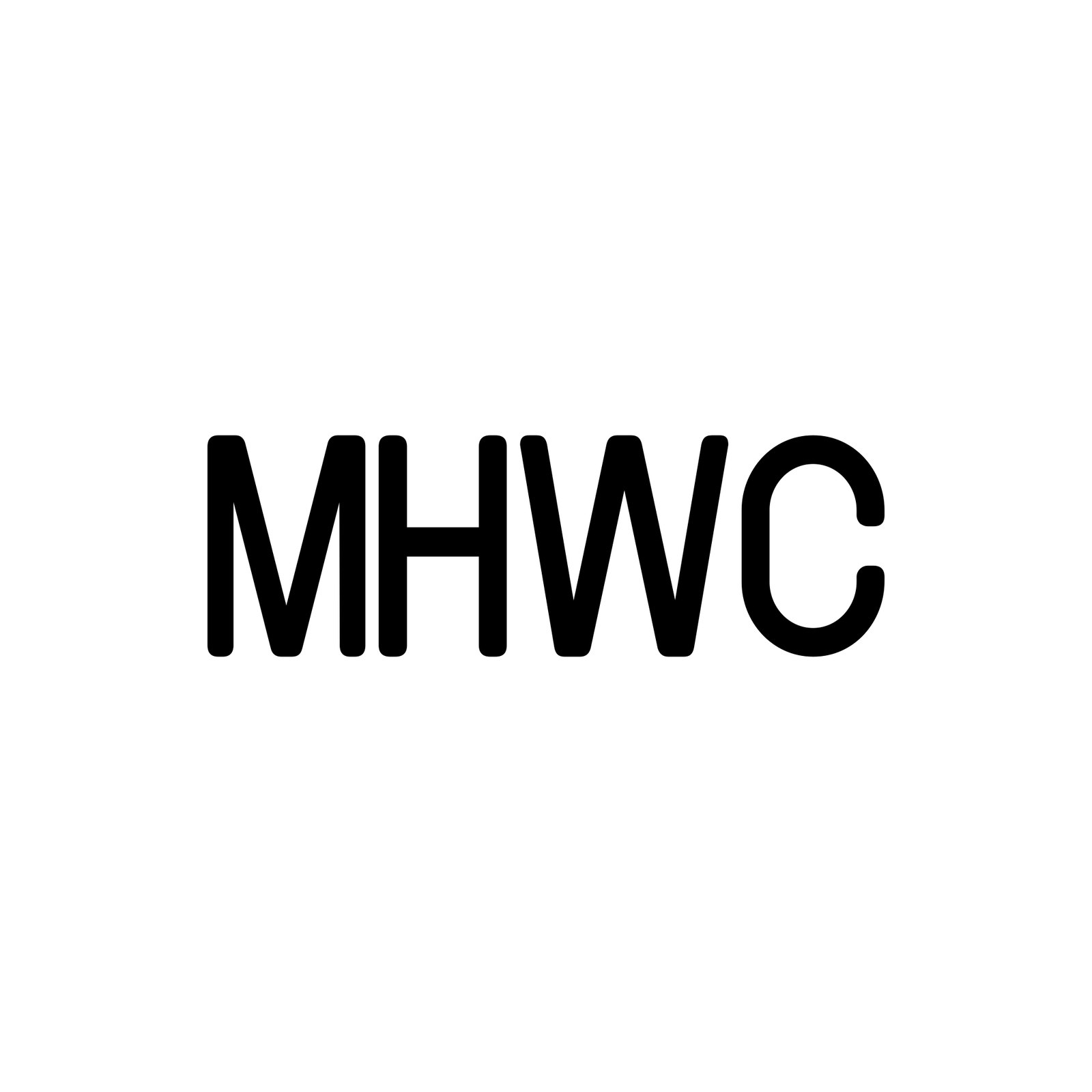
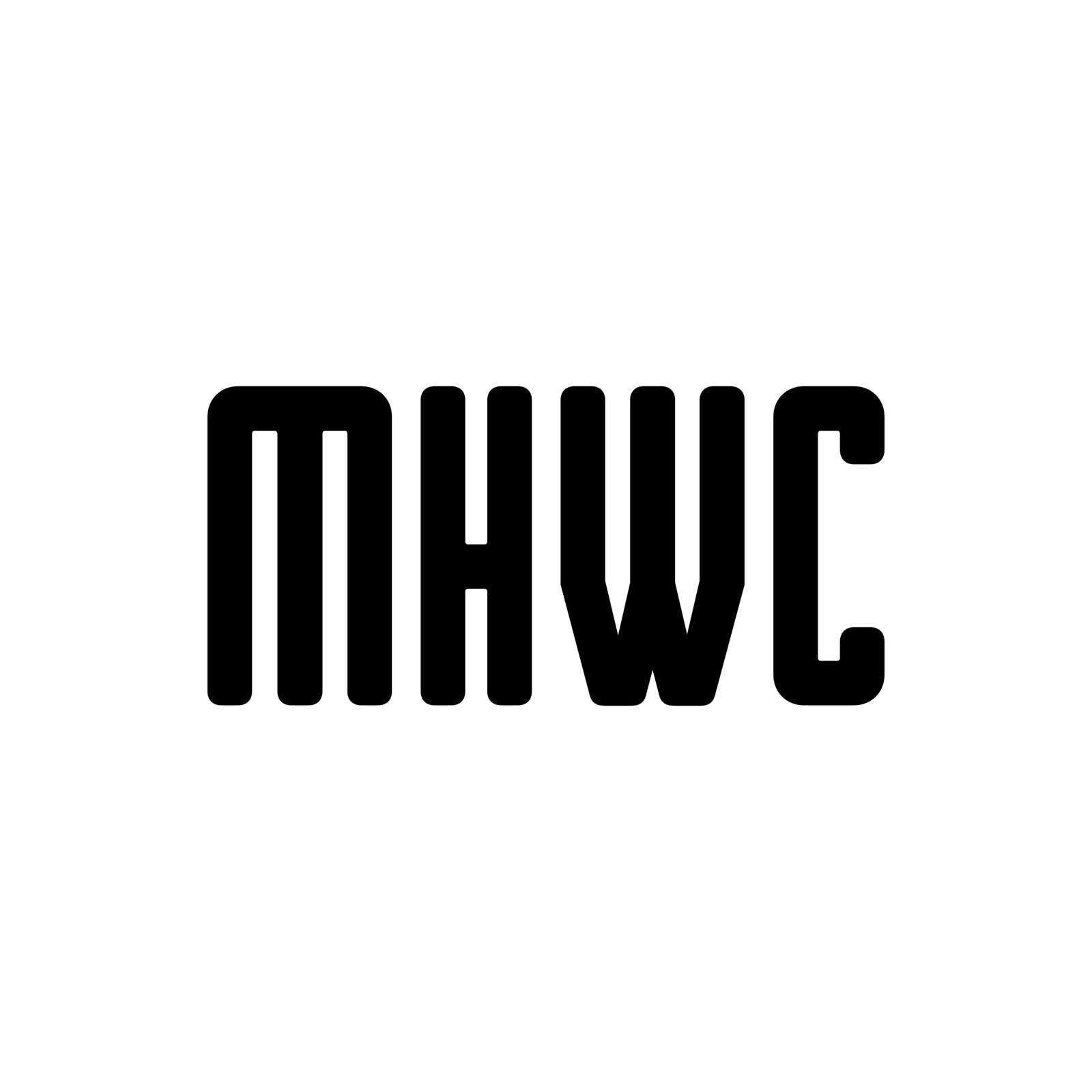
R27 MHWC Hyper Elite — MHWC in Hyper Elite Condensed (the 5280 font), black on white: the same letterforms in every take, only the treatment changes. Inline, outlines, shadows, slant, stencil and cuts, split fill, plates and frames, arch, baseline bar and ridge-cut tops. All on one line.



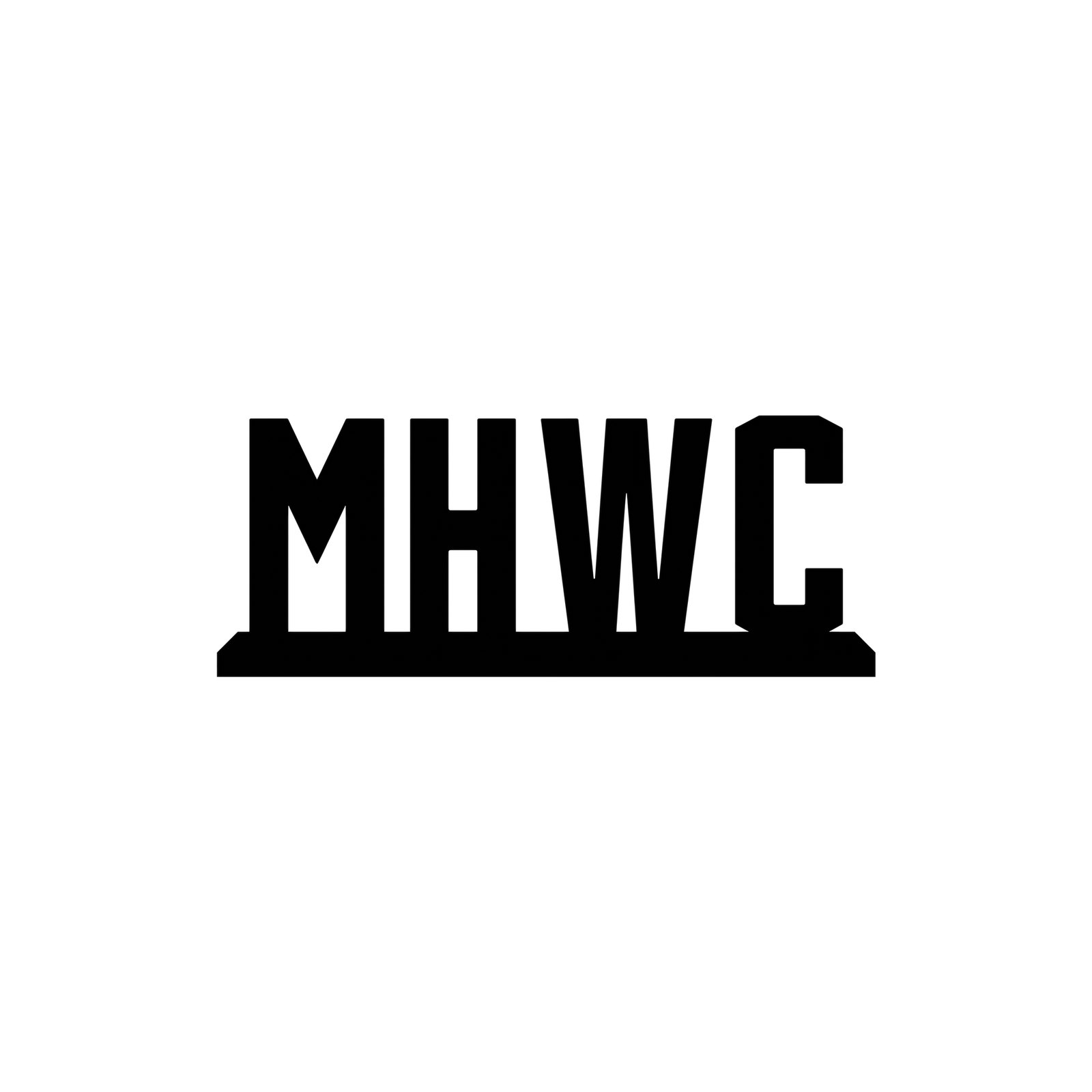
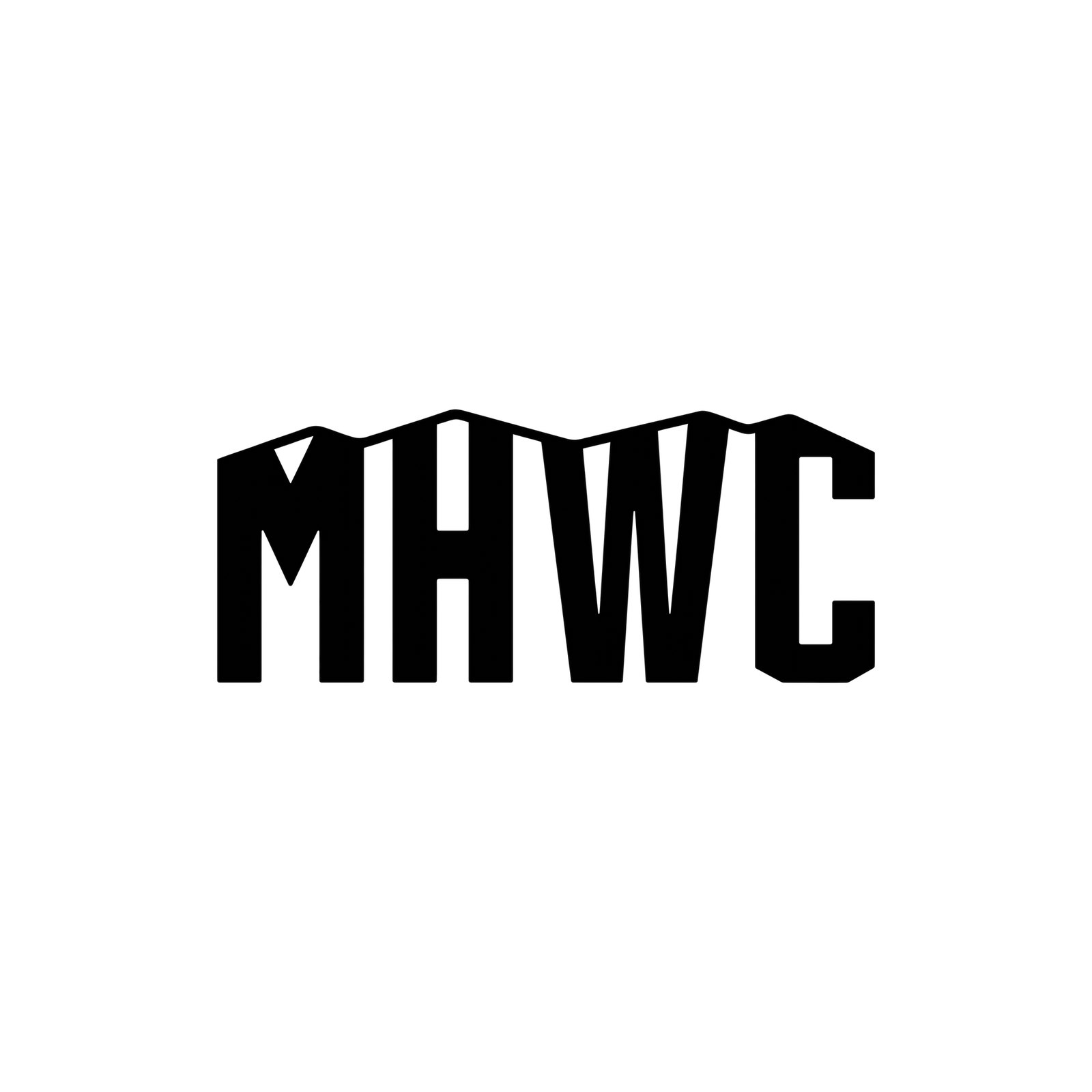
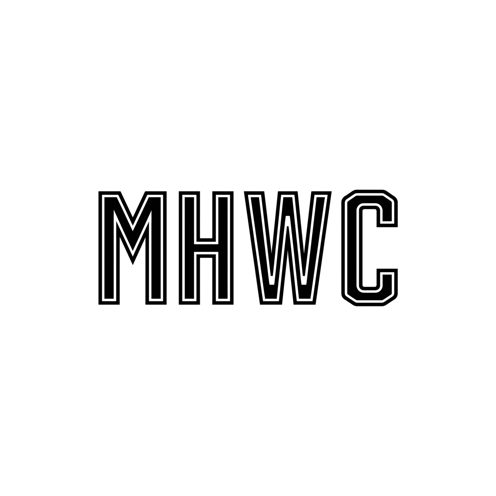
R28 MHWC Fonts — MHWC on one line in 22 different typefaces, black on white, each set straight from the font file (so every one is already a clean vector): athletic gothics and varsity blocks, the Denver Nuggets and Colorado Rockies letters, hockey and jersey blocks, extended and ultra-condensed, rounded tech and sci-fi, italics and stencils.
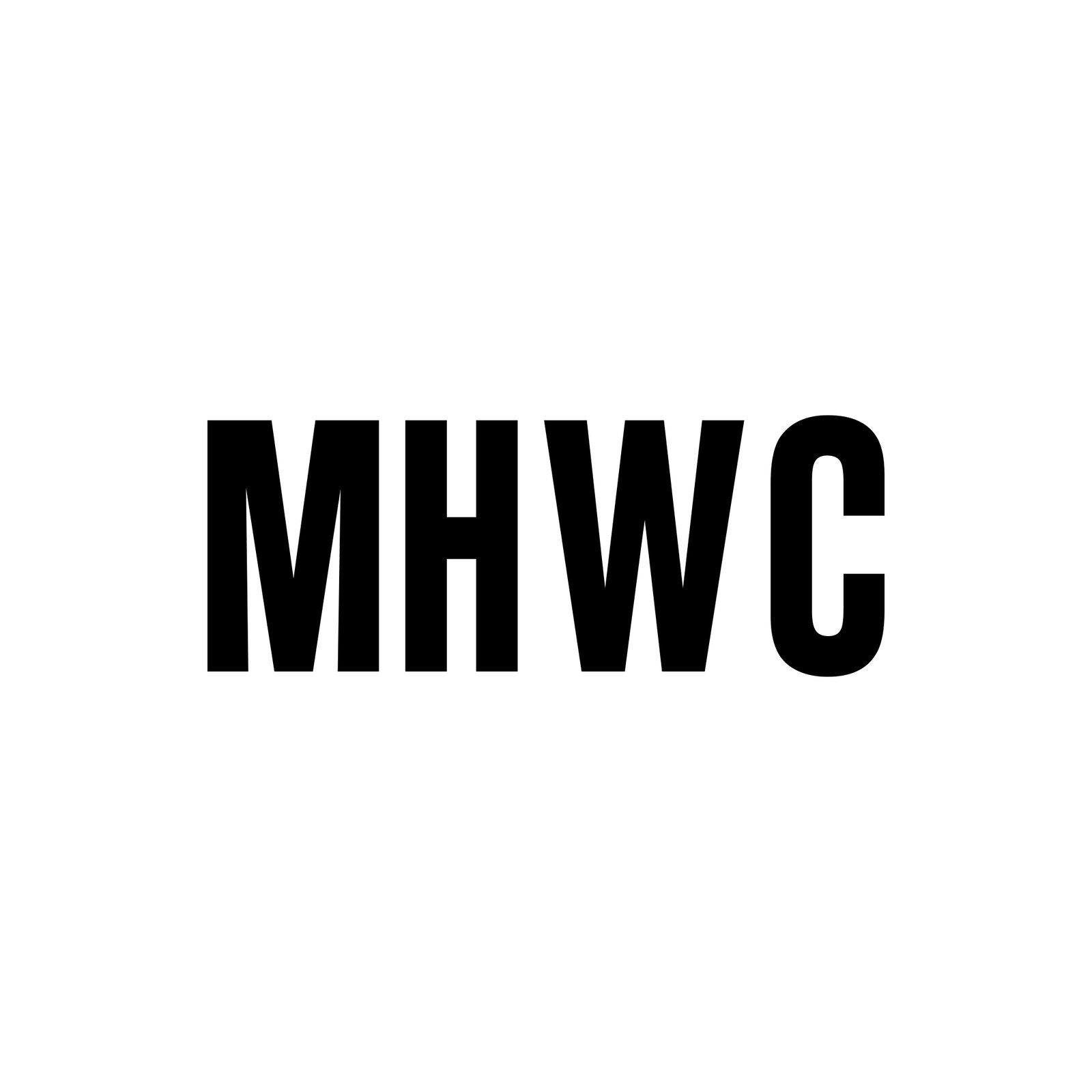
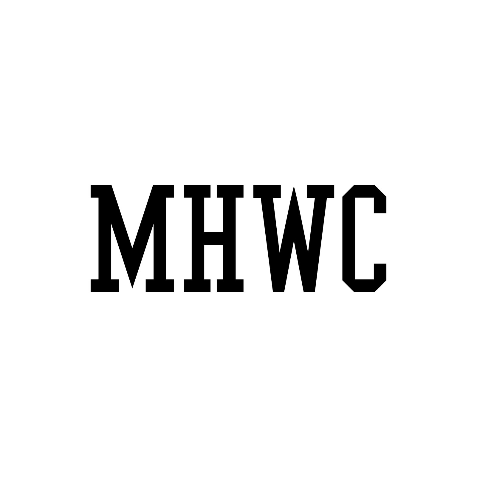
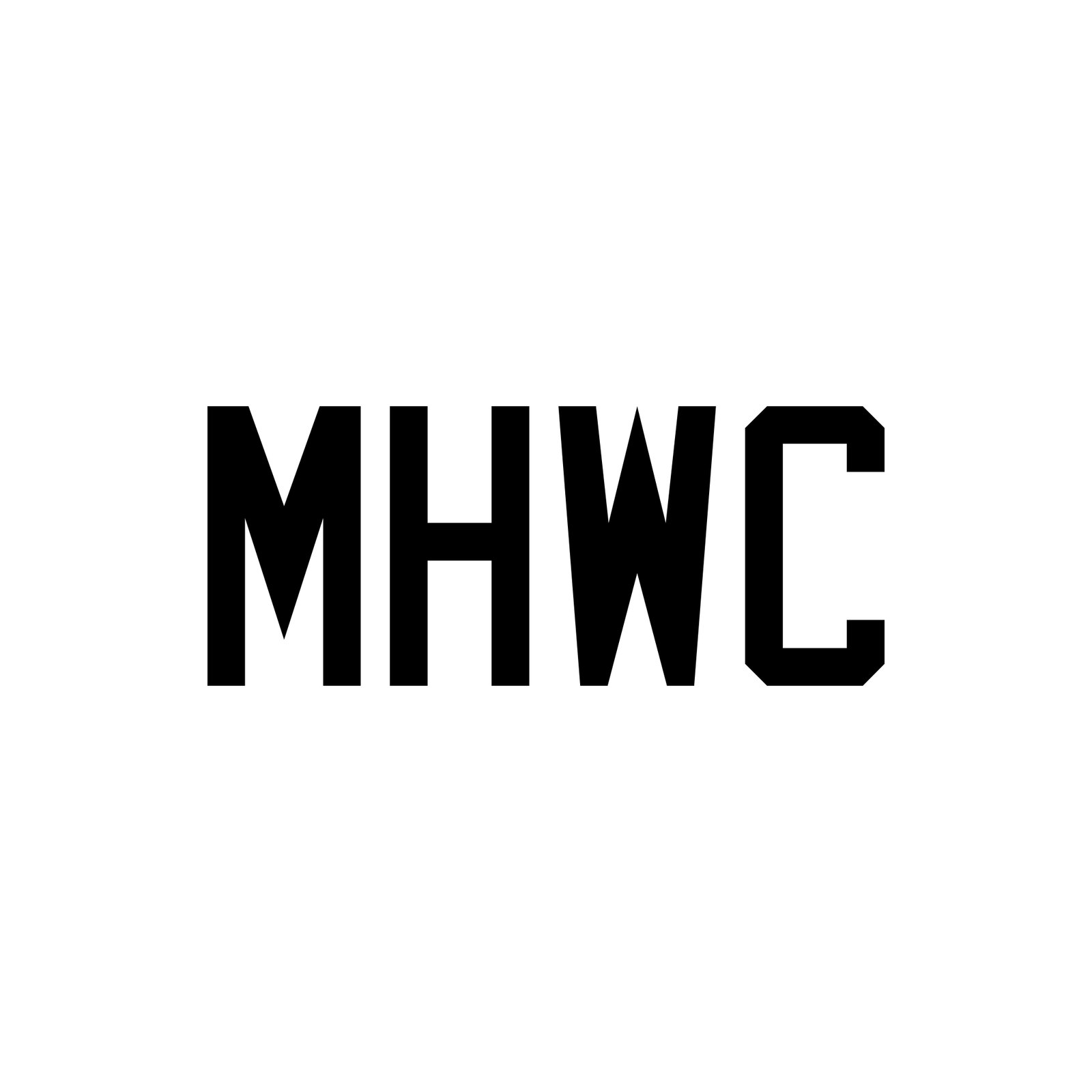
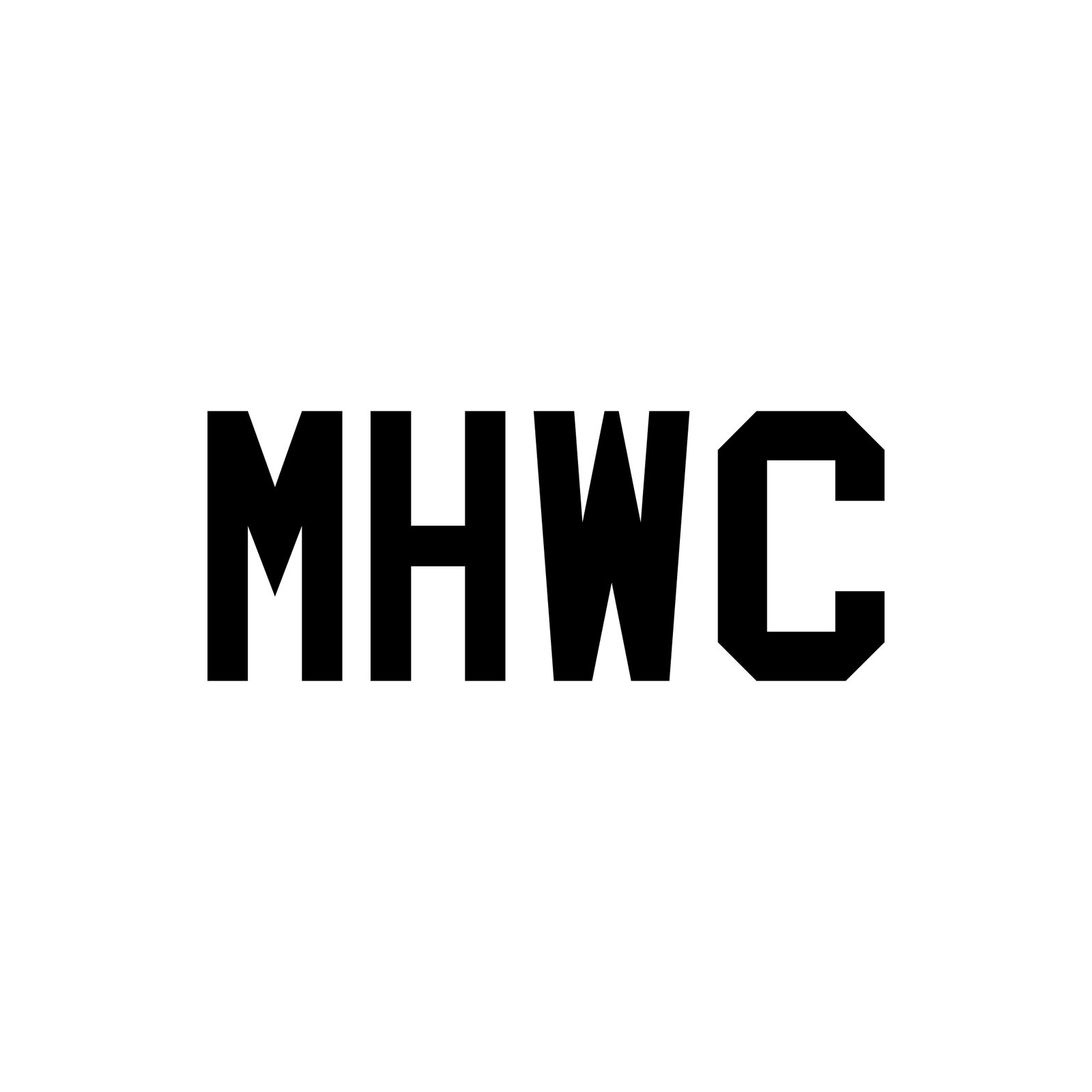
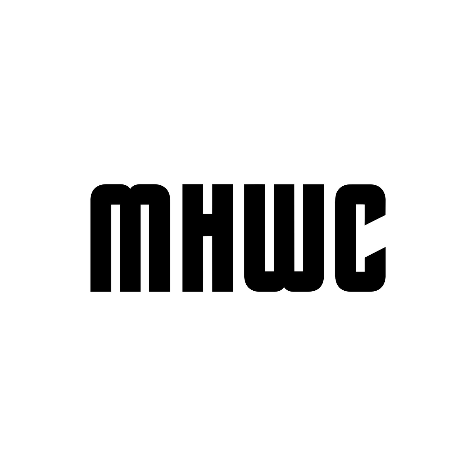
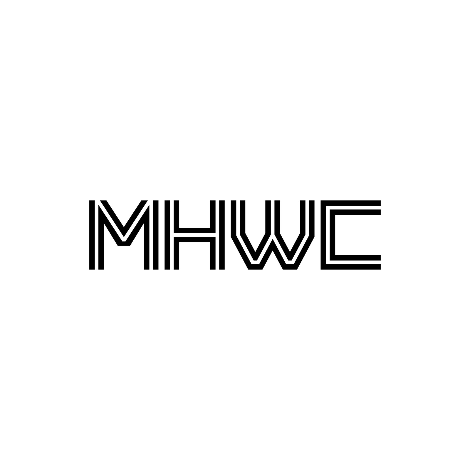
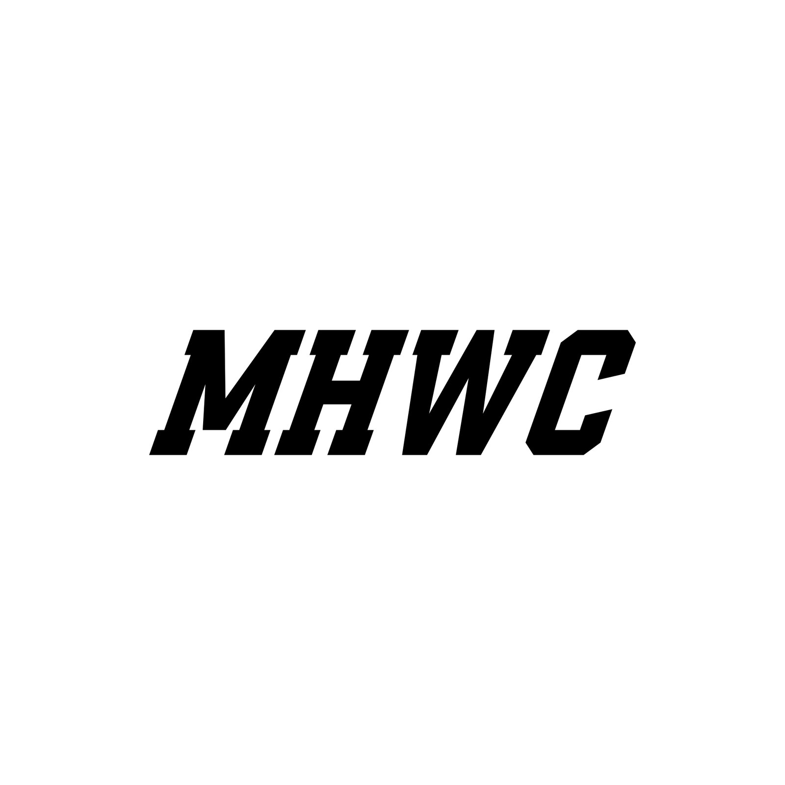
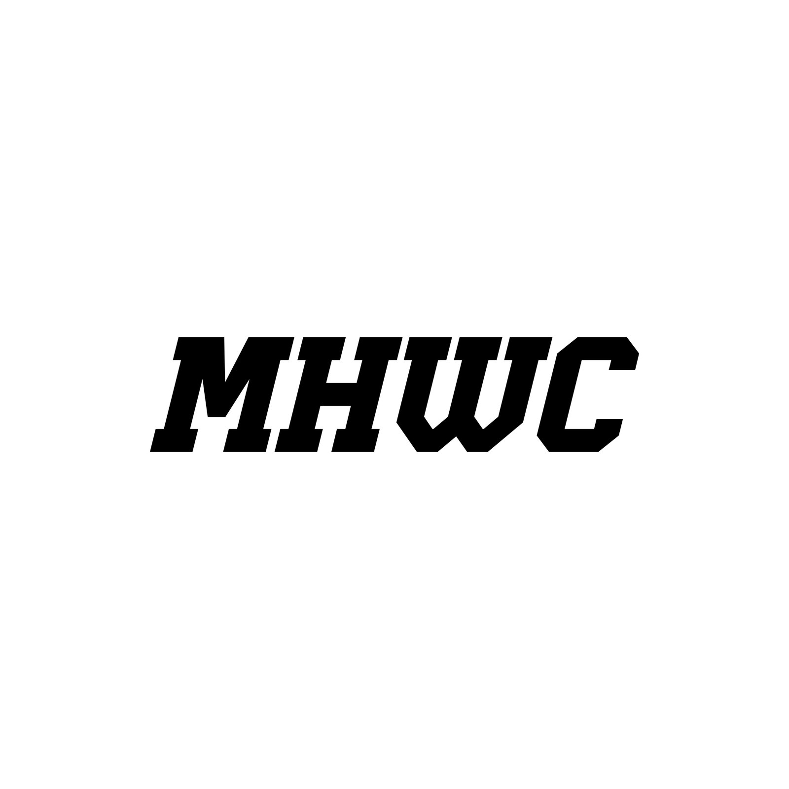
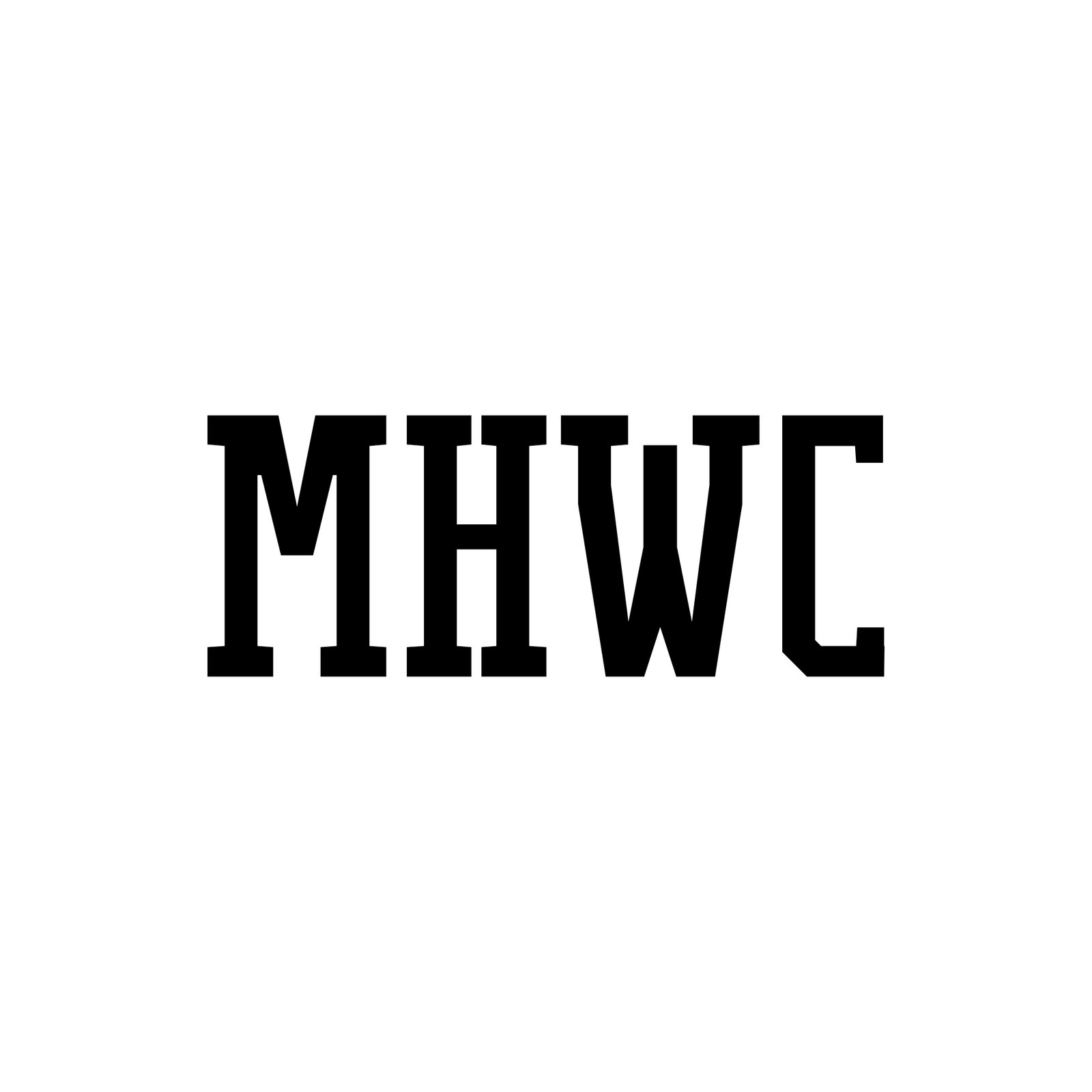

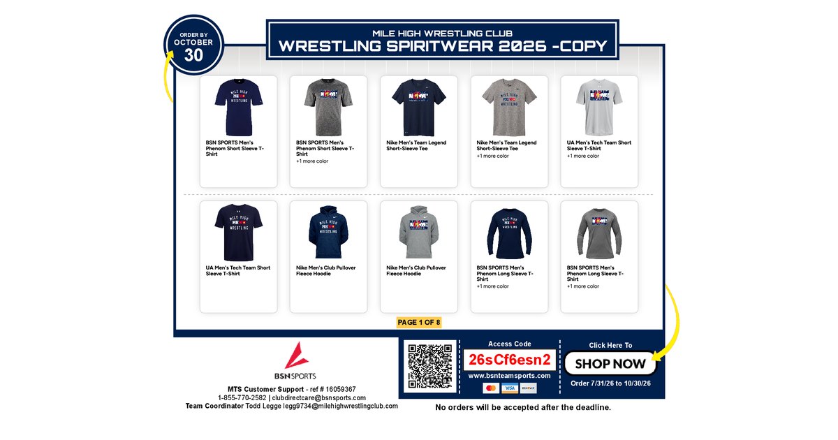
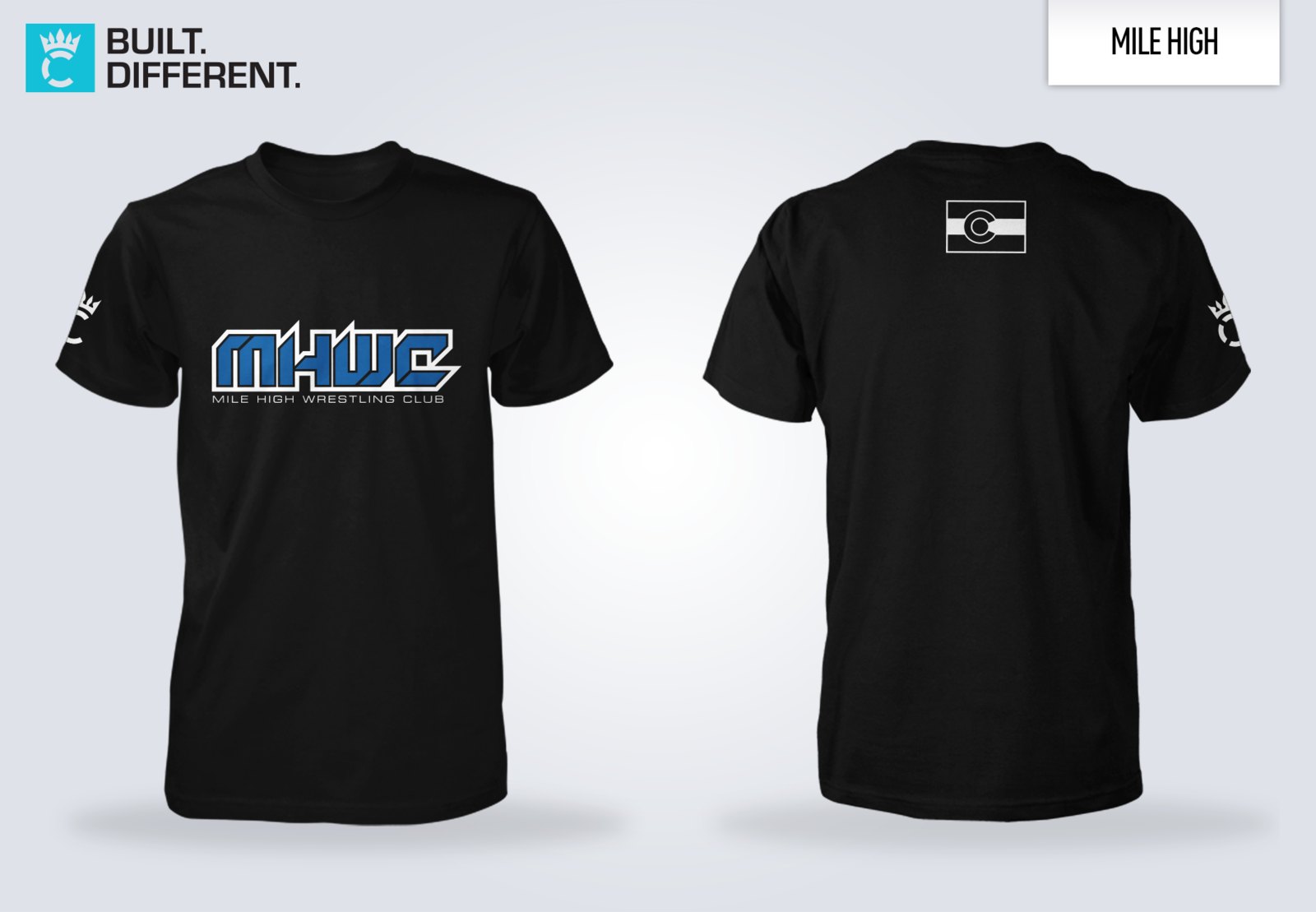
Sources — what Mile High wears today, from the files supplied and their live store. Three looks are in circulation at once; R1 picks one.
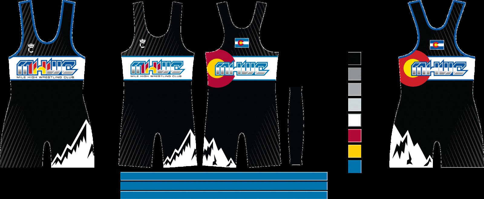
Approved — everything marked Approve, with any note. Copies: each design also stays in its own round tab. Hit Approve again on the original to take it off.
Revisions — everything flagged Revision or carrying a note, shown with the note. Edit the note on the original design.
Archive — set aside, nothing deleted. Restore puts a design back in its round.