Round 5 · 11 Aug 2026

'26 STYLE GUIDE
PPC BANNER ADS

Six paid-media concepts built to send cold and warm traffic to cmpsportswear.com/2026-style-guide and convert them into a mockup request. Round 2 rebuilds every layout against your notes — campaign imagery from the email and homepage slider, a louder "the guide is live" announcement on all six, and a CTA that actually reads as a button. All shown at 1080×1080, the master square.

Round 2 — rebuilt Master square 1080×1080 Meta · Google Display · YouTube Zero Boring → all 9 sizes shipped

WHAT CHANGED IN ROUND 2

Your notes, applied

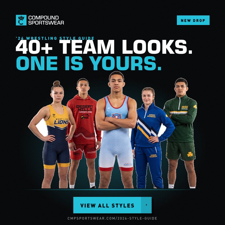
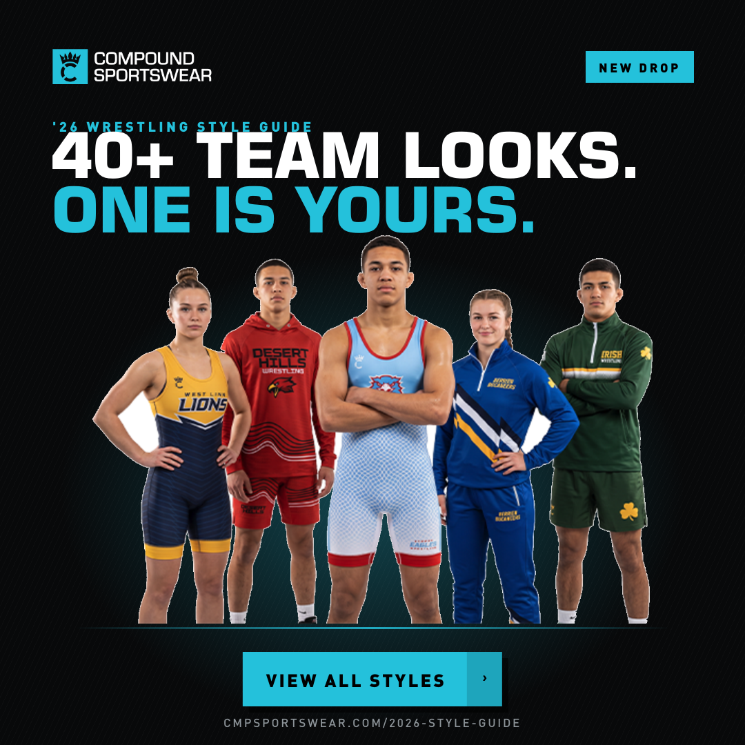
  • A now uses the five-athlete group from the email and homepage slider, and reads 40+ team looks — not "41 new," since some styles carry over. "View all styles" is a real button.
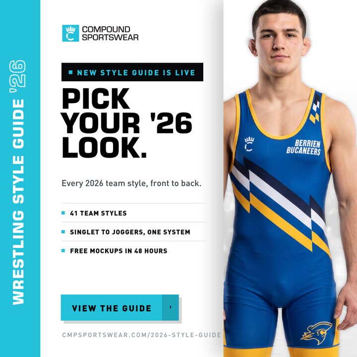
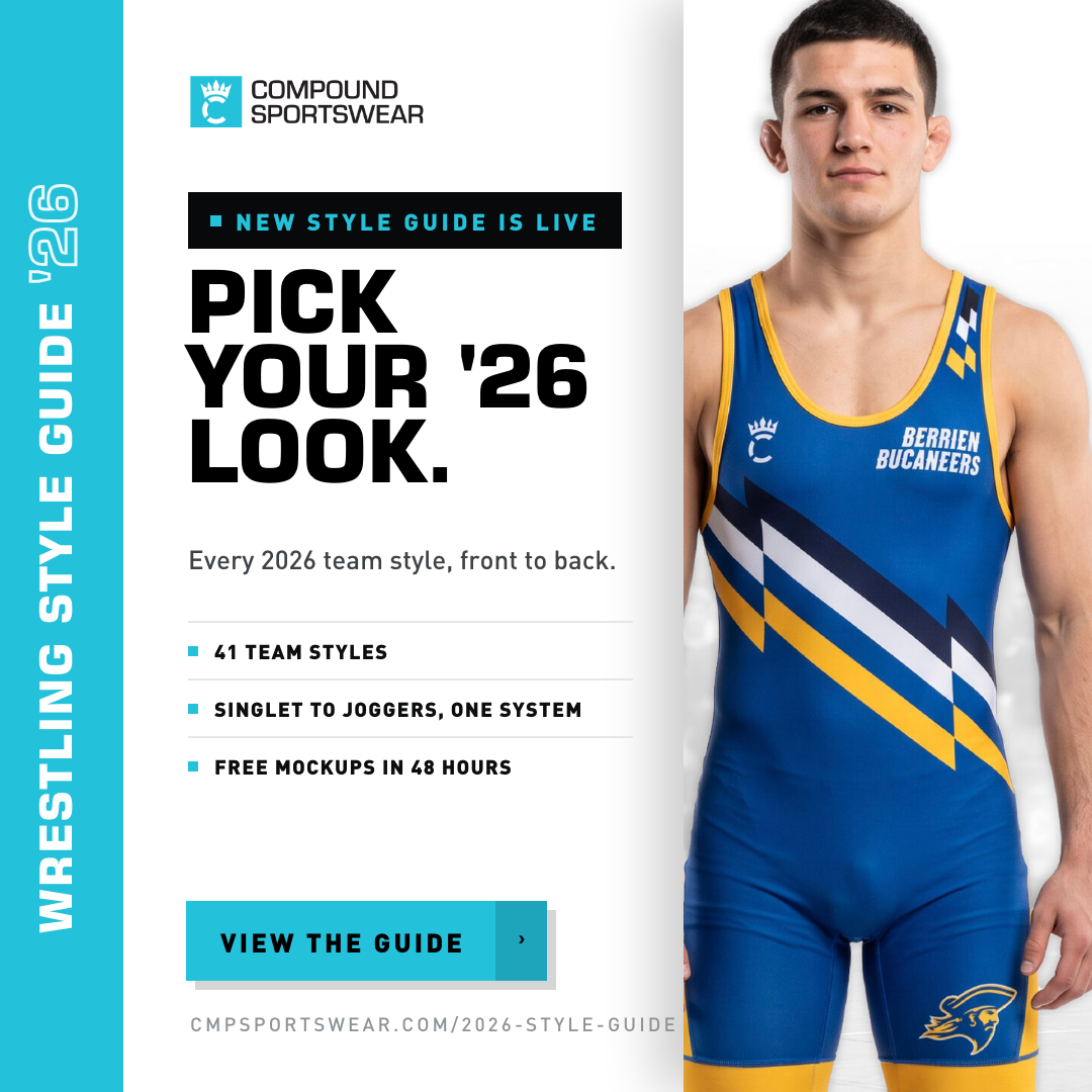
  • B puts the guide name vertically down the left edge like the slider, leads with a loud NEW STYLE GUIDE IS LIVE slab, and the 41 / 7 / 48h stat row is gone — replaced with a tight three-line benefit list.
  • C is now PICK A VIBE and is flagged as a UGC concept, not a PPC one.
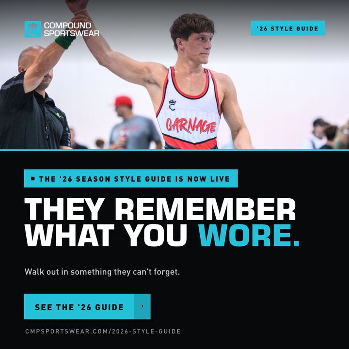
  • D headline is bigger and spans the full width; a "'26 season style guide is now live" slab sits above it, and everything breathes. Ready for your better photo.
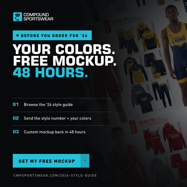
  • E uses the angled style-guide grid fading to black right-to-left from the email, and the dead space between the 01/02/03 and the CTA is closed up.
  • F wall now has equal vertical and horizontal gaps — no more black bands between rows — and the launch announcement is a teal slab across the top of the panel.

THE SIX

Three jobs across the funnel: stop the scroll (A, D), explain the offer (B, F), close the lead (E). C is the social/UGC play. Running one from each row beats running six of the same kind.

Concept A — The Lineup
CMPSW_26SG_A_1080PNG  ·  Layered PSD
CONCEPT A

The Lineup

Cold traffic · Meta feed · Google Display · Best all-rounder
Headline
40+ team looks. One is yours.
Round 2
Swapped to the five-athlete group from the email / homepage slider — men and women, singlet through quarter-zip. "'26 Wrestling Style Guide" now sits tight above the headline, "New Drop" holds the top-right corner, and the CTA is a proper teal button with a hard shadow.
Why it works
It answers the only question a coach has — "will my school look good in this?" — before he reads a word. Same faces as the site and the email, so the whole campaign looks like one thing.
Wording
"40+ team looks" instead of "41 new looks," since not every style is new this year.
AwarenessRetargetingSearch partner
Concept B — The Drop
CMPSW_26SG_B_1080PNG  ·  Layered PSD
CONCEPT B

Pick Your '26 Look

Launch week · All placements · The announcement ad
Headline
New style guide is live — Pick your '26 look.
Round 2
Guide name runs top to bottom down a teal edge tile, exactly like the homepage slider. The announcement is now a black slab in teal caps instead of a small kicker. The 41 / 7 / 48h number row is gone — three short benefit lines carry it instead, and the cover art is cropped to the athlete so the type doesn't fight itself.
Why it works
The only light ad in the set, so it stands out in a dark feed. The click and the landing page look like the same object — the cleanest scent trail of the six.
Doubles as
Email header and website banner with a straight crop.
PSD detail
Broken out further than the rest: the teal edge tile, the announcement bar, the three feature rules and the CTA button are each their own layer, and the sideways guide name is live rotated type — only the outlined '26 stays as art.
Launch weekEmail headerEvergreen
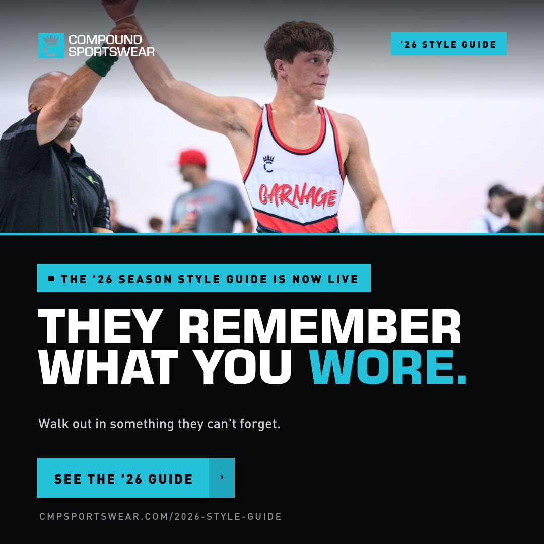
Concept D — They Remember What You Wore
CMPSW_26SG_D_1080PNG  ·  Layered PSD
CONCEPT D

They Remember What You Wore

Cold traffic · Feed + Display · The emotional one
Headline
They remember what you wore.
Round 2
Headline up to two full-width lines, a "'26 season style guide is now live" slab above it, and real air between every element. Photo band tightened to make room.
Why it works
The only concept that leads with a moment instead of product — no wash, no duotone over it. The line reframes teamwear as part of the memory, which is the argument that gets a booster club to spend more.
Waiting on
Your better photo — it drops straight into the band, no layout change.
ProspectingNew photo pendingYouTube companion
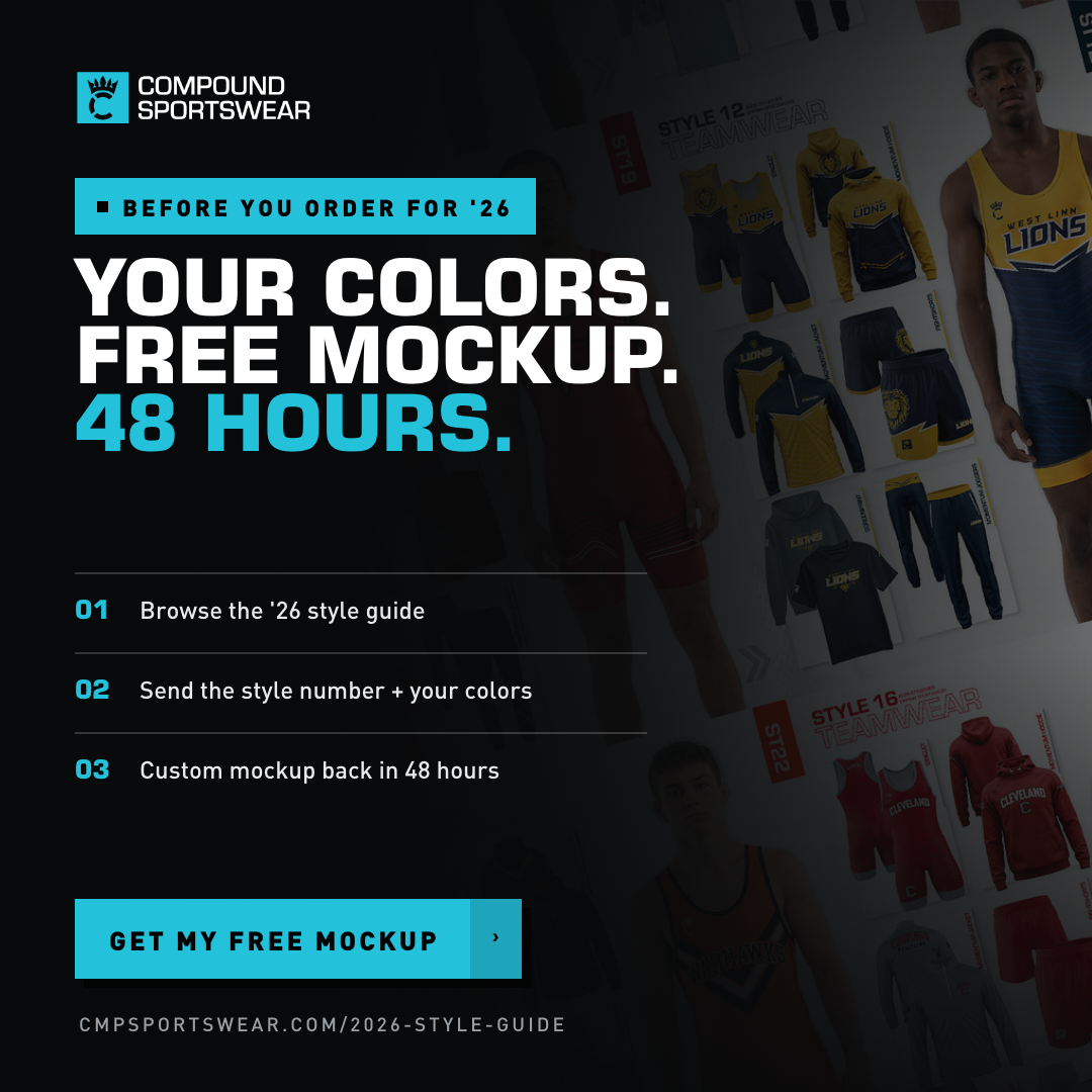
Concept E — Free Mockup
CMPSW_26SG_E_1080PNG  ·  Layered PSD
CONCEPT E

Your Colors. Free Mockup.

Retargeting · Everyone who saw the guide · The lead ad
Headline
Your colors. Free mockup. 48 hours.
Round 2
Background is now the angled style-guide grid from the email campaign, gradating to black right to left. The 01/02/03 block moved down and opened up, so the gap above the CTA is gone.
Why it works
This is the one that produces a lead. It doesn't sell the guide — it sells the no-risk next step, and the three steps make the ask feel like two minutes of work.
PSD detail
Broken out layer by layer: both gradients (collage→black and top/bottom) are separately adjustable, and the announcement slab, each 01/02/03 rule and the CTA button are their own layers.
Needs
A visible 48-hour mockup promise on the landing page so the ad and the page agree.
RetargetingLead genEmail send 3
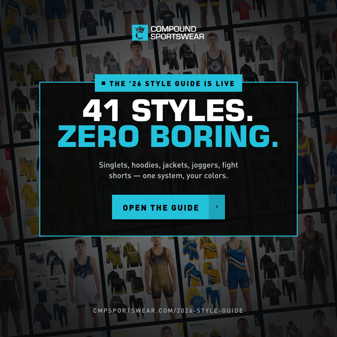
Concept F — The Wall
CMPSW_26SG_F_1080PNG  ·  Layered PSD
CONCEPT F

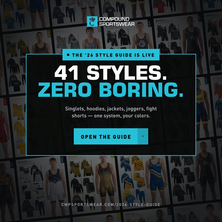
41 Styles. Zero Boring.

Cold + retargeting · Display network · The volume argument
Headline
41 styles. Zero boring.
Round 2
Wall rebuilt on a six-column grid with equal gaps in both directions — the black bands between rows are gone and the pages read as one surface. "The '26 style guide is live" now sits as a teal slab notched into the top of the panel.
Why it works
Sells scale in one glance — the guide's own pages become the texture. Reads clearly all the way down to 300×250, which is exactly what Display needs.
Flag
"Zero boring" is the sharpest line on the board. Say the word and it becomes "Nothing off the shelf."
DisplaySmall sizesRemarketing
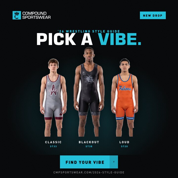
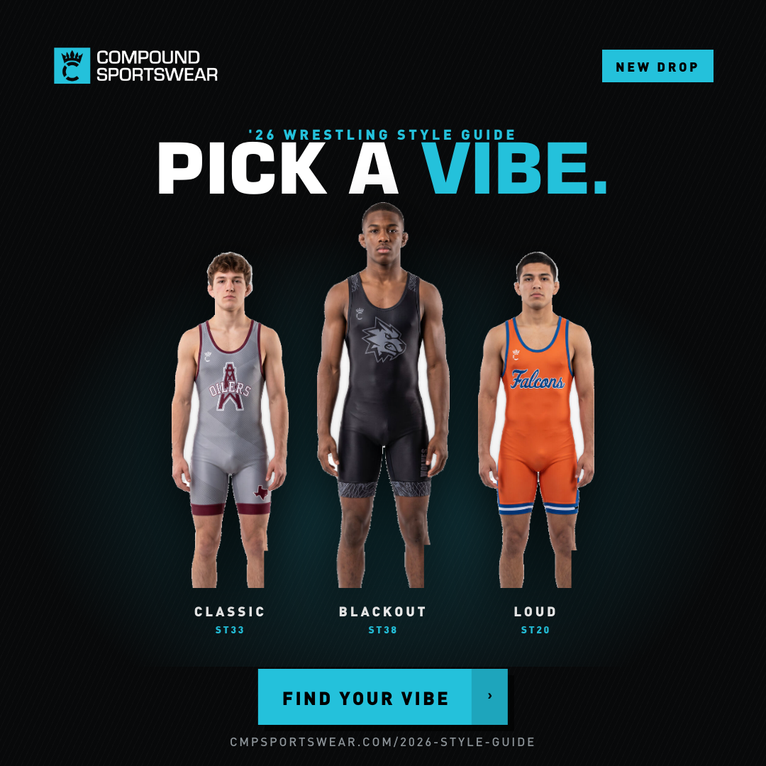
Concept C — Pick A Vibe
CMPSW_26SG_C_1080PNG  ·  no PSD — direction only
CONCEPT C · UGC DIRECTION

Pick A Vibe

Social / UGC · Reels, TikTok, Stories · Not a PPC unit yet
Headline
Pick a vibe.
Round 2
Renamed from "Pick a Side" and rebuilt as a three-up vibe rack — Classic, Blackout, Loud — so it can grow to any number of options. This still image is the layout target, not the finish.
To do it right
It needs a staged shoot: models side by side, playing off each other's body language like they know they're in a style contest, with vibes cutting in and out. That's a video beat, not a static crop — the current figures are all the same locked-off studio pose, which is exactly why it reads flat here.
Then it becomes
An organic Reel with a poll sticker, and a paid version cut from the best frame.
UGC / organicNeeds staged shootPoll mechanic

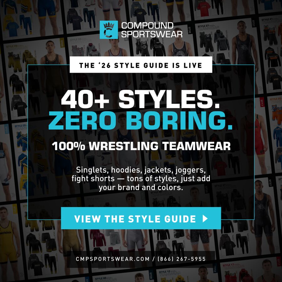
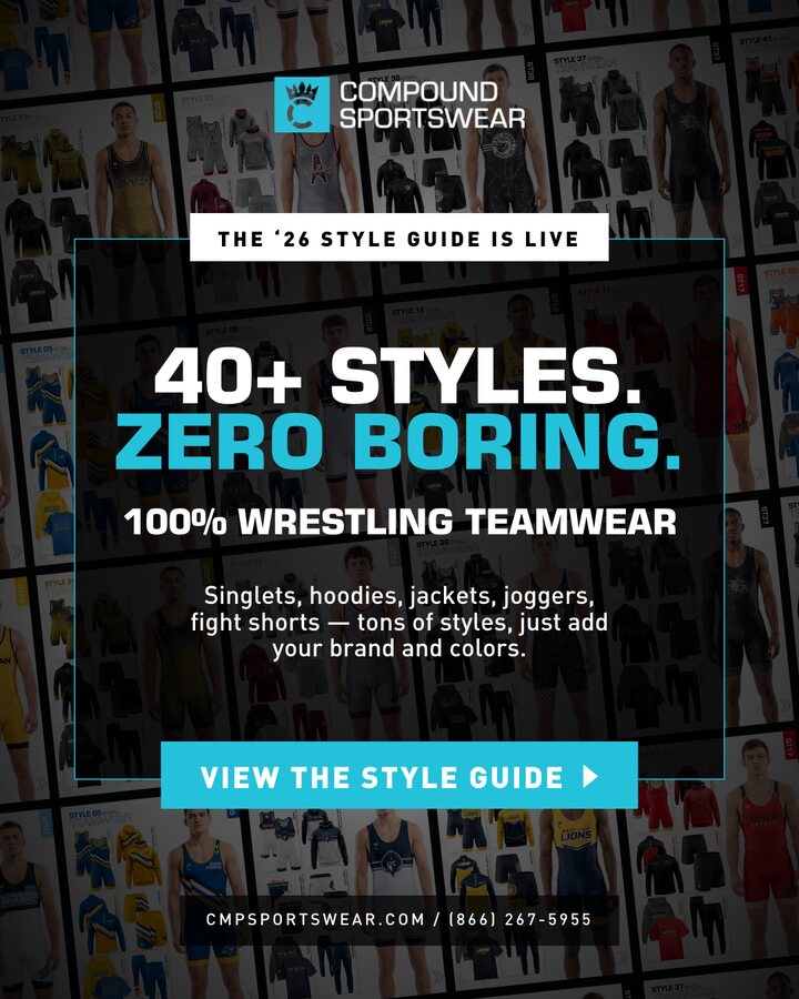
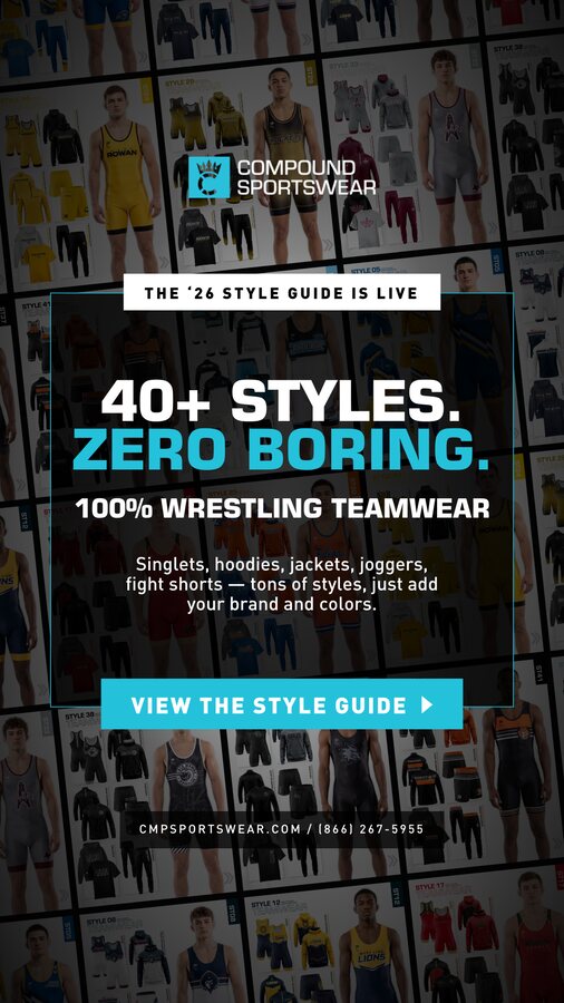
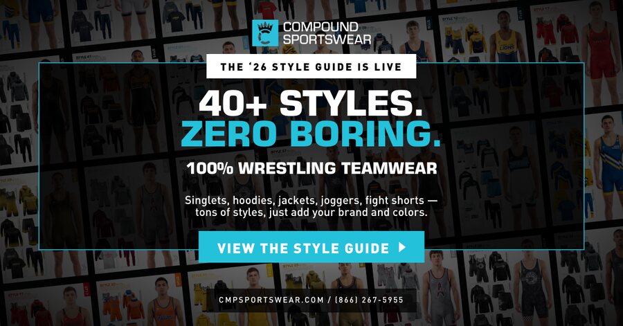
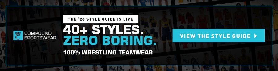
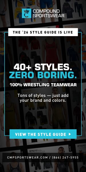
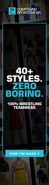
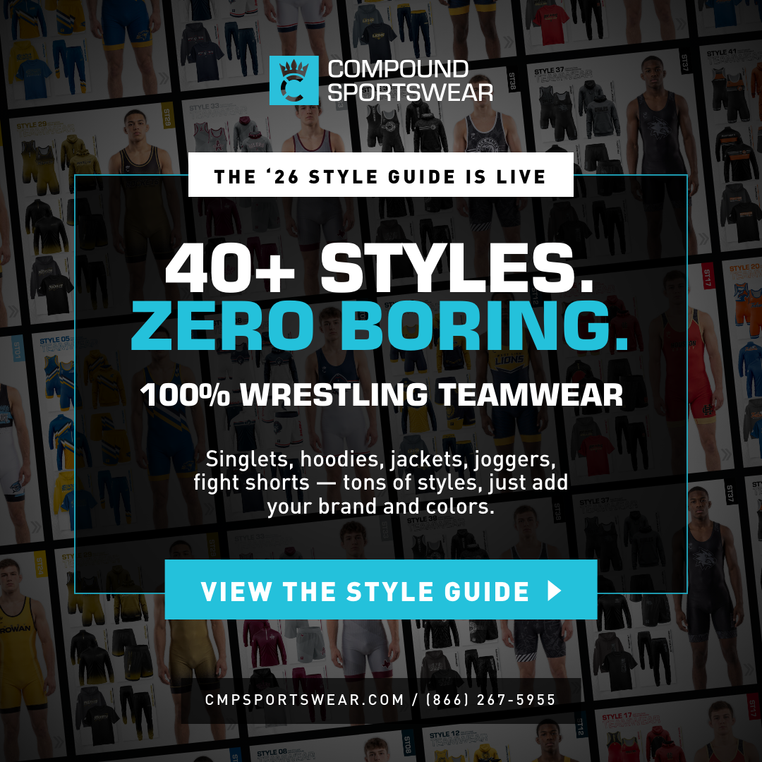
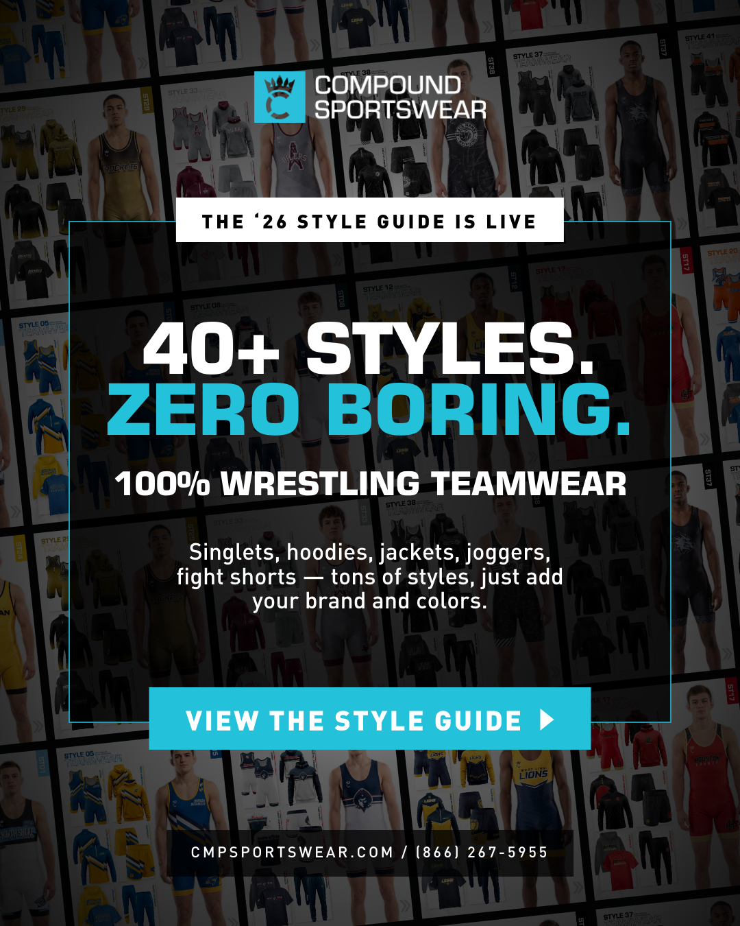
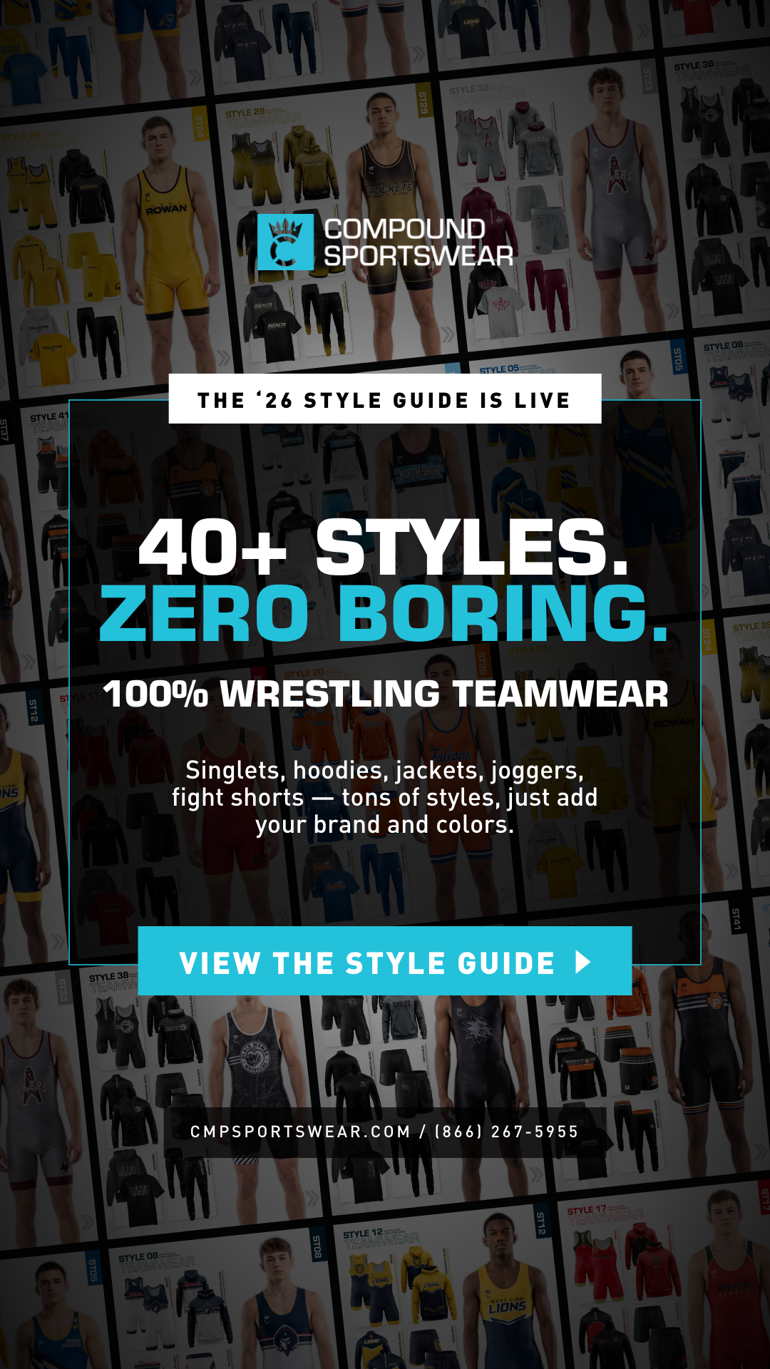
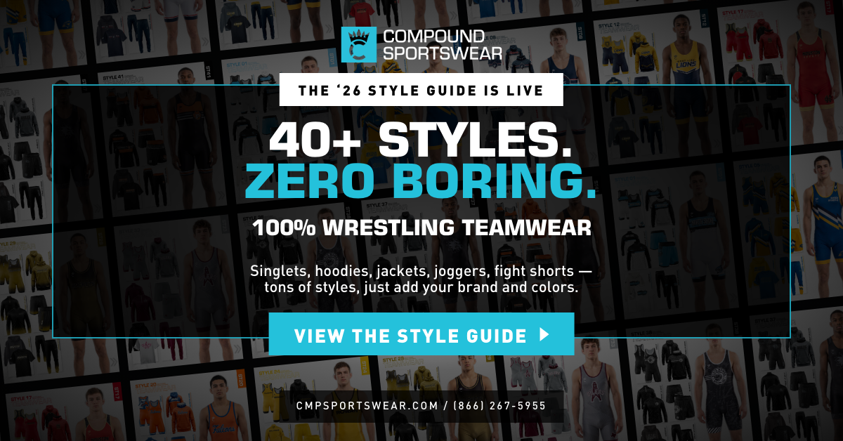
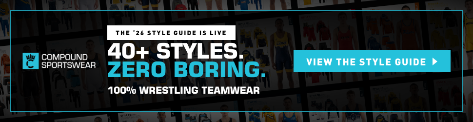
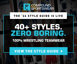
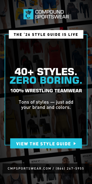
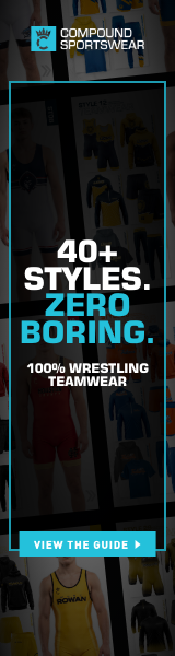
SHIPPED — 40+ STYLES. ZERO BORING.

Rebuilt from your latest 1080 master — the 100% WRESTLING TEAMWEAR line, the wider VIEW THE STYLE GUIDE button straddling the panel's bottom rule, and the phone number in place of the URL path. Every size is laid out for its own shape rather than scaled from the square: the headline rebreaks, the panel re-proportions, and the CTA never drops below a readable size.

1080x1080 banner
1080 × 1080 PNG · PSD
Meta & IG feed square, Display square
1080x1350 banner
1080 × 1350 PNG · PSD
Meta / IG portrait — biggest feed footprint
1080x1920 banner
1080 × 1920 PNG · PSD
Stories, Reels, Shorts
1200x628 banner
1200 × 628 PNG · PSD
Link ads, LinkedIn, email hero
970x250 banner
970 × 250 PNG · PSD
Billboard
728x90 banner
728 × 90 PNG · PSD
Leaderboard
300x250 banner
300 × 250 PNG · PSD
Display workhorse
300x600 banner
300 × 600 PNG · PSD
Half-page
160x600 banner
160 × 600 PNG · PSD
Skyscraper

What carried over from your master

  • Type: Eurostile Bold 96/86 at −15 tracking on the headline, Eurostile Bold 44 on the 100% line, DIN Medium 32 on the subhead, DIN Black 38 at 75 tracking on the CTA, DIN Medium 21 at 160 on the phone line — scaled per size, same relationships.
  • Colour: teal #24C1DB, panel black at 80% behind a 2px teal rule, white announcement slab straddling the panel top, teal CTA with a white arrow straddling the panel bottom, contact bar black at 70%.
  • Copy: your subhead, 100% line and CTA verbatim. The narrow units drop the subhead; the 160×600 breaks the headline to four lines, wraps the 100% line to two, and shortens the button to VIEW THE GUIDE — the full label cannot fit 160px without going unreadable.
  • Wall: regenerated at each aspect ratio from the guide pages so it never stretches.

LAYERED PSDs

Every production concept ships as a real Photoshop file at 1080×1080 — not a flattened export. Same six groups in each, bottom to top.

GroupWhat's in it
00 · FLAT REFERENCEThe approved design, flattened and hidden — toggle it on to check any edit against the original
01 · CANVASThe background fill
02 · PHOTO BEDSFull-bleed imagery that sits under the overlays — the action photo, the guide cover, the page wall. Swap here.
03 · ART PLATEEvery painted overlay with real transparency: gradients, teal slabs, rules, buttons, the vertical guide tile
04 · PHOTOSCut-out imagery over the art — the athlete group, the logo. Swap here.
05 · TYPELive editable text in Eurostile and DIN, one layer per line — retype any headline without redrawing anything

Working in them

  • Type is live, not outlined — you need Eurostile LT Pro and DIN installed, which you have.
  • Photos are smart objects. Double-click to replace contents and the crop, position and scale hold.
  • Files were rebuilt from the same source as the PNGs, so a PSD edit and a re-render stay in sync.
  • C has no PSD — it's a direction waiting on a real shoot, not a production ad.

WHAT YOUR POLISH PASS TAUGHT ME

Notes from comparing your shipped finals against my handoff, so the next size set arrives closer to done.

What you changedThe rule going forward
Rewrote copy per shape — 1200×628 headline became "40+ WRESTLING STYLES." and the 100% line came out; 728×90 merged the kicker and qualifier onto one pipe-separated line; the three tightest units got "VIEW NOW" instead of the full CTA Copy is a variable, not a constant. Author every line in two lengths up front.
Set 100% WRESTLING TEAMWEAR much larger and broke it to two lines It's a headline tier at roughly 0.62× the headline — break it before scaling it.
Held the headline at one size across 1080×1080 and 1080×1350 Extra canvas height buys white space, not point size.
Moved the logo right on 728×90 and 970×250 On wide units the headline owns the left; logo and CTA share the right.
Dropped the white slab to small teal type at 970×250, gone below that The kicker degrades in three states rather than just shrinking.
Removed the black bar behind the phone line No chip on type that already sits in a vignetted zone — don't stack a scrim on a scrim.
Sized CTA boxes to their label, with a 1–2px offset shadow on the small units Hug the text; add depth with an offset, not padding.
Cropped the wall to show a full athlete on 970×250 and lightened the overlay A garment grid is texture; a person is interest.

The one that matters most

  • My build shrank type to solve overflow. You never did that once. The order is: rewrite the copy → rebreak the lines → tighten the frame → drop a tier → and only then reduce size.

SIZE ROADMAP

Zero Boring is complete — see the section above. The remaining concepts get cut to the same nine placements once you sign off on their masters. Layouts are authored per shape so the headline, logo and CTA reflow rather than shrink.

SizeWhere it runsWhat changes
1080 × 1080Meta feed, IG feed, Display square — the masterZero Boring shipped
1080 × 1350Meta / IG portrait — the biggest feed real estateTaller panel, same type block
1080 × 1920Stories, Reels, ShortsPanel centred inside the Stories safe area
1200 × 628Link ads, LinkedIn, email heroSubhead rebreaks to two lines
300 × 250Display workhorseSubhead drops, logo + headline + CTA
728 × 90LeaderboardOne line: logo, headline, CTA
300 × 600Half-page skyscraperShort subhead, stacked
970 × 250BillboardLogo left, headline centre, CTA right
160 × 600SkyscraperHeadline breaks to four lines

Before these go live

  • Landing page must match the ad. Every concept promises the guide; E promises a free 48-hour mockup. That request needs to be visible on /2026-style-guide/ or the lead leaks.
  • UTMs on every click — utm_campaign=26-style-guide, utm_content=A…F so we can tell which concept earned the lead.
  • Sequence: week 1 run B + D cold. Week 2 add A. From week 2 on, retarget every guide-page visitor with E. F fills Display the whole time. C runs organic once the shoot happens.
  • Still open: your photo for D, and the staged shoot for C. Everything else is production-ready.
  • Zero Boring is done — all nine sizes are built and downloadable above. The other concepts get the same treatment once you clean up their masters.