The reference board.
Round one is below with your notes pinned to the five you called out. Round two is eighteen new sites pulled toward our actual industry — licensed and collegiate graphic apparel, combat sports, and the team-store/custom players we compete against. Every screenshot is a real page captured today. Mark up round two the same way you did round one and this becomes the build brief. The MAAP grid you flagged is already built below with real Compound product.
What your round-one notes already tell us
Five notes, and they're more consistent than they look. Read together they rule things in and out before we draw a single screen — worth agreeing on now, because these are the decisions that are expensive to reverse later.
- The vibe
-
Gritty, not precious. You went to Ciele for the grit and explicitly parked Tracksmith's high-fashion restraint for "down the road." That's a real fork: we build a site with texture, contrast, and noise in it — not a quiet gallery. Combat sports earns that.
From your notes on Ciele and Tracksmith
- The product page
-
UNRL is the target, and it's the highest-value decision you've made. "Sections and imagery mixed with products" is a long-scroll PDP where the page keeps teaching — detail crops, fabric, fit, in-use photography stacked below the buy box instead of a description and a size chart. That's a theme requirement, not a styling choice.
From your note on UNRL
- The collection page
-
SATISFY's product display. Big product imagery, one clear idea per row, and specs written like equipment. Our collection grids are where the majority of shopping actually happens, so this is worth as much attention as the homepage.
From your note on the SATISFY shorts collection
- The layout skeleton
-
Pas Normal for structure. "OK layout wise" reads as: the bones are right, the styling isn't ours. Full-bleed action photography, oversized type sitting directly on it, generous space between sections. We take the skeleton and dress it in Compound.
From your note on Pas Normal Studios
- Parked, not rejected
-
Tracksmith's restraint stays on file. You flagged it as a future high-fashion direction rather than this one. Noting it here so it doesn't quietly leak into the current build and dilute the gritty read — one or the other, not a blend.
From your note on Tracksmith
The MAAP grid, built with our product
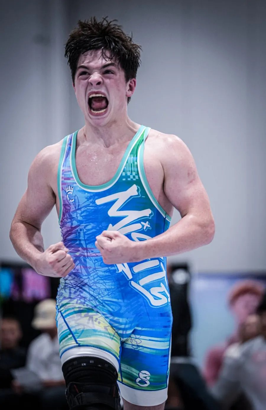
You sent MAAP's Icons section and called it for collegiate. It works because of one decision: the product photography sits on the same flat ground as the panel behind it, so sixteen separate shots read as a single surface. Ours already shoots that way — every product below is a real Compound garment on a real school, pulled straight from the catalog, on the light ground the studio already uses. Nothing was retouched to make this work.
Colors
Every program in one place — team-issued and fan-ready, in your marks and your colors.
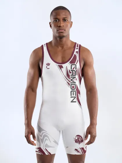
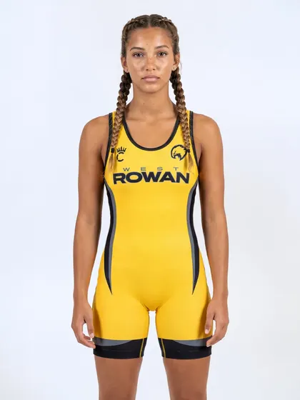
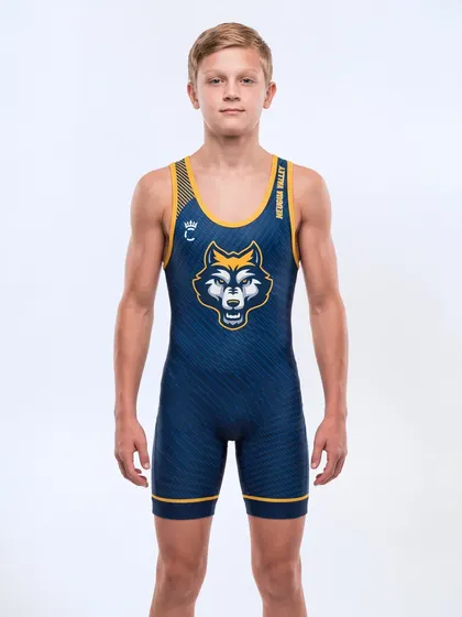
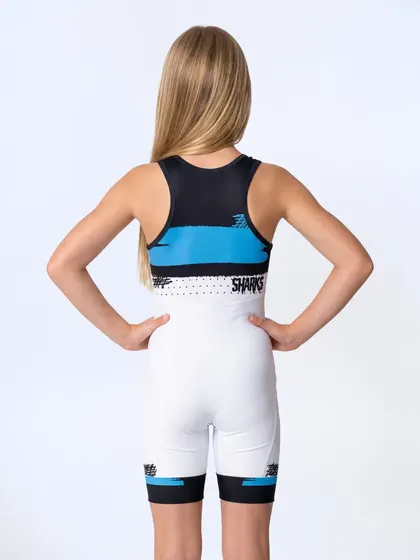
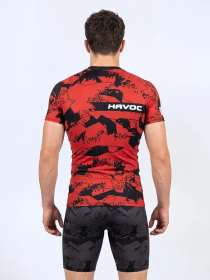
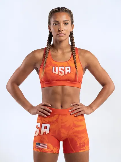
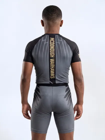
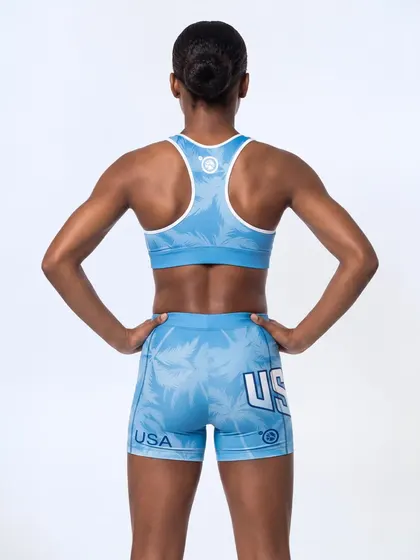

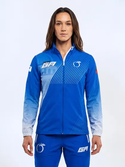
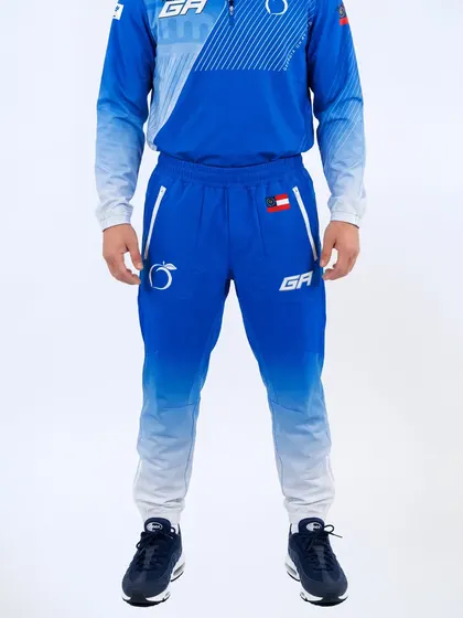
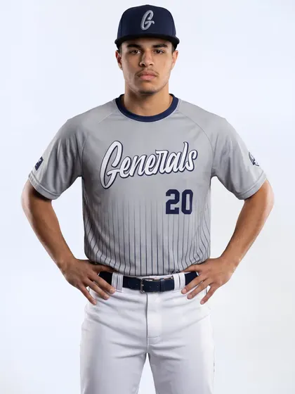
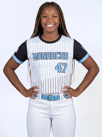
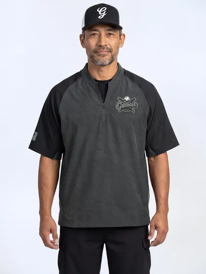
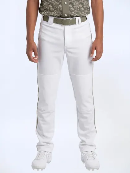
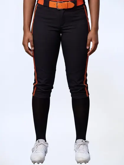
Hero and all sixteen tiles are live Compound assets. Headline, body copy and the two buttons are placeholder — the point here is the layout and the ground, not the words. The two CTAs map to the split we actually run rather than MAAP's Woman/Man.
One shooting standard, enforced
The whole effect collapses the moment one product is shot on a different ground or at a different distance. Same background, same framing, same crop ratio, every SKU — which means the shot list becomes a rule rather than a preference. Our current catalog is already close enough that this mockup needed no retouching, so it's a standard to hold, not one to build from scratch.
It has to be a real collection, not a hand-built section
Hard-coding sixteen products means someone edits the theme every time a program changes. Driven off a collection with a sort order instead, the section refills itself — and the same block gets reused per school. That's a metafield-and-collection job, which is exactly the catalog work in the rebuild section below.
It scales to school-by-school storefronts
This is the strongest argument for the Homefield and HOMAGE pattern in round two. One block, one collection per program, and every school gets a real landing page instead of a filtered search result. Build it once, point it at a different collection, and it's their store.
Apparel design language for the collegiate line
This one isn't a website note, and it's worth separating out so it doesn't get lost in the site work. These four are a reference set for what we make — the graphics, the garment mix, the way a collection gets named and shot — not how we lay out a page. Parking it here so it's ready when the collegiate teamwear design starts.
Cliff said
“These styled teamwear sites please keep in mind when we start designing the collegiate teamwear. I want to use a lot of these apparel design concepts.”
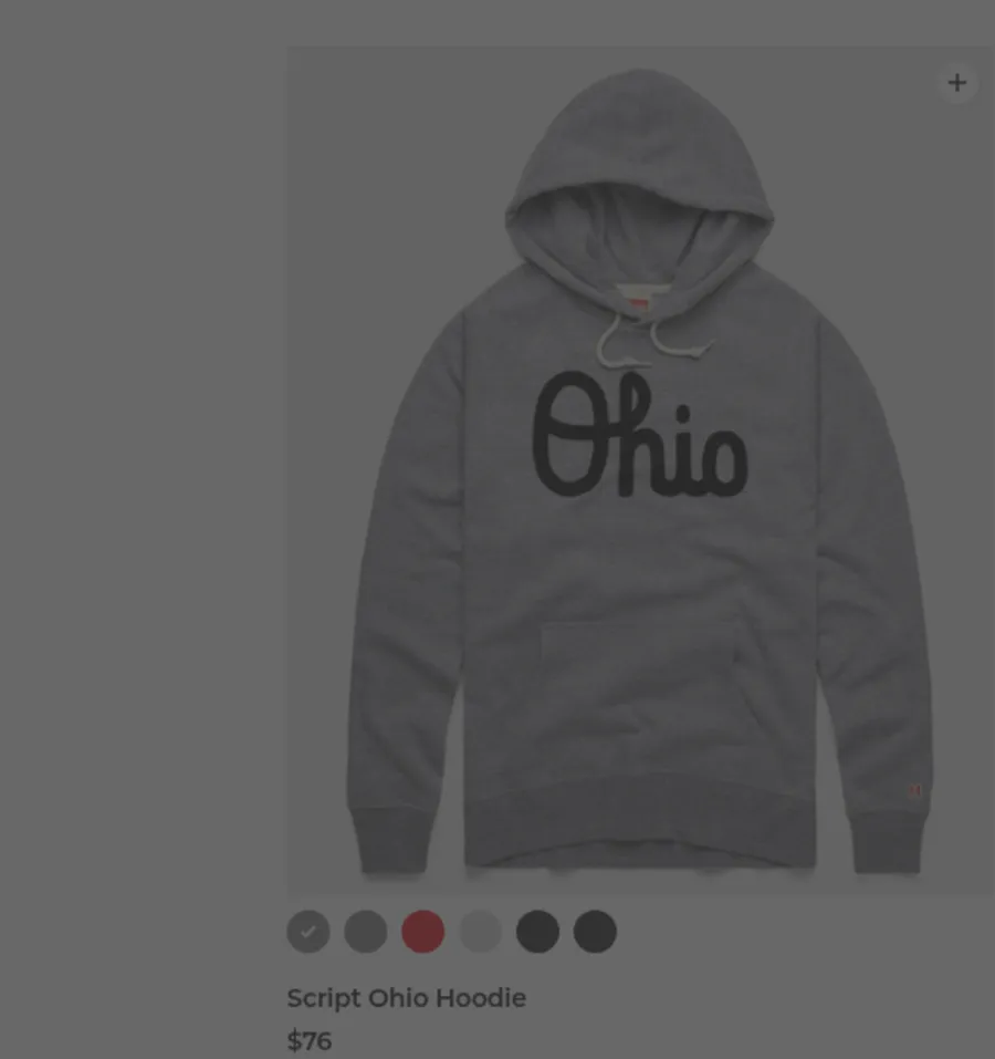
HOMAGE
homage.com — Script Ohio, from the Ohio State collectionVintage-licensed graphics on soft, worn-in blanks. Distressed archival marks, muted school palettes, and a garment that reads like it's been owned for ten years. The graphic library is the product; the blank is the delivery mechanism.
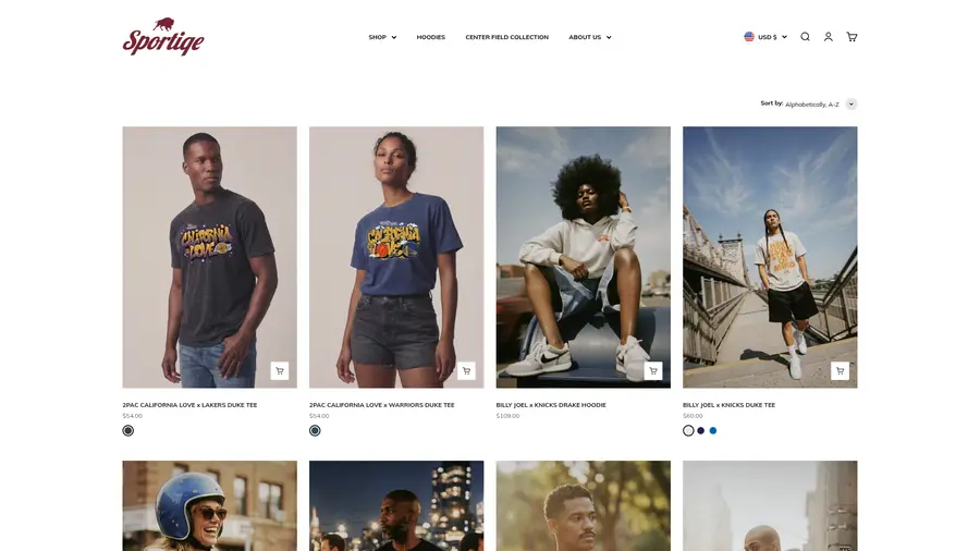
Sportiqe
sportiqe.com — full catalogLicensed product designed as fashion first. Elevated fabrics, relaxed cuts, restrained placement — the team mark is one element of a garment rather than the whole reason it exists. The closest model for a collegiate line that has to sell off the mat too.
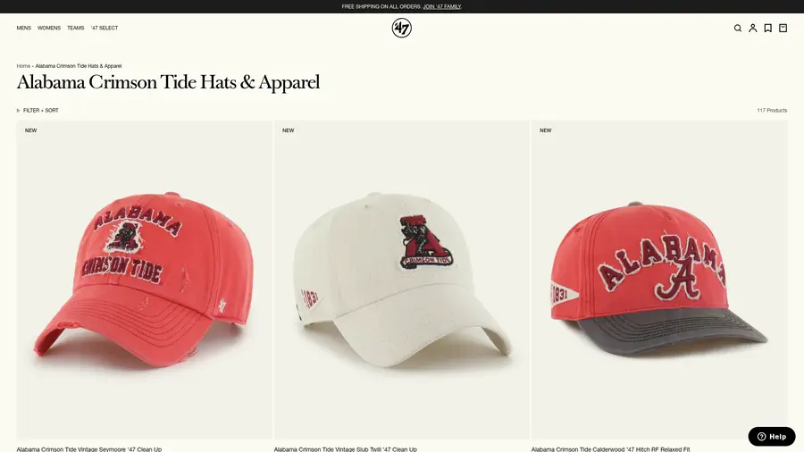
'47
47brand.com — Alabama Crimson TideOne mark, executed across a whole family. The same school identity rendered in washed twill, chenille, embroidery and print — every finish a different price point. This is how a single program becomes twenty SKUs without repeating itself.
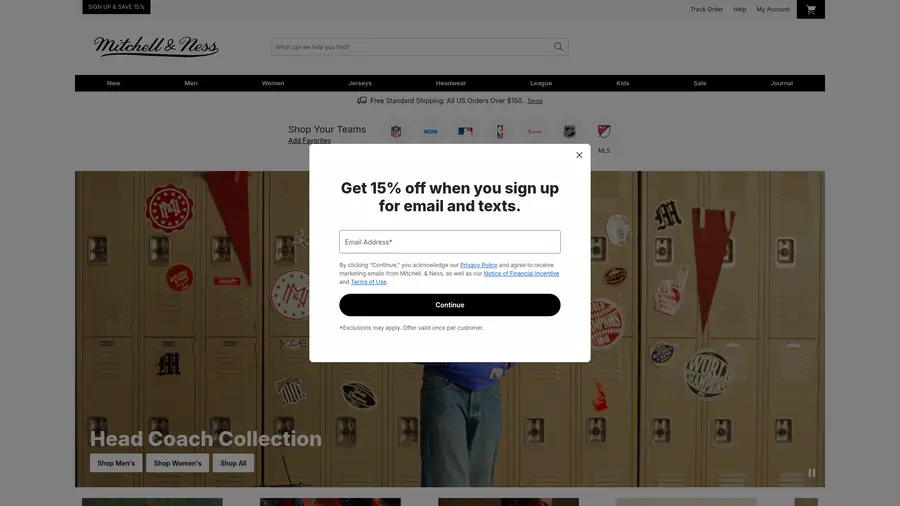
Mitchell & Ness
mitchellandness.com — Head Coach CollectionCollections with a concept and a set to match. "Head Coach" isn't a category, it's an idea — sideline-era garments shot against lockers and pennants. The naming and the art direction do as much work as the product. Their site redirects every collection URL to this modal, so the capture is what it is.
What this actually commits us to
All four sell a decorated blank at a premium, and all four earn it the same way — the blank is good, the mark is restrained, and the collection has an idea behind it. That's a product decision before it's a design one: it means better base garments and fewer, better-executed graphics rather than every school's logo dropped on the same fleece. Worth deciding early, because it sets cost.
It needs its own photography, and that's a second shot list
Your Sportiqe note and the Icons grid pull in opposite directions — styled, environmental, garment-specific on one side; identical flat studio ground on the other. Both are right, for different parts of the site. Budget them as two separate shoots rather than discovering the conflict halfway through, and start the styled one with the wrestling department as you suggested.
The Shopify rebuild — answering your product-data question
Short answer: yes, and you're right to treat it as a rebuild rather than a reskin. The catalog is a data project that happens to have a theme on top of it. Getting the data right is what makes SEO, filtering, POS, and reporting all work at once — and it's much cheaper to do now than to retrofit onto a finished site.
Product taxonomy, options and SKUs
This is the layer everything else hangs off, and the one that's almost certainly inconsistent today. It has to be settled before a single product gets rebuilt.
- Assign every product a Shopify standard product category — it drives tax, marketplace feeds, and the attribute fields Shopify offers you.
- Lock option names to a fixed set (Size, Color, and only where genuinely needed a third) spelled identically across the whole catalog. "Colour", "Colorway", and "Color" as three different options is what breaks filtering.
- Fix size ordering at the option-value level so YS→YM→YL→S→M→L→XL sorts correctly instead of alphabetically.
- One SKU scheme, parsed left to right — style, colorway, size. Boring and rigid beats clever.
- Barcodes (UPC/GTIN) on every variant. Without them POS scanning and Google Shopping both stay half-broken.
Tags, collections and metafields — three different jobs
Most messy Shopify catalogs come from using tags for all three. Separate them and the site starts merchandising itself.
- Metafields carry facts: fabric, weight, fit, decoration method, care, country of origin. Structured, typed, filterable.
- Metaobjects carry reusable content: size charts, fabric technology blurbs, athlete stories — authored once, referenced by many products. This is also what feeds the UNRL-style long-scroll PDP sections you liked.
- Tags drive merchandising automation only — automated collections, promo eligibility, drop grouping. Never taxonomy.
- Collections should be mostly automated off metafields and tags, so adding a product to the right places is a consequence of describing it correctly.
Locations, tracking and the made-to-order problem
You sell the same catalog two ways, and those two ways want opposite inventory behavior. Decide per product type, not per product.
- Separate locations for warehouse and retail/POS so on-hand is real in both places and you can actually report on channel.
- Stocked retail goods: track quantity, deny overselling.
- Made-to-order and decorated team goods: keep selling when out of stock. We already hit this on the team-store build — new variants default to tracked/deny and silently show as sold out.
- Set that policy at creation time in the rebuild rather than patching it afterward.
URLs, redirects and structured data
A full rebuild is the single easiest way to lose rankings you already have. This part is not optional and it needs to happen on launch day, not after.
- Export every current live URL first, then build a 301 redirect map to the new handles. Any URL that changes without a redirect is lost traffic.
- Handles set once and never edited afterward.
- Product structured data with GTIN, price, and availability so listings can earn rich results.
- Real alt text on every image — a shot list per SKU makes this mechanical instead of a chore.
- Unique title and description patterns per template, not the theme defaults.
What to switch on
- Search & Discovery — filters from your new metafields, synonyms (singlet/uniform), and product boosts. Biggest win for the least work once the data is clean.
- Shopify Flow — automate tagging, restock alerts, and team-store open/close instead of doing it by hand.
- Markets, Forms, Segments, gift cards — all sitting idle.
- Bundles — already proven on the team-package build; same mechanic works for retail kits.
- Consistent shot list per SKU (front, back, detail, on-body, scale) with colorway images grouped to their variant.
Data first, theme second
Audit the live catalog and produce the gap report. Agree the option, SKU, tag and metafield standard. Rebuild the catalog against that standard in a staging theme with the redirect map built alongside. Then design the theme onto data that's already correct — because the PDP and collection pages you picked out are only possible if the underlying products can feed them.
What I need back
Round two is the one to mark up now. Same as before — reactions in your own words are more useful to me than a ranking.
- Star and note the round-two sites the way you did round one. Especially anything in the licensed/collegiate bucket, since that's the closest read on spirit wear.
- Confirm the gritty direction over the Tracksmith restraint, so I can stop hedging between them.
- Tell me how far we go on the theme: custom sections on a strong existing theme, or fully custom. The UNRL-style PDP is achievable either way, but the cost and timeline differ a lot.
- Green-light the catalog audit and I'll start on the data while the design direction settles. Those two tracks can run in parallel.