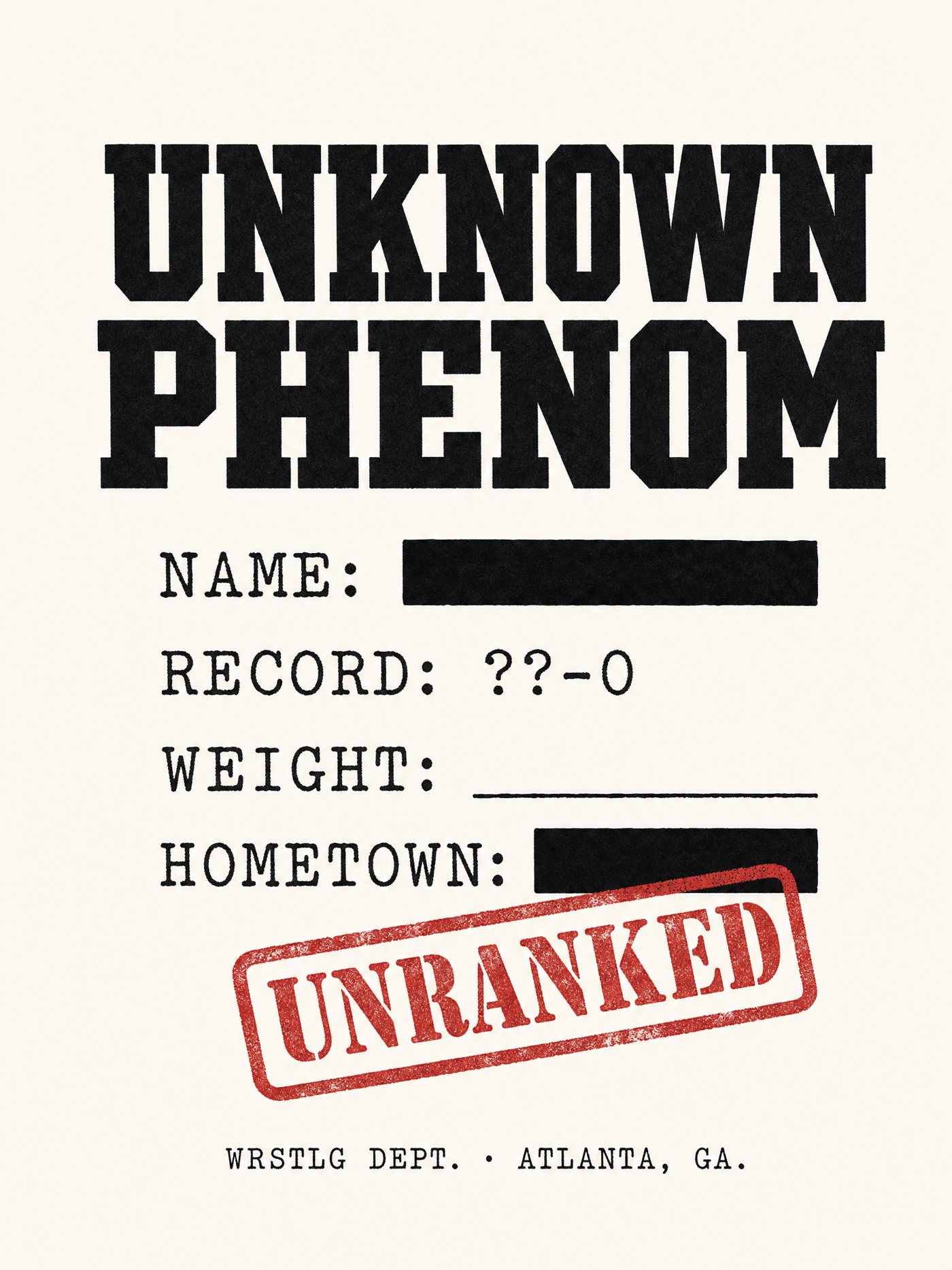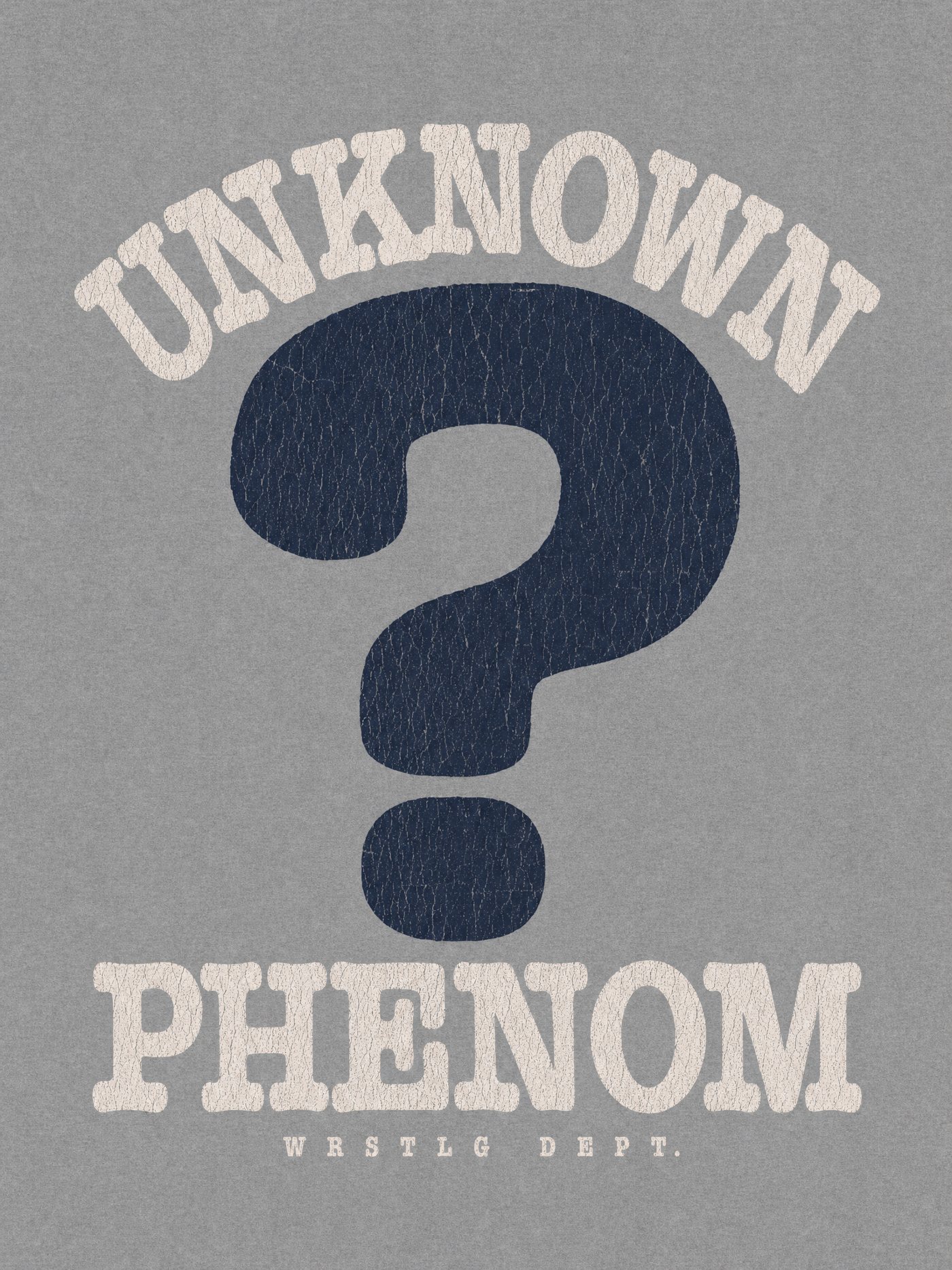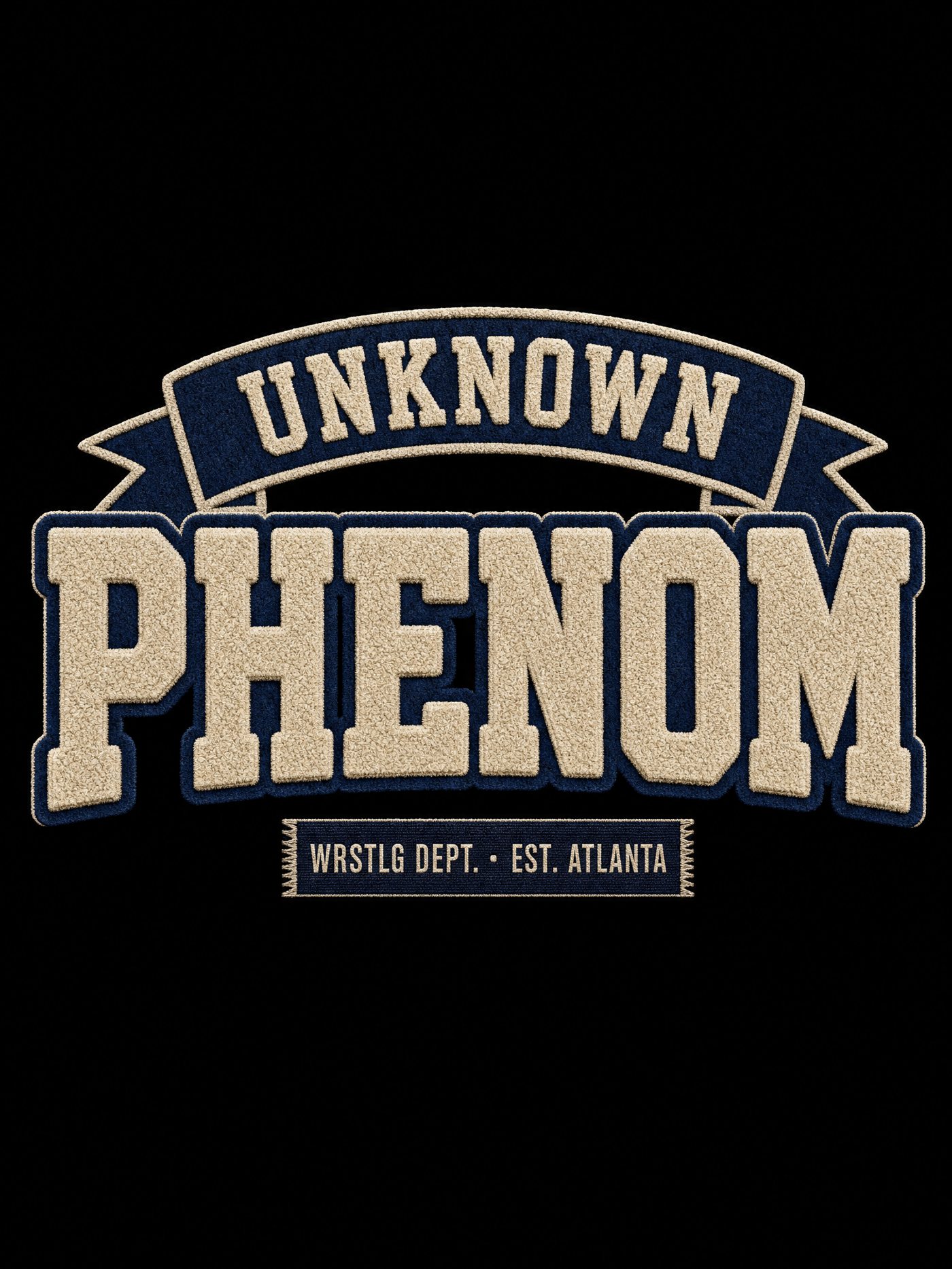
Round 2 off your notes: the arch lettering identified and packaged as a full upper/lowercase family, six pocket-print takes on the Dept. name patch, and eight UNKNOWN PHENOM concepts leaning on the two things you liked (the cracked slab arch and the chain-stitch patch). Round 1 lanes you called lame are dropped.
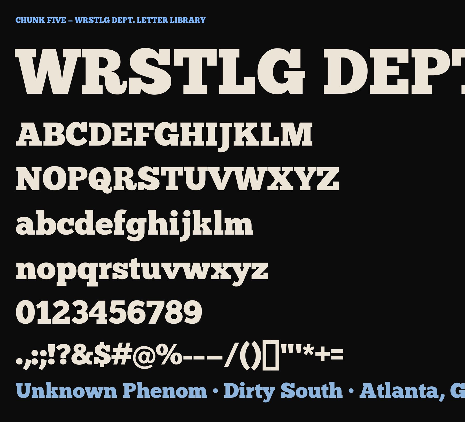
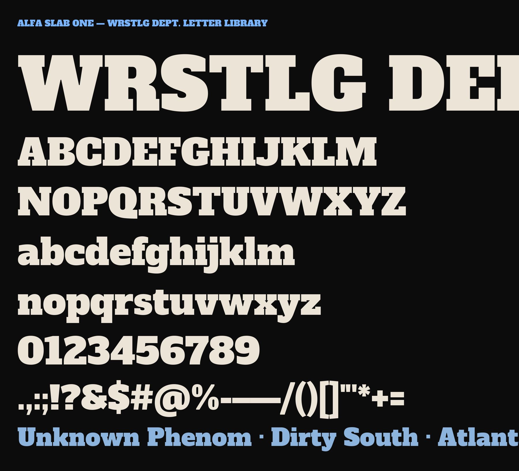
The arch lettering on the Dirty South piece is AI-drawn, so no font is a pixel match, but it is built on the classic vintage-tee slab. Closest real family is Chunk Five (the curved R leg, the soft bracketed slabs, the S terminals). Runner-up is Alfa Slab One. Both are free under the SIL Open Font License, both have full upper and lower case, numerals and punctuation. The zip has TTF/OTF, licenses, and these specimens. For production, set the type in Chunk Five, arch it in Illustrator, then apply the crack texture.

The League of Moveable Type, OFL. Regular plus a "Chunk Five Print" letterpress cut in the zip. 323 glyphs.

Google Fonts, OFL. A touch lighter in the brackets with a straight R leg; 671 glyphs incl. accents.
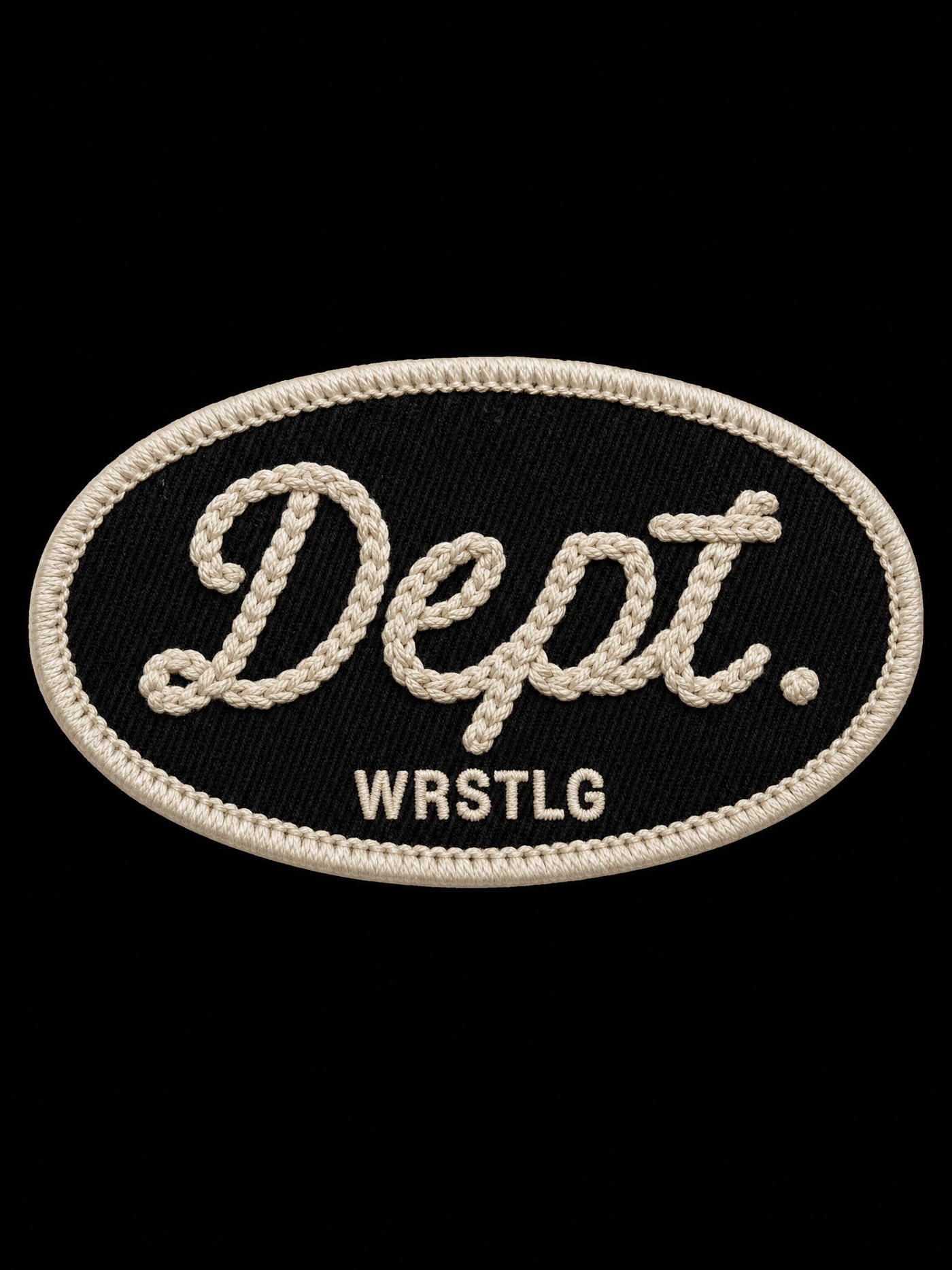
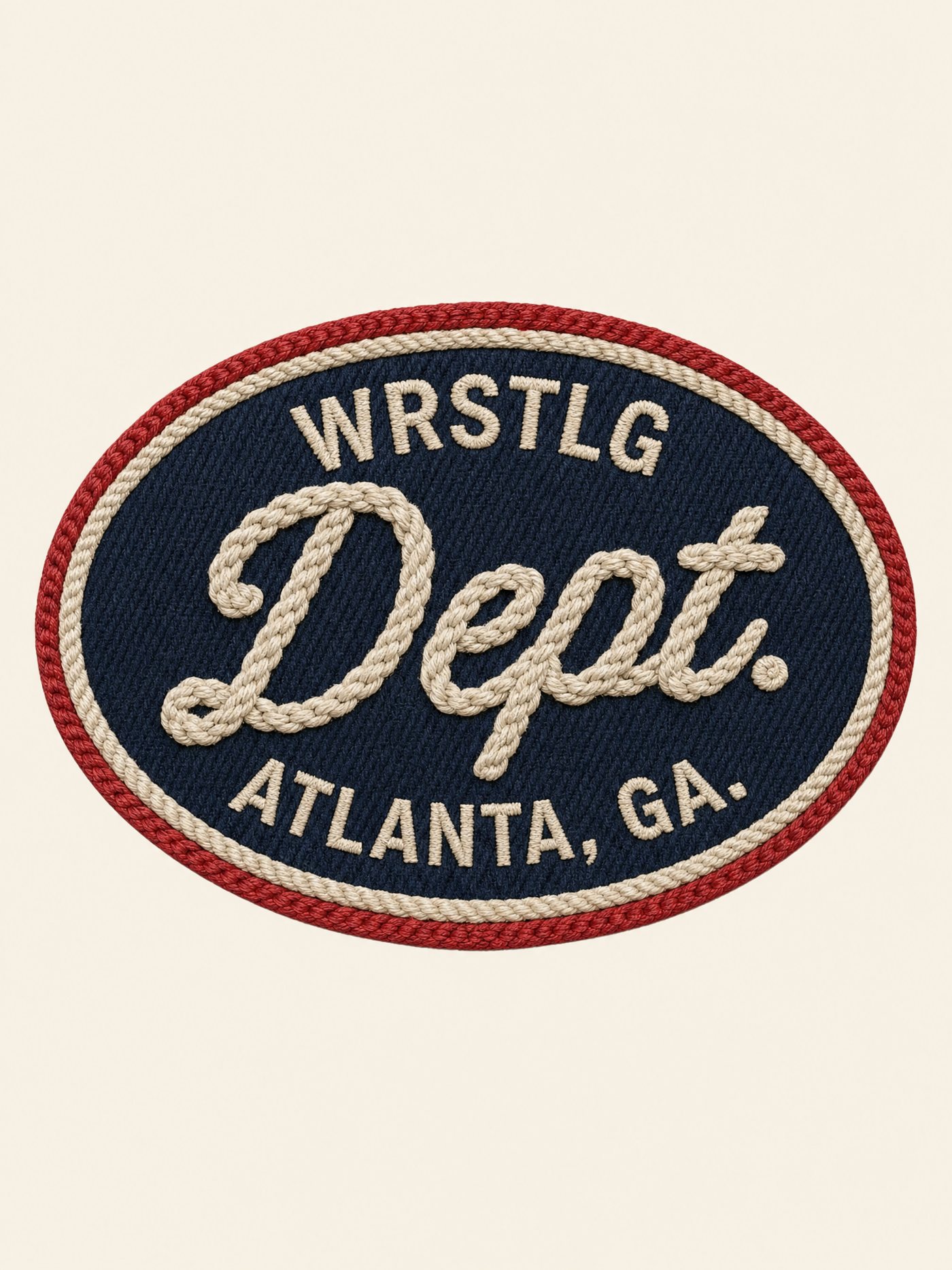
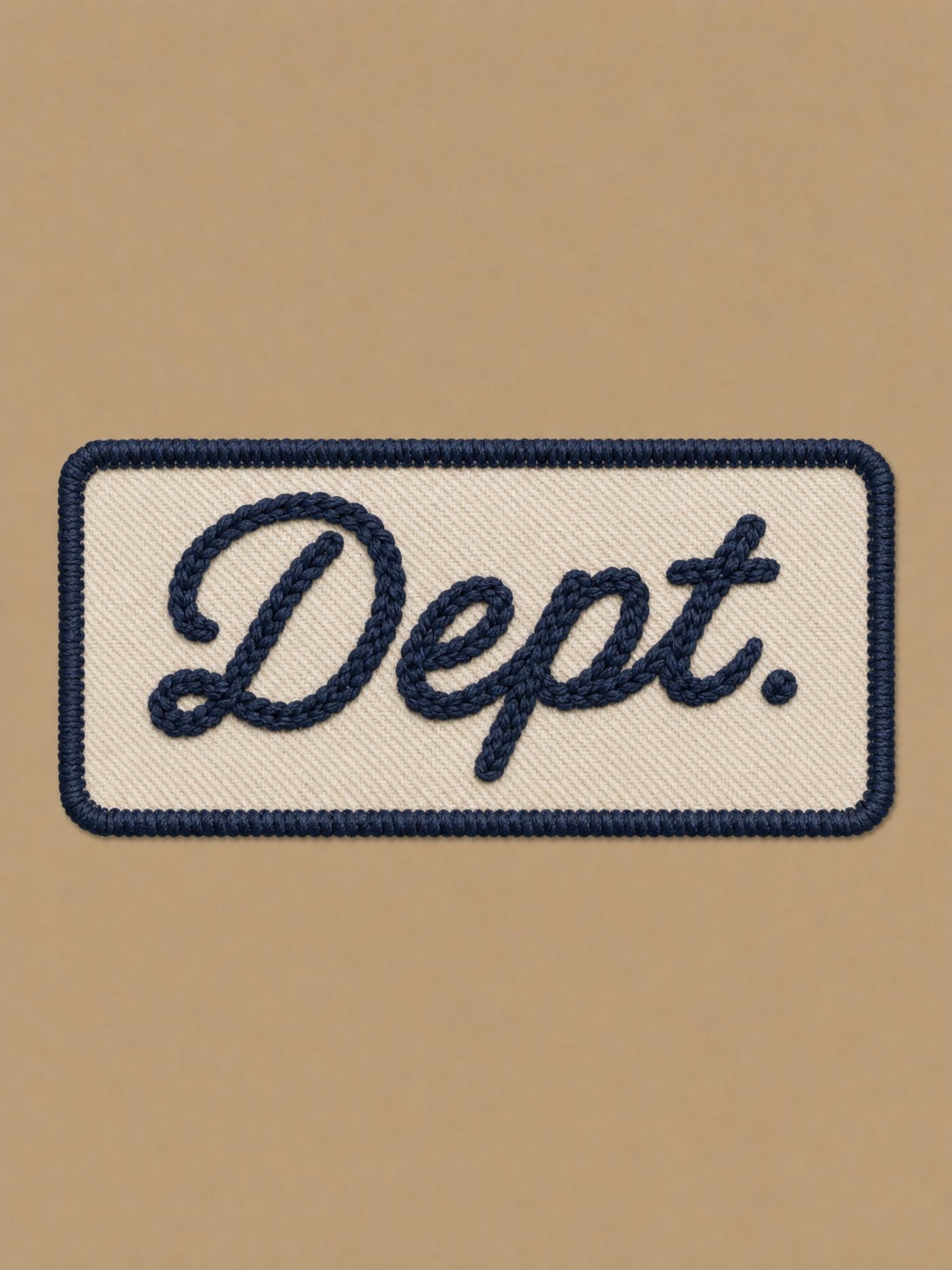
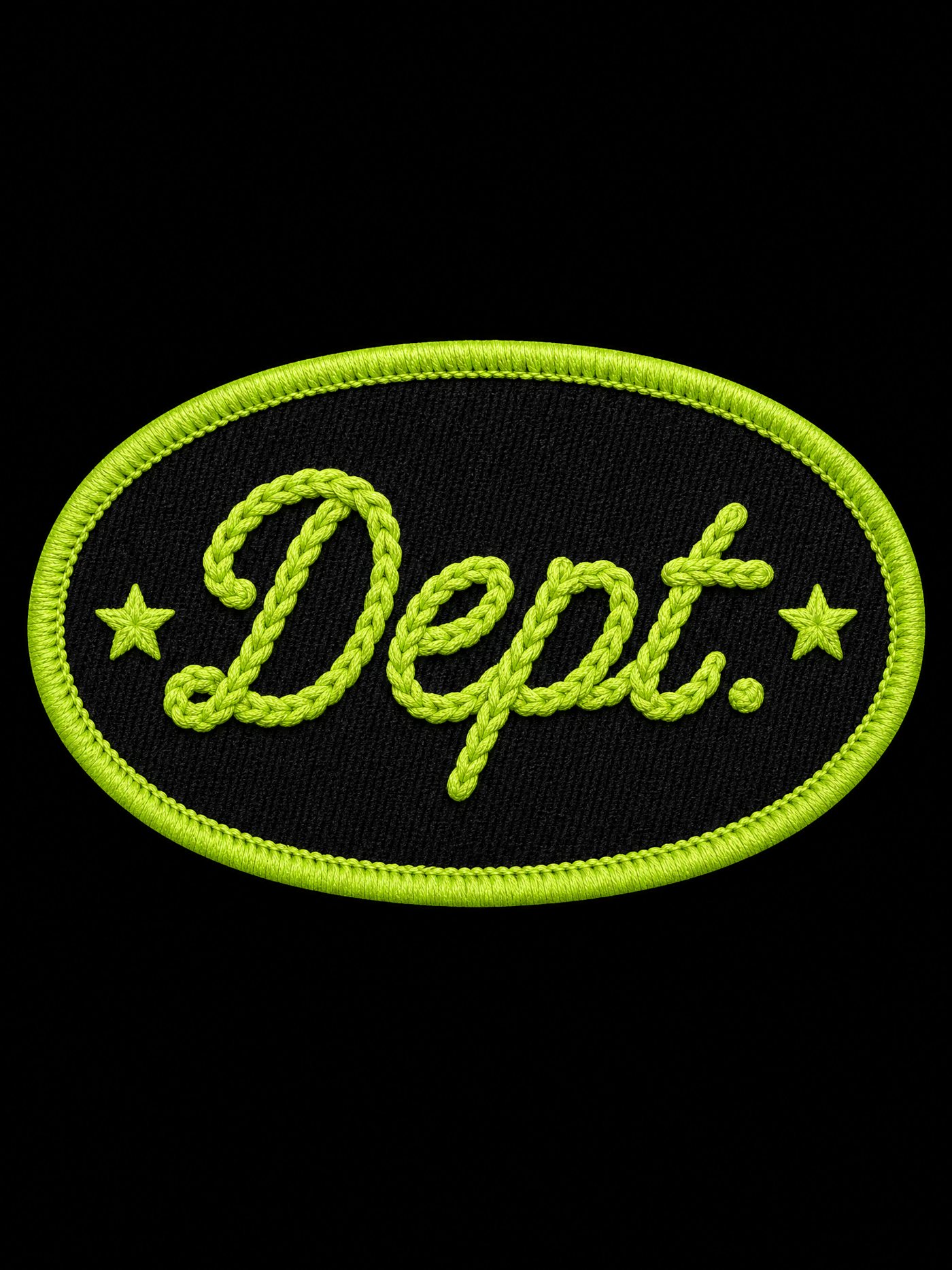
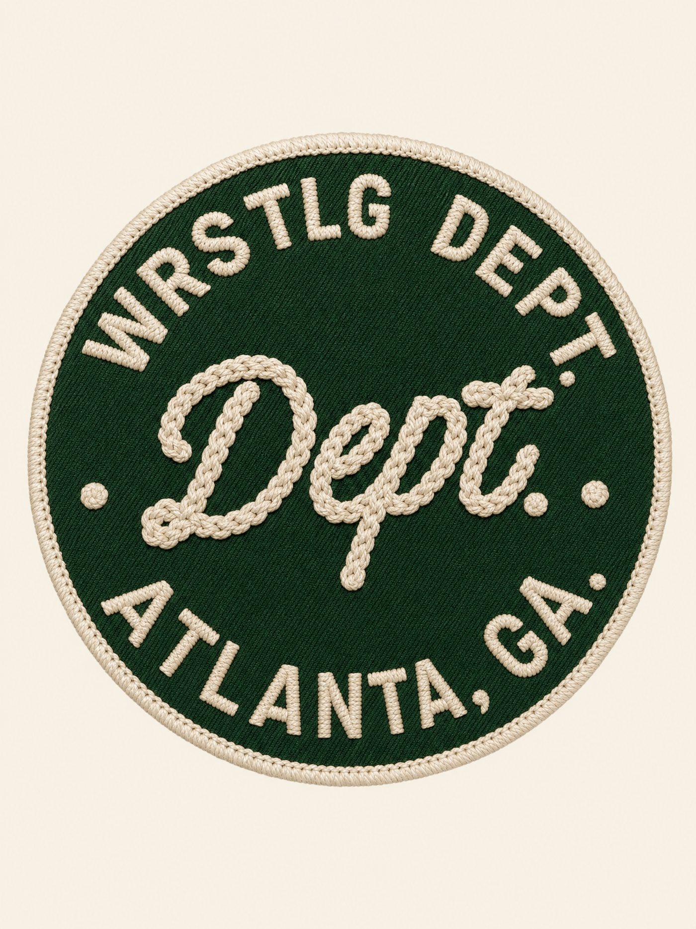
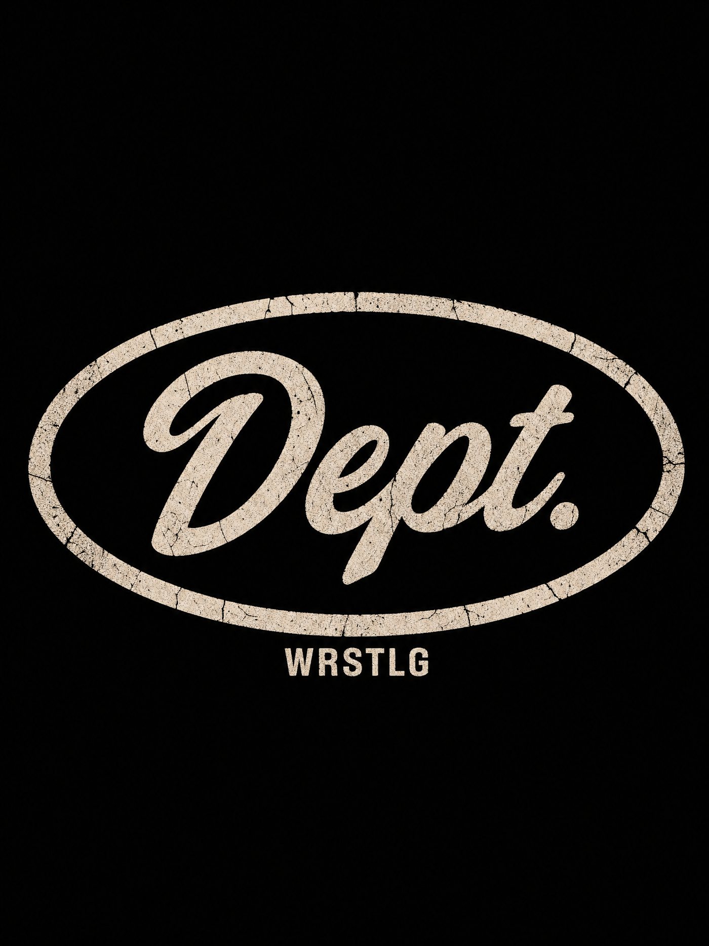
Six takes on the oval name patch as a left-chest print. Five embroidered looks (DTF can print the stitch texture photographically) and one flat cracked-ink version.
P01
P02
P03
P04
P05
P06Same oval as a one-color cracked print instead of embroidery. Cheapest to DTF, reads vintage.
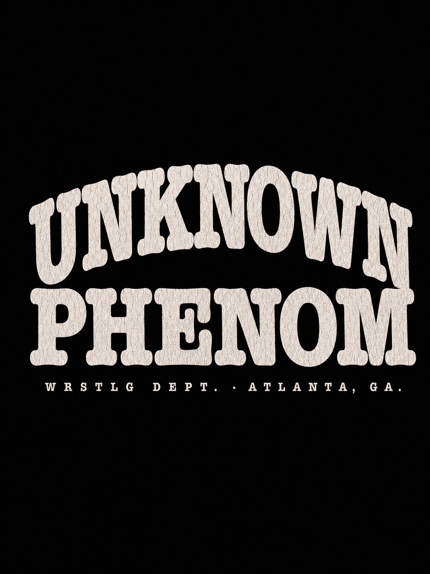
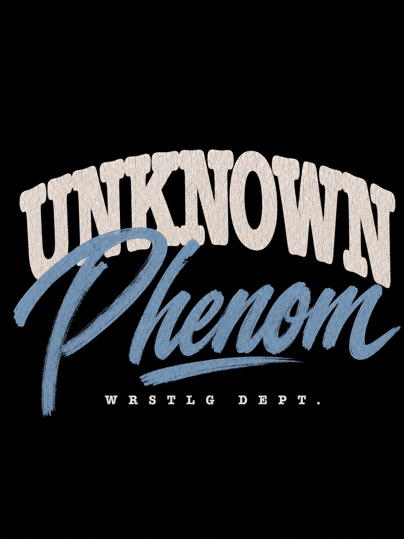
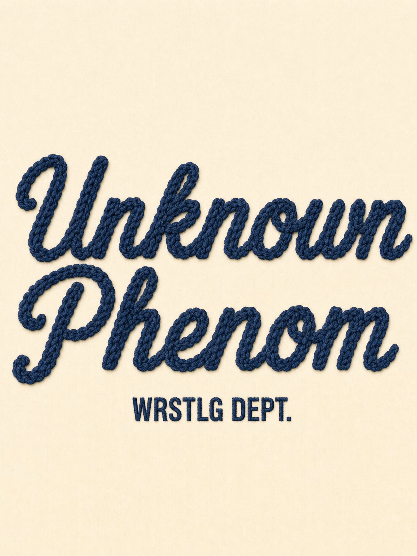
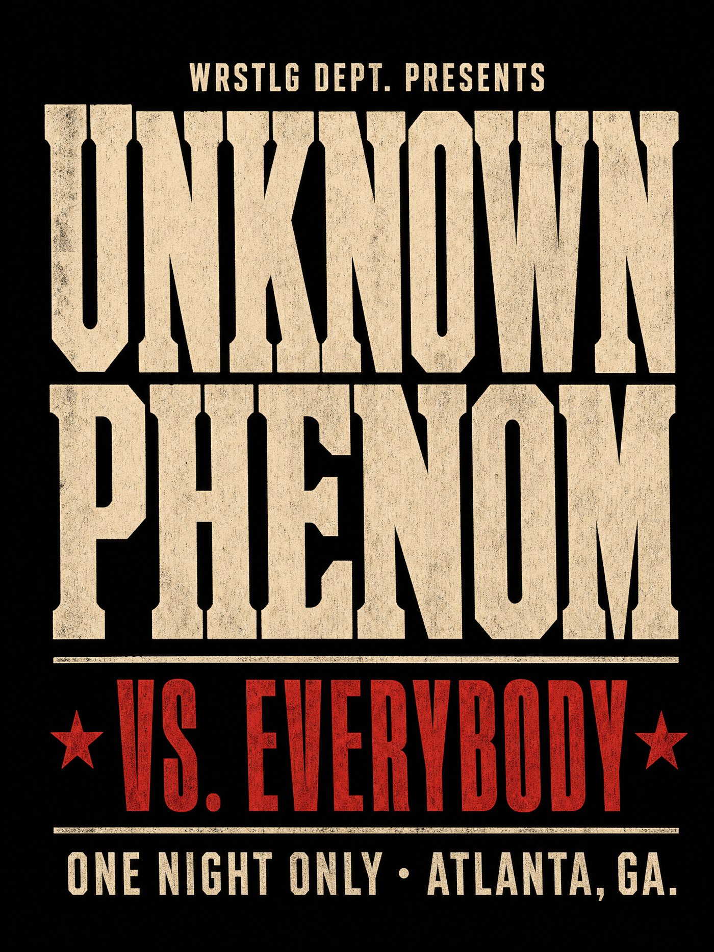
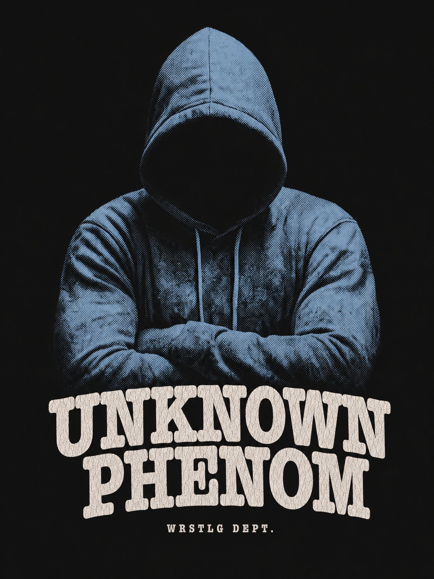
Eight concepts. U01 and U02 are the direct descendants of the piece you liked; U03 ties into the patch program; the rest test how far the phrase stretches.
U01UNKNOWN arched, PHENOM straight, the cracked Chunk-Five-style slab from the piece you liked.
U02UNKNOWN in slab with a sky-blue Phenom brush script over it. Same formula as Dirty South.
U03Unknown Phenom as a big navy chain-stitch script on bone. Pairs with the patch program.
U04
U05
U06
U07
U08