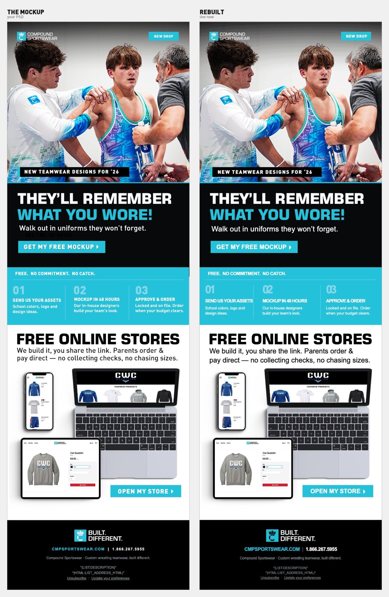
| Element | Change |
|---|
| Band CTA |
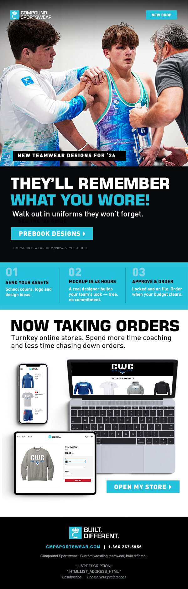
(no button existed)
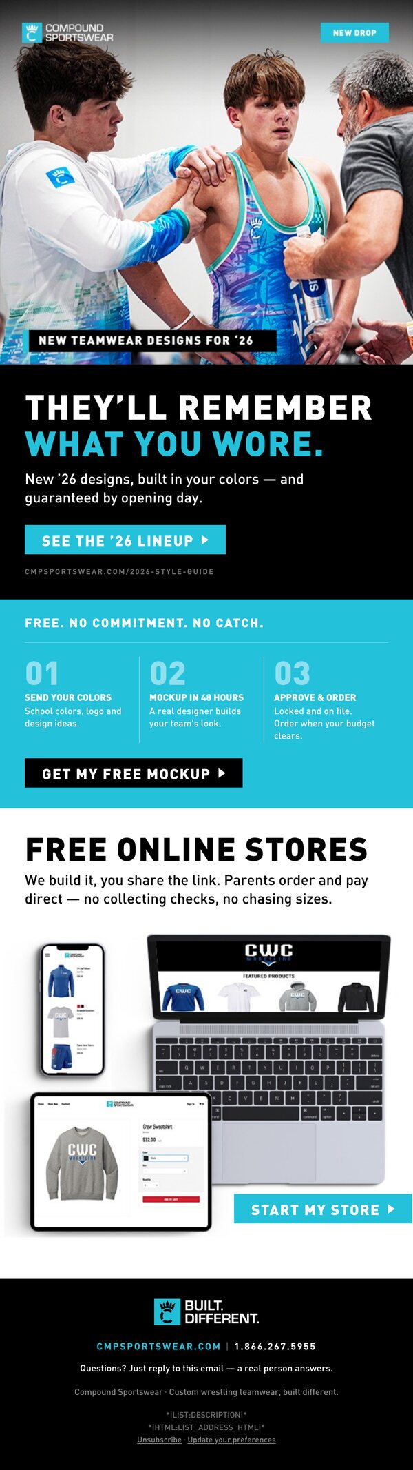
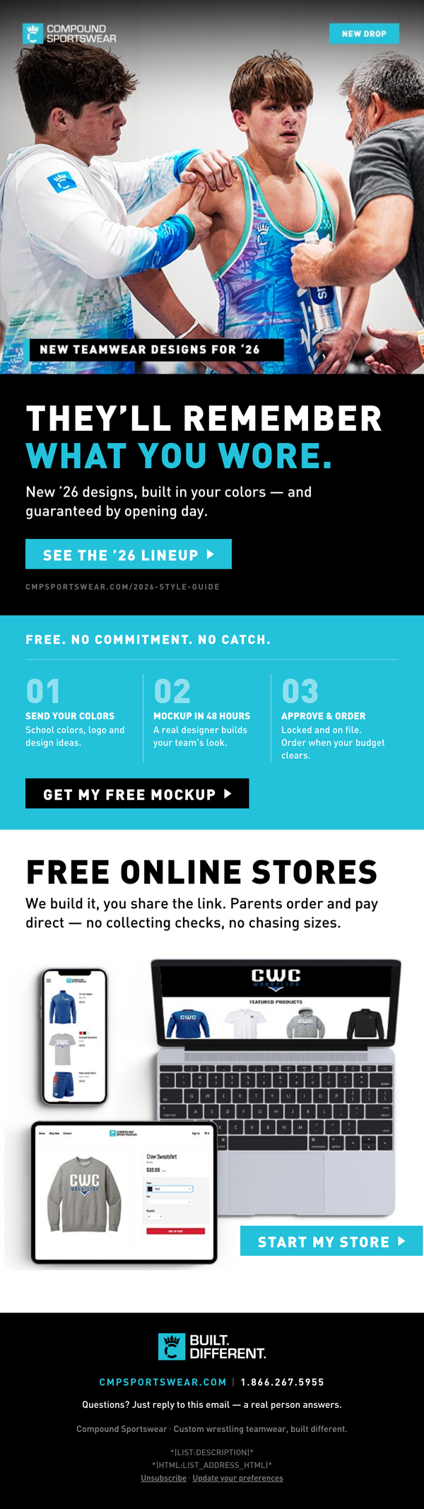
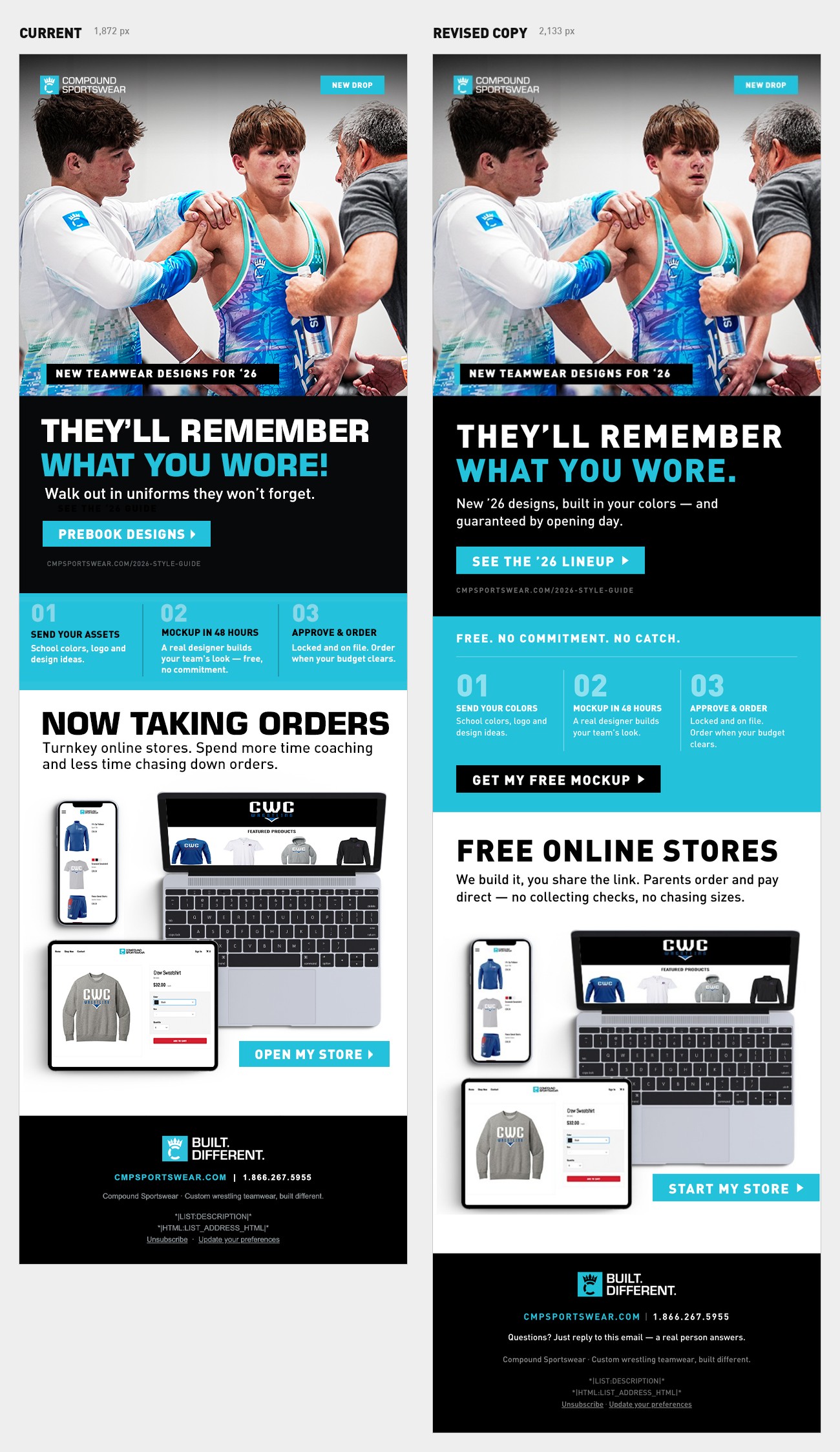
GET MY FREE MOCKUP ▸
The single biggest fix. The 01/02/03 band is the most persuasive
thing in the email — free, real designer, 48 hours, order when your budget clears. It kills
the money objection outright, and then asks the reader to do nothing. Any coach it convinced
had to scroll back up to a button that says "Prebook," which is the opposite of what they
just read. Black button on the teal band so it reads as the primary action on the page.
|
| Hero button |
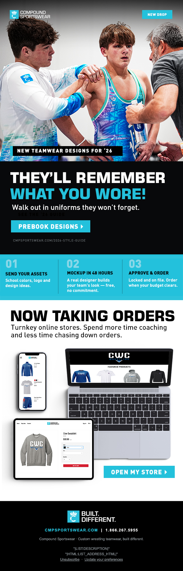
PREBOOK DESIGNS ▸
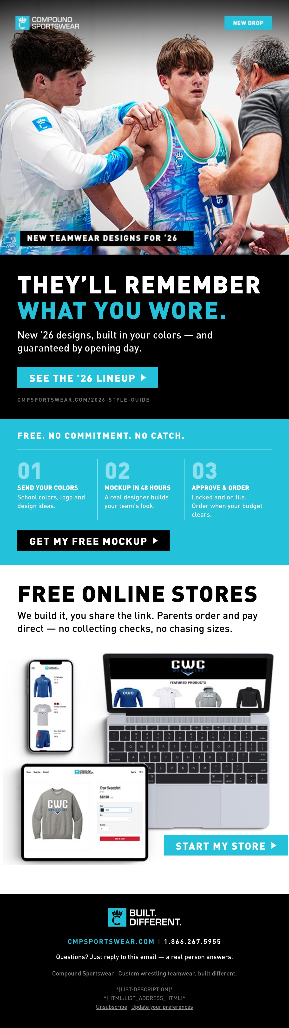
SEE THE '26 LINEUP ▸
"Prebook" asks for commitment before the coach has seen a single design,
and it contradicts the "no commitment" promise directly beneath it. It also over-promises
the destination: the '26 style guide page is a browse page, not a booking form — that
mismatch is what makes people bounce straight back out. Low-friction ask up top, commitment
ask further down. If Prebook is a real program with an incentive, see the note below.
|
| Subhead |
Walk out in uniforms they won't forget.
New '26 designs, built in your colors — and guaranteed by opening day.
The old line said the headline again in different words. That's the most
valuable real estate in the email spent on an echo. The new line does three jobs the
headline can't: says it's new, says it's custom, and answers the question every coach asks
before anything else — will it get here in time.
|
| Hidden layer |
SEE THE '26 GUIDE
deleted
It's set dark-on-dark in the current comp — invisible unless you select it.
Worth knowing: hidden text is a classic spam-filter signal, so it's not just a cosmetic
leftover. The CTA underneath already says it.
|
| Band eyebrow |
(band started cold on "01")
FREE. NO COMMITMENT. NO CATCH.
Frames the three steps as an offer instead of a process diagram, and puts
the word free above the fold of that block where it gets scanned. Three hard stops —
same cadence as BUILT. DIFFERENT.
|
| Stores headline |
NOW TAKING ORDERS
FREE ONLINE STORES
Two problems with the old one. It contradicts "order when your budget
clears" three inches above it, and it's ambiguous about who's taking orders — it reads like
Compound is, when the whole point is that the coach's store takes them. The new line
leads with the word that earns the click.
|
| Stores subhead |
Turnkey online stores. Spend more time coaching and less time chasing down orders.
We build it, you share the link. Parents order and pay direct — no collecting checks, no chasing sizes.
"Turnkey" is a word coaches don't use. The rewrite names the three things
they actually hate about running team gear — collecting money, chasing sizes, fronting the
cost — and says out loud how little work is left for them.
|
| Stores button |
OPEN MY STORE ▸
START MY STORE ▸
"Open" reads as "open the store I already have." "Start" is unambiguously
the first step. Kept short on purpose so it still fits the button in your layout —
if you want FREE in the button too, the button has to grow left and the tablet moves.
|
| Step 01 |
SEND YOUR ASSETS
SEND YOUR COLORS
"Assets" is agency language. Coaches have colors and a logo.
|
| Headline |
WHAT YOU WORE!
WHAT YOU WORE.
The line is confident enough without help — the exclamation mark makes it
sound like it's trying. Your brand punctuates in periods (BUILT. DIFFERENT.). Exclamation
marks in subject lines and headers also nudge spam scoring the wrong way.
|
| Footer |
(none)
Questions? Just reply to this email — a real person answers.
Cheapest lead capture in the email. A coach who isn't ready to click a
button will still hit reply, and replies are the strongest positive signal inbox providers
measure — it protects the deliverability of every send after this one.
|